|
| Group |
Round |
C/R |
Comment |
Date |
Image |
| 34 |
May 21 |
Reply |
Thanks Candy! It's fun that you noticed the little bird in the far off tree. :-) |
May 16th |
| 34 |
May 21 |
Reply |
Thanks Alan. I didn't do anything to the bus except ramp down the saturation a bit. For the houses, I did the same (as a first step), then used a very soft brown paintbrush at reduced opacity to color the outside edges of them (and in the case of the blue house, its orange roof as well), and lastly used the dodge tool to lighten up the center areas of the houses and the orange roof. |
May 16th |
| 34 |
May 21 |
Comment |
This is a creative concept Gwen. I too like your background treatment. You did a nice job of cutting and pasting the cat from your originals to the final. To my eye, three cats is too many. The cat inside the bird house is the one best integrated into the image, so I would keep only that one. I tootled around a bit with your image. I thought maybe having the one cat larger would add to the drama. I also added a few shadows to help the cat seem more grounded with the bird house. I'm a big fan of using realistic shadows in composites to make them more believable. Just a different interpretation of your idea. I think it's fun that you used your own cat for a whimsical composite. Nicely done! |
May 10th |
 |
| 34 |
May 21 |
Comment |
This is so cool Fran. I love the creativity and experimentation process you described. I don't have a crystal ball, but this makes me want one. You've created a colorful and energizing abstract that would be at home in any high-end art gallery. Well done! |
May 10th |
| 34 |
May 21 |
Comment |
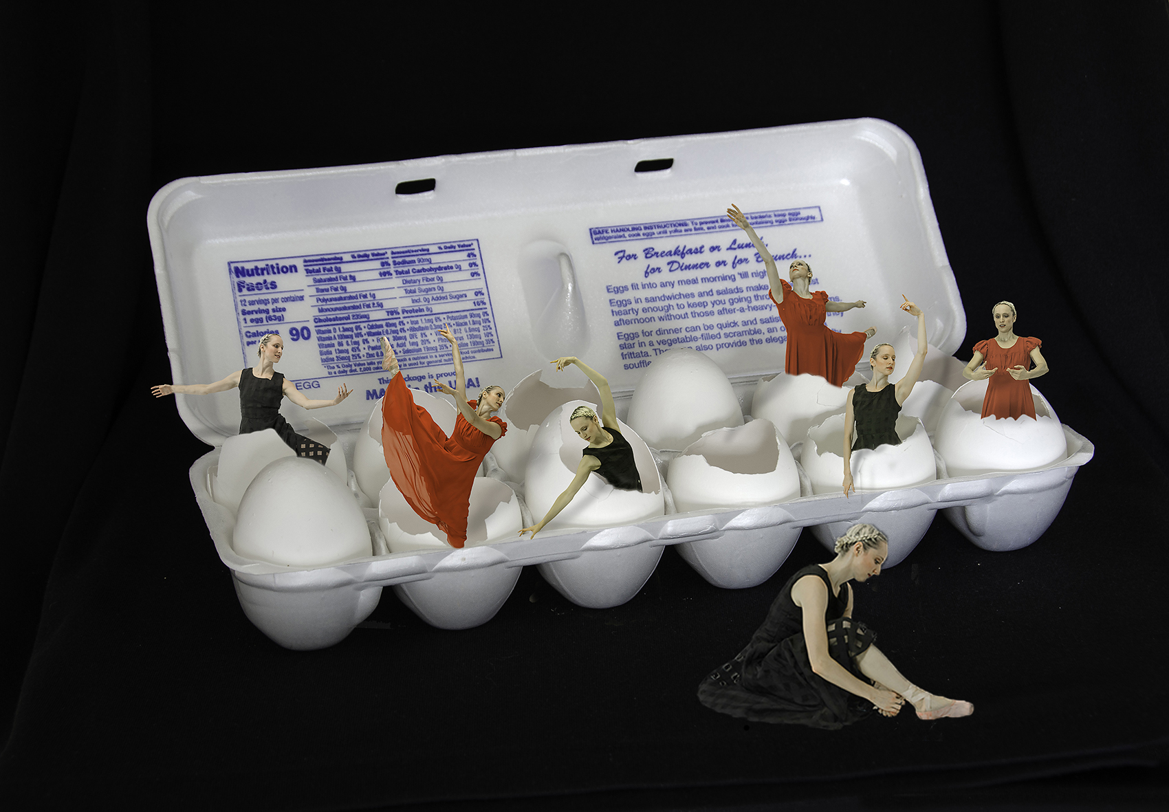
Fun image and title Alan. You've done a fine job of making all the lighting consistent. Your cutting and masking of the dancers is well done. The color combination of the black, red, white is nice and dramatic, but all the blue printing on the inside of the carton really takes the image from dramatic to cluttered, to my eye. And you know me and shadows -- I think some of the dancers need shadows down from their extended arms onto the shells so they don't look so pasted on. I agree with the other comments about the dancer in front. Steve has done an interesting treatment. I also think if she were a bit larger and overlapping the carton a bit (since she's closer to the viewer), she would seem more grounded in the scene. I quickly made a couple of edits just to show my points, but they're far from well done. Your concept is a good one here. Just needs a bit more work to take it to the next level. |
May 10th |
 |
| 34 |
May 21 |
Reply |
Hang in there Steve. Patience is obviously one of your strong suits! |
May 10th |
| 34 |
May 21 |
Reply |
Yes! Of course I love it! :-) |
May 8th |
| 34 |
May 21 |
Comment |
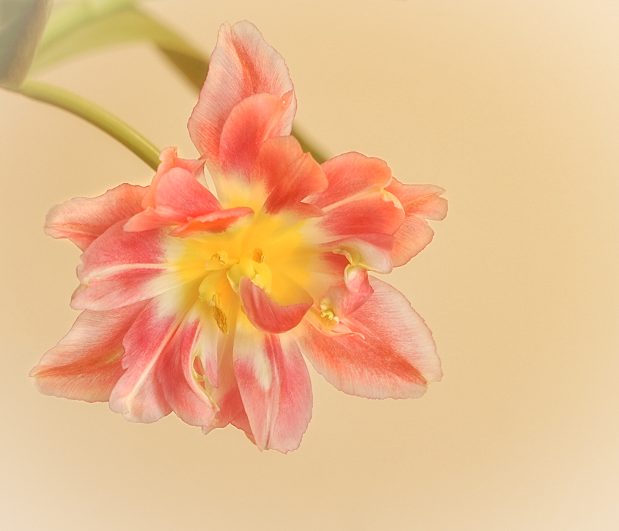
I love the original image for its delicate color and beautifully photographed details. The blossom's color in the final version is much more dramatic in comparison to the background, but I'm much more attracted to the original because it feels more "pure" and unmanipulated. The texture seems to have flattened the lovely original depth of field too. I played with your original a bit, just to see where it would lead me. I think your final version is lovely and you processed it beautifully. |
May 8th |
 |
| 34 |
May 21 |
Comment |
A good match indeed! You did a great job of placing the wonderful matchstick trawler at sea. I love the big dark wave at the front of it starting to crash against it. The contrast and drama in the final version is a big improvement over Original 3, and makes it look completely believable. Fran did a good job of adding the rocks, but I think I like the scene best without any hazards to draw attention away from the ship. I also like that you left the shoreline in the background. Since I put birds in most of my images, I probably would add a seagull or three in the distance, but that's just me. I love your image and your amazing matchstick project. |
May 8th |
| 34 |
May 21 |
Reply |
Thanks so much Gwen. I hope you like DistressedFX. They recently upgraded it and I guess there are extra enhancements you can purchase, but I haven't looked into that yet. I did buy a couple of additional filter packs previously, but they were minimal cost. The new add-ons are pricier. |
May 5th |
| 34 |
May 21 |
Reply |
Thanks Fran. So glad you tried rendering a tree and liked doing it! I'll hope to see a rendered tree in one of your future images! :-) |
May 5th |
5 comments - 6 replies for Group 34
|
5 comments - 6 replies Total
|


