|
| Group |
Round |
C/R |
Comment |
Date |
Image |
| 18 |
Oct 20 |
Comment |
Great! So creative and happy. Thanks for making me chuckle. |
Oct 16th |
1 comment - 0 replies for Group 18
|
| 34 |
Oct 20 |
Comment |
I like the texture and reduced saturation that your treatment provided to your image. It's very quaint and nostalgic and makes a nice tableau. Well done Georgianne! |
Oct 26th |
| 34 |
Oct 20 |
Reply |
Very cool Alan -- congrats!! |
Oct 26th |
| 34 |
Oct 20 |
Reply |
I'm puzzled as to why you think an old lighthouse and shipwreck don't fit in with a vintage look image. If anything, it would seem to me the seagull was the least vintage-esque of the three components. But that's what makes the DD discussion interesting -- everyone sees things differently. Thanks for your comment. |
Oct 16th |
| 34 |
Oct 20 |
Reply |
I agree that shadows in composites almost always present challenges, but I think it's worth the time to get them right because they either "sell" the image as believable or make it feel "off." Like Steve, I create one separate layer for shadows in a simple composite, or sometimes many different shadow layers in a complex composite so that each element (and its shadow) can be moved, eliminated, resized, or whatever, without affecting the rest of the elements. |
Oct 16th |
| 34 |
Oct 20 |
Reply |
Thanks Steve. I guess the boat ran aground because everyone was in a "foggy state of mind" -- the sailors, the lighthouse keeper, me -- a recipe for disaster. :-o |
Oct 16th |
| 34 |
Oct 20 |
Comment |
Oh my gosh, Steve! You've sent me into cardiac arrest with this creature. I'm making my comments from memory because I could only peer at your image for a split second. My fear and loathing of spiders prevents me from perusing and enjoying the intricacies of your composite. Needless to say, your spider is very powerful. And you know how much I enjoy Steampunkers, so they've redeemed you. Their placement and sizing are just right. They might be able to use a bit of shadowing under their feet in a couple places where the blurred foreground doesn't cover them up. Great image for Spooky season! An image I love to hate! :-) |
Oct 6th |
| 34 |
Oct 20 |
Comment |
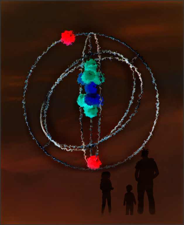
The gyroscope is a good symbol of chaos, Candy. I like the orange background, but it's pretty subtle to convey the fires in a clear way. Your image looked like a fun one to play with, so I used PS filter Spatter, and then On1 Glow on just the gyroscope, hoping to amp up the chaos factor. I like the silhouettes of the family, but I might have kept the weedy area they're standing on to keep them grounded, even if you still added some smoke too. I certainly identify with your feeling of chaos and instability and your image takes us to that place. |
Oct 6th |
 |
| 34 |
Oct 20 |
Comment |
The vibrant reds in this are great Alan. And the white-haired, wrinkled monk has so much character and interest. The clouds add nice mystery to the scene. My only suggestion would be to cover the bright toes of the smaller monk in clouds like you did to the feet of the front monk. Nice image! |
Oct 6th |
| 34 |
Oct 20 |
Reply |
I appreciate your point about a bit more blue in the image. I tried adding a touch after the fact, using a Blend Mode of Color and a soft blue brush, but it didn't quite work on the flattened file, so if I use the image again, maybe I'll go into the original layered .tif and add it properly. Or maybe just lower the opacity of the distressed fx (yellow) layer so some of the blue layer comes through. Thanks Lori. |
Oct 5th |
| 34 |
Oct 20 |
Comment |
I like this image a lot Denise! For some reason the figure looks like a pilot (maybe the goggles on top of the head?), so this makes me think of a warp speed journey through space or something. The spin blur was a great idea and I love the glow of the blue tones. Your decision to add the warm tones after you added the smoke also worked well to give the image depth and interest. The one tiny bright yellow spot on the left side of the head is distracting to my eye, but that's a nit-pick. Great image! |
Oct 5th |
| 34 |
Oct 20 |
Comment |
Very nice colors and textures in this image, Lori. The color in the upper right sky and the soldier's uniform go nicely together. The warm tones complement the blues nicely too. The light you added on the right side is lovely. I like the addition of the three buildings, and they all have a nice rustic charm. My only suggestion would be to add a deeper shadow right under the soldiers' feet to keep them from looking like they're floating, and maybe darken their highlights a bit since they're in the shadow of the trees. I love that you added smoke coming from the chimneys, which adds another level of "life" to the scene. Very well done! |
Oct 5th |
6 comments - 5 replies for Group 34
|
7 comments - 5 replies Total
|


