|
| Group |
Round |
C/R |
Comment |
Date |
Image |
| 19 |
Jul 20 |
Comment |
Beautiful image! I've taken scads of these blossoms and never get them to look this artistic. Love it. |
Jul 7th |
1 comment - 0 replies for Group 19
|
| 34 |
Jul 20 |
Reply |
Thanks for your kind words Helen. I have a few folders for elements like sky shots, textures, flowers, etc. but not for landscapes really. I don't even put key words or labels on images like some people do, because it takes so much time. Usually I just dive into a past trip folder and use whatever comes up first that seems like it might work. That's why I had to add my own horizon line and sky to this month's background, because I decided after the fact that I needed some sky behind the clock house and didn't want to go searching again for just the right landscape. |
Jul 28th |
| 34 |
Jul 20 |
Reply |
Thanks for visiting and your kind comments Lisa. The sheep became less recognizable when I applied the filters and I decided they are such a minor detail that it didn't matter whether they looked like sheep or rocks. It seemed like removing the filters from just them would look forced. The competition process is cumbersome and not enjoyable for me, so I just stick with creating images that I can have fun with. |
Jul 26th |
| 34 |
Jul 20 |
Reply |
LOL! |
Jul 21st |
| 34 |
Jul 20 |
Reply |
You're too kind Georgianne. I'm glad you enjoyed my image. Escapism seems to be my most effective defense at this point. |
Jul 21st |
| 34 |
Jul 20 |
Reply |
I don't always know where I'm heading with an image either. And I think experimenting and playing is a fabulous way to come up with something creative. Your images are always creative and uniquely you. Don't be so hard on yourself. If you enjoy working with the tools you have, there's no need to upgrade. If it has become frustrating or you think upgrading would allow you to grow, then it's something to consider. I have some apps on my iPad I use from time to time, but most months I use only PS and On1 from my desktop. DD is just about enjoying the creation process and learning from others in a stress free environment. I'm glad you're part of Group 34! |
Jul 14th |
| 34 |
Jul 20 |
Reply |
Thanks Helen. I wasn't really trying to improve on your version; I just was seeing whether this effect was what you wanted it to look like when you said the blur>spin filter didn't work. And offering an alternative of distort>twirl in case that got you the look you wanted. |
Jul 13th |
| 34 |
Jul 20 |
Comment |
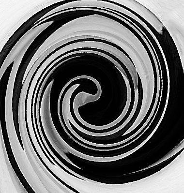
You did a good job of finding work-arounds to accomplish a dramatic graphic image. I played with your original image to see if I could find something like what it sounds like you wanted with the blur spin that didn't work for you. First I transformed (squished) it into a square. Then I used PS Filter>Distort>Twirl (twirl set to 450 degrees). It left the outsides not very twirled, so I cropped off that part. Then I did the same process again but with twirl set to 254 degrees to twist it in a bit more. I'm not sure if this is what you had in mind, but it is one way to get a pinwheel without spin blur. I like your patriotic pinwheel! |
Jul 13th |
 |
| 34 |
Jul 20 |
Comment |
This is lovely Denise! The lighting is gorgeous. You've selected a perfect background. At first the letters seemed not to fit with the rest of the image, but then I decided they do go with the book. It might look kind of cool if they were sort of tumbling out of the book? You did a great job of creating the glow coming from the book; is it a radial fill? Your title is a good one. I find myself saying "if only" several times a day these days. Good to have you back. Stay safe! |
Jul 12th |
| 34 |
Jul 20 |
Comment |
Excellent "painting" Georgianne! So often when people process photos into paintings, they just use one filter or preset and it's too obvious that it's from a photo. You've done a masterful job of using several different programs and tweaked presets to create an image that truly appears to have started life as a painting. I can't quite decide if I like the bit of red in the lower right corner; my eye seems to gravitate there away from the main blossom. I do like that you angled the water lily a bit more rather than leaving it straight. Your crop is just right too. Well done! |
Jul 12th |
| 34 |
Jul 20 |
Comment |
You've constructed a very nice Surrealist image here, Alan. I agree with the others about your handiwork in removing the tree. The three human figures work well together. As I studied the image, I especially enjoyed the contrast between the bright color with clean, stark lines of the building, and the monochrome color and grungy, wibbily lines of the sidewalk. There's a nice sense of anticipation in the image too. The color of the sky is a bit too saturated for me, but that's just personal taste; and after all, you're not going for realism here. Thanks for your detailed description of your process; very informative. |
Jul 12th |
| 34 |
Jul 20 |
Comment |
Great image with a nice moodiness, Candy. The broom on the wall, the wood burning stove, the polished benches all contribute to a rich, albeit simple, tableau. Your window replacements are really impressive. I do feel a sense of isolation and loneliness. The muted colors are lovely. When I first looked at the image, it seemed symmetrical. But as I studied it, I loved the way one side has a bench at the front of the room, an empty bookcase?, a shade on the window. The other side just has the broom. Nice yin and yang. |
Jul 11th |
| 34 |
Jul 20 |
Comment |
Very cool Steve. Your blending of the orange flowers on the left and the purple ones on the right into the main shot makes it look like that was the original shot. The three ethereal faces give it a nice feeling. My only nitpick would be to take out the wood structure going across the bridge of the nose on the left face. In the blending process, it turned to orange, so it distracts from the beauty of the face, to my eye. I especially like the way the center face melds into the foliage so that only her eyes, nose, and mouth are visible. The array of colors gives everything a nice vibrancy. Well done! |
Jul 11th |
| 34 |
Jul 20 |
Reply |
Yipes, you're ramping up the pressure for next month. :-0 |
Jul 11th |
| 34 |
Jul 20 |
Reply |
Thanks Alan. I find that each image requires its own treatment when it comes to textures and overlays. I've tried saving presets I like from images, but when I apply them to a different image, they just don't quite work. Plus, I kind of enjoy seeing where different treatments lead during experimentation. When you use your witch's brew on an image, do you tweak settings within your recipe? |
Jul 11th |
| 34 |
Jul 20 |
Reply |
Awww. Thanks Denise. |
Jul 11th |
| 34 |
Jul 20 |
Reply |
Thanks for visiting and your kind comments Larry! I didn't think about a white rabbit. Settled for a black cat instead. :-) |
Jul 7th |
6 comments - 10 replies for Group 34
|
7 comments - 10 replies Total
|


