|
| Group |
Round |
C/R |
Comment |
Date |
Image |
| 33 |
May 20 |
Comment |
Beautiful image Elizabeth. I absolutely love gnarly trees and old barns and this is a wonderful combination with both! I've had the same experience with thinking I would take a photo another time and then having the subject be gone when I went back. I've learned the same lesson. Even if all I have is my cell phone, I try to at least take a shot when I can. Many times I've ended up using the cell shot for a composite or something where utmost image quality isn't imperative. I love your capture here! |
May 11th |
1 comment - 0 replies for Group 33
|
| 34 |
May 20 |
Comment |
I think this is great Helen. Your image might "evoke" reminders of a famous painting to someone who's familiar with that painting, but yours is very much an abstract, which the Hakusai painting is not. In my image this month, two people noted that it looks like a painting they're both familiar with, but I (obviously not being very knowledgeable of various artists) had no clue of the one they mentioned when I created it. Inspiration can come from anywhere and I applaud you for finding it where you can. You did a great job of taking it from your original shot to the final image. Nicely done! |
May 11th |
| 34 |
May 20 |
Comment |
I would say your method of figuring things out as you go works very well for you! No need to know where you're going ahead of time when you manage to come up with something this great in the end. The detail and wonderful contrasts between light and dark elements in the character do make him the stand out main subject in my opinion. I do agree that the dragon sort of blended into the background in your original, but your edit is super. I'm sure you'll do very well with this image in a mono comp. Great! |
May 11th |
| 34 |
May 20 |
Comment |
Making a photo into a sketch is something I like to do on my ipad while watching TV, just for fun. But most of the time I end up not saving them because somehow they just don't look any better than the original photo, so I sympathize with your not being happy with your final image. You did a great job of getting rid of his glasses. He's very clean shaven in the original, but the sketch version gives him a serious five o'clock shadow. The pink cast of the final seems, to me, not to work with the sketch concept. Having time on my hands these days, I played with your image a bit just to see where it took me. I reduced the saturation and used Spot Healing and Clone tools to tamp down the whiskers and under eye circles. Far from a good result and I certainly didn't take your time and care with it, but I thought maybe you'd enjoy seeing it. Your tenacity in working so hard on the image is admirable and I'm sure you'll be able to apply that knowledge going forward. Knowledge is power! |
May 10th |
 |
| 34 |
May 20 |
Comment |
Very cool image Alan. The light beam is great. You did a fine job of fixing the woman's hair problem, and changing her dress color was a good call. The only thing that's a bit distracting, to me, is the foreground stonework. I might have cropped off that part, but I know from previous comments of yours that you prefer to keep a more standard dimension ratio. The hills and stage area make a nice backdrop, keeping things clean and undistracting. The osprey capture is great. Nicely post-processed composite! |
May 10th |
| 34 |
May 20 |
Comment |
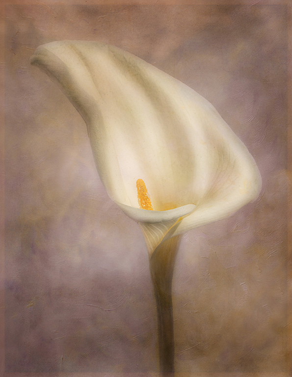
Serene and lovely, Candy. I like the monochromatic feel of the image. When I looked at the original, I especially liked the translucent area where the flower and stem meet, and it seemed that some of that was lost in the final. So I played with it a bit and tried to bring that back, along with a tad more contrast in the flower itself (and a little Glow in On1). Might be hard to see a big difference in the reduced size here though. Your subtle border is just right, in my opinion. Thanks for giving us a beautiful respite with your image! |
May 6th |
 |
| 34 |
May 20 |
Comment |
Great image Steve! Your treatment of the hut accomplished the important step of making the blue tarp disappear. I agree with the other comments about the boat, but you did a good job of toning down the colors, and I think you could add a grungy texture in On1 or one of your many other programs just on the boat to make it look old. Or maybe even just randomly clone some of the textures from the hut onto the boat. The color toning of the Fisherman's wife makes her fit beautifully into the scene. Great image -- well done! |
May 6th |
| 34 |
May 20 |
Reply |
Thanks for visiting Stephen. And thanks for posting the Wyeth painting. I can see why you thought of it when you saw my image. |
May 6th |
| 34 |
May 20 |
Reply |
Thanks Steve; very kind. As for simplicity, I think my years as a Graphic Designer help me with that because it was a constant exercise in "less is more" when I was creating marketing and demonstration materials for clients. Steampunk sort of throws that philosophy out the window, but sometimes it feels good to go back to uncluttered roots. |
May 6th |
| 34 |
May 20 |
Reply |
Thanks Alan. I did look up the Wyeth painting, and now I see Stephen has posted it here. The similarities are strong. I'm glad I didn't desaturate mine any more than I already did or it would look too similar for comfort. :-0 |
May 6th |
6 comments - 3 replies for Group 34
|
| 93 |
May 20 |
Comment |
Beautiful image! The water droplets are mesmerizing. Worth all the effort and time for sure! |
May 11th |
1 comment - 0 replies for Group 93
|
8 comments - 3 replies Total
|


