|
| Group |
Round |
C/R |
Comment |
Date |
Image |
| 34 |
Apr 20 |
Reply |
Thanks for visiting Ian! Glad you like it :-) |
Apr 24th |
| 34 |
Apr 20 |
Reply |
Very kind words, Ian. Thanks for visiting Group 34! |
Apr 16th |
| 34 |
Apr 20 |
Reply |
Thanks Steve. I'm glad you enjoyed the escape -- and the gin! |
Apr 16th |
| 34 |
Apr 20 |
Reply |
Thanks very much, Mark. And thanks for visiting! |
Apr 16th |
| 34 |
Apr 20 |
Reply |
Thanks for visiting, Mark! |
Apr 16th |
| 34 |
Apr 20 |
Reply |
It's a shame the Goths and Steampunks are cancelled, but I'll very much look forward to more flowers from your garden moving forward! |
Apr 13th |
| 34 |
Apr 20 |
Comment |
You did a great job of enhancing his face and the general lighting. The background was a good choice and the lantern added a nice detail. I think making it a bit brighter would make it more noticeable and match the exposure of the Grinch. I agree with Alan that he doesn't look very menacing, although looking at the green face and spiky fingers makes me feel like if he didn't have the Santa suit on he would be a good embodiment of the virus that has changed all our lives. |
Apr 10th |
| 34 |
Apr 20 |
Comment |
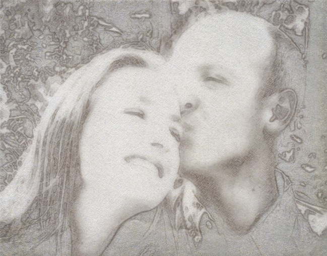
Congratulations on your grandson's engagement. I like your idea of ratcheting up the lightness of the image, although I might have gone even further. I agree with Alan's comment about the poof of hair and with Steve's about the couple needing to dominate the composition more. Since I had a little time on my hands sitting here at home in the pouring rain, I experimented with a couple of iPad apps. First into Snapseed to make it black and white high key, which eliminates the poof of hair issue. Then I cropped in closer and used Artista to change it into a sketch. Not a lot of detail but I think they're still recognizable. Your idea of a simpler background was a good one. |
Apr 10th |
 |
| 34 |
Apr 20 |
Comment |
This is well done and lots of fun Alan! I especially like the way you placed the Mad Hatter behind the frame on the bottom and in front of the frame at the top. That created wonderful tension and interest. The way you skewed the tiles the barmaid is stepping on is cool, and I like your shadows progressing from darker to lighter depending on the distance from the floor. My only suggestion would be to darken the barmaid a bit as she seems a little too bright in comparison to the Mad Hatter. Making the frame fuchsia was a good choice to add to the whimsy and surrealism of the scene. Once again you've created a composite that's entertaining to view and sparks the viewer's imagination. Great! |
Apr 9th |
| 34 |
Apr 20 |
Comment |
Wonderful image Candy! Your processing worked great to lighten and bring drama to the horse's face, chest and neck. I love the counterbalance of the straight lines and curved lines throughout the image. Your crop is perfect. If I was going to nit-pick, I would suggest desaturating the redness inside his nose and cloning out the light letters on the dark rein, because my eyes were drawn to both and away from the beautiful important parts of the image as I studied and enjoyed it. The background is very nice and I like that you tied it into your title. Nice work! |
Apr 9th |
| 34 |
Apr 20 |
Comment |
Daffodils are one of my favorite flowers so this appealed to me right off the bat. I too am liking your new non-goth look! I'm impressed by the various experimentation methods you used to capture the prism image to best advantage. It seems counterintuitive that your iPhone would work better than your good camera. Your treatment to darken the background image worked well to differentiate it from the bright flowers. I might have used a vignette to darken the edges and bring the lovely flowers forward even more. Your final background looks like it would be fun to experiment with in some iPad apps. Your image is sunny, uplifting, and inspires hope for brighter days ahead. Well done! |
Apr 9th |
5 comments - 6 replies for Group 34
|
5 comments - 6 replies Total
|