|
| Group |
Round |
C/R |
Comment |
Date |
Image |
| 19 |
Nov 19 |
Comment |
Beautiful image. The essence of serenity. Love it. |
Nov 11th |
1 comment - 0 replies for Group 19
|
| 33 |
Nov 19 |
Comment |
Nicely imagined from the original! Taking out all the distracting elements took it from a snapshot to a piece of art. |
Nov 11th |
1 comment - 0 replies for Group 33
|
| 34 |
Nov 19 |
Reply |
Thanks Denise. The Poster Edges filter is one of my favorites and I use it a lot. I find it to be most effective when I keep the settings extremely subtle. |
Nov 19th |
| 34 |
Nov 19 |
Reply |
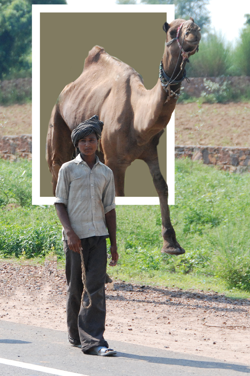
Alan, you are absolutely correct. Adding the left front leg doesn't really solve anything. And doesn't help at all to convey the idea of the subjects moving from the desert world to the beach world. So -- I hope you don't take this as overly critical or being anal about the whole thing, but I found it to be an interesting and challenging exercise in visual logic to figure out what would make the scene feel more comfortable to view. The boy is in the beach world already, and he's connected to, and in front of the camel, so the camel needs to be entering the beach world through the window. This would mean that the camel's head and right front leg should be in front of the window frame, rather than behind it. Here's what I came up with. I just used your original photo as a time saver, so consider the background to be the beach scene. The brown rectangle represents the desert scene; the white border the window frame. I didn't take a lot of time to fine tune things like the angle of the camel's upper leg (needs to have its perspective tweaked). Now it seems to be ok (visually logical) that the three legs that are still in the desert world can't be seen by the viewer. So, even though it's a surreal concept, it feels to me that it's now grounded in a realistic organization of its parts. It was kinda fun for my aged brain to work through the visual logic here. Your image is thought provoking and really interesting. |
Nov 11th |
 |
| 34 |
Nov 19 |
Reply |
Happy to, Alan. Do you object to doing it by email, in case we have a back-and-forth exchange? Might be easier that way. |
Nov 11th |
| 34 |
Nov 19 |
Comment |
Very nice Helen! The mood is serene but the drama created by the geometric architecture is a nice counter balance. All the decisions you made worked out well. The complementary colors of blue and orange create a simple and striking image. I like Steve's addition of the light source. You've done a great job of selecting components to combine in your composite. Great result! |
Nov 9th |
| 34 |
Nov 19 |
Comment |
This is beautiful Denise! I love the contrast and detail in the stone pieces. You've done a great job of blending and integrating them with the clouds. I didn't notice the lightening until I read about it, so I think that could be a bit stronger for more impact. Seeing your cloud images taken from a plane reminds me of a cross country trip I took where I was doing the same thing. Suddenly the clouds cleared away and what I saw below was Monument Valley. Took my breath away. But I digress. The light areas you've added contribute greatly to the depth and interest. I also like the blue sky background area; it sets off the whole scene beautifully. Wonderful image! Great to have you back! |
Nov 9th |
| 34 |
Nov 19 |
Comment |
This is lovely Georgianne. I absolutely love lighthouses and this is a nice homage to them. I think I might have made the lighthouse even larger, though. The reeds you added in the front were a nice addition and add good depth. I agree with Candy about the dark vertical pole, especially the part reflected in the water. I like the painting effect you've used; I think it works well with the scene. Very nicely composited and processed! |
Nov 9th |
| 34 |
Nov 19 |
Comment |
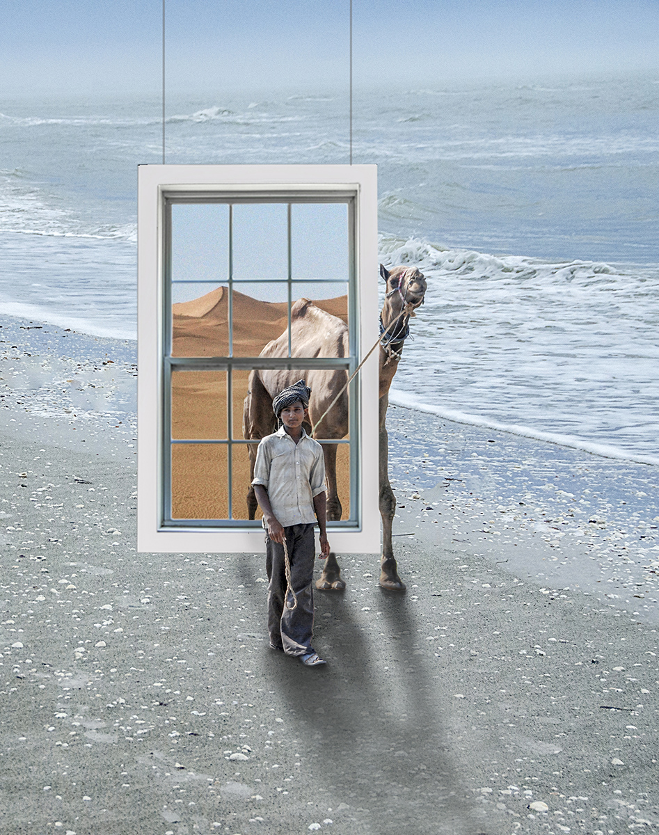
I like your idea here a lot, Alan. The colors are very nice. The symbolism of a window connecting two different worlds works well. I'm not bothered by the rope being behind the boy because the camel is behind him too. Since both of the camel's front legs are at nearly the same plane in the original, I think they should both be in the final image. To me, if you just add a strong shadow right under the boy's foot, it will anchor it so it won't appear to be floating, as Candy noted. I'm curious as to why you made the shadow go the direction you did, even though the shadow in the original image was different. I think if you had kept that original angle, it might have kept the image from feeling like it didn't "gel" as Steve noted. I played with your final and added the second front foot, darkened the shadow right under the boy's foot, and lightened the shadow as it moved away from the parts of the subjects that were touching the ground. I didn't change the direction of the shadows in the interest of time. |
Nov 9th |
 |
| 34 |
Nov 19 |
Reply |
Thanks Georgianne. I was hoping the pier would look like it was floating in mid air, so I'm glad it came across that way to you. :) |
Nov 9th |
| 34 |
Nov 19 |
Reply |
Such kind words, Steve. Thank you. |
Nov 9th |
| 34 |
Nov 19 |
Reply |
Thanks Alan. I seem to be in a period of escapist compositing. :-) |
Nov 9th |
| 34 |
Nov 19 |
Comment |
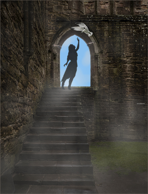
The stone steps and archway create a wonderful mood, Candy. Taking out the railing was a great move. The addition of the mist was a nice idea too. I agree with Alan about the pose of your granddaughter. I'm sure it made total sense when she was standing in the cemetery though. I like the addition of the bird, and you placed it beautifully to conform to the arc of the doorway. I feel like it's an important part of the image, so it's okay that it's one of the brighter elements. It seemed to me that having some interaction between the person and the bird might engage the viewer more. I tried changing your granddaughter's arms to reach up toward the bird, but I failed at that miserably. So I just found a silhouette image and added it in to illustrate my point, but a non-silhouetted image would be much better. It looks like many of our group are spending time in the clouds and mist this month! Your concept here is lovely. |
Nov 7th |
 |
| 34 |
Nov 19 |
Comment |
Your mini-tour is wonderful, Steve. I very much enjoyed the history of the church. Original 1 is such an amazing image on its own, but adding the other elements expands the tour nicely. Since the grass from the original is visible through the pews, I feel like it's a bit hard to tell what they are without your explanation. Your process of adding the Ten Commandments worked really well. I feel as though I've been on a day-tour to a charming corner of the world! Thank you -- well done! |
Nov 7th |
6 comments - 6 replies for Group 34
|
| 41 |
Nov 19 |
Comment |
Nicely done composite. Fun and whimsical! |
Nov 11th |
1 comment - 0 replies for Group 41
|
| 54 |
Nov 19 |
Comment |
I like this image a lot Alan. I too like the mountains and water, and I like the fish included because it makes a varied and interesting group of three on the chess board. Maybe just removing the line from the fish's mouth would work? Well done! |
Nov 14th |
1 comment - 0 replies for Group 54
|
| 78 |
Nov 19 |
Comment |
Beautiful image! The textures are great and your contrast is spot on. Well done. |
Nov 7th |
1 comment - 0 replies for Group 78
|
11 comments - 6 replies Total
|


