|
| Group |
Round |
C/R |
Comment |
Date |
Image |
| 34 |
Oct 19 |
Reply |
Thanks for the kind words Denise. I really must tell you though that your images are amazing and your skill and talent are clearly displayed in those you have submitted to our group! I hope you'll be back soon! |
Oct 28th |
| 34 |
Oct 19 |
Reply |
Thanks Steve. This pup looks like he's having fun strutting with his cool Steampunk owners! |
Oct 24th |
| 34 |
Oct 19 |
Comment |
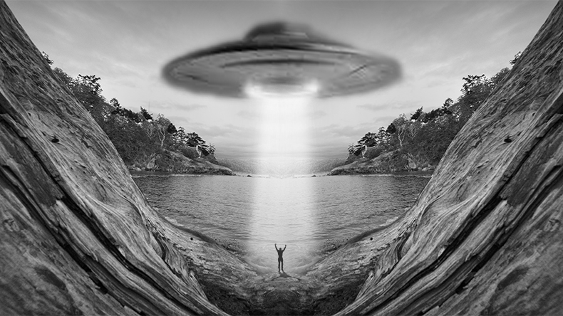
You did a very nice job bringing out the contrast and texture of Original 1 and I very much like the monochrome result in Original 3. The red and black shape is eerie and compelling. It does seem a bit too stark and sharp compared with the rest of the image, so I might have tried a different blend mode or reduced the opacity just slightly. Your Original 3 seemed to be a perfect stage for an alien encounter, so I googled up a couple images and added them in just to have a little fun. |
Oct 11th |
 |
| 34 |
Oct 19 |
Reply |
I see your point about the lights being brighter than the man. A halfway point between completely dark and bright white might work, but you have good reasons for why you did it the way you did and that's the important thing. Thanks for your info about your witch's brew. |
Oct 11th |
| 34 |
Oct 19 |
Comment |
I used to love doing "assignment photos," but then I kind of got away from it, so your image brings back good memories. I really like your use of both the flashlight and the reflective surface. I especially like the way the reflection lines and the shadow lines intersect each other in the whisk and potato masher shots. Since they're both realistic, the third tool doesn't seem to go with them because it has an altered treatment, but that's just my personal preference. It looks like you had a good time working on this. Just curious... do you know how many total shots you took? |
Oct 10th |
| 34 |
Oct 19 |
Comment |
I think your placement of the man is refreshing and cool. Since he is, overall, brighter than the rest of the image, it looks to me as though something is illuminating him, so Steve's alteration of turning on the light works for me. Your witch's brew works nicely here. Is it a formula that you've come up with that you just apply and you're done? Or is it a setting that you start out with and then fine tune for each image? The desaturated colors are great for this image. Nicely done! |
Oct 10th |
| 34 |
Oct 19 |
Comment |
I'm in awe of the various settings within PS that you used! Your experimentation ended with a very nice result. The details and coloring in the final are much stronger than the original, and I like the warp you applied on the square area to make it more dynamic. One of the most fun aspects of traveling is to come across things like this curb and take the shot so you can enjoy working with it when you're back home. Nicely seen, shot, and enhanced! |
Oct 7th |
| 34 |
Oct 19 |
Comment |
There seems to be no limit to the variety of ghouls who attend your local Goth events. These charmers are particularly engaging. You did a great job of making them appear to be standing next to each other. Their various facial features are so different and interesting to study, they need to occupy most of the image, but I totally understand why Georgianne and Alan want to see more of the background image because it's so stunning in its own right. According to your title, you planned to focus on their mouths, but just to nitpick, I'd like to see their eyes brightened up just a skosh. The image you posted in the reply to Alan is very cool too. Your expertise and talent in portraying "the dark side" is indeed indisputable. Well done!
|
Oct 7th |
| 34 |
Oct 19 |
Reply |
Thanks Alan. I do use On1 most often as my final step, but I'm not sure it's just that giving the look you like. I frequently use Poster Edges and Oil Paint in PS before On1 (as I did in this image). Poster Edges seems to enhance details -- compare the hair on Original 1's face to the final -- but then Oil Paint softens and blends the black lines that Poster Edges creates so they're not so harsh. The Glow filter in On1 is wonderful because it has so many presets and fine tuning options that it's pretty easy to find the right one for each image. I do like adding Glow to most images (even non-Steampunk ones) because, to my eye, it raises them beyond the simple snapshot look. |
Oct 7th |
| 34 |
Oct 19 |
Reply |
Your enhancements are a great improvement Georgianne -- thank you! |
Oct 3rd |
5 comments - 5 replies for Group 34
|
5 comments - 5 replies Total
|


