|
| Group |
Round |
C/R |
Comment |
Date |
Image |
| 34 |
Apr 19 |
Reply |
I do like your revision better with the hull showing through the new ghost. Gives a more ethereal feel to that part of the image. |
Apr 10th |
| 34 |
Apr 19 |
Comment |
Learning something new is always a good thing and helps us expand our photographic horizons. I haven't done cyanotype; it certainly gives an old-timey look to your photo, which actually was already pretty retro looking. With so much of our lives tied to high tech every day, it's nice to take a step toward a simpler time and simpler effects. Well done! |
Apr 10th |
| 34 |
Apr 19 |
Comment |
I was at Zaans Schans less than a year ago, so this image brings back fond memories. The program you found looks like fun to play with. I like the effect it produced on both the upper part and the water. To my eye, the water effect is quite like it would have really looked if the upper part was somehow actually "constructed" of stained glass. Hope your computer problems will soon be behind you -- I feel for you! |
Apr 10th |
| 34 |
Apr 19 |
Comment |
This is a lovely and very creative image Georgianne. I love the monochromatic color, with the rainbow staying in full color. The white vignette works nicely. I do like the woman sitting on the beach, but as Mark noted, her chair isn't adding to the ambience. Perhaps if she were in an Adirondack chair? The use of the Difference blend mode for the guitar layer works well. I try that blend mode from time to time, but can't remember ever liking what it did to any of my images. It gives a nice switch-up to this one. Well done! |
Apr 7th |
| 34 |
Apr 19 |
Comment |
This is the rusty hull you mentioned a couple of months ago, right? I can't imagine how many hours you spent using the pen tool to eliminate the scenery behind it. You did a great job. Your reflections are very nicely done. I agree with Georgianne that the ghost doesn't seem quite ghostly enough. Perhaps if you used a simple background photo rather than the gradient (maybe wispy clouds and a watery/rocky shore or something like that), you'd have some detail behind the ghost to show through her and make her appear more translucent. I know you like to keep your images simple, but to my eye, the gradient background is static and uninspiring. But that's just my personal preference, of course. Your image and its title give the viewer something to think about, for sure. |
Apr 7th |
| 34 |
Apr 19 |
Reply |
Thanks Alan; valid critique. As for the color overlay, I almost always use On1 plug-in because most of the time I also use a texture overlay and it's super easy with their presets to see what effect each one will have on the image (you can also fine tune them if the presets don't quite get you there, but I seldom need to). There are at least a couple of ways to do the same thing in PS, but I find it to be much more time consuming because it involves more trial and error to get the look I'm going for. You could use a Layer Style -- I usually access that through the Blending Options dialog -- or you could add a new Fill or Adjustment Layer and then use Solid Color, Photo Filter, or Selective Color, depending on what works for you. PS has so many ways to do the same thing, I'm sure there are other paths, but these are the ones I'm familiar with. |
Apr 7th |
| 34 |
Apr 19 |
Comment |
This is really cool Steve! Great use of the lens sphere and prisms. You've created a lively and very interesting world here. I especially like the background in Original 2, with its dark and glowing effect. Changing it to a lighter tone for the final was a good idea though, so your Goths show up well. I can just imagine the fun you had photographing and compositing this image. Way more interesting than a blood moon. Very nicely done! |
Apr 5th |
| 34 |
Apr 19 |
Comment |
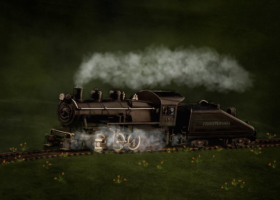
Your husband's toy train looks absolutely real with all the detail. I love the smoke and engineer additions -- very well done. Your glow and vignette give it a very nice mood too. It feels to me as though the train is sort of floating above the ground, so I played with it a bit. First I rotated it a tad to level the train. Then I added a few California poppies in front of and just behind the tracks to see if that grounded it any. Your version has the advantage of being more clean and uncluttered though, so maybe that's more the look you were going for. |
Apr 5th |
 |
6 comments - 2 replies for Group 34
|
6 comments - 2 replies Total
|


