|
| Group |
Round |
C/R |
Comment |
Date |
Image |
| 34 |
Mar 19 |
Comment |
Alan -- I tried to reply to your last comment but maybe we've exceeded the number possible, so I'm trying it as a new comment block rather than a reply. I'm happy to pass along how I create overlays. First, let me ask -- do you have the On1 plug-in? You can do it in PS but it's a bit more time consuming because you create the overlays rather than using On1's presets. Perfectly doable though; I just need to know what software you'll be using. |
Mar 23rd |
| 34 |
Mar 19 |
Reply |
Of course, glad to. First, let me ask you -- do you have the On1 plug-in? That's what I usually use; you can use PS but it's a bit more time consuming because you have to create the overlays rather than being able to use On1's presets. Still perfectly doable; I just need to know what software you'll be using. |
Mar 23rd |
| 34 |
Mar 19 |
Reply |
Of course, glad to. I usually use the On1 plug-in to PS. Let me know whether you have On1 and we'll go from there. If not, the basics can be done in PS, but it's more cumbersome without the cool presets in On1. |
Mar 22nd |
| 34 |
Mar 19 |
Reply |
It's nice to know who your inspirational artists are. And that's the great thing about art -- some appeals to me more than to you and vice versa. I didn't explain my revision to your image very well. I wasn't suggesting that the texture gave it a theme, just a common look. When I create composites (some more surrealistic than others), I always finish with a texture and/or color overlay to help all the elements look like they belong together. In my "Steampunk Femme" image (Nov) that you have mentioned you like, if you notice the many different elements in my Original 2, they all have a different color cast. So my last step was to add an overlay that gave them a common color-way and reinforce the Steampunk look. Your current image is certainly thought-provoking and I've enjoyed the dialog to help me understand it better. :) |
Mar 22nd |
| 34 |
Mar 19 |
Reply |
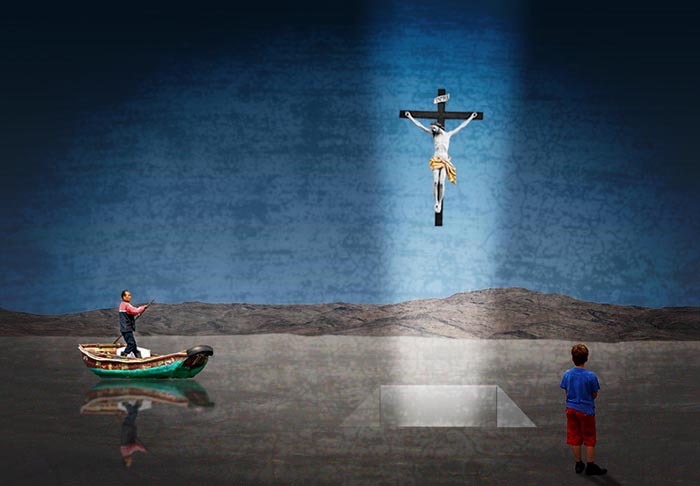
The main reason I'm curious about the individual elements of your piece is because I wonder what your artistic vision is for it. I agree that each viewer will extract a different meaning, but in order to do that, to me, there needs to be some bit of cohesiveness or a theme so that the viewer feels that they're looking at more than just a random collection of elements. I want to feel something from your image, but I guess I'm not "getting it." In reading your reply to Candy, I note that you gave a clue when you said the boy was captivated by the image of Christ -- and yet the boy's body is facing away from Christ and his head is looking straight ahead rather than upward. The viewer is unable to make a connection if your elements don't reinforce what you're trying to convey. Steve's comment about perhaps using a texture (or I'm thinking maybe a color tint) to tie the elements together is a valid one, in my opinion. Your desire to keep your surrealistic images simple is well and good, but if your elements don't carry through your vision, the viewer will have a hard time connecting with it. I'm including a revised version with a texture and vignette, only to see if you think perhaps your original image can still have your intended simplicity, while being tied together with a consistent overlay. It's more heavy-handed than ideal, but I wanted to make sure you could tell the difference. |
Mar 17th |
 |
| 34 |
Mar 19 |
Comment |
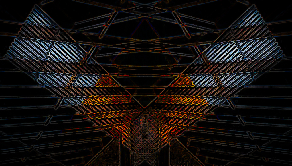
I love geometric images as well as architectural images and you've combined them into a very pleasing bit of symmetry here. It looked like a very fun image to play with so I gave it a try. First I cropped in tighter on the center. In PS I applied Poster Edges and Glowing Edges. In On1 I applied HDR, Glow, Color Enhancer, and Brocade Black texture. My version obliterated the pyramid, which I very much like in your version, but I had fun playing. |
Mar 11th |
 |
| 34 |
Mar 19 |
Comment |
I really like what you did to enhance the texture and lighting on the barnacled tree. It does indeed remind me of a sentinel. The border treatment is interesting and I think it does contribute to the mood of the image, but it seems to be covering up the ends of the fish to a point where it's hard to tell what it is. I like Steve's quirky addition of the face, and I'd love to see what you come up with in that regard too. Well done. |
Mar 11th |
| 34 |
Mar 19 |
Reply |
Thank you Steve. Funny how one image can be seen so differently by two people, as all of us have experienced in the judging process. |
Mar 11th |
| 34 |
Mar 19 |
Reply |
Thanks Alan. This image wasn't intended to be easy on the eye, but to evoke feelings of being harried and rushed that many of us feel on a daily basis. I most certainly respect your assessment that it doesn't work for you, but if it made you feel you're going to be late for class, it did meet my aim. ;) |
Mar 11th |
| 34 |
Mar 19 |
Comment |
Wow, lots of symbolism here. I'd be interested to know your reasons for each of your elements. Is the light beam coming from above and heading below, or the other way around? The boatman is heading right for the hole; is he eventually going to disappear into it? Your Original 2 made me chuckle; the little boy is getting quite an eyeful -- wonder what he was thinking. ;) |
Mar 10th |
| 34 |
Mar 19 |
Comment |
Very nice post processing Candy. Everything you did enhanced the image greatly. Your Liquefy edits to her eyes and mouth were really well done -- big improvement but not over the top noticeable. Heart-warming image. |
Mar 10th |
| 34 |
Mar 19 |
Comment |
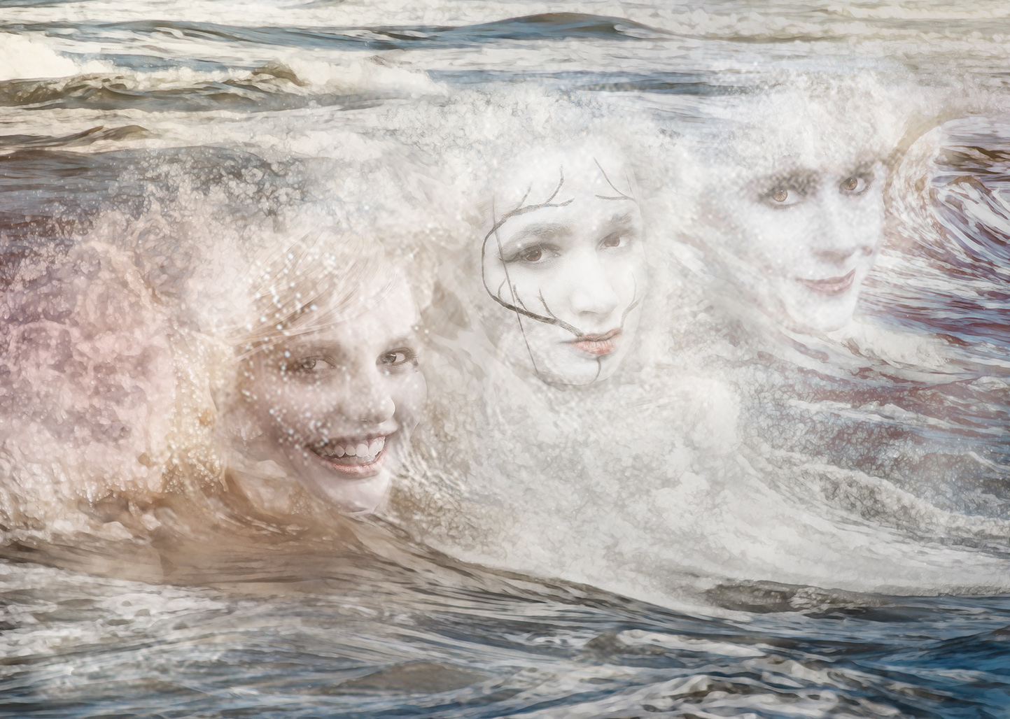
Fun image Steve. I'm not familiar with the Old Spice ad but you did a good job of describing it as your inspiration. The difference in color from one side to the other contributes nicely to the fantasy aspect. My only suggestion would be to reduce the opacity of the ladies' faces to give them a more watery, translucent quality. I tried the image below just to see if my idea was valid, but in the interest of time I kind of worked backwards. I placed your left Original 1 on top of your finished image with a Screen blend mode at 92%. I then brought back some of the detail in their eyes and softened the dark right edge of the center face to meld it into the water. Far from a great edit, but I hope it at least illustrates my point. |
Mar 10th |
 |
| 34 |
Mar 19 |
Reply |
Thanks for your comments Dave. I checked out your cactus ghost image and I like the moody feel of it; experimenting with slow shutter paid off. |
Mar 6th |
6 comments - 7 replies for Group 34
|
6 comments - 7 replies Total
|


