|
| Group |
Round |
C/R |
Comment |
Date |
Image |
| 34 |
Jul 18 |
Reply |
Thanks very much Helen! Glad you like both composites. |
Jul 28th |
| 34 |
Jul 18 |
Reply |
Hi Georgianne. I told you I would let you know if the image got accepted by the Varna Exhibition judges, which it did, but didn't earn any awards. However, I also submitted my DD image from March -- the old man w/ a cane silhouette, facing the bright light through the doorway. I received a FIAP Bronze medal for that one. I do enjoy entering a few exhibitions now and then, even though the same image might do well in one but not so much in another. As you well know, that's the name of the game when it comes to judges! |
Jul 26th |
| 34 |
Jul 18 |
Comment |
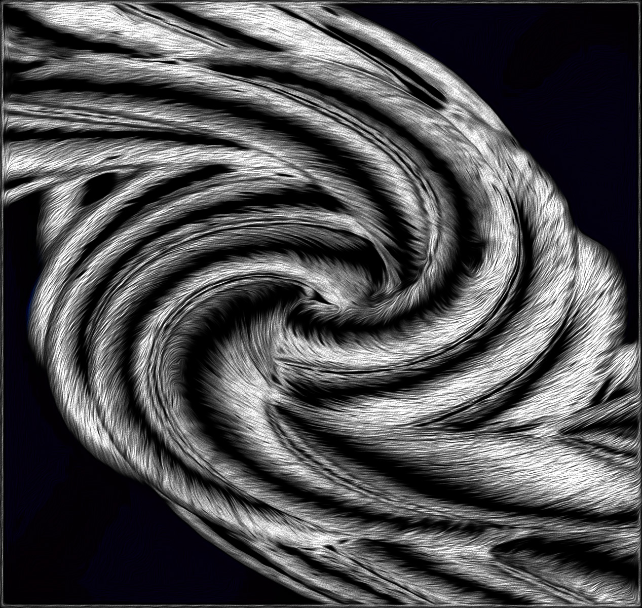
It looks like you had a good time tweaking this image, Helen. I like the B&W treatment and the fact that you didn't go overboard with the twirl effect. When I first saw it, it seemed like a good candidate for the Solarization effect in Nik, so I gave it a try. Still wanting to play, I took it into On1 for HDR and Glow filters, and finally in PS I used Oil Paint. It doesn't look like a coil after my playing, but I had a good time! I like the pinline border you put on it too. |
Jul 11th |
 |
| 34 |
Jul 18 |
Reply |
Regarding the light, one of the main reasons I decided to use this particular beach image was because it had stronger light further back and less at the front. Since I imagined the clock/orb as a "sun" concept, it seemed to make sense that there would be a concentration of light closer to it. |
Jul 11th |
| 34 |
Jul 18 |
Comment |
You really spiffed Ned up, Christine. He looks very elegant in your version and I like the black background. You brought out nice detail and light on the left side of his face. If you're going to put a thin border around it, I might use the pretty brown from his coat rather than a stark white, but that's just personal preference. Giving Ned a tad more space next to his face would allow the recipient to have room to frame the piece if he so desires. |
Jul 10th |
| 34 |
Jul 18 |
Comment |
I applaud your experimentation with speedlights! I have 3 or 4 my husband has given me over the past few years and I'm woefully inept at figuring them out. I thought a few years ago I would be doing studio photography, but it has ended up that 90% of my shots are outside with my cell phone. I do agree with Steve about the texture on her skin, but I really like the texture in the background. You got nice soft but illuminating light on her face with your flash. Nicely done! |
Jul 10th |
| 34 |
Jul 18 |
Reply |
Thanks very much Steve. Alas, I goofed and didn't upgrade my Nik before the end of June, so I guess now it'll cost me $49 or $69 to upgrade. Thanks for reminding me to go online and check to see. Actually, the more muted, antique colors were one of the things that appealed to me about the sketch version, but I certainly understand how you might prefer the warmer version. Thanks! |
Jul 10th |
| 34 |
Jul 18 |
Reply |
How very kind of you Georgianne, thank you. Glad you like it. I do like Dali, although I didn't consider this near as artistic as his work. I've enjoyed entering some of my altered reality pieces in the various international competitions under the sponsorship of PSA (listed under Current Exhibitions on their website). Most of the time the Open Category will accept altered reality works, and once in awhile a particular exhibition will also offer a Creative Catetory -- which usually has quite a few altered reality entries. PSA also has a Creative Competition of its own that accepts altered reality images. I did enter this image in the Varna Salon Exhibition (Creative Category) last week, so if it gets accepted, I'll let you know! Fingers crossed :-) |
Jul 10th |
| 34 |
Jul 18 |
Comment |
Interesting image Phil. I have really enjoyed your flower images done with your scanner, but I'm afraid this one doesn't quite wow me. You did a good job of evening out the lighting and contrast in the final and the B&W treatment increases its "artsy" factor. The fact that your eye is closed so tightly makes me feel like you're in a lot of pain, although I understand why it's that way. Maybe you could do a version with a pirate patch over your eye? :-) I applaud your sense of experimentation here! |
Jul 8th |
| 34 |
Jul 18 |
Comment |
Toby is a cutie and looks like he has a lot of personality. Your processing choices all improved the image. I'm very glad you darkened the pink spot right below his nose, as that seemed distracting in the original. This is nitpicking, but I noticed an area in his whiskers where the new background didn't fill in a tiny triangle right next to his face (straight across from the bottom of his nose). I like the background you chose. Nice pet portrait! |
Jul 8th |
| 34 |
Jul 18 |
Comment |
Beautiful, Steve. This looks like the cover photo on a high-end safari brochure. The bark texture worked well to create a nice effect. I like your muted colors too. You did a great job of extracting all that lion hair out of the original backgrounds. Since the wildebeests are small, bunched together and in silhouette, they're a bit hard to distinguish from each other, but considering the context it's pretty self evident what they are. It was a good call to stop with the number of animals that you did in order to keep things from getting too cluttered. Very nicely done! |
Jul 8th |
6 comments - 5 replies for Group 34
|
6 comments - 5 replies Total
|


