|
| Group |
Round |
C/R |
Comment |
Date |
Image |
| 34 |
Nov 17 |
Reply |
Helen, figuring out which photos to combine into a composite just comes with practice and, oftentimes, trial and error. I think your composite efforts in our group have been really good. Keep compositing! |
Nov 28th |
| 34 |
Nov 17 |
Reply |
The drawing of the fence wasn't from scratch, so don't be too impressed! :-) I just used the original photo as my template, created a new empty layer, and used the brush tool to redraw over the original to make the wood stakes more rough and rustic and the wire more wiggy and bent. Then just transferred that layer into the image I had cloned out the blurred fence from. |
Nov 28th |
| 34 |
Nov 17 |
Reply |
Your decision was a logical one and technically correct. I stand corrected! :) |
Nov 12th |
| 34 |
Nov 17 |
Comment |
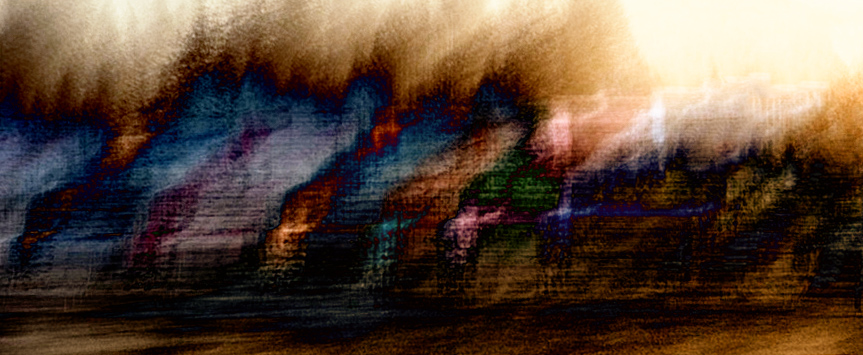
Very cool Helen. I've got to see if that app will work with my old iPhone 5. I like your results. The colors are very saturated in the original, but the motion blur caused them to become more muted and appealing to my eye. The texture that the slow shutter created is also really interesting. The abstract nature of the shot seemed like a lot of fun to play with, so I used Nik Solarization and Bi-Color filters on it. A fun image to experiment with for sure. The possibilities are limitless! Gotta check out that app right now -- thanks for the tip! |
Nov 9th |
 |
| 34 |
Nov 17 |
Comment |
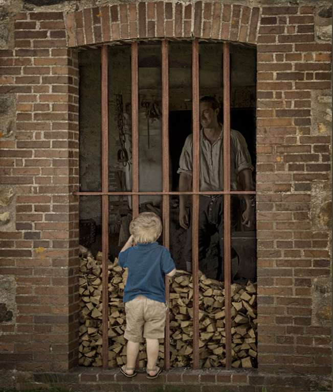
This is great Candy. I like your crop on the brick wall and little boy and you did a great job of placing the man and toning down the lighting so it looks very much like he's really behind the window grate. I really like the sepia tone you gave everything. Georgianne's version is very nice, but I also like the boy's blue shirt to give the composition a unique look. The crooked perspective at the bottom of the window sort of caught my eye, so I corrected it with Lens Correction in PS. While I was there I toned down the brightness of the blue shirt ever so slightly by selecting one of the brown bricks with the Eyedropper tool and then brushing over it at 33% opacity. I like your vignetting and the fact that the stroke is there but not overpowering. Nicely done! |
Nov 9th |
 |
| 34 |
Nov 17 |
Comment |
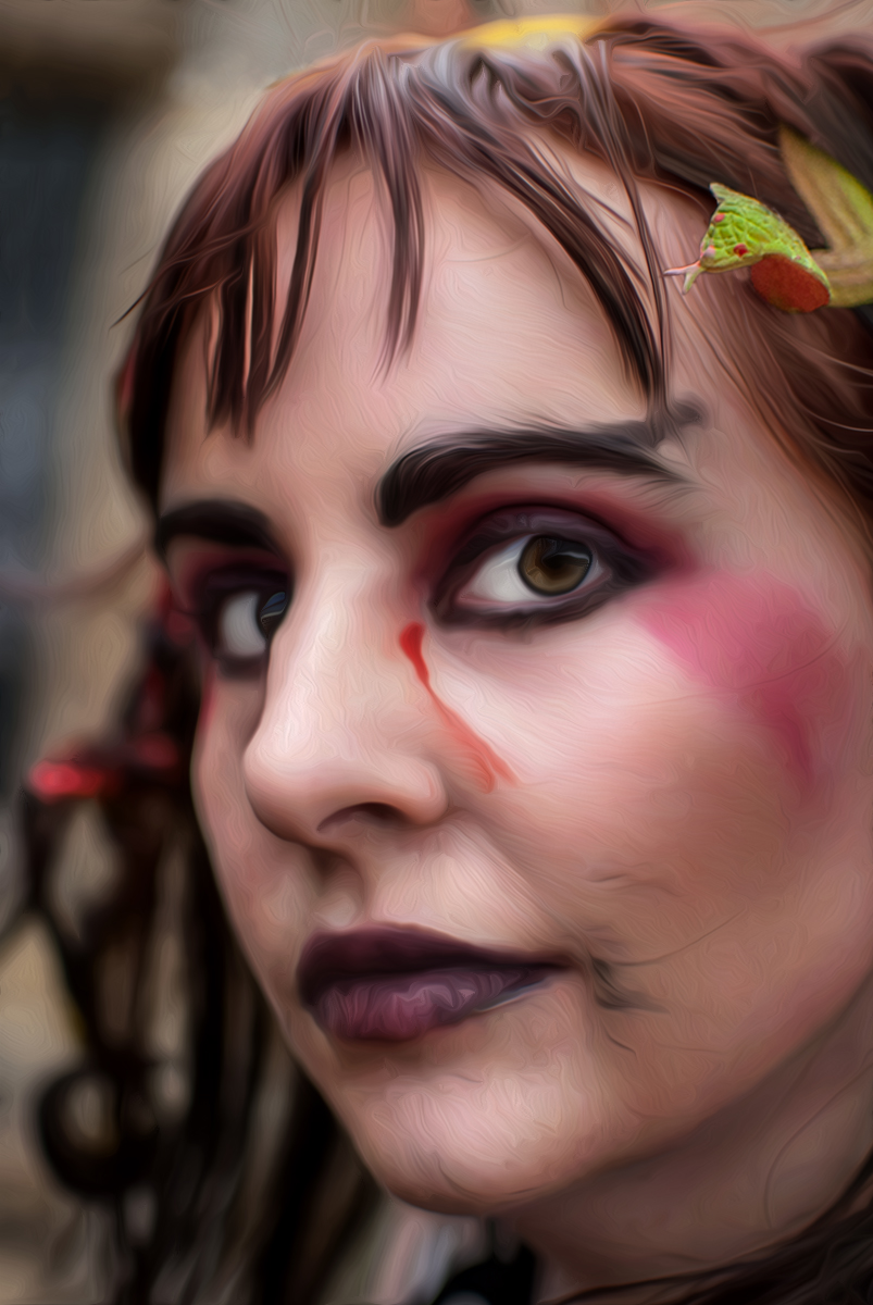
Wow Steve, the difference between the original and #2 is huge. The improvement in her eyes is amazing. You obviously knew just what to do with Portrait Pro. I like what you did with Topaz as well, and the final result is great. The only thing that caught my attention was the fact that the snakes in her hair became unrecognizable with the paint filter. So just for fun -- and to play with a Goth vicariously -- I used Original 2 as a starting point in PS, used the Oil Paint filter to (poorly) approximate your Topaz paint filter, and then applied a mask to reveal the detail of the green snake from the bottom layer. I also copied/pasted and enlarged the snake a bit for a more menacing presence since you titled your piece "Snakebite." The other snake I just cloned out. The woman's expression is more calm than I would expect after just getting snake bit, but I guess since she's a Goth, it's all in a day's work. Lots of fun and well done! |
Nov 9th |
 |
| 34 |
Nov 17 |
Comment |
I can't even imagine how much effort went into photographing the eclipse. Your setup blows my mind. I love your result and the unique spin you put on your image. The stark white circle around the outside seems a tad too strong for me. I think if you used the eye dropper tool in the gray corona area and made the stroke size a bit smaller, it would give the "clock" a border but not overpower the other wonderful elements of the composition. Great work! |
Nov 4th |
| 34 |
Nov 17 |
Comment |
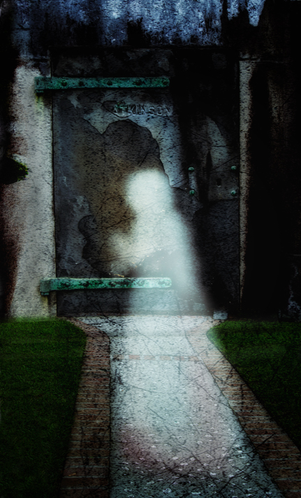
I like it! Your ghost lady is well done. I love the textures in the door and the way you processed that part. It seemed to me the ghost just needed a bit more prominence and the tree textures on the sides sort of distract my eye from the ghost. I tried a version with those cropped out, and a bit of crop on the bottom as well. In Color FX I used Glamor Glow to pump up the impact of the ghost and then burned down the light areas on either side of the door so they didn't compete with her. I agree with you about the lines working well together. The part of the door texture that arches over her head is really cool. Well done! |
Nov 4th |
 |
| 34 |
Nov 17 |
Reply |
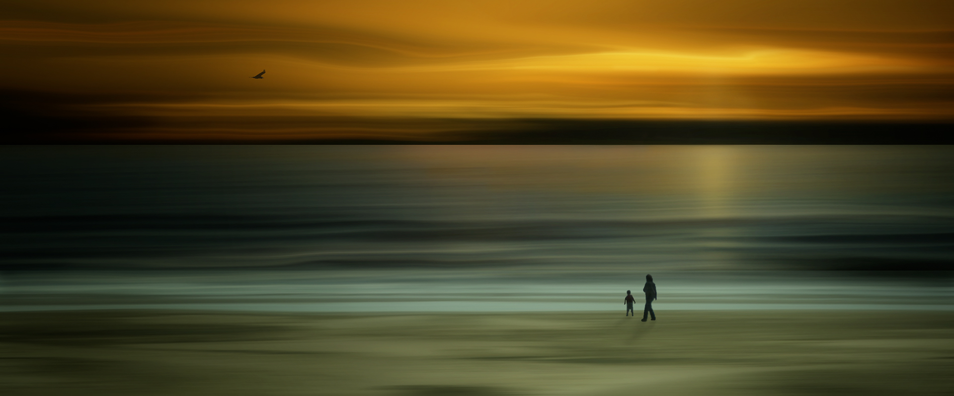
Thanks Georgianne. I entered the image in my club competition today and the judge felt the same way you did about the man, boat, bird and fence. He didn't like that they were in focus and everything else was motion blurred. Last month in competition, a different judge awarded me third place for this sunset beach image where the shore, water, and sky are motion blurred but the woman, little boy, and seagull are in focus. Go figure. |
Nov 4th |
 |
5 comments - 4 replies for Group 34
|
5 comments - 4 replies Total
|


