|
| Group |
Round |
C/R |
Comment |
Date |
Image |
| 34 |
Jun 17 |
Comment |
I wasn't familiar with Klimt, so after googling him and his famous Adele painting, I think your interpretation is really great, Helen. The water ripples look very much like his background, and once you isolated them it's impossible to tell whether they're a photo or a painting. Assuming your aim was to make your final image look like a Klimt painting, it might be interesting to work on your granddaughter's face with the PS Oil Paint filter or some other program that's good at making photos look like paintings and THEN merge it with the ripples. Thank you for the exposure to a very cool artist. Now I'm looking all over for things to photograph that have that "look." Fun! :) |
Jun 24th |
| 34 |
Jun 17 |
Comment |
You accomplished a great final effect, Christine. The color is really nice, the texture is just right. Steve's bringing the eye back is good. I might try a slight vignette just to bring a tad more attention to the bird. I especially like the sprayed brush effect you did behind the bird; it's just the right amount. If you had added more in other areas, it would have been overdone. Nicely conceived! |
Jun 10th |
| 34 |
Jun 17 |
Comment |
I'm so glad I submitted this image to Group 34 before finalizing it for competition. All your suggestions are really helpful. Thanks! |
Jun 10th |
| 34 |
Jun 17 |
Reply |
Good suggestions. Thanks! |
Jun 10th |
| 34 |
Jun 17 |
Comment |
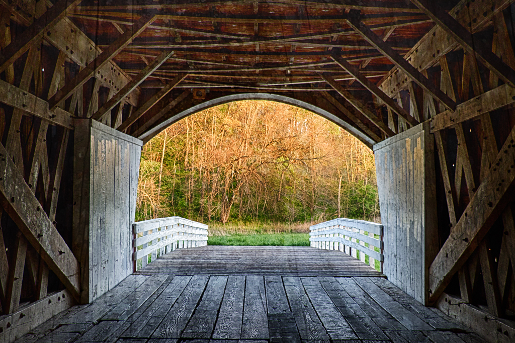
This is a lovely nostalgic image, Georgianne. Your original shot of the bridge is very nice; you kept the detail in the bright foliage outside the bridge and good structure inside the dark bridge. I agree with Steve and Candy about the placement of the bird. To my eye, the fact that your texture photo is a lot lighter on the left side than the right side is causing the final image to be less dramatic than your original bridge shot. I tried rotating your texture 90 degrees, cropping off the bright area, then sizing it to fit the dimensions of the original bridge. I used soft light mode at 79% on the texture layer. Your story of the adventure in capturing this image is charming, and your interpretation of the final is as well. |
Jun 10th |
 |
| 34 |
Jun 17 |
Comment |
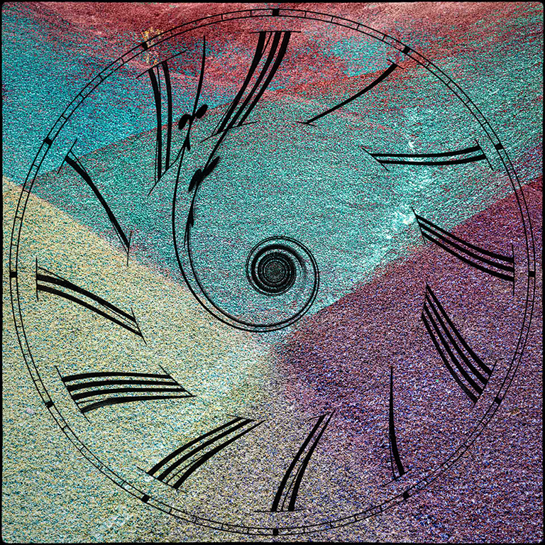
The colors you pulled out of this image are very cool, Phil. I do see Steve's downhill skier too. In the right setting, and maybe printed on metal, I think this could be a nice calm image for a wall. But I also agree that it has a ton of potential as a backdrop. Maybe something like a very simple silhouette of bare aspen trees in front, or a funky swirled clock cutout as I've done here. The sky's the limit really. I definitely like what you've done. |
Jun 9th |
 |
| 34 |
Jun 17 |
Comment |
Wow, what a great job at pulling out the dark details and ratcheting back the bright overpowering color of the scarf. Annie's eyes are so much more expressive now. I like the close crop, and the lighter vignette was a nice idea. I'm curious about what kind of camera you shot it with. She looks like a dog with a lot of personality and that she's convinced she's a human who can sit in that chair whenever she pleases. Nicely done. |
Jun 4th |
| 34 |
Jun 17 |
Comment |
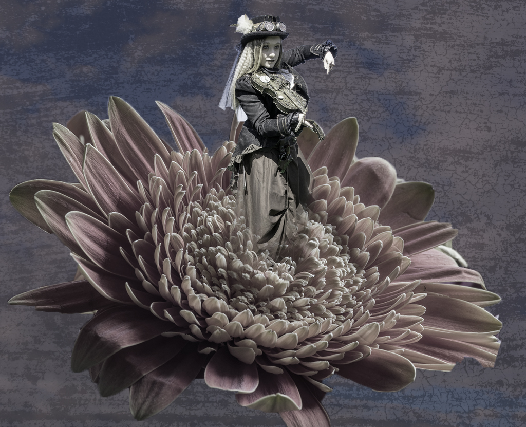
I really like the color toning you've got going here Steve; it complements the Goth theme nicely and it's very unique. You've done a nice job with your two main elements having similar lighting angles. I sort of feel like the flower is overpowering and competing with the fiddler a bit. Maybe if the important and expressive part of her body was above the flower (extending into the plainer sky area), it would give her more strength. I tried a very quick and crude version to show my point, but I didn't even manage to grab all of her fiddle and bow when I selected her. And my colors are way off, but at least it illustrates the point I was trying to make. Your composite combos always intrigue me and this one is really nice. |
Jun 4th |
 |
| 34 |
Jun 17 |
Reply |
Thanks Steve! I realized after I submitted my description that I was wrong when I said I used the liquefy tool on the boat. I just used it on the stem. For shaping the boat I used the warp tool. And even though you've let me off the hook for the different light directions, you're absolutely right. I think I'd better take care of that before entering it in any competitions! |
Jun 2nd |
| 34 |
Jun 17 |
Reply |
As I was composing the image, I had in mind that the birds were either paper or plastic birds that the little girl brought with her in the cage and then in her dream they'd turn into real birds with rainbow colors, but it's a pretty big assumption on my part that the viewer would get that. Maybe I could make the little birds origami birds so that would read better? Thanks for your suggestion! |
Jun 2nd |
7 comments - 3 replies for Group 34
|
7 comments - 3 replies Total
|


