|
| Group |
Round |
C/R |
Comment |
Date |
Image |
| 34 |
Feb 17 |
Reply |
Hi Helen. The oil paint filter was used only for the texture it gave the image (original 2). Then when I hand painted, I used the Color blend mode so the texture remained visible as I brushed on the colors. |
Feb 27th |
| 34 |
Feb 17 |
Comment |
I very much like what you've done here Helen. Nicely conceived and executed. I'm not seeing the bottom of the god still showing that you're talking about, so it looks good to me. I like the way you faded him out toward the grass -- it makes it look like he's emerging from the water. Really interesting image! |
Feb 18th |
| 34 |
Feb 17 |
Comment |
I agree with all of the previous comments. The scratched bronze texture contributes nicely to the image. I also like Phil's black and white treatment and closer crop. Since you titled it Scratched Bronze, I think the monochrome color you chose works. Nicely done! |
Feb 18th |
| 34 |
Feb 17 |
Comment |
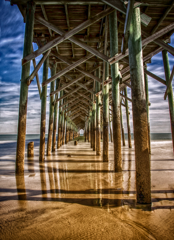
Very nice subject, Georgianne. I like your altered version, but the original is really nice too. I love the texture in the sand in the original and the color variation between the blue/green at the top and the brown at the bottom is very appealing to me. So I tried a version in Nik HDR, then to On1 for Dynamic Contrast, and finally Nik ColorEfx BiColor filter to ramp up the color contrast between the sky/pier and the sand. Yours is more altered and creative though, so well done! |
Feb 16th |
 |
| 34 |
Feb 17 |
Reply |
Great Steve, thanks for the info on the magazine and brushes. I'll check them out. You are indeed The Goth Man! And it's obvious you enjoy playing with effects. This composite is lots of fun and other-worldly. I can see why it's done well in exhibitions. Kudos! |
Feb 12th |
| 34 |
Feb 17 |
Comment |
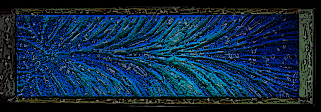
Nicely seen, Phil. I'm always impressed by the way you see potential for a great image in the everyday things you come across. The detail you pulled out of the original is impressive. I like the panorama version, but I agree with Steve that I couldn't really see the black hole version because it's so tiny.
I experimented to see if I could add a bit more depth. I first used the PS Bas Relief filter (normal blend mode) and then a combo of the Plastic Wrap and Poster Edges filters with a Darken blend mode. |
Feb 11th |
 |
| 34 |
Feb 17 |
Comment |
Fantastic editing, Candy! Everything you did strengthened the image by leaps and bounds. Because the background was so busy, I think I would have been tempted to eliminate most of it, but your decision to keep the fences and cowboys in the background was spot-on; those details beautifully recede but still add to the overall scene. I've never used "transform scale," so I really need to check that out. Super image! |
Feb 11th |
| 34 |
Feb 17 |
Comment |
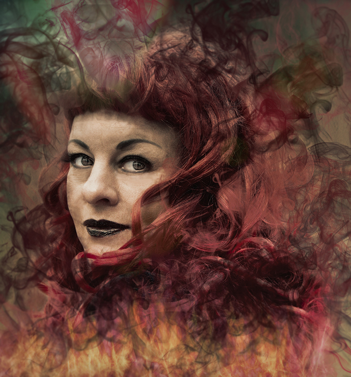
This is a cool image Steve. I'm intrigued by the smoke brushes. Are they downloaded brushes? If so, can you direct me to the website? I'm always so leery of downloading add-ons without knowing whether the sites are reputable. I really like the effect you've gotten here with the smoke. I actually prefer Original 2 because the smoke is more prevalent and I feel like the lighter border in your final distracts a tad from her face. Also, there seems to be some sort of artifact on her forehead that my eye keeps going to.
Usually I'm in favor of keeping a person's facial features intact because they give the image character, but for some reason I wanted to try taking a few years off of Joan to see what that did to the image. I didn't spend much time on her facelift though, so don't inspect too closely! |
Feb 11th |
 |
6 comments - 2 replies for Group 34
|
6 comments - 2 replies Total
|