|
| Group |
Round |
C/R |
Comment |
Date |
Image |
| 21 |
Jan 17 |
Reply |
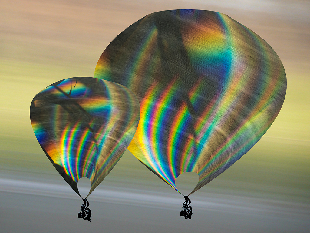
A lot of people want a framing line around the image, but I think that interferes with the infinity of outer space idea; outer space has no edges, no? |
Jan 28th |
| 21 |
Jan 17 |
Comment |
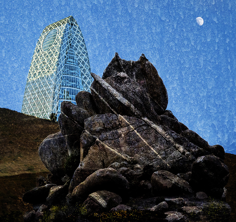
The building is really interesting and sort of otherworldly. If you selected just it and then played with the surrounding area, it could become an interesting composition, but you'd have to use layers and masks. The use of the filters alone on the building and sky doesn't do anything for me. |
Jan 28th |
| 21 |
Jan 17 |
Comment |
Creative seeing alright! The head is placed in the mural so that round shape looks like a space helmet and the uniform the man wears strengthens that possibility. If you wanted to, you could strengthen that concept by creative manipulation and editing. |
Jan 28th |
| 21 |
Jan 17 |
Comment |
I very much like the overall effect: the softness, the absence of texture, the color, the rondo shape. Everything contributes to the impression of another time, in the past. If it were my image I would change 2 things: 1)remove all traces of the original image in the outer light band; 2)make the outer square more visible everywhere, not just the UL corner, but not too much, just as suggestion of its presence. Fine job. |
Jan 15th |
| 21 |
Jan 17 |
Comment |
Barrie, for me the outlining of the different tonal areas in a map-like effect does little for the image besides flattening it. This one filter alone just doesn't do it, and I can't think of anything to recommend. Unless I'm doing a pure abstract, I usually start with an idea of what I am trying for before I select the starting image. So, why this picture of the Grand Canyon? |
Jan 13th |
| 21 |
Jan 17 |
Comment |
I like this abstraction, Joan. I like the proportions of the green and orange-yellow areas and the slight, graphic emphasis on borders. |
Jan 13th |
5 comments - 1 reply for Group 21
|
5 comments - 1 reply Total
|
