|
| Group |
Round |
C/R |
Comment |
Date |
Image |
| 43 |
Feb 24 |
Reply |
Interesting idea. |
Feb 27th |
| 43 |
Feb 24 |
Reply |
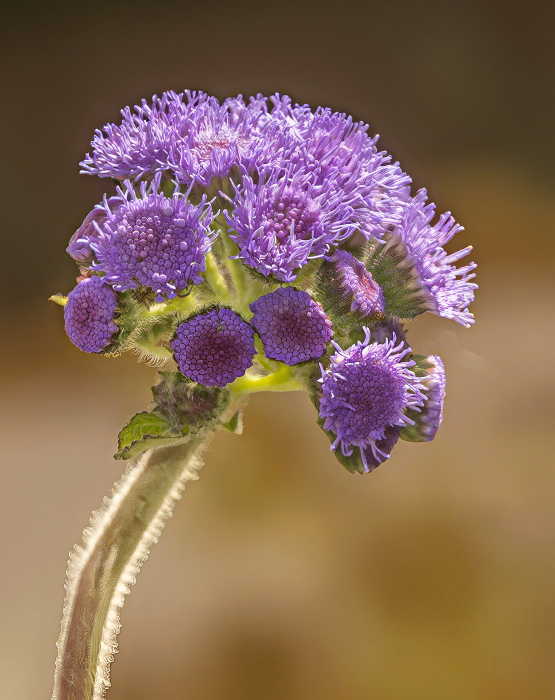
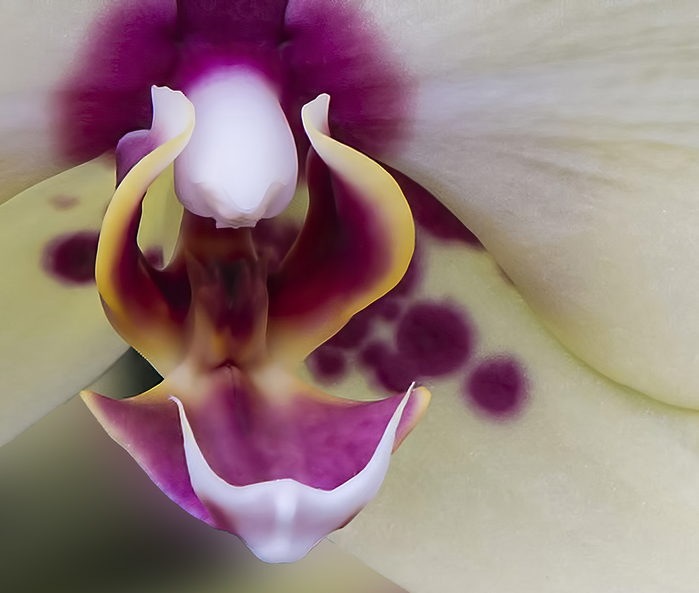
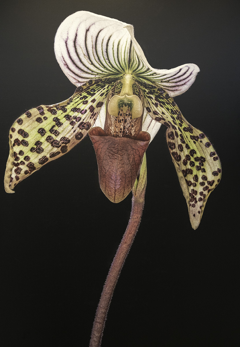
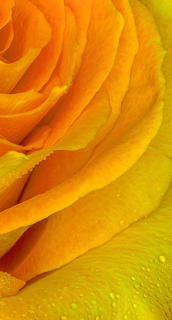
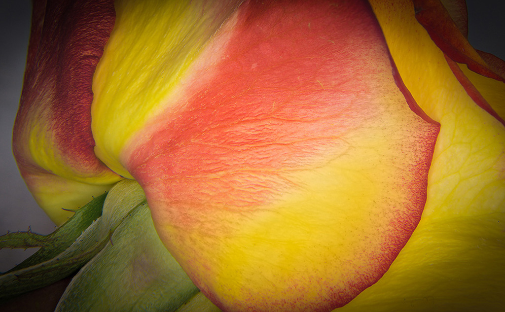
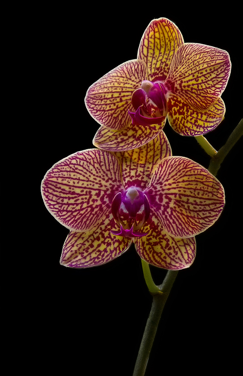
Mark, painted may be nice. I thought this was a macro of the inside center of an Ochid. I have done macro close up and in the past with a rail and focus stacking. Also, if I want the whole section in focus, I usually do focus stacking. I used to use Helicon focus but my newest camera does it in camera. I did not think this whole flower was as nice as the crop. I thought it looks smooth nd dreamy |
Feb 25th |
| 43 |
Feb 24 |
Comment |
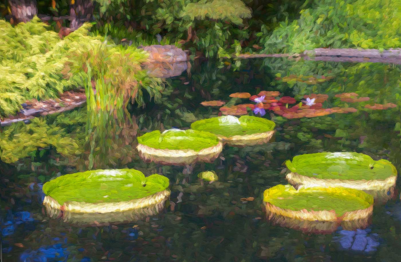
Very lush. Bunny took the words out of my mouth. I want to bathe in the bountiful splendor. Bruces suggestion sounds interesting also. |
Feb 17th |
| 43 |
Feb 24 |
Comment |
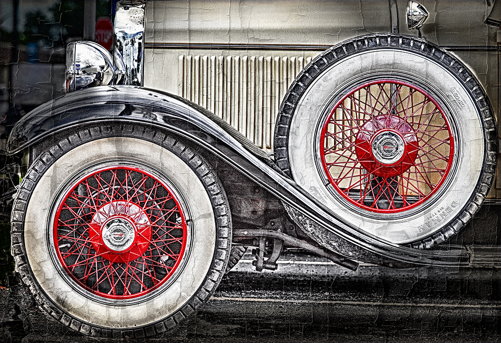
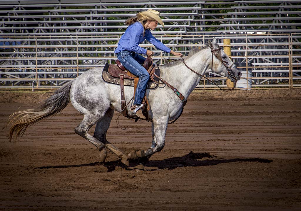
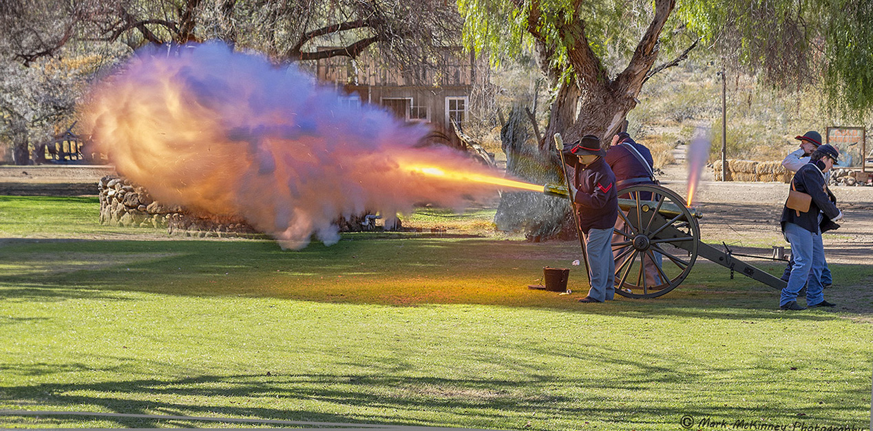
A great shot. Fire from front and fuse area. Hand over ears. The different directions they are all facing. The house almost looks like it is from the period. I do agree with Bruce about room in front of the blast. Also I straightened the image using the house lines as reference. Slight crop an cleaned a couple of branches-A few suggested touches for a great shot. |
Feb 17th |
 |
| 43 |
Feb 24 |
Comment |
Interesting tones and textures and knife action. I did not recognize that it was meat at first. I thought sharpening the fibers in the meat make it better to tell. I was wondering at first if this may look better in color, but brisket is always well done, so black and white does not detract from a bright pink or red center. I too am hunry for southern BBQ brisket. |
Feb 17th |
 |
| 43 |
Feb 24 |
Reply |
Thanks Bruce for your input. |
Feb 17th |
| 43 |
Feb 24 |
Comment |
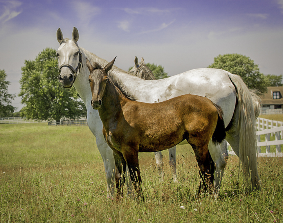
I love the image. Just wondering if anyone would know if fill flash, reflectors and or neutral density filters would work to eliminate bright spots and shadows. I always have problems with outdoor lights without shade and do not want to carry around an entire studio. |
Feb 17th |
| 43 |
Feb 24 |
Comment |
I think I erased both of my replies and yours to me somehow. |
Feb 17th |
| 43 |
Feb 24 |
Reply |
47 Reply
Harley Rubens Harley RubensLove the vintage look. Great effect with the wind hitting the dress. Only thing Bruce is when I checked 1940s images like this they do not have shadows or very bright spots. They do not look as real. I tried to even out the areas. She had some light streaks on her arm so I tried to even them out a bit. I made a slight crop and flipped it. I do not know if others would think it is an improvement. I love the original. You mentioned the thought that it needed something so I took a stab. Did they use a fan to create the wind effect. Fun photo. Posted: 02/17/2024 11:21:28 Reply Edit |
Feb 17th |
| 43 |
Feb 24 |
Comment |
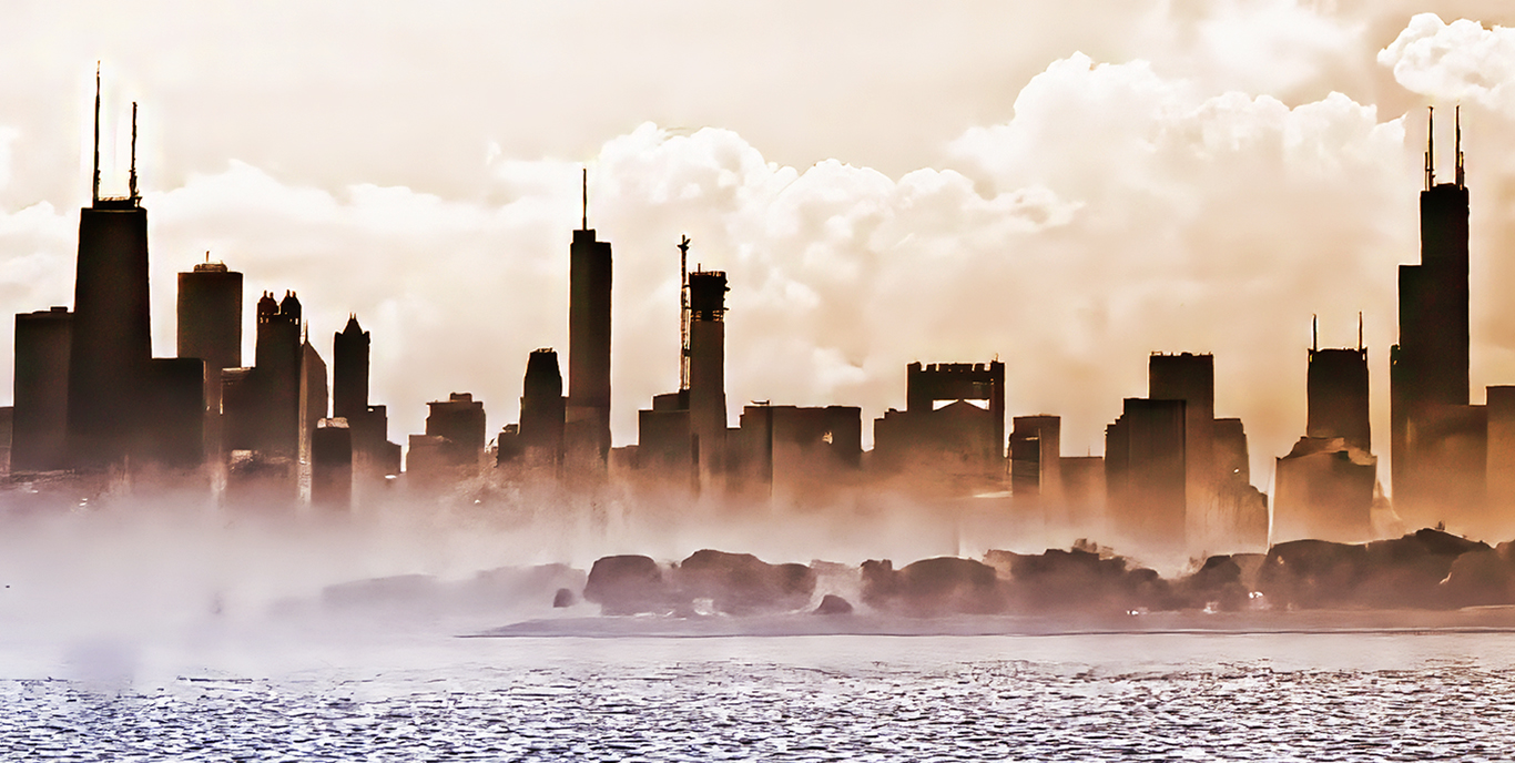
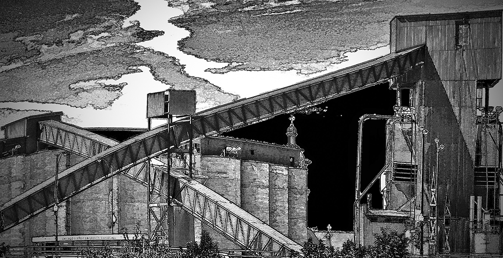
Very interesting photo. The line and ink filter seems to have given more definition to the architecture. The original was very cluttered and haphazard looking. Nice crop with lots of geometric shapes, colors and contrasting architectural styles. You have made Reykjavik look very inviting. I do like what you have done. |
Feb 17th |
6 comments - 4 replies for Group 43
|
6 comments - 4 replies Total
|