|
| Group |
Round |
C/R |
Comment |
Date |
Image |
| 43 |
Jul 22 |
Reply |
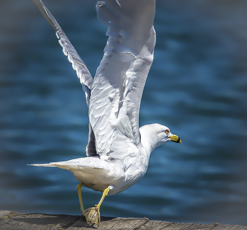
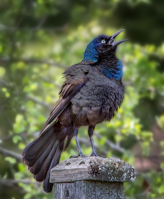
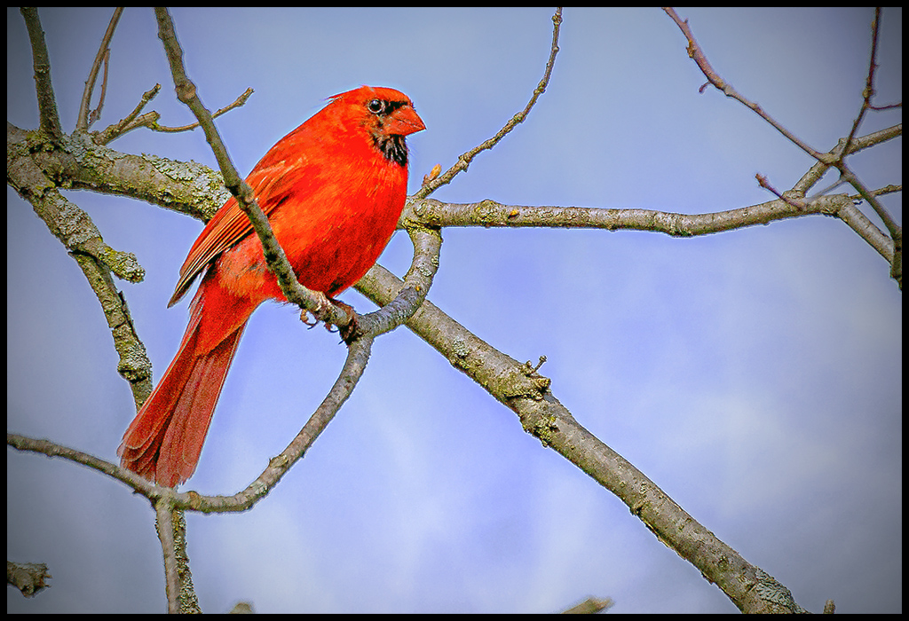
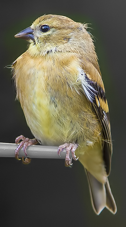
I meant Right eye sharper than left. |
Jul 18th |
| 43 |
Jul 22 |
Reply |
I could go back, but if I recall, the blur, especially on the tail, was due to movement. Look at the original and wonder if you agree. Thanks for the input Bruce. |
Jul 18th |
| 43 |
Jul 22 |
Reply |
I have the raw file. The shirt looks like solid white on my screen. How do they keep their hats on ? A mystery to me. |
Jul 18th |
| 43 |
Jul 22 |
Reply |
On knowing you want the shadows, I took another look. The Shadow with its background shapes and curves does give it another dimension. Too myopic on my first view. |
Jul 13th |
| 43 |
Jul 22 |
Reply |
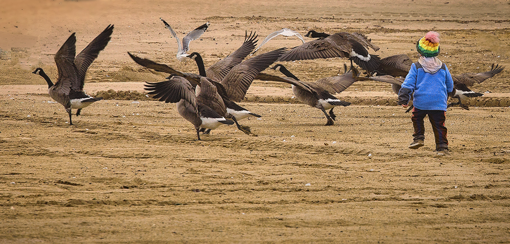
Thank you Lane but why more room on the right ? It is a Stop motion image . |
Jul 13th |
| 43 |
Jul 22 |
Reply |
Thank you Mark. I played and maybe should try again with the saturation. |
Jul 13th |
| 43 |
Jul 22 |
Comment |
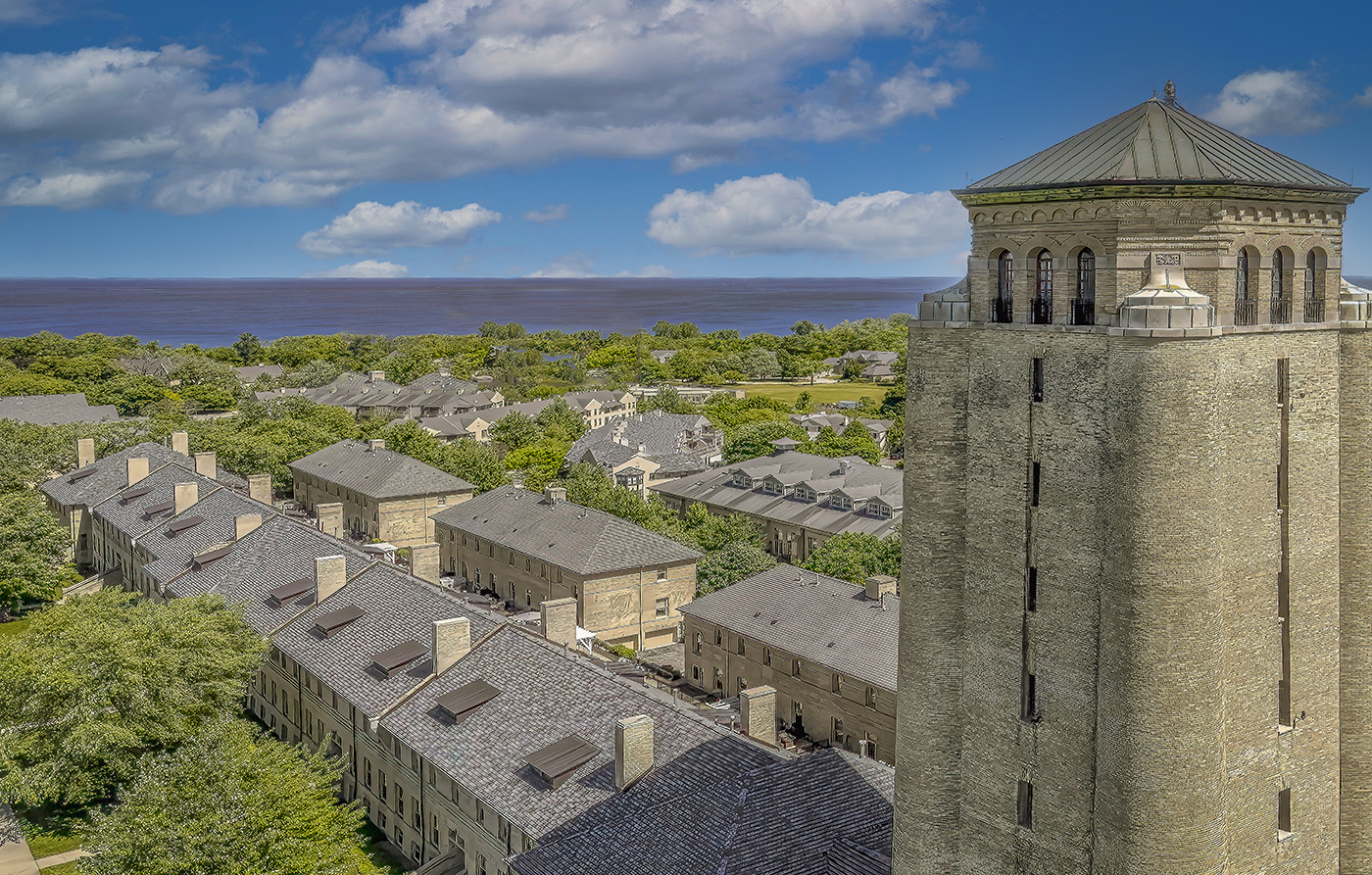
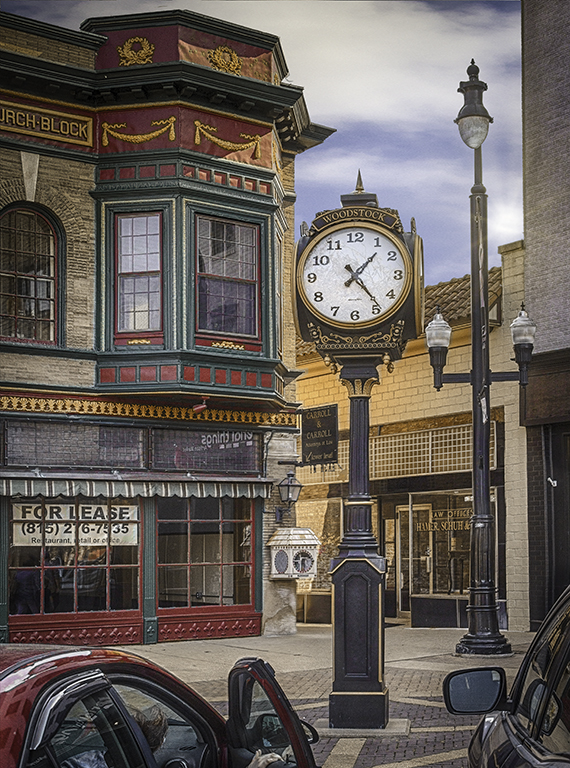
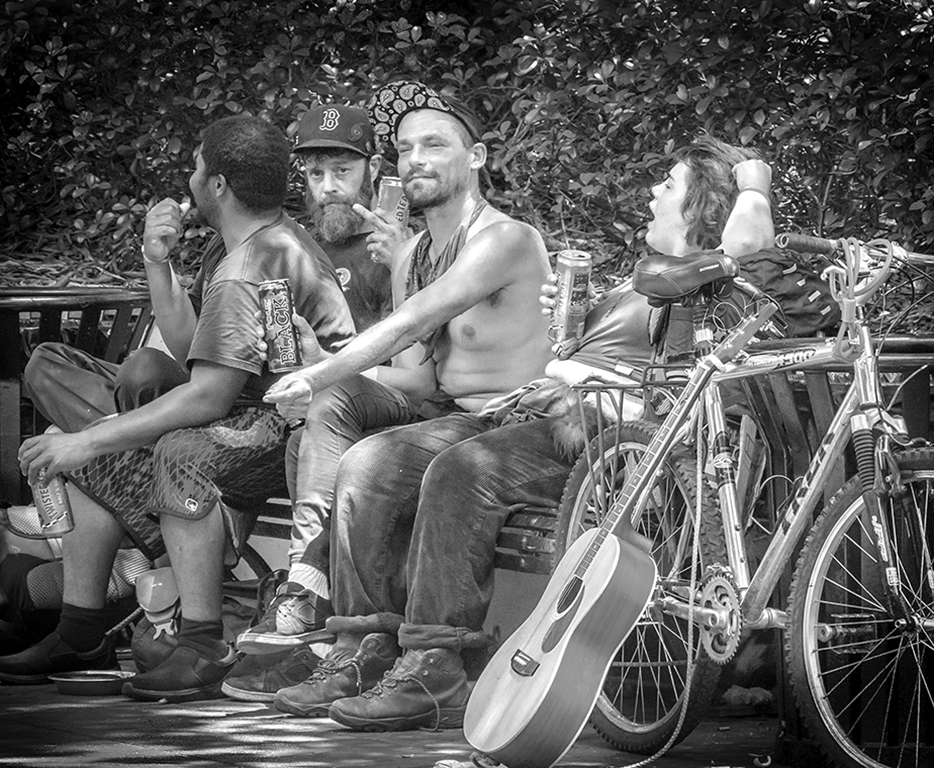
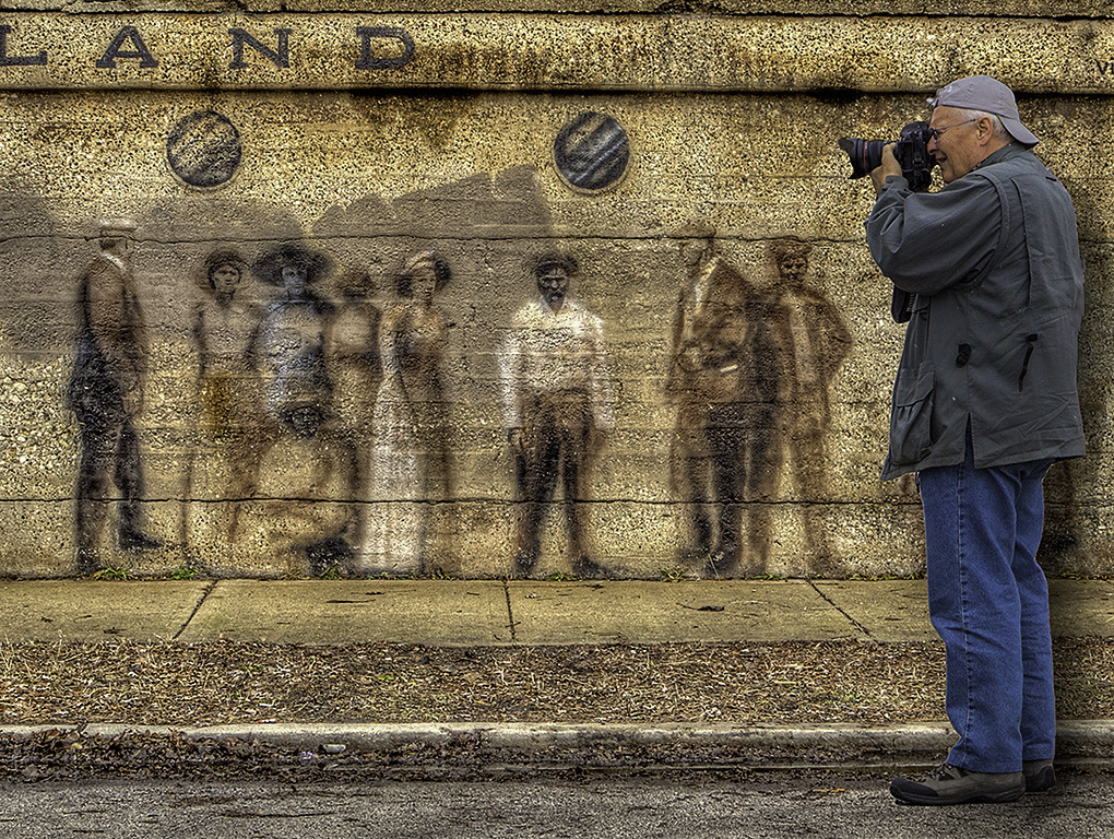
Congratulations, by the way. I like this ageless photo a lot. It is wonderful in Black an White. I like the tones and textures in the bricks and the more subtle tonal differences within the advertisement. Bruce makes a point about the town but my first thought before seeing his remarks, was to wonder what this town is like around the corner and to suggest to my kids and grandkids in North Carolina, go and see the town. I like the interest it stimulates. The only thing I wrestle with is the one stoplight which is cut off. I wonder if the stoplights add to the photo. My eyes bounce from the bush to the sign and the resonance draws me in. I like it there. Since this is on a converted camera, I suppose it is infrared. Which I think was a good idea. |
Jul 11th |
| 43 |
Jul 22 |
Comment |
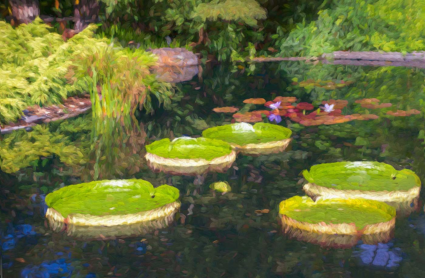
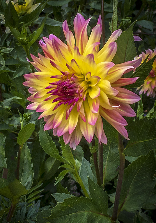
Very nice colored landscape. Lots of shapes and colors. It is a nice odd number of pots and boxes. It would be different with less objects, not sure if it would be "better". The one distracting part for me are the shadows, which I think clutter the image. Perhaps a background flash or light could eradicate them. Well thought out image Mark. |
Jul 11th |
| 43 |
Jul 22 |
Comment |
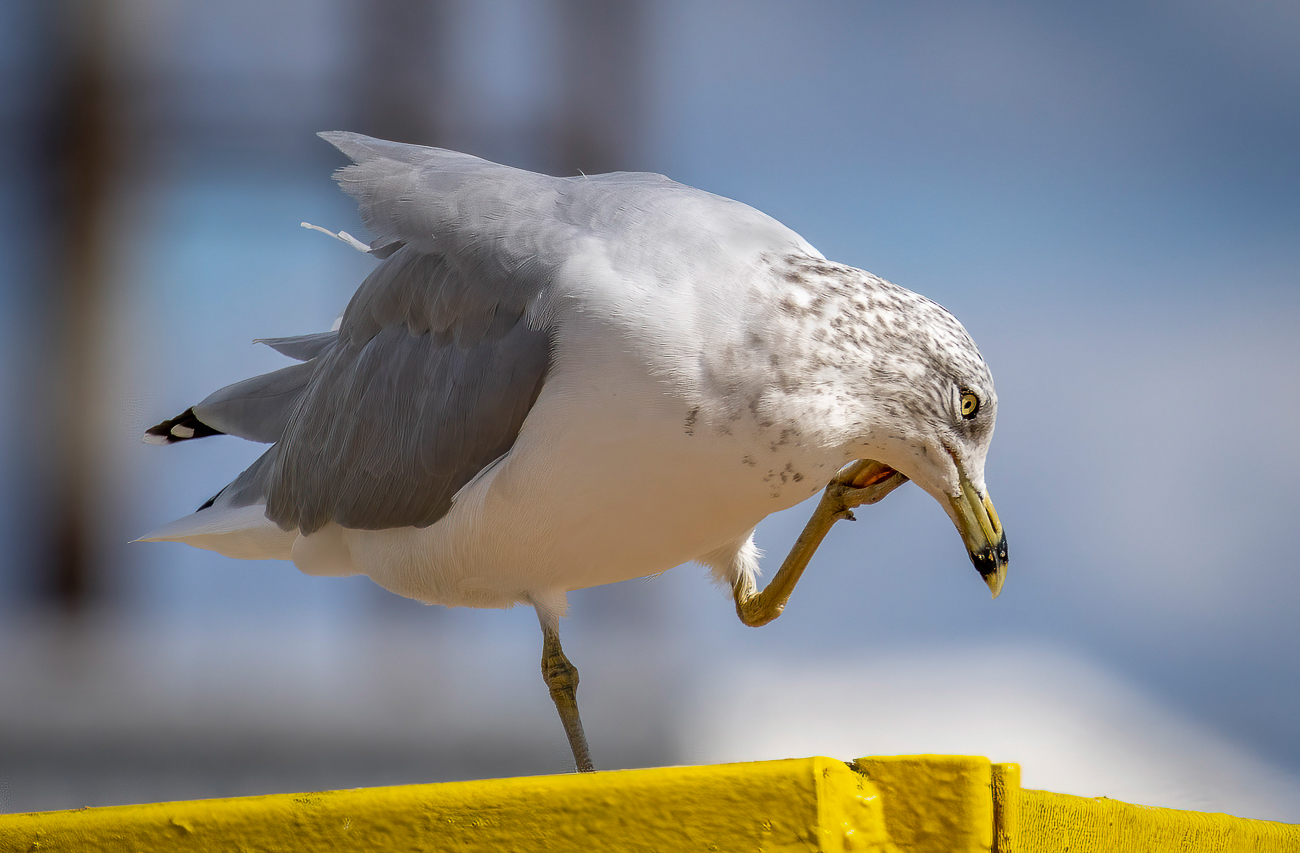
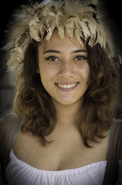
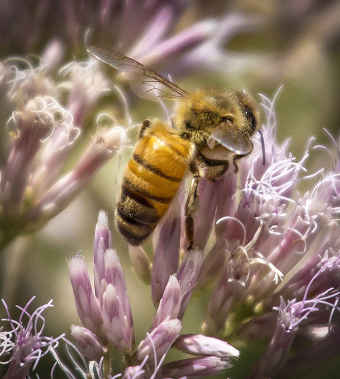
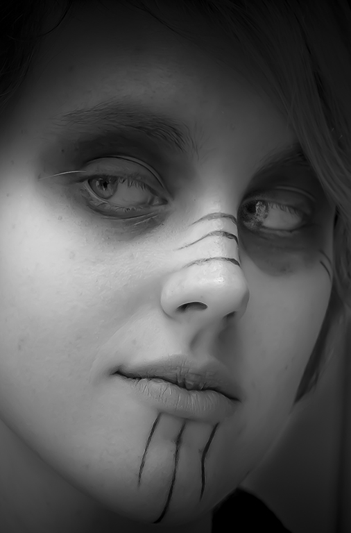
I love the original portrait Bruce. I like the framing, and lighting, It is so sharp and expressive that I showed this to a sensitive woman and she was taken about how adorable he is. I like the tree in the background which adds to the feeling of X-Mas. I would not change a thing, and what a great X-Mas card. I suppose Mark's comment about the eye may do something, but am afraid I am not sure I understand the suggestion. The right eye looks sharpened more than the right. Not sure if that would make any difference. It was a stretch for me to notice it. The flash or light reflection in the eyes may be editable. |
Jul 11th |
| 43 |
Jul 22 |
Comment |
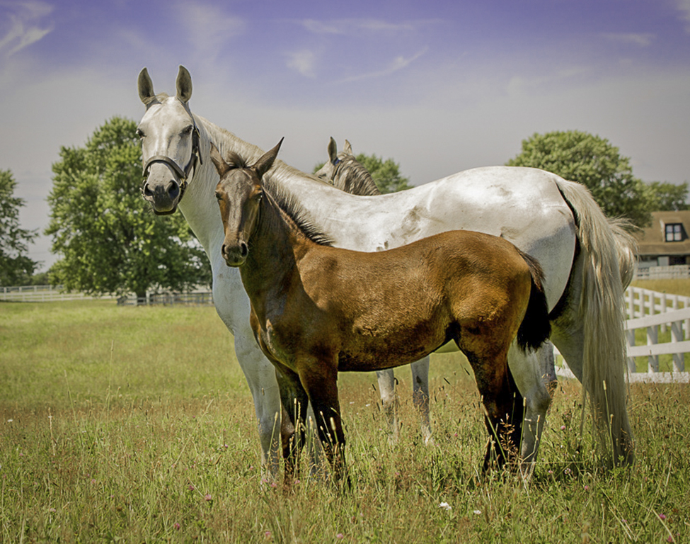
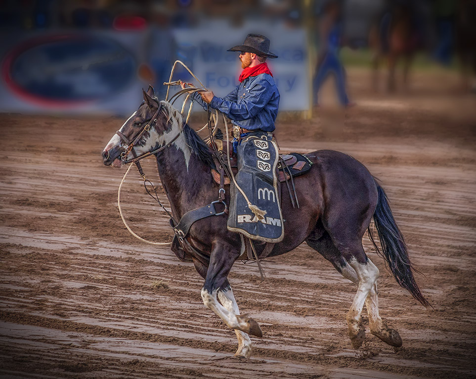
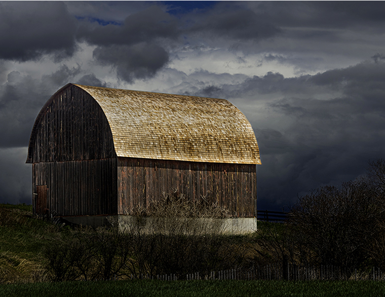
What can I say. Great shot, not one I associate with Yellowstone. You have a good eye for images. Bruce's point is well taken but looks excellent now. There are many other interesting ways it could be cropped. One I tried is interesting to me because the fence acts like a stair case to the barn. Many ways. Awesome mood of the light. It adds a lot of depth and wonderful tones to the shot. |
Jul 11th |
 |
| 43 |
Jul 22 |
Comment |
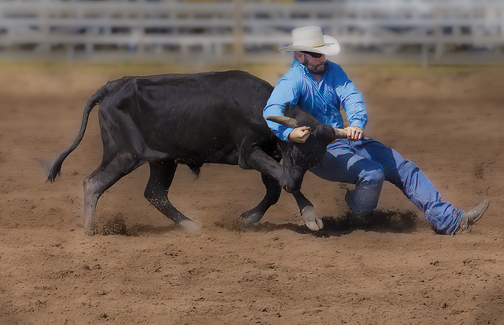
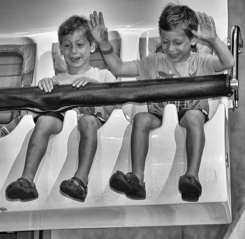
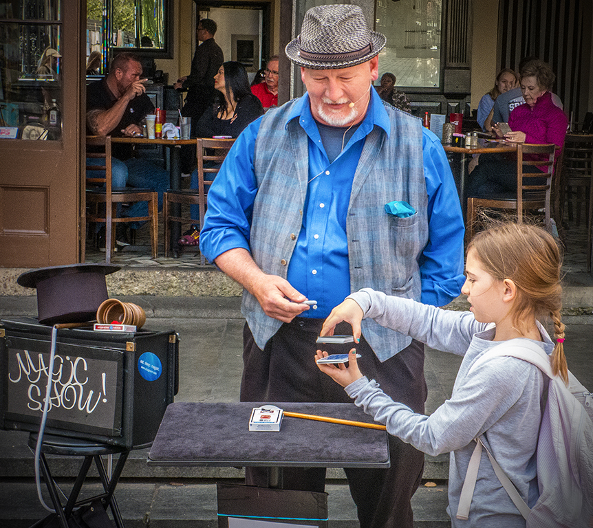
Fun exercise and photo. Excellent Composition. I know the man in the image looks real and is framed well, but still leave a question, if I did not know, whether he and the books were painted in. Looks like it could be a poster for the store. I like it. I bet the owner would also. |
Jul 11th |
5 comments - 6 replies for Group 43
|
5 comments - 6 replies Total
|