|
| Group |
Round |
C/R |
Comment |
Date |
Image |
| 35 |
Aug 18 |
Comment |
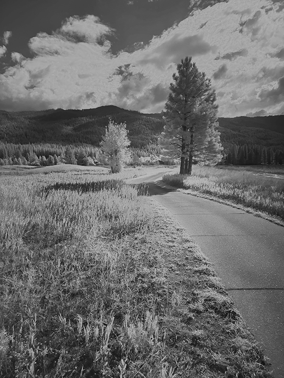
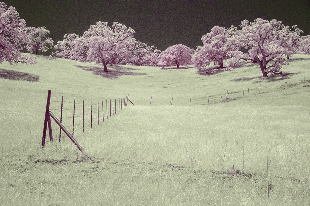
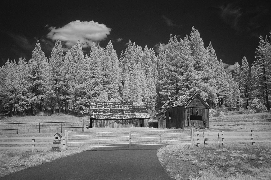
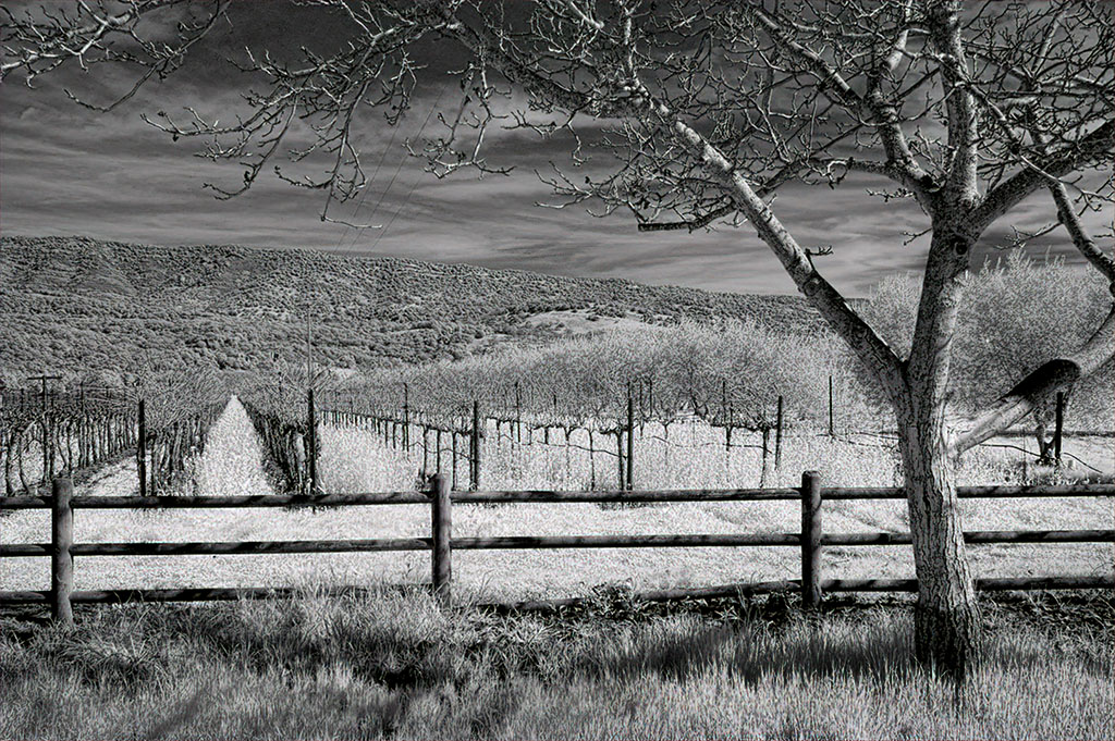
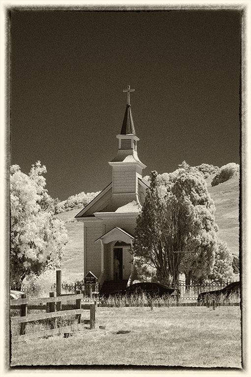
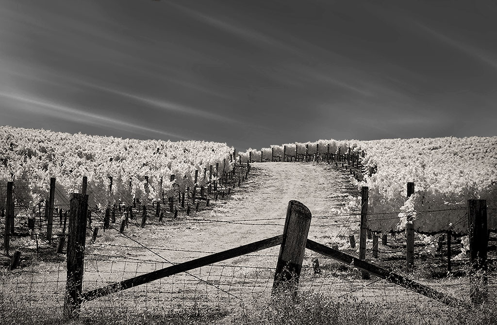
What is interesting is that all the lines direct the eye to that framed object at the end of the path. Even the trees, as their tops slant toward that object! For me, the straight on composition works well as it reveals what is at the end of the path (even though the object is too small to recognize). Infrared color can be bazaar to folks who don't know about it so the subtle use of it is probably a better approach. |
Aug 11th |
| 35 |
Aug 18 |
Comment |
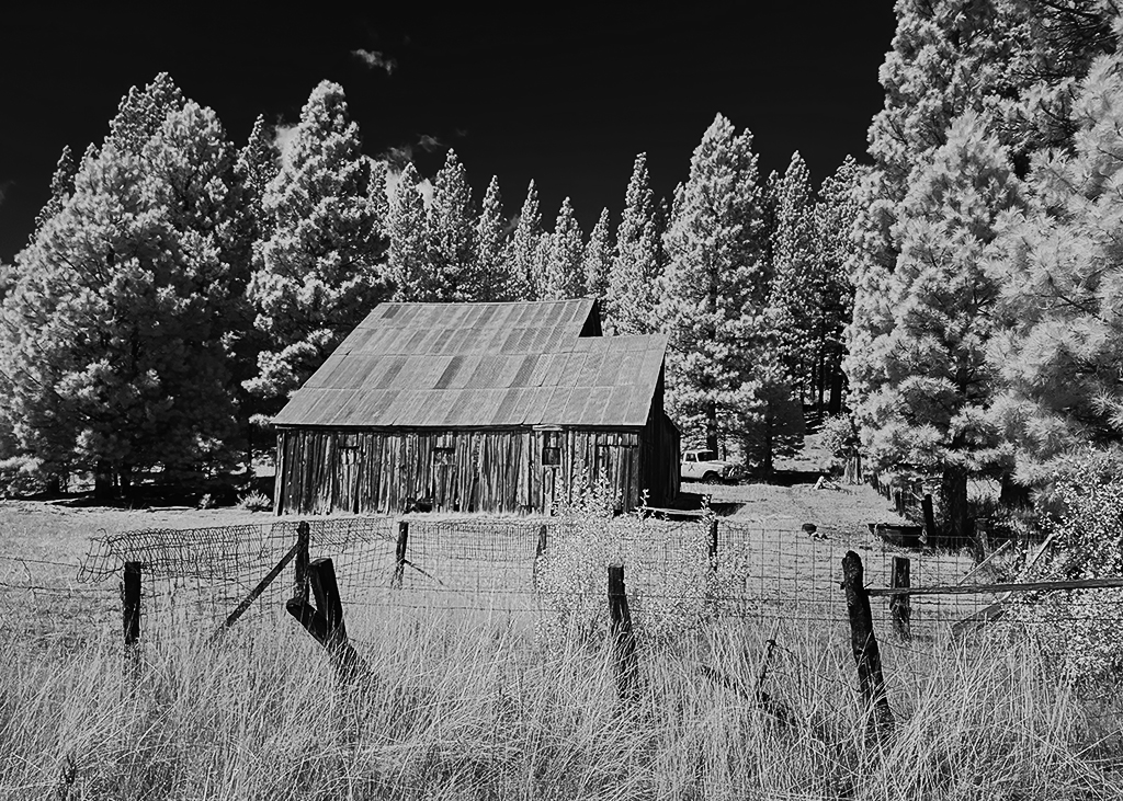
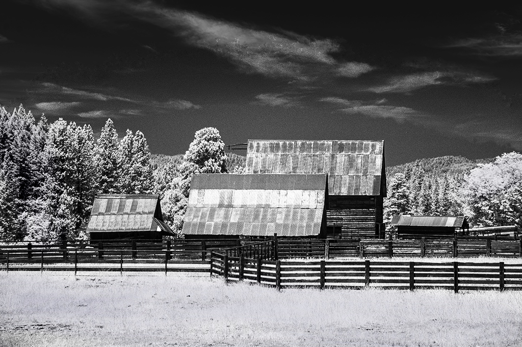
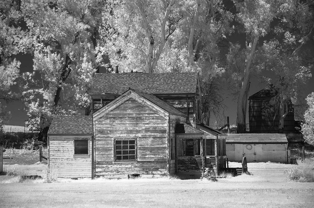
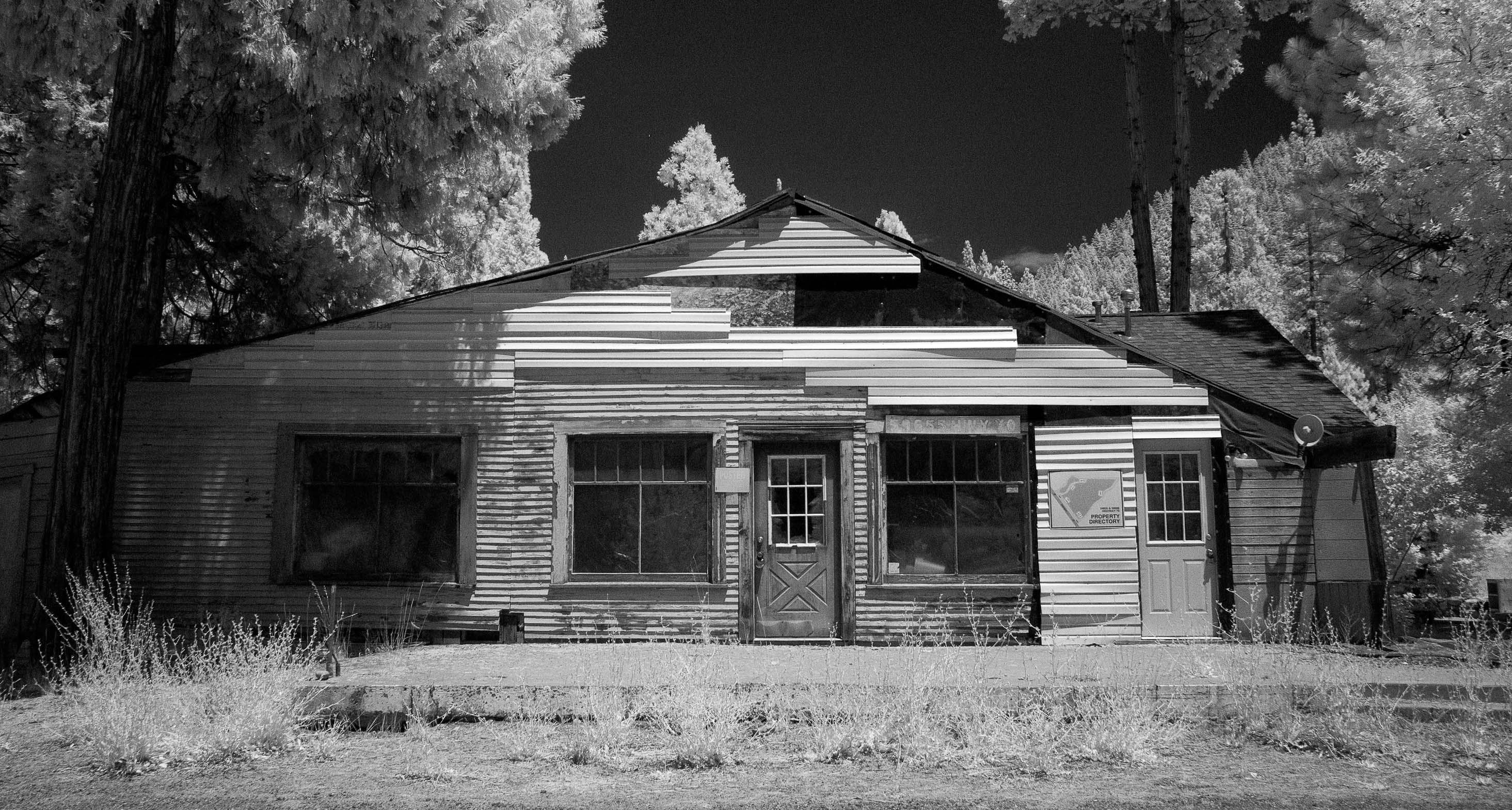
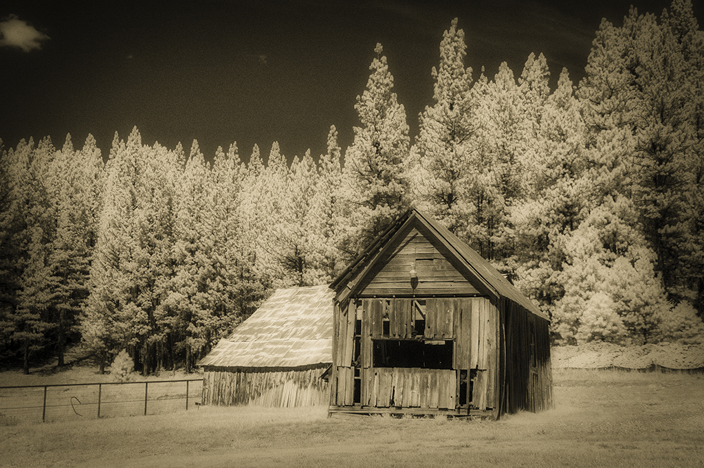
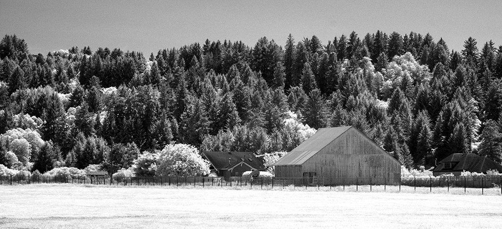
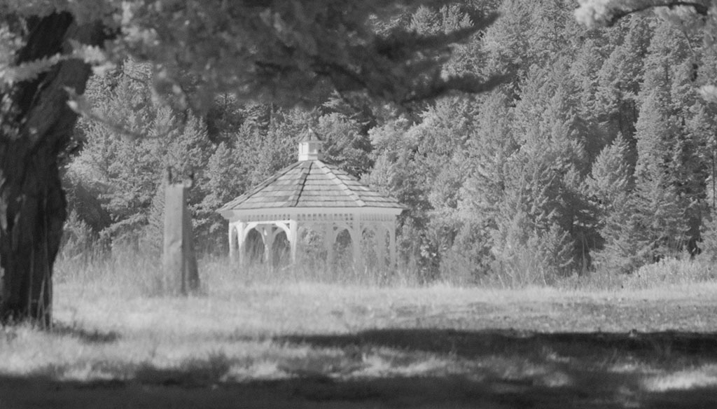
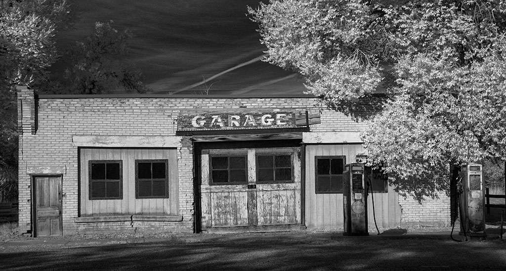
To be blunt, this is a great image! I like it as the stone building in the midst of a forest of white trees is like a mystical setting and using Topaz Impression makes it even more so. In this instance the bright white foliage is a wonderful compliment to the "heavy" dark building. All the steps you did in the conversion resulted in a fine, memorable picture. |
Aug 11th |
| 35 |
Aug 18 |
Comment |
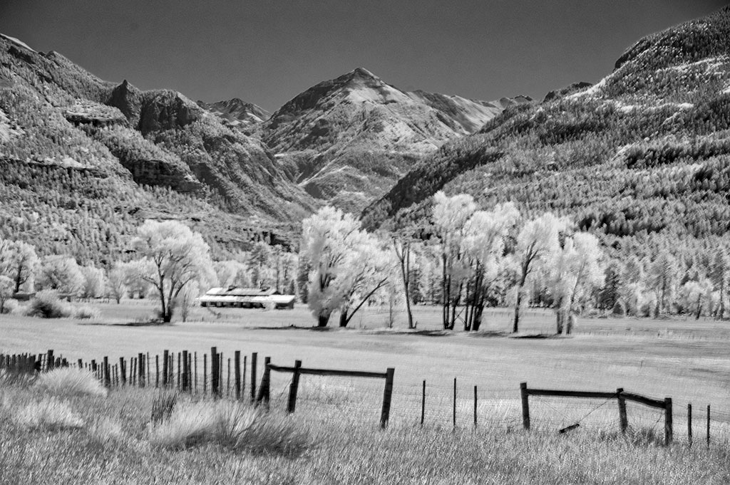
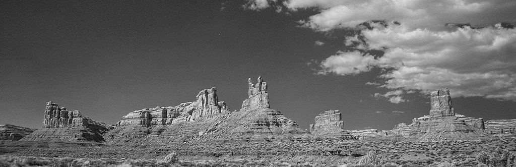
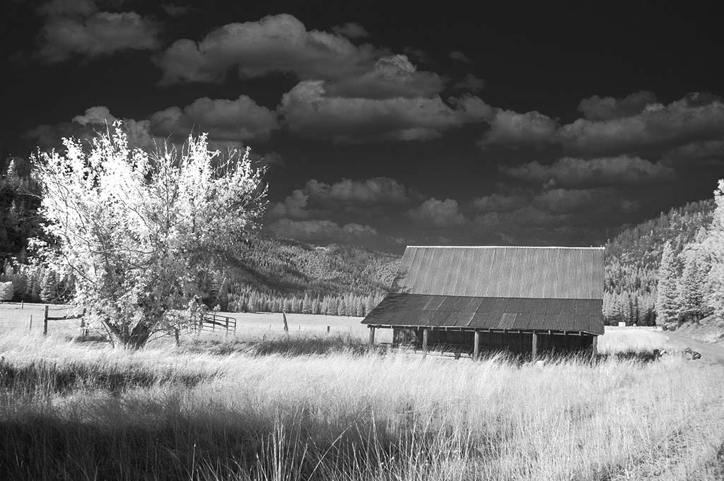
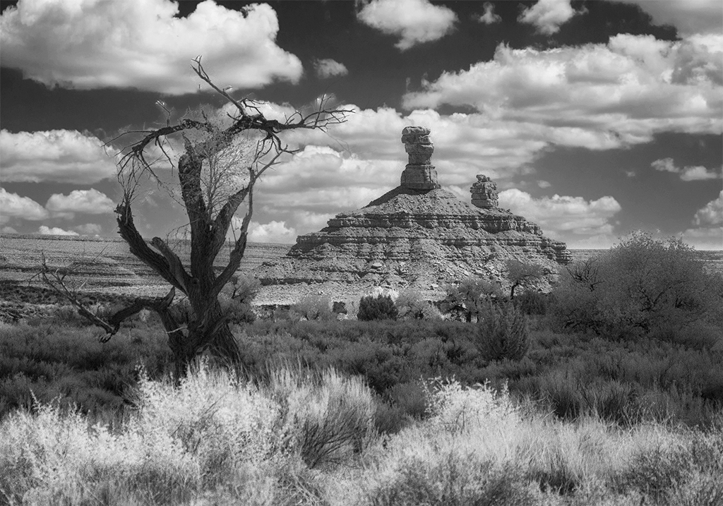
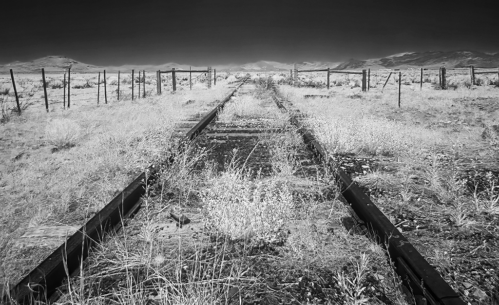
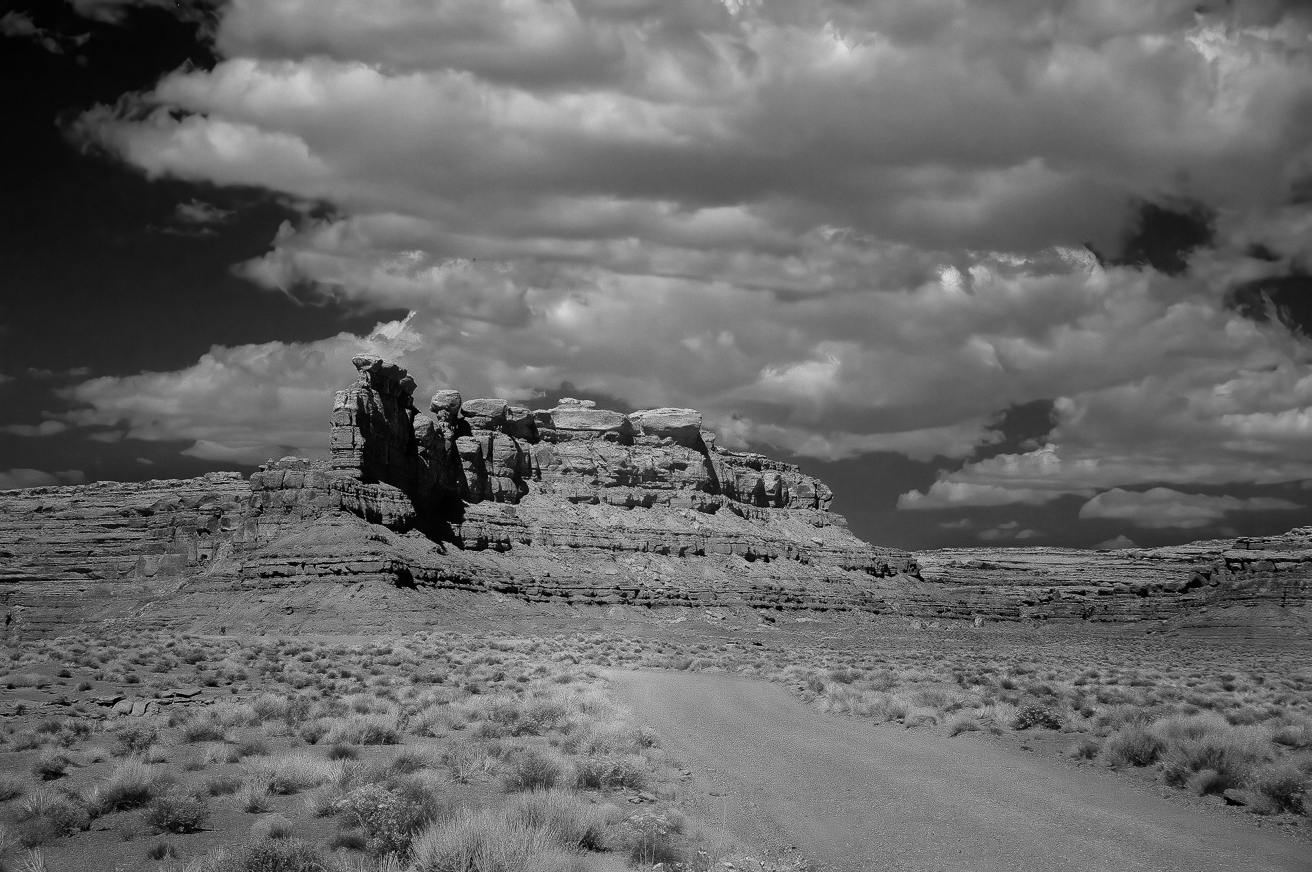
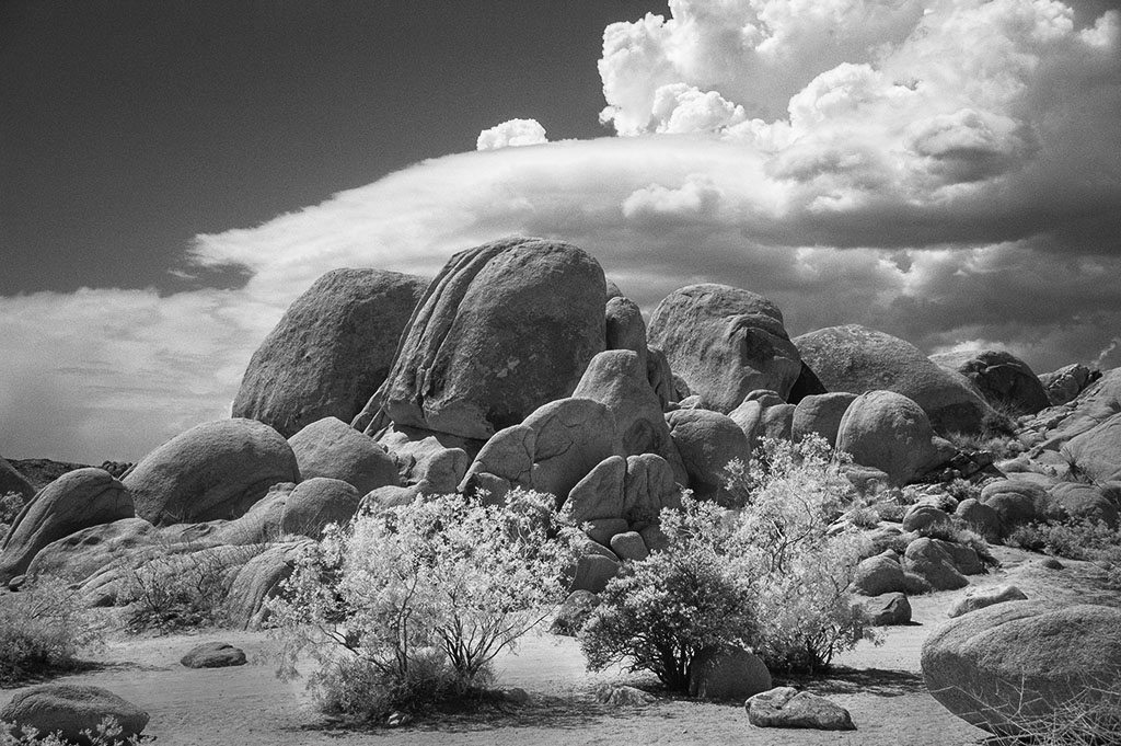
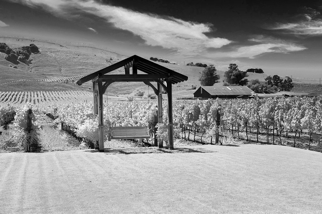
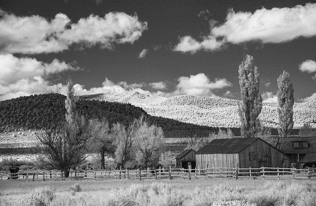
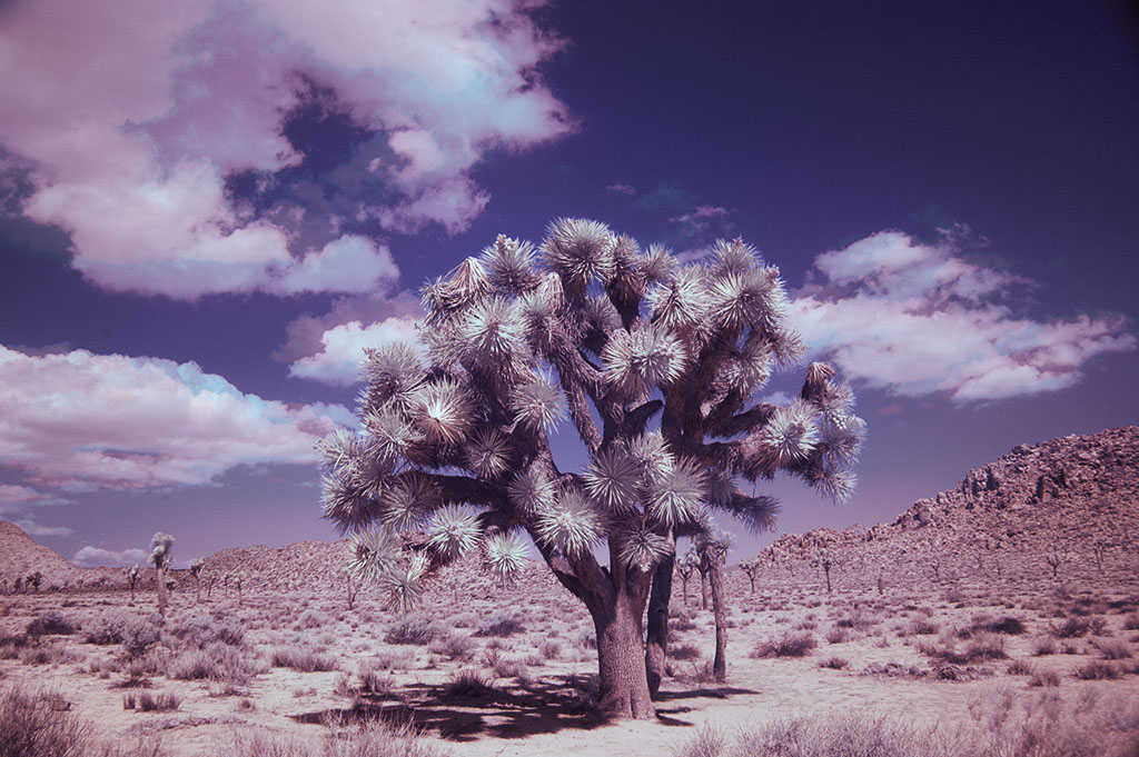
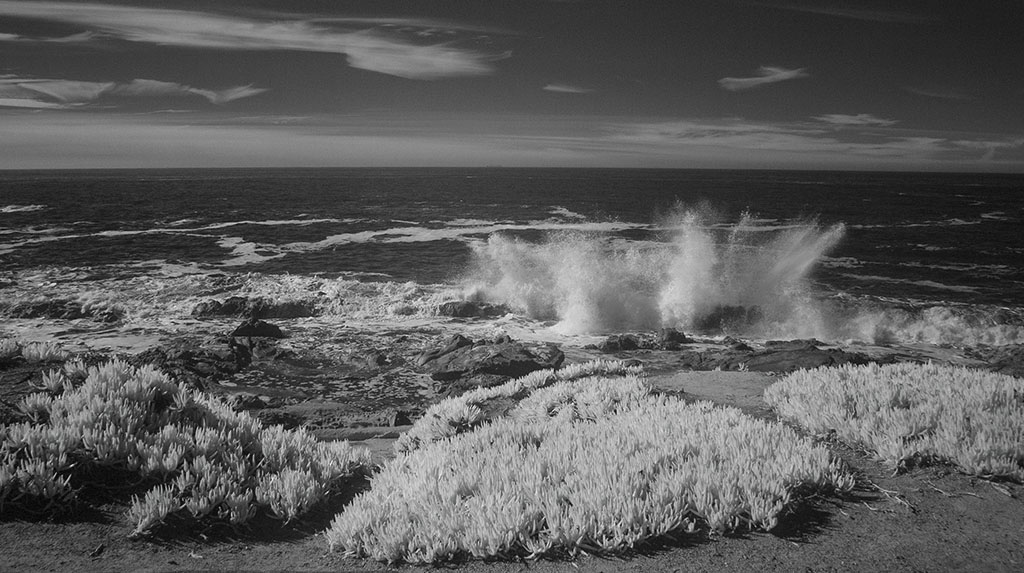
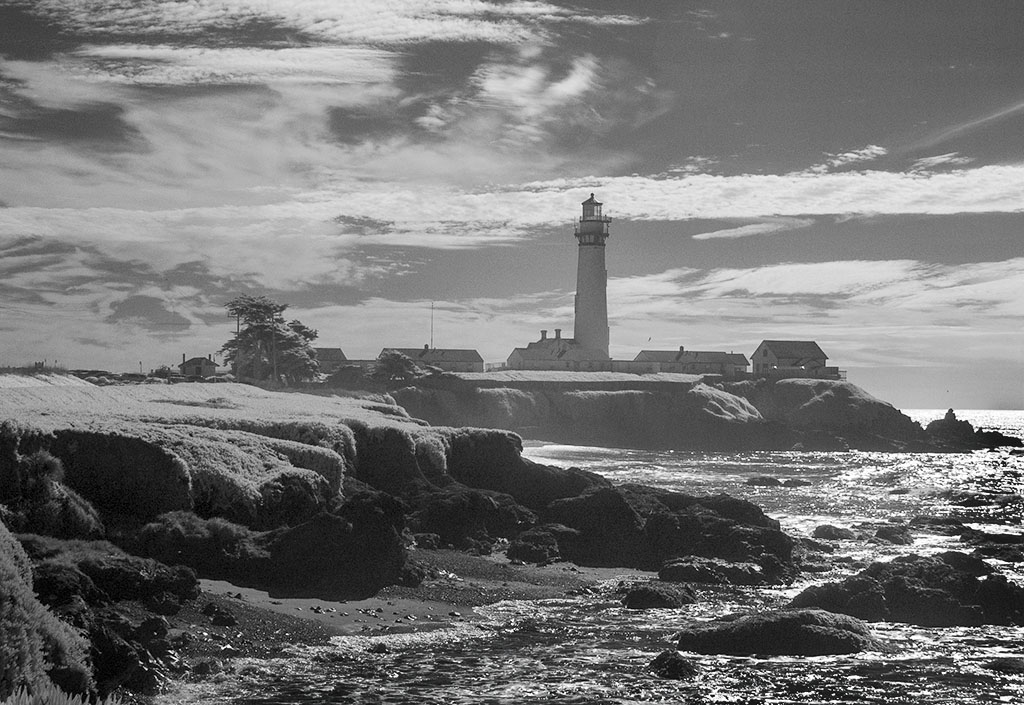
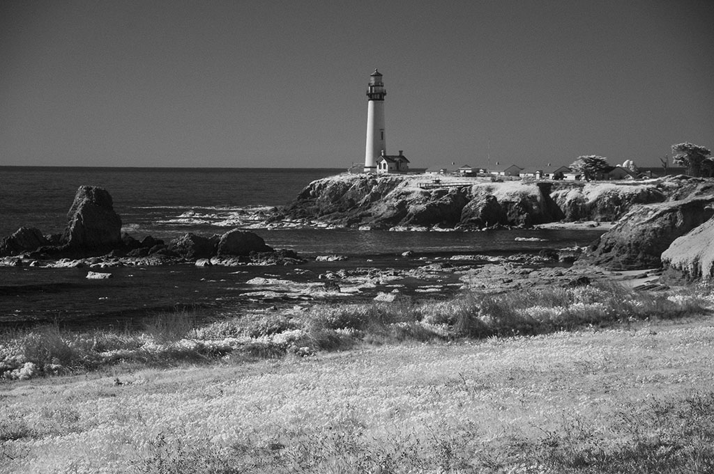
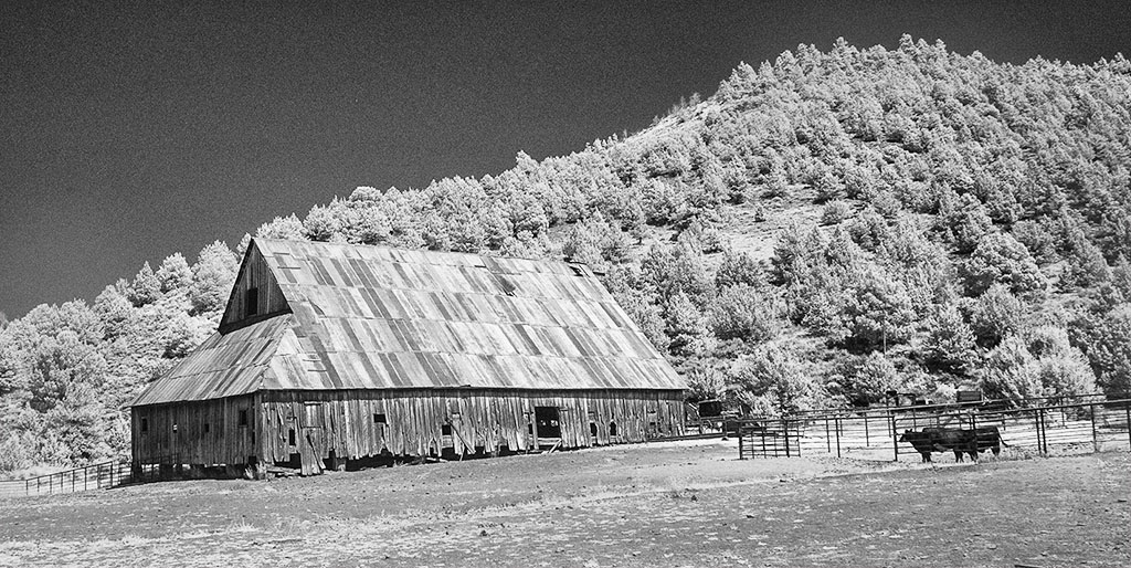
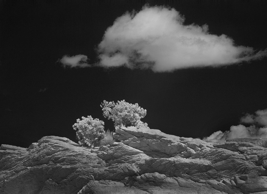
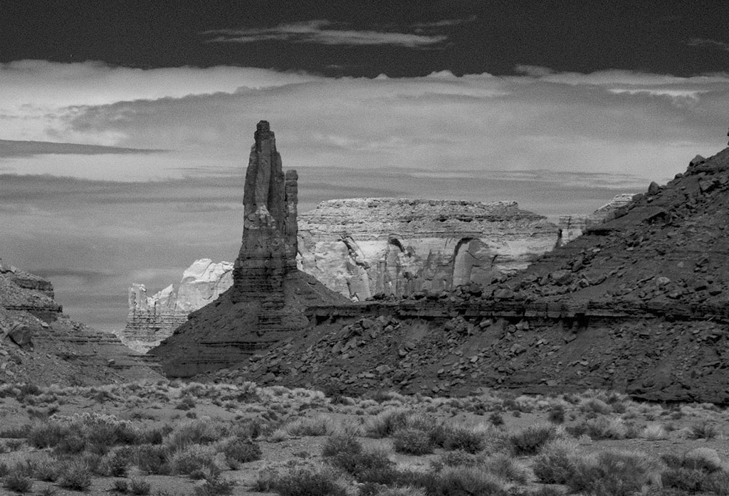
Unfortunately the foreground is so dominate that the rugged mountains in the distance lose their importance. Even cropping most of the foreground out still doesn't make the mountains any bigger but their ruggedness does create some interest. The basic composition is good as the overhanging tree creates a good framing device. My question is, what are those white curved lines on the left side? They are so symmetrical that they appear to be something man made. |
Aug 11th |
| 35 |
Aug 18 |
Comment |
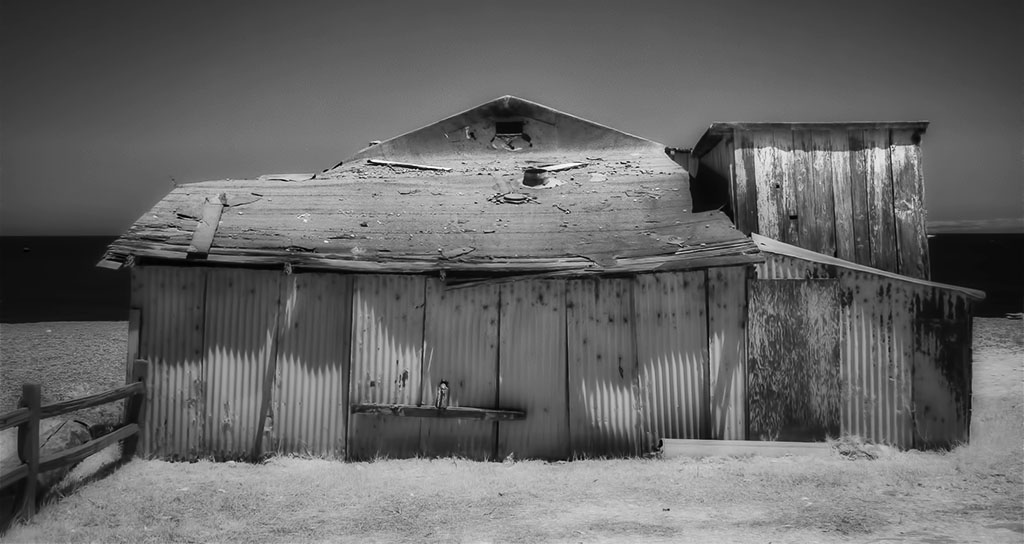
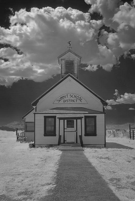
To be quite frank, the story behind the pictures makes the image more interesting but if one didn't know that information I don't think the picture would have too much appeal, especially seeing the rear end of a horse. What to me would make a more pleasing composition is to crop out the rear end (and tail) of the horse and only show the heads of the other three. The viewer can sense a story behind it as the small horse is tethered to the rope which makes for more interest than if it wasn't. |
Aug 11th |
| 35 |
Aug 18 |
Comment |
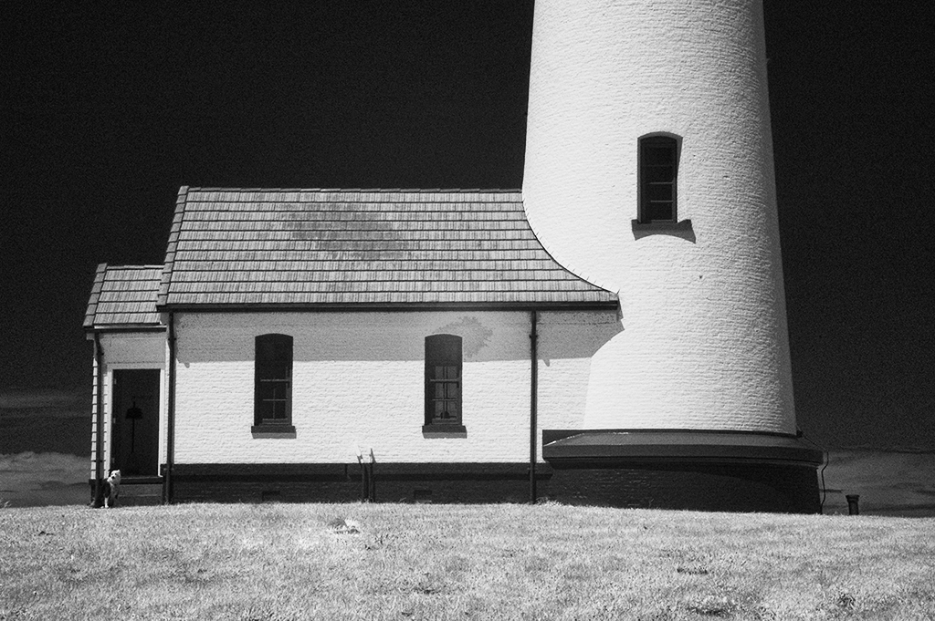
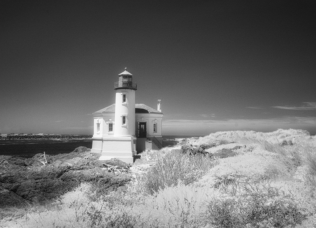
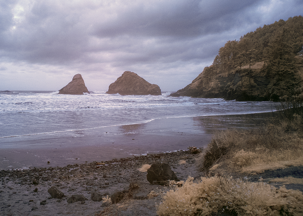
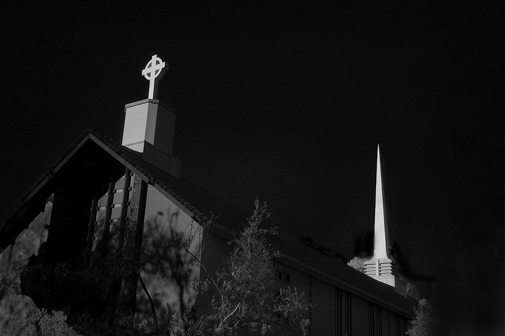
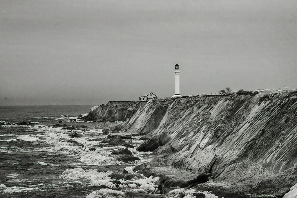
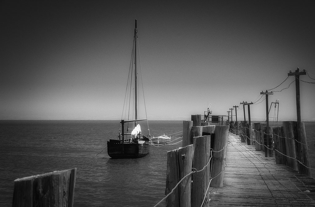
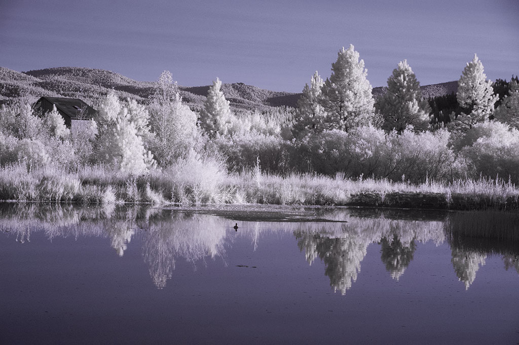
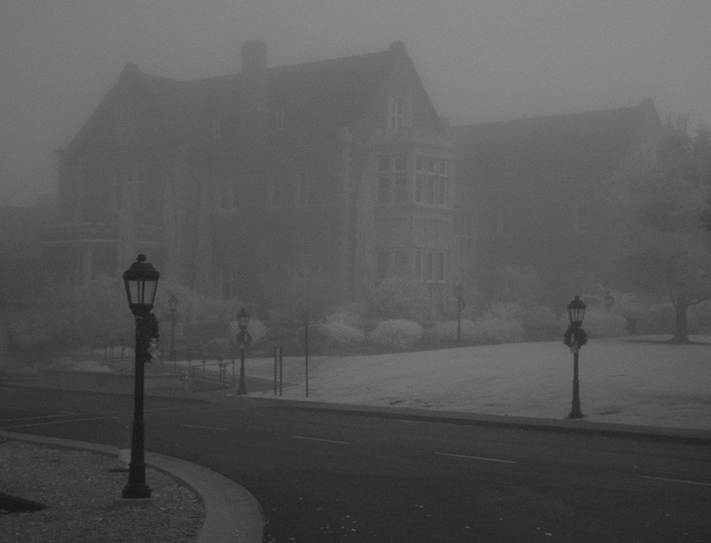
Two aspects of this one that I really like are the heavy foliage on both sides of the building and the light poles. The foliage makes it appear that the lighthouse is in a "wild" remote areas rather than the usual clear coastal location. The light poles are different and seem out of place which is the reason that I like them. Your conversion from IR to the resulting b/w was done well as the IR factor shows up with the dark sky and the light foliage but your retained the detail in the foliage to keep it from being a white mass. |
Aug 11th |
| 35 |
Aug 18 |
Comment |
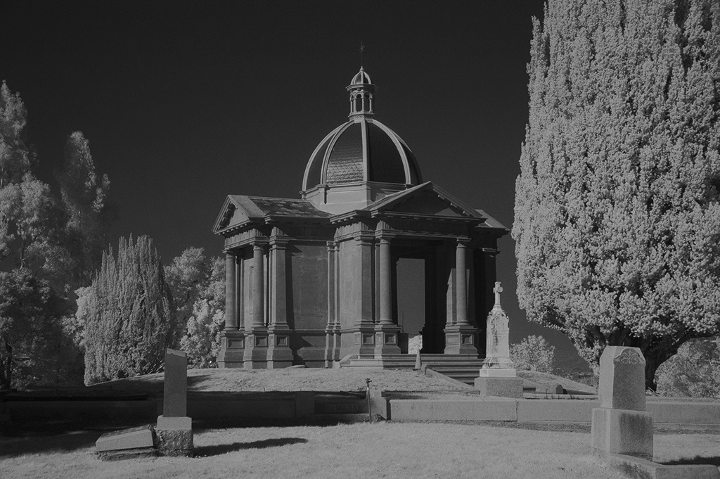
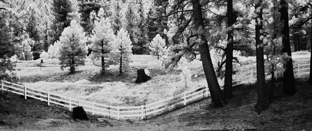
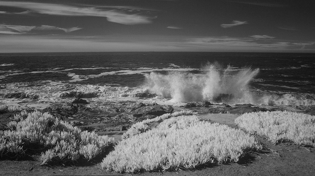
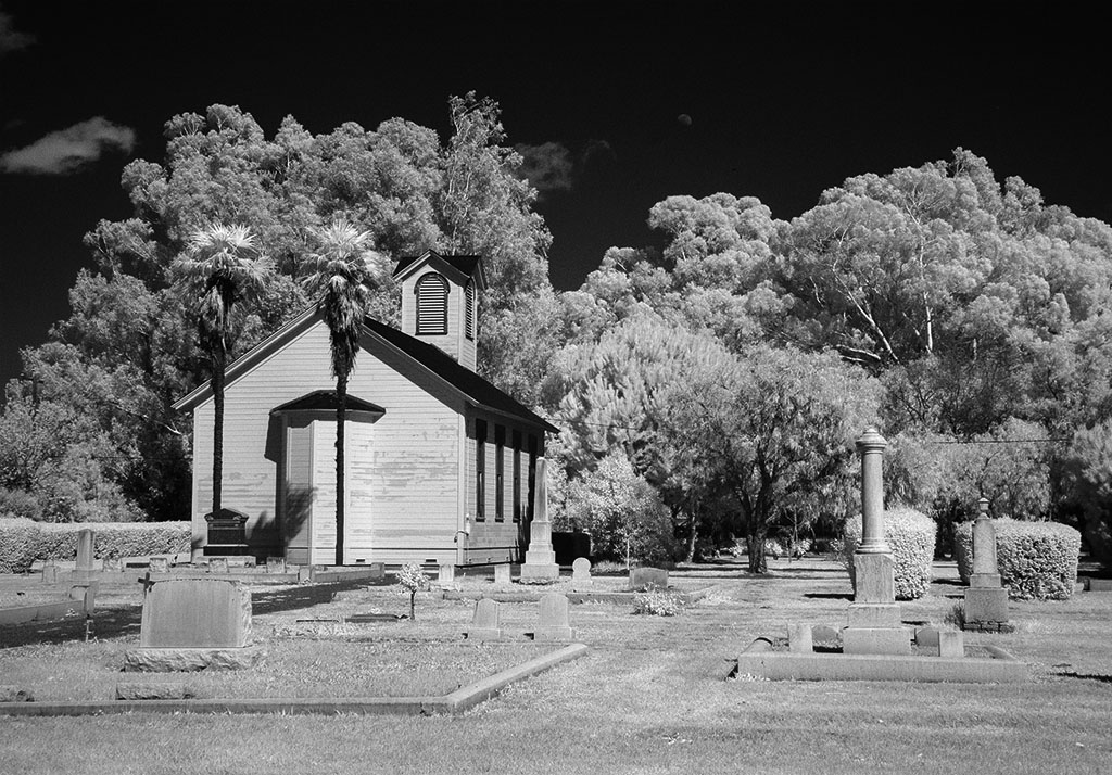
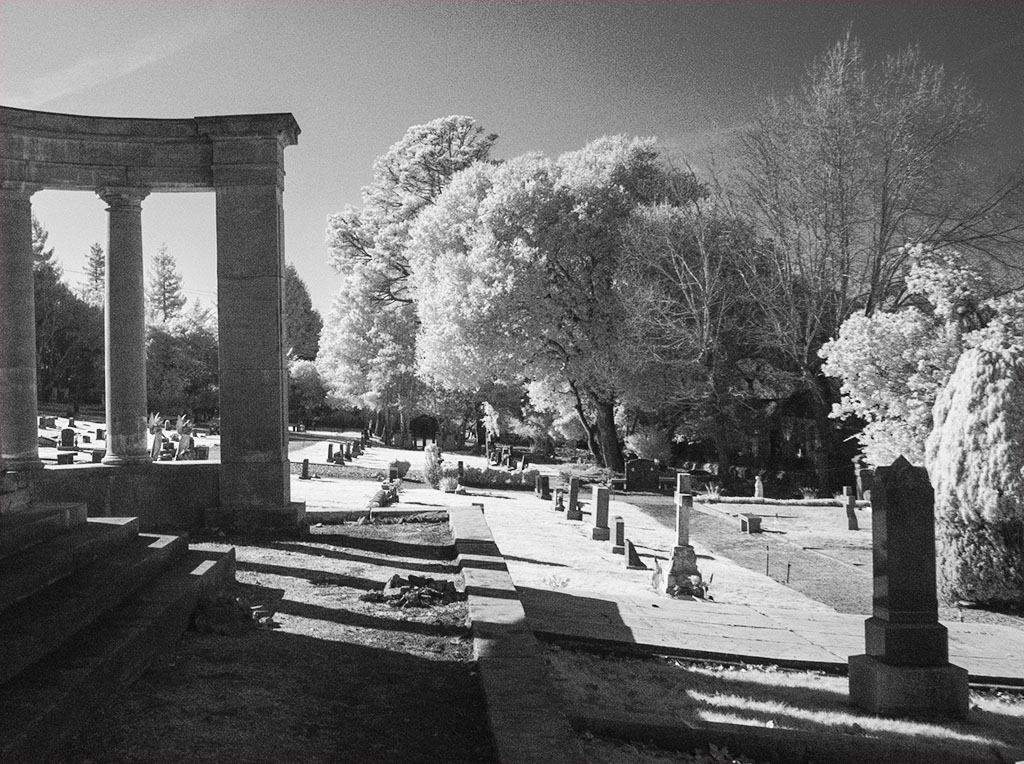
This works for me as the brick arch, the building and the tombstones are all strong objects so the tree color is secondary as is the ground cover. The eye immediately goes to the arch then because it is the entrance to the cemetery, my eye goes to the tombstones. The church, for me, compliments the arch and tombstones. (Too bad that it doesn't have a steeple or bell tower that most churches have!) Maybe because I have seen "odd" color trees from other IR images they don't bother me but I can understand that a "purist" might object. To get a little picky, I'd remove the two tombstones that are cut by the edges as, from my judging days, I always objected to having an important part of a picture cut by an edge. |
Aug 11th |
6 comments - 0 replies for Group 35
|
6 comments - 0 replies Total
|