|
| Group |
Round |
C/R |
Comment |
Date |
Image |
| 35 |
Jun 18 |
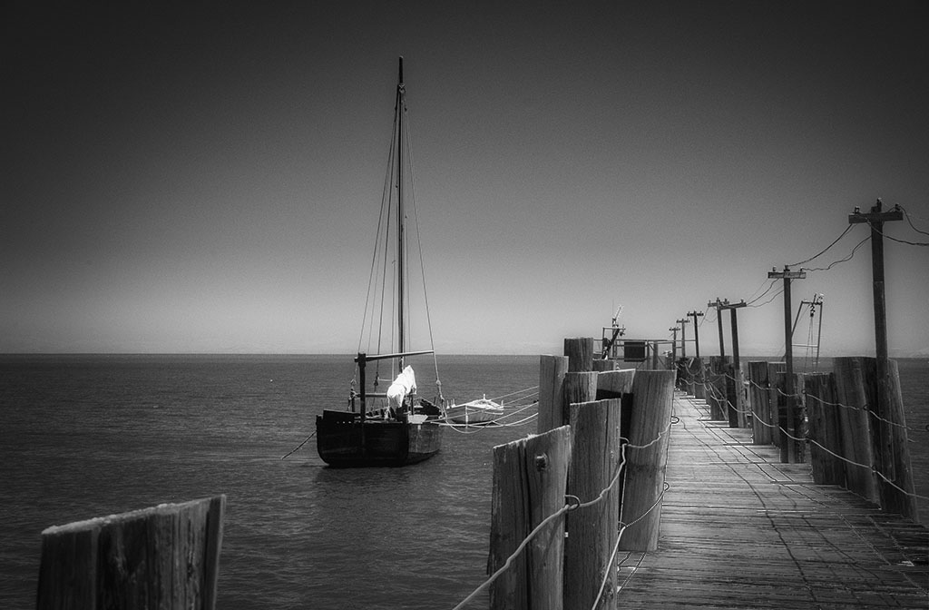
Reply |
Now that I have a comparisons with the original I thing you should add a bit more empty space on the right (a little breathing room for the boats). The contrast change does work well. |
Jun 17th |
| 35 |
Jun 18 |
Reply |
Thanks you. Every suggestion from you and Helen have given be something concrete to try. One of these days I might even get one that satisfies me. |
Jun 17th |
| 35 |
Jun 18 |
Reply |
Thanks. Periodically I experiment with color and have to admit that I haven't reached a point where is was completely satisfied. I have admired the pale blue that you achieve and have tried to do the same. Your notes are helpful so will give it another try. |
Jun 17th |
| 35 |
Jun 18 |
Comment |
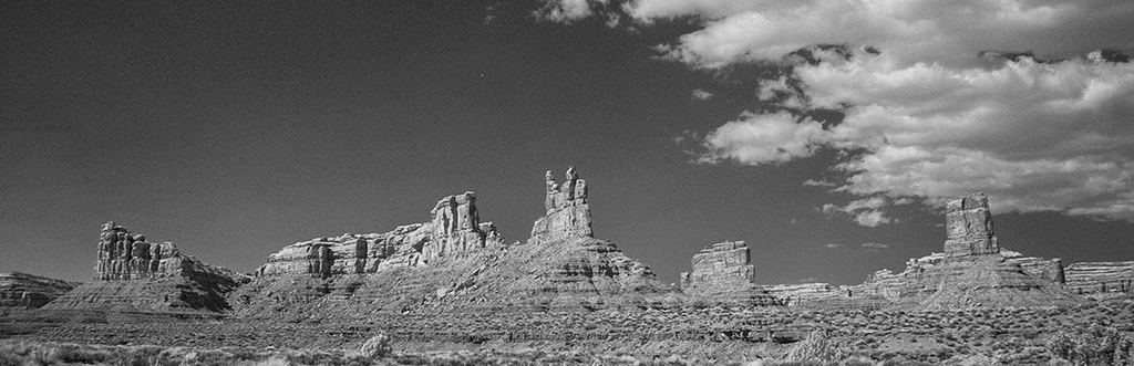
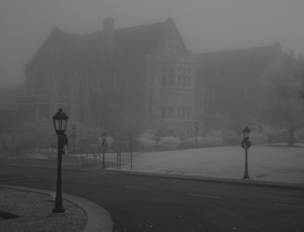
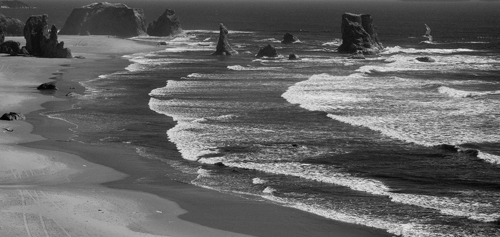
It is very good bit of seeing but when I look at it more there is a vast area that doesn't hold interest nor add to the overall presentation - the sky and the water on the right. Why not crop the sky just above the tallest mast and the water close to the boat on the right. Cropping will accentuate the boats and reflections more than they are in your picture. When you are reprinting experiment adding different levels of contrast to give the scene more impact. |
Jun 15th |
| 35 |
Jun 18 |
Comment |
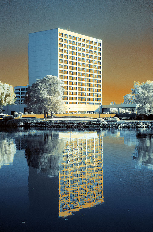
You have all the components to make a beautiful scene. The bridge is a great subject and the scene is enhanced with the building on the other side. I particularly like the sky condition. It doesn't detract rather it adds some more interest to the composition. I feel that the IR really makes the scene come alive, far more than a conventional b/w or even color rendition. You must have a really steady hand for hand holding the camera while making three exposures. |
Jun 15th |
| 35 |
Jun 18 |
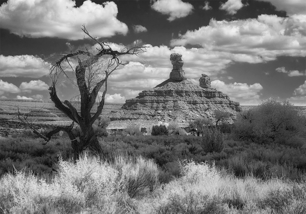
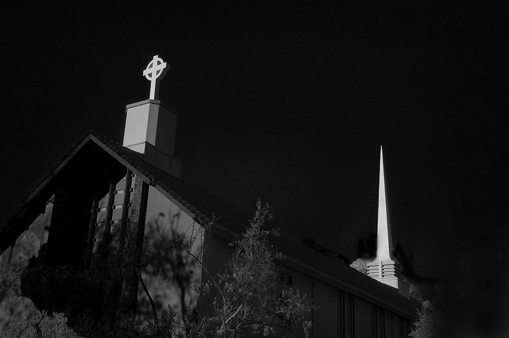
Comment |
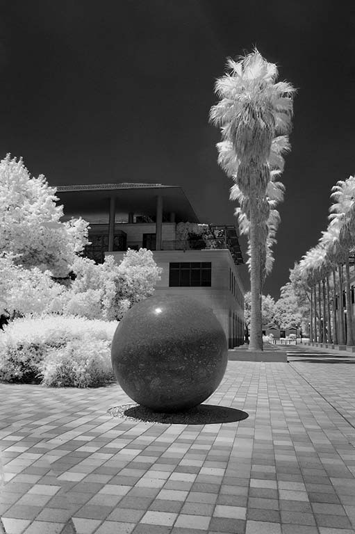
The combination of the statue and the very different objet behind make for an interesting scene, something that probably means more to you as you were there than to those who don't know what the two objects stand for. the IR conversion was done well. |
Jun 15th |
| 35 |
Jun 18 |
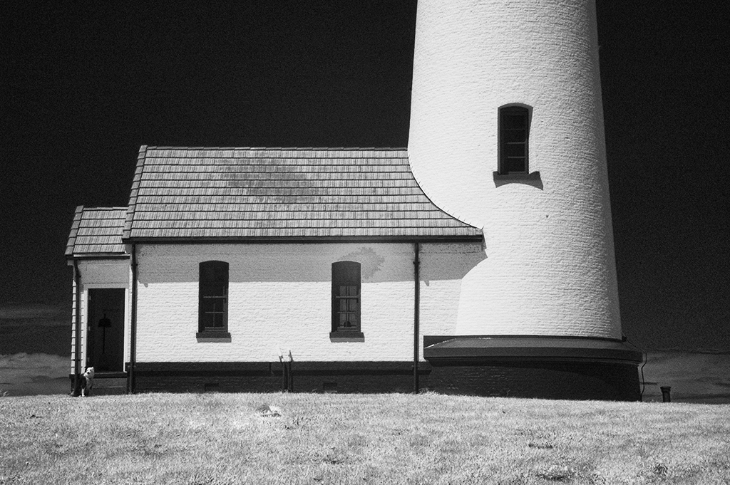
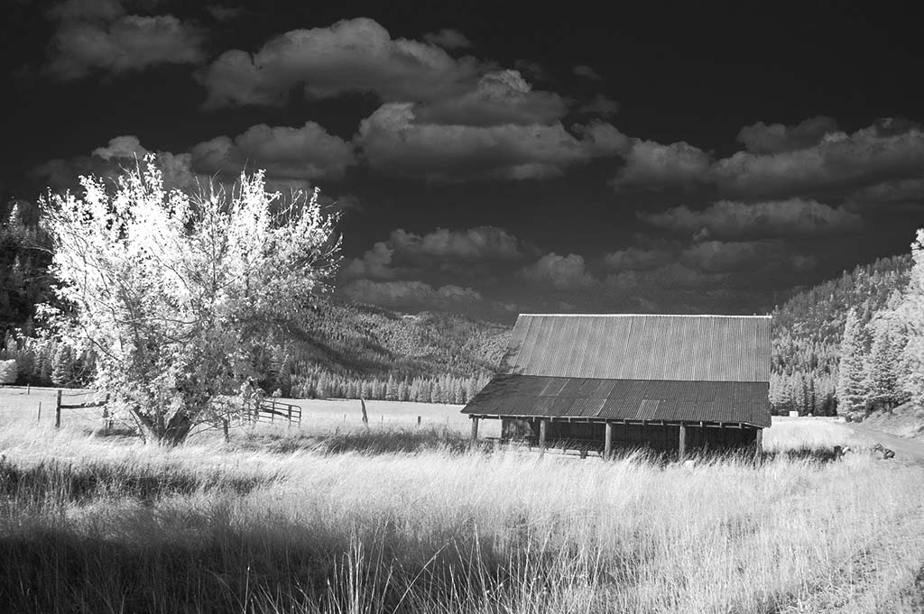
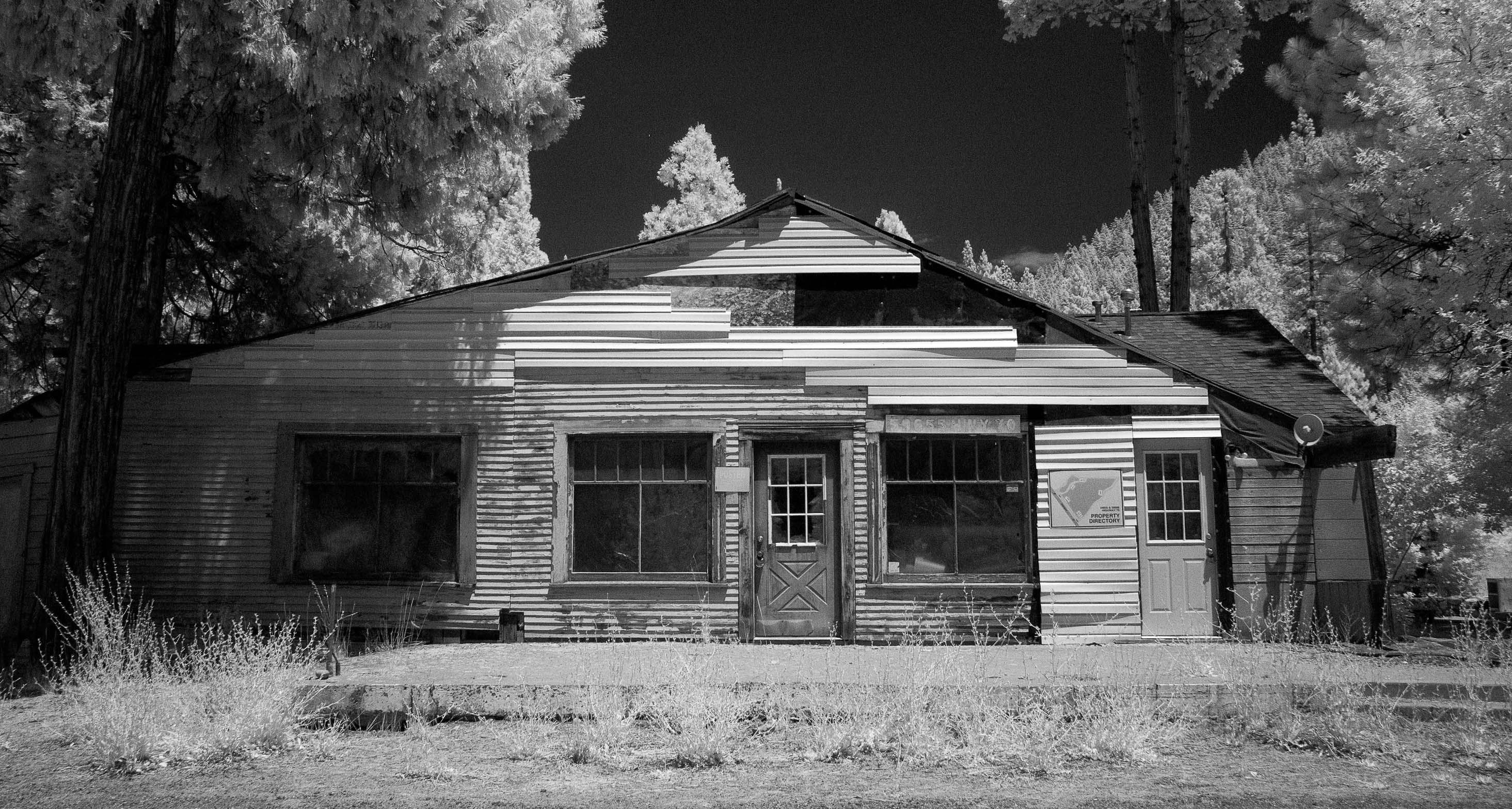
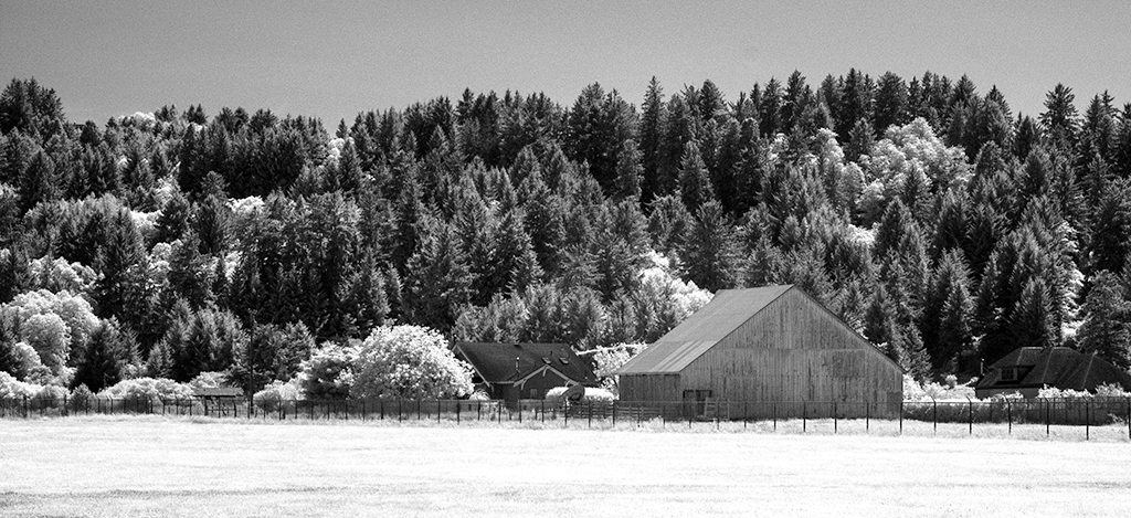
Comment |
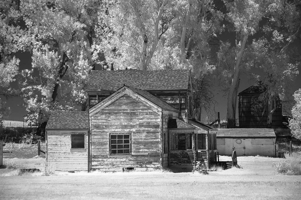
The prime question is: Did you get help with the flat tire? You may not have had the opportunity to more around the area but I feel that either structure in the background would make for a more interesting major subject than the rear end of a pickup truck. It doesn't hold my attention. However, I imagine that you were more concerned with getting the tire taken care of than taking pictures. |
Jun 15th |
| 35 |
Jun 18 |
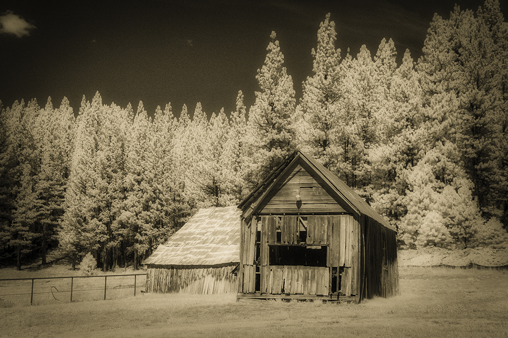
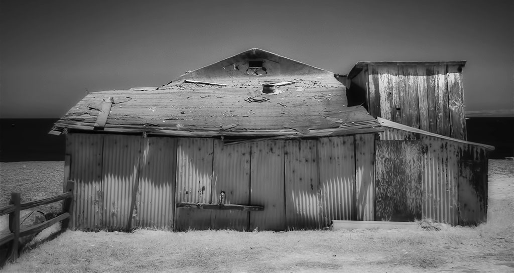
Comment |
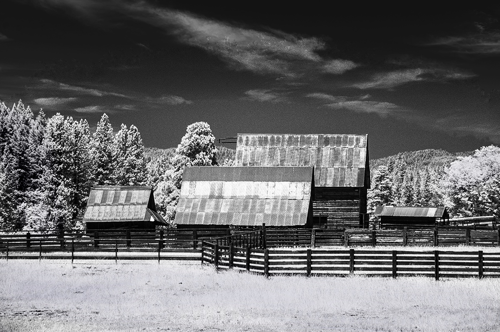
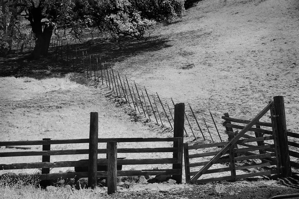
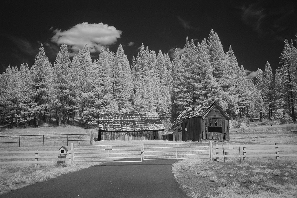
My initial reaction is there is too much white space. Each time I looked at the image I seem to zero in on the two tools leaning against the fence. I cropped a lot off the right side to show just a bit of the building's side. Then I did the same with the top but left some of the hanging vines in the picture. And finally (I'm almost done) I tried to visualize my version of the scene with and without vignetting. It might be stronger if more of the foreground in front of the tools was shown. |
Jun 15th |
| 35 |
Jun 18 |
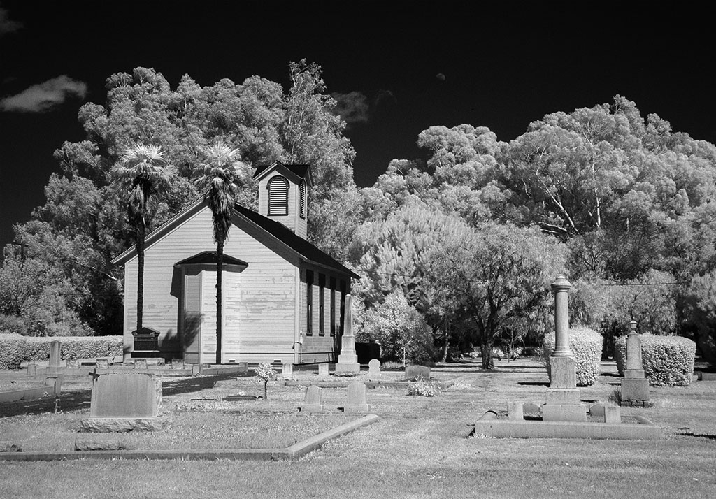
Comment |
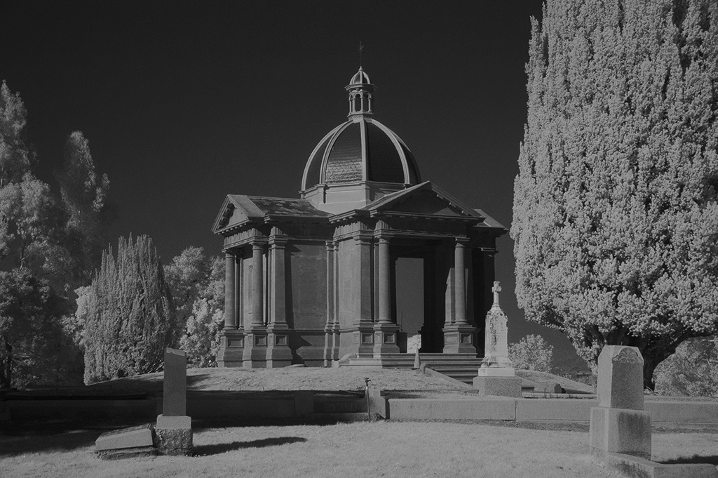
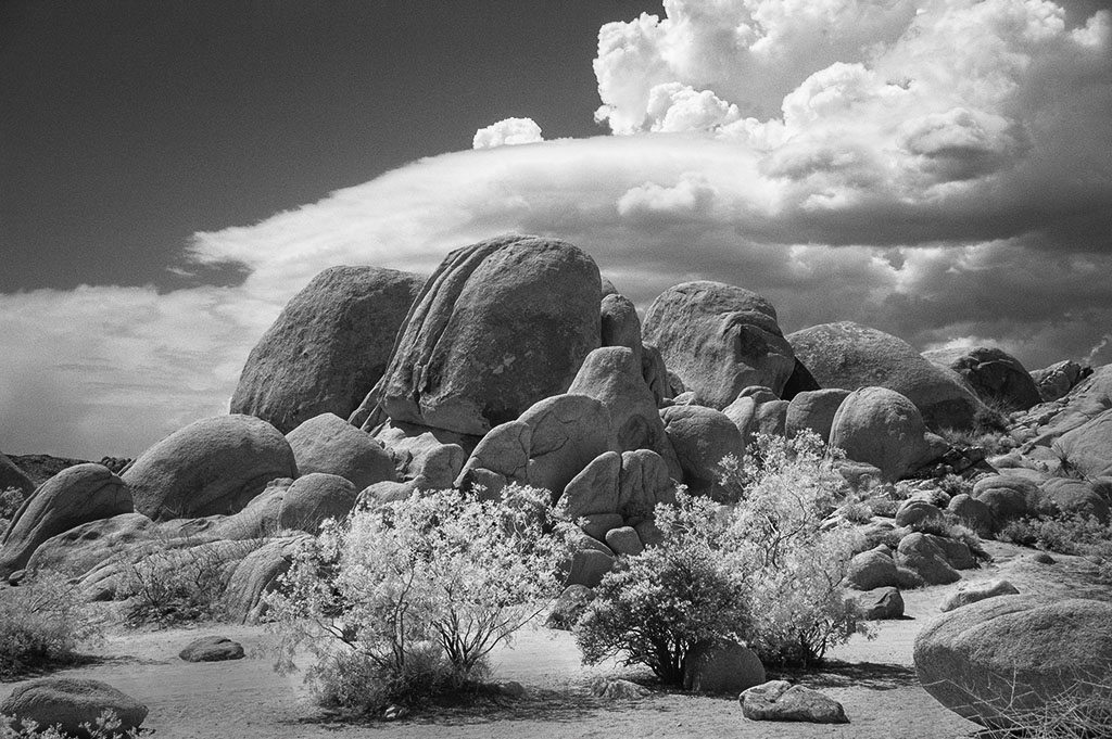
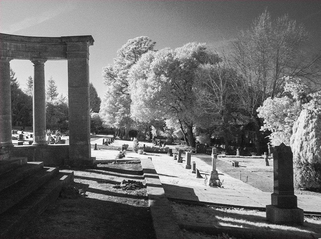
This is beautiful with the symmetry of the tombstones, their shadows and the flags. Because the flags are not all hanging the same way they add an extra element and keeps the cemetery scene from being static. The trees make a beautiful canopy for the "final resting place." So many pictures need a "center of interest" but in this case one is not needed as the rolling field and the repetition of all the tombstones causes the eye to enjoyable wander throughout. I feel there is sufficient impact from the light and shadows and the repetition that you should enter an exhibit.(When I started entering they were called salons, now they are exhibits!) |
Jun 15th |
6 comments - 3 replies for Group 35
|
6 comments - 3 replies Total
|