|
| Group |
Round |
C/R |
Comment |
Date |
Image |
| 9 |
Sep 25 |
Reply |
Sylvia, what a wonderful dilemma to have!
My suggestion would be to choose whichever version you'd want to print out and hang on your wall - the one that makes you feel joyful when you look at it.
The fact that everyone offered different approaches just shows how strong your original composition was! |
Sep 19th |
| 9 |
Sep 25 |
Reply |
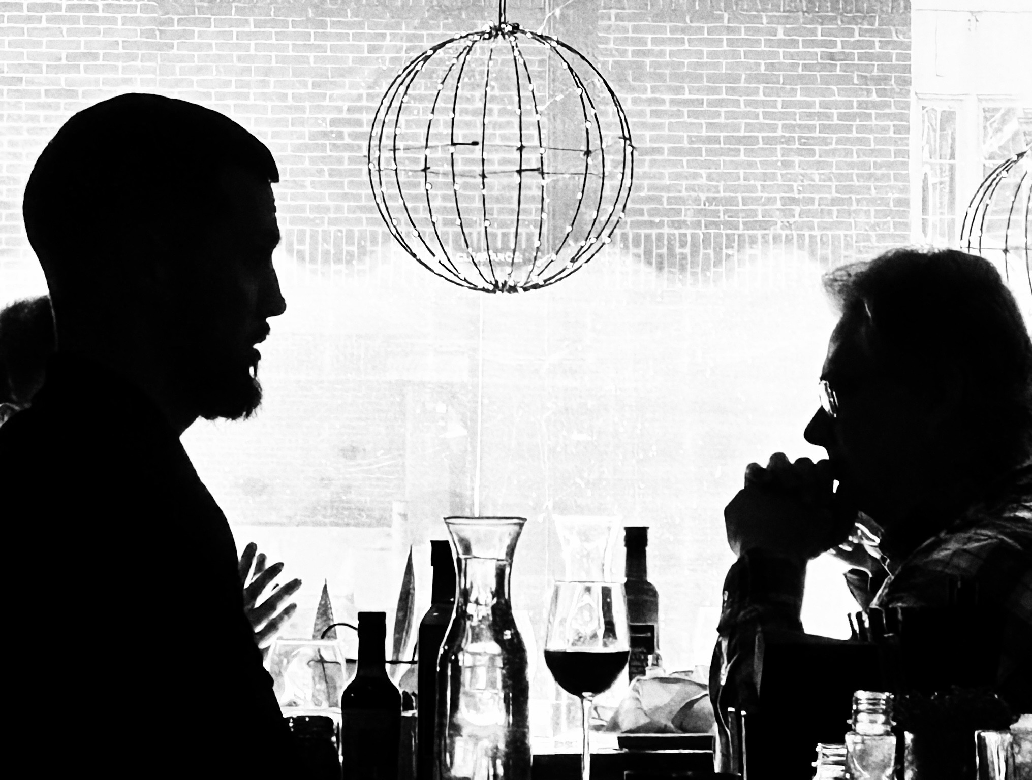
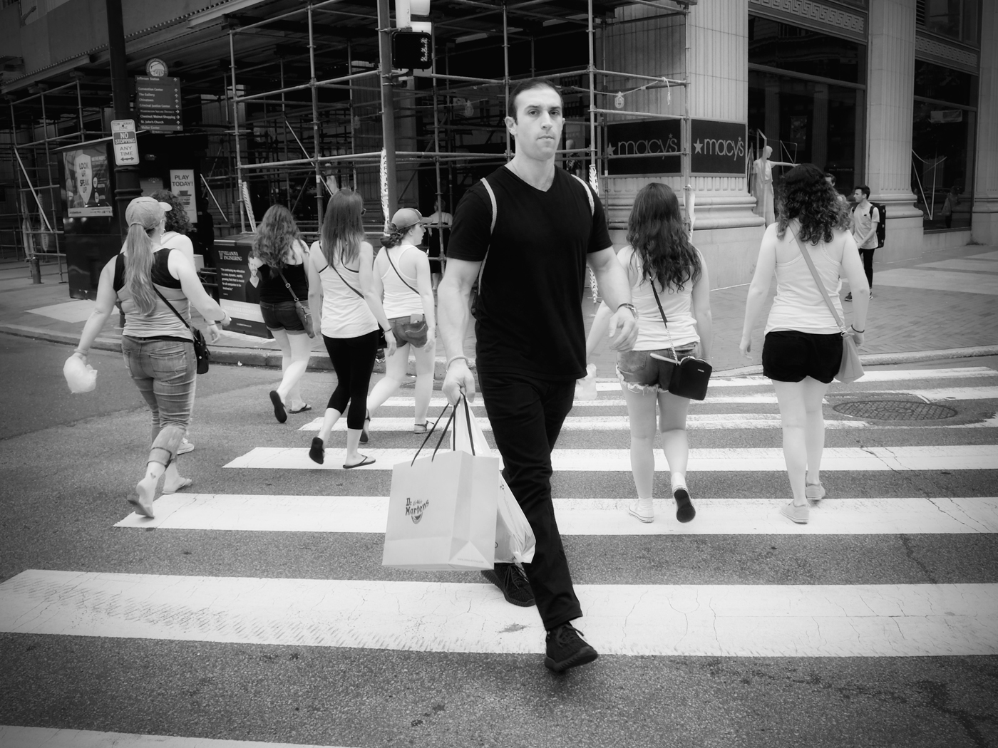
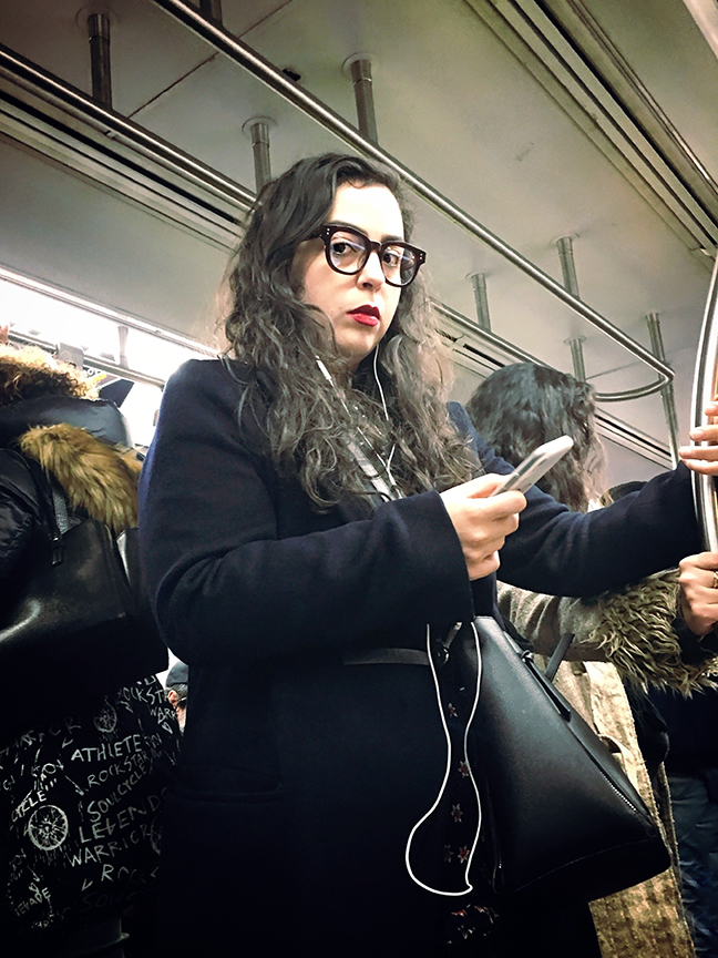
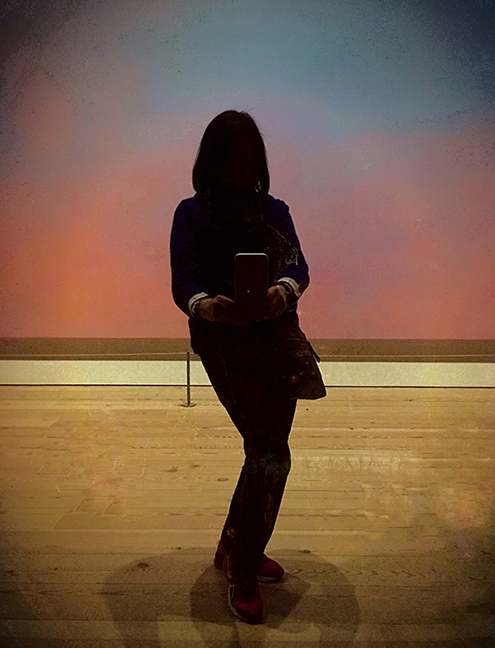
Thank you, Sabine! You captured exactly what I hoped to convey - that sense of urban refuge where people can decompress and connect. I'm glad the image communicated that feeling of escaping the day's stress. |
Sep 19th |
| 9 |
Sep 25 |
Reply |
I love your approach of letting images speak first, Sylvia! That guy on the phone definitely adds another layer to the story - the contrast between digital connection and physical presence. Thanks for seeing the summer evening energy I felt. |
Sep 19th |
| 9 |
Sep 25 |
Reply |
Thanks for noticing the technical details, Jim! I was surprised how well the phone handled the mixed lighting conditions. You're right about the sharpness - sometimes the best camera really is the one you have with you in the moment. |
Sep 19th |
| 9 |
Sep 25 |
Reply |
Thank you, Randy! That open-door quality is exactly what drew me to take the shot. There's something about spaces that feel accessible and welcoming that makes city life more human-scale, isn't there? |
Sep 19th |
| 9 |
Sep 25 |
Reply |
Thanks, Yvonne! You're right about the inviting warmth of the lighting - it really does draw you in. I love how you described it as 'lively colors and human connections or not' - that perfectly captures the urban paradox I was trying to show. |
Sep 19th |
| 9 |
Sep 25 |
Reply |
Thank you, Douglas! I'm so glad the details came through - you really picked up on all the different stories happening in that moment. That figure in shorts on the left caught my attention too. There's something compelling about capturing people in those in-between moments of decision. |
Sep 19th |
| 9 |
Sep 25 |
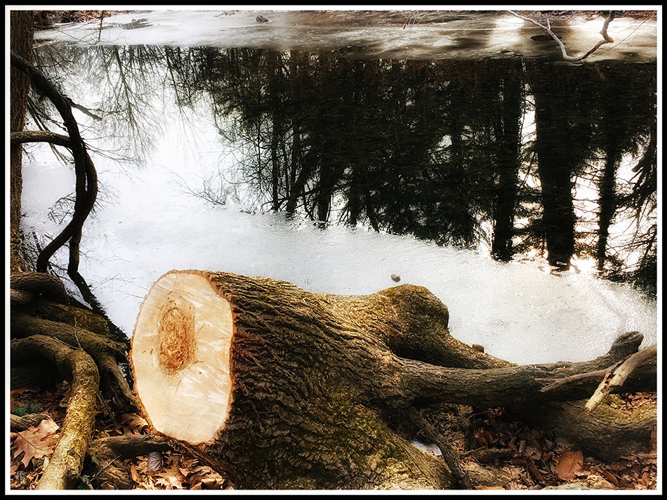
Comment |
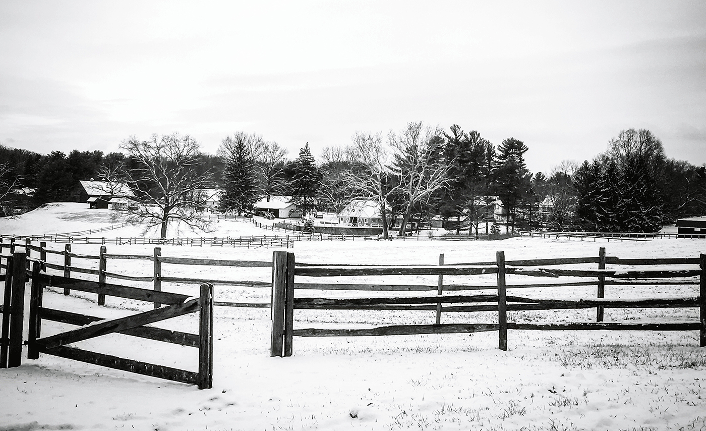
Randy, This winter scene has such a peaceful, contemplative quality - it really does evoke those memorable winter holiday feelings. There's something timeless about how the snow blankets everything, creating that sense of quiet tranquility you've captured.
I can see what you were aiming for with the protective relationship between the larger tree and the rhododendron beneath it. That's a beautiful observation and adds narrative depth to the image. Your cropping to the 4x5 ratio helps focus attention on this central story while keeping the surrounding trees for context.
I think tuning down the brightness of the snow slightly could add a bit more warmth and detail. Sometimes revealing a bit more texture in the snow can make the scene feel more inviting.
The composition works well, and you've done thoughtful work with the adjustments you've made. This captures the serene beauty of a fresh snowfall beautifully. Your patience working on this image over time really shows. |
Sep 19th |
| 9 |
Sep 25 |
Comment |
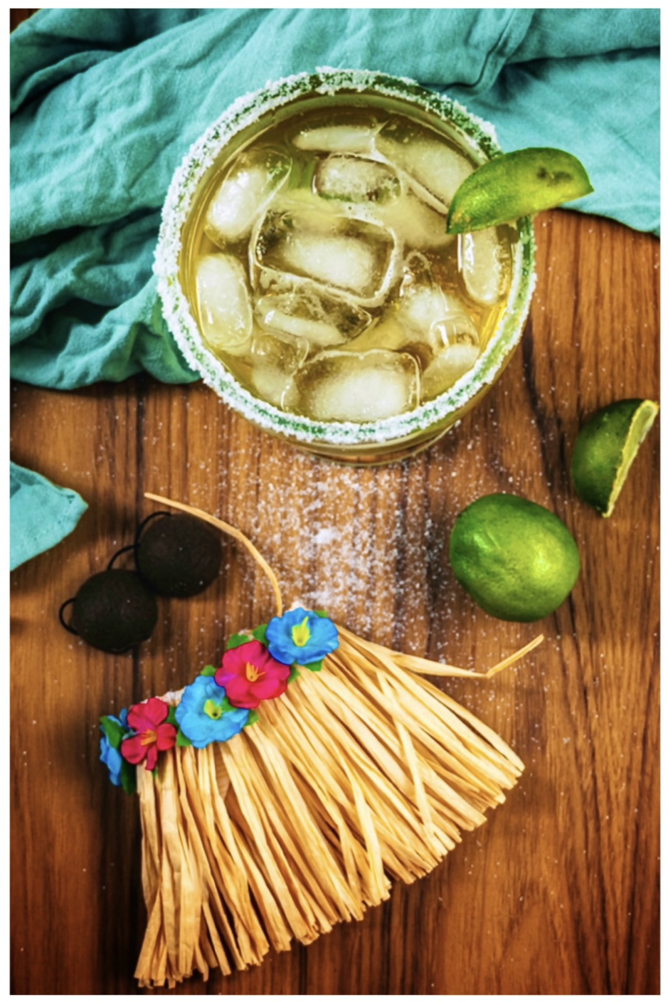
Hi Sylvia, What a fun and creative take on the 'Summer' theme! I love how you've arranged all these tropical elements - the margarita with its perfectly salted rim, the fresh limes, and those colorful decorative pieces that add such a festive touch. The wooden surface provides a great warm base for the composition.
The styling really captures that summer vacation vibe. Your choice of props and the casual, relaxed arrangement work well together to tell the story.
I took the liberty of trying a different crop on your image - going vertical and focusing more tightly on the drink and key elements. By reducing some of the towel area, it puts more emphasis on your beautiful styling of the cocktail and accessories. I also added some brightness adjustments and a vignette to enhance the tropical feel.
Still life photography is definitely challenging - you're being too modest about your skills! The lighting is even, and you've created a cohesive color palette with the turquoise, lime green, and warm wood tones. This really does capture that summer fun feeling perfectly. |
Sep 18th |
 |
| 9 |
Sep 25 |
Comment |
Hi Jim, This image has such a creative, artistic quality - it's quite lovely. After seeing the original, I'm really impressed with your cropping skills, which make the composition much more impactful.
I love how the soft green background creates perfect separation for the colorful new growth. Those warm tones in the leaves - the oranges, yellows, and purples - really capture that fresh spring energy beautifully.
Your post-processing work is excellent too. The background masking creates that dreamy bokeh effect, and the subtle adjustments to highlights and shadows bring out all the delicate detail in the leaves without overdoing it.
It's wonderful how you documented this moment of growth over time and then found the perfect way to present it. The diagonal composition of the branch adds nice visual movement. Beautiful capture and editing - nice work! |
Sep 18th |
| 9 |
Sep 25 |
Comment |
Douglas, I love how refreshing this feels with all those lush greens - it really captures that sense of tranquility you mentioned from your retreat. The variety of green tones and textures creates a wonderful layered effect.
Perhaps without the tree trunk, it might bring even more focus to the tranquility of the pond and those charming inner tubes lounging on the dock. That detail about the tubes being 'a bit lazy' really comes through in the image!
Your post-processing work with the radiant masks and color adjustments has enhanced the natural vibrancy beautifully. The slight vignette works well to draw the eye toward the center of the pond.
This really does epitomize that end-of-trek relaxation feeling. The composition captures both the untouched natural beauty and the quiet human presence at the retreat center nicely. |
Sep 18th |
| 9 |
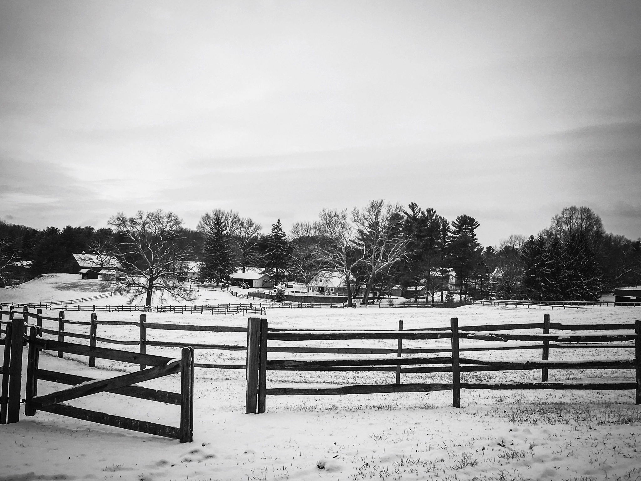
Sep 25 |
Comment |
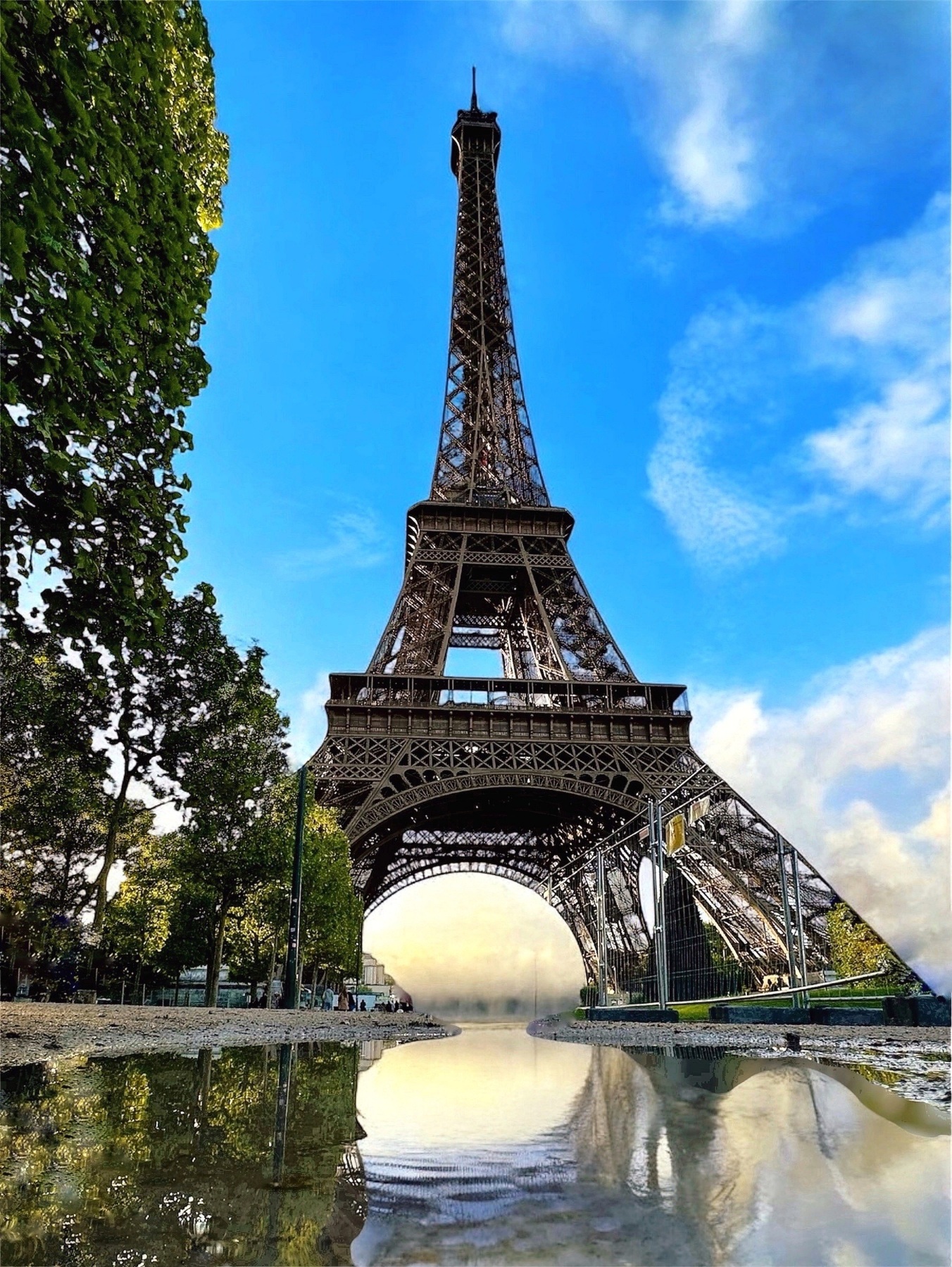
Yvonne, I agree about straightening the tower - that really helps the composition. The tight cropping does feel a bit constrained; the original with more space on the left gives the eye a better entry point.
That bridge tender's house is fascinating - such a unique detail that makes this more than just an industrial shot. You've captured a great contrast between the weathered steel framework and that domestic space perched above.
The late afternoon lighting works beautifully, bringing out the metalwork's texture while keeping good shadow detail. The reflection adds nice visual interest too.
One small note: the mariners' sign in the corner might be slightly distracting from the main subject. But overall, this really captures both the industrial heritage and character of this Chicago landmark. Great documentation of the city's history! |
Sep 18th |
| 9 |
Sep 25 |
Comment |
Hi Sabine,
I really like the edited version with the blue tones - it gives the photo a very pleasant and lively feel. The sight of all those sailing ships together is truly impressive, and I love how you included the city landmarks in the background. That makes the photo not only about the ships but also about their connection to Bremerhaven.
If I had to suggest anything, it would be to leave just a little more space on the left so that the edge of the ship (and the wooden bar) isn't cut off. The overall crop already works very well, though, and your edit really brings out the atmosphere compared to the hazy original.
Overall, it's a very striking image, and thank you for sharing this magnificent parade of ships with us! |
Sep 18th |
6 comments - 7 replies for Group 9
|
6 comments - 7 replies Total
|