|
| Group |
Round |
C/R |
Comment |
Date |
Image |
| 2 |
Oct 17 |
Comment |
Thanks Hung...your composition in both the images are looking good. But I would rather keep the original form (as the scene is so fresh in my mind) :) |
Oct 18th |
| 2 |
Oct 17 |
Comment |
Yes Al, I feel its over saturated and also over sharpened and that's why you may have got that halo around the mountain top. Actually its such a wonderful image you don't need to do much( or may be nothing at all) post editing. |
Oct 18th |
| 2 |
Oct 17 |
Comment |
To me its a very nice street photograph. I would go with Harry's cropping. I prefer the colored version as its showing a very soothing effect, although the expressions on their faces are different, which is making the image more interesting.
The only issue to me is, the light, which I see is thrown more on the hands rather than on the faces. |
Oct 18th |
| 2 |
Oct 17 |
Comment |
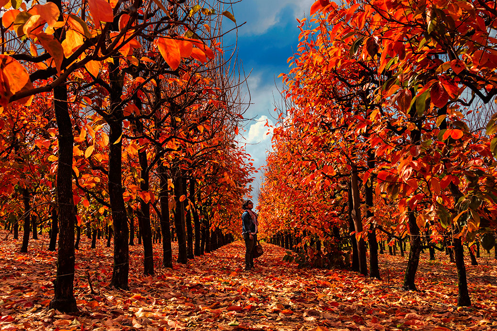
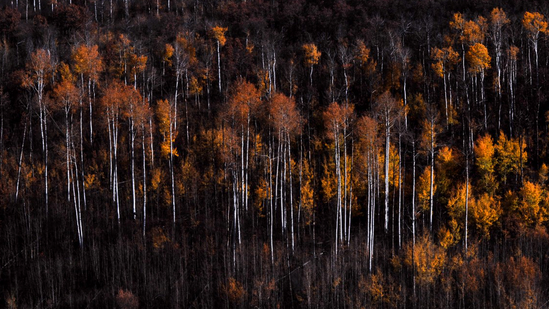
very nice image Hung. I would like to crop a bit from left and below so that the focus would be more on the bright fall colors. May I fix it this way ...I have also increased the saturation a bit. |
Oct 18th |
 |
| 2 |
Oct 17 |
Comment |
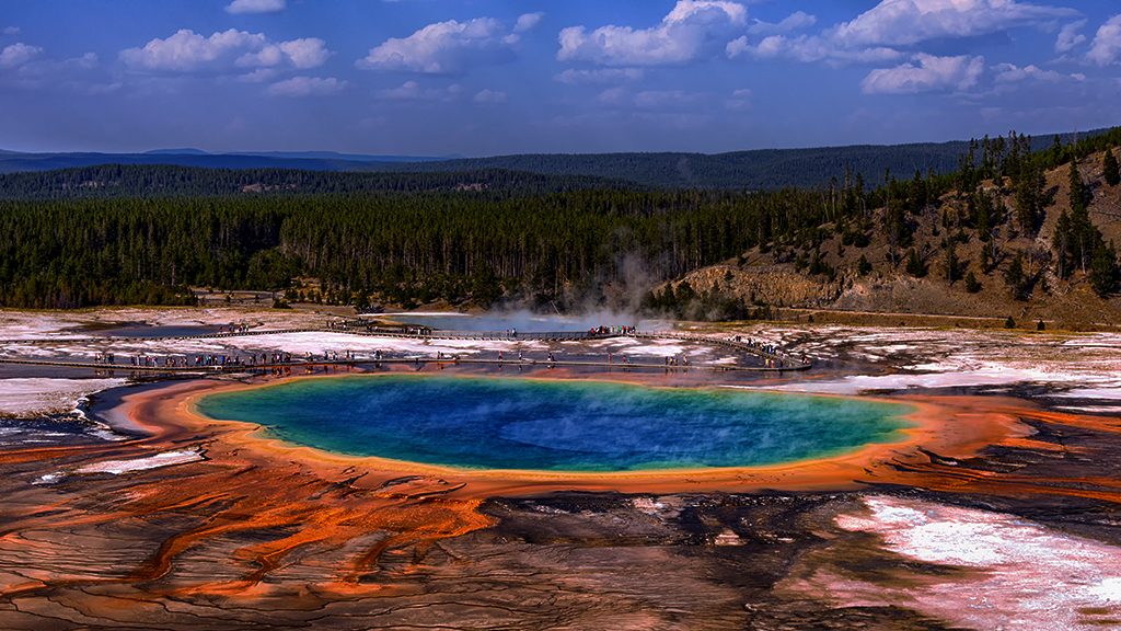
Oops something went wrong and your submission got repeated. Anyway thanks for the comment.
It is a single lane bridge over Grand Prismatic Spring in Yellowstone.
|
Oct 16th |
| 2 |
Oct 17 |
Comment |
Oops something went wrong and your submission got repeated. Anyway thanks for the comment.
It is a single lane bridge over Grand Prismatic Spring in Yellowstone.
|
Oct 16th |
| 2 |
Oct 17 |
Comment |
Thanks Shirley & Harry :) |
Oct 15th |
| 2 |
Oct 17 |
Comment |
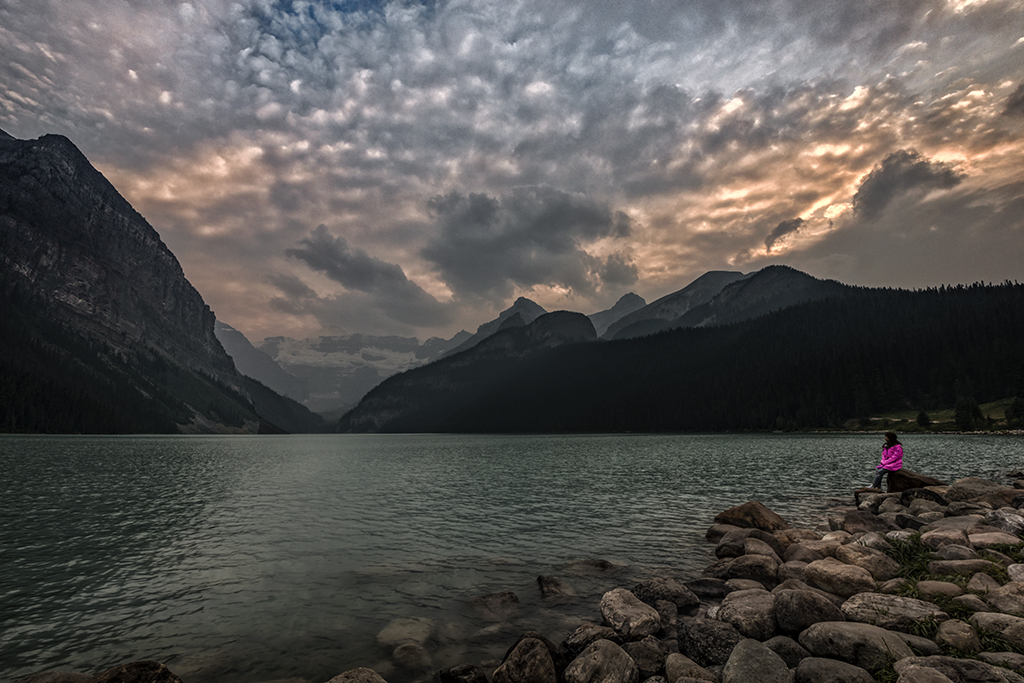
Shirley, I second Gary's comment. The original, to me looks better as there is no noise in the sky. Apart from that the structure of the light house and the house are also very sharp and well taken. The contrast on the upper part of the canvas looks more appealing to me. Although the sky is flat but there is nice gradation, which is making the image very serene. |
Oct 15th |
| 2 |
Oct 17 |
Comment |
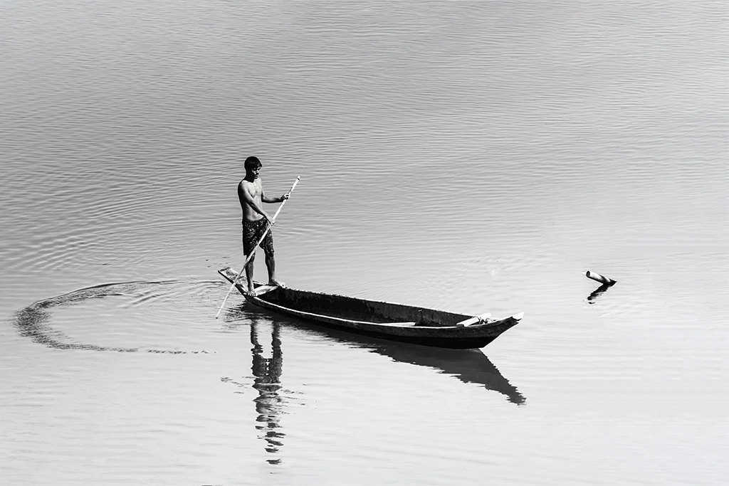
I think you did good Harry. Sharpness and shades of B&W is looking good. The only issue, I feel is the light, which is too harsh to me.
Still over all, I think its a nice image with good cropping. |
Oct 15th |
| 2 |
Oct 17 |
Comment |
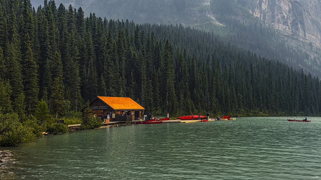
I like what Hung did... keeping more space in the front. |
Oct 15th |
| 2 |
Oct 17 |
Comment |
I like what Hung did... keeping more space in the front. |
Oct 15th |
| 2 |
Oct 17 |
Comment |
I totally agree with Shirley that birds in flight is the most difficult subject, but I think you did pretty well, assuming you captured it in a hurry. I feel your specks are fine. It could be focusing problem which led to the softness all over. As rightly said ...at f/9 much sharper image was expected. Still I think it's a good image. |
Oct 15th |
12 comments - 0 replies for Group 2
|
12 comments - 0 replies Total
|