|
| Group |
Round |
C/R |
Comment |
Date |
Image |
| 26 |
Apr 24 |
Comment |
The path really makes this image interesting. And you have captured the depth of this scene perfectly, showing the mountains in the distance clearly.
I like Bob's suggestion to move the rock off the path to the side. It does help to clean up the foreground. |
Apr 17th |
| 26 |
Apr 24 |
Reply |
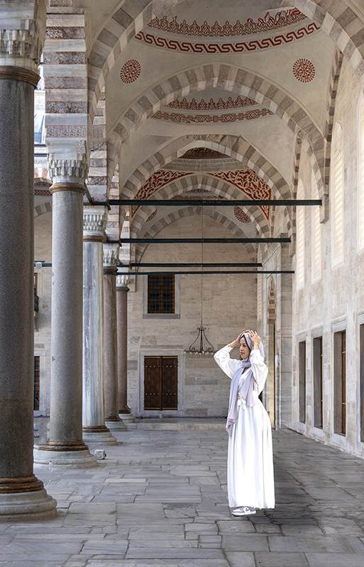
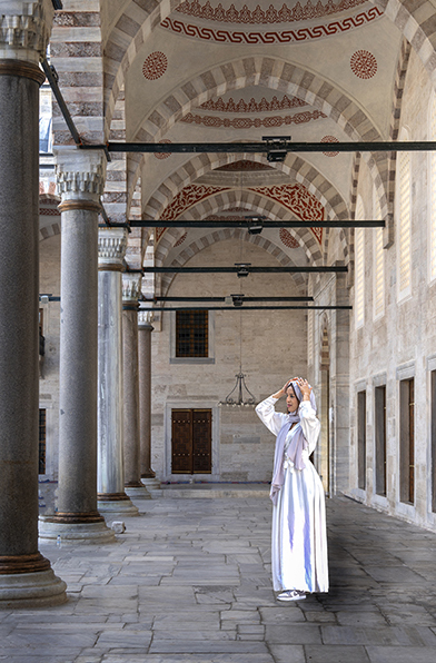
Yes. you are right. It is the Blue Mosque.
Following your advice, here is a better picture with new crop and removal of the top 2 black beams |
Apr 5th |
 |
| 26 |
Apr 24 |
Comment |
What an interesting technique, and once again you are so imaginative with your interpretation of the scene.
I do agree with Bob about the color saturation and so prefer your second image. |
Apr 3rd |
| 26 |
Apr 24 |
Comment |
Love the image as it is. I wouldn't change a thing. |
Apr 3rd |
| 26 |
Apr 24 |
Comment |
This looks like the same architect - Calatrava, who designed the new Occulus station in New York(near the new Freedom Tower)
You have captured the great lines of this building, and the sky is great too. I prefer the toning provided by Bob.
Pity about the modern buildings on the left horizon. Did you consider cloning them out? |
Apr 3rd |
| 26 |
Apr 24 |
Comment |
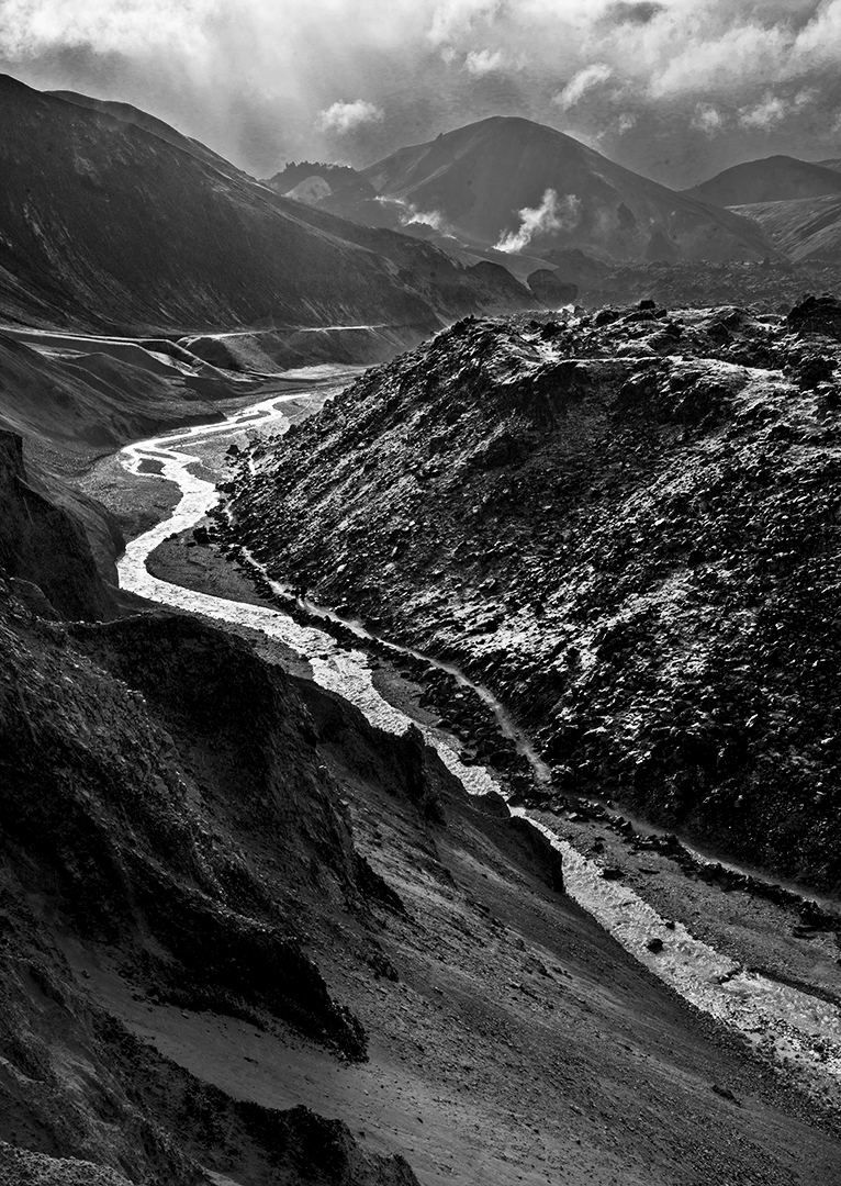
Composition with the river flowing through the valley is great. And the clouds provide good mood.
However I find the tones a little flat and would prefer stronger whites and blacks. Here is my suggestion using selective color in image adjustments. |
Apr 3rd |
 |
| 26 |
Apr 24 |
Comment |
What a lovely, cute image with just the babies eye showing so prominently.
You have handled the post processing well to eliminate the distractions lower left and top right. |
Apr 3rd |
| 26 |
Apr 24 |
Comment |
I went forward and back with this crop. My original crop keeps the 2 red semi circles at the top of the image and continues them from front to back. However the new crop as you have suggested provides better balance to the piece. |
Apr 3rd |
 |
7 comments - 1 reply for Group 26
|
| 69 |
Apr 24 |
Comment |
Diane, you have captured a nice relaxed image of this kangaroo, and shows how tame they are, and obviously used to human presence.
I also find the ear too close to the edge of the frame and spoils the picture. Pierre's crop is ok, but I would add some canvas above the frame and then use Content aware fill to add some background. |
Apr 3rd |
| 69 |
Apr 24 |
Comment |
Jas, another perfect image from Africa. Once again the lighting is lovely and the background bokeh and coloration is ideal.
Which park was this taken? |
Apr 3rd |
| 69 |
Apr 24 |
Comment |
Jacob, I think this is your best image so far. Your editing techniques have improved tremendously. Keep up the good work. |
Apr 3rd |
| 69 |
Apr 24 |
Comment |
Cindy, you have captured the coyote very well. There is great interaction and eye contact between the 2 of you.
I agree that the face could be lighter, but I feel that Pierre's version lightens the background too much. |
Apr 3rd |
| 69 |
Apr 24 |
Comment |
The whiptail is well shown on the tree, colors are good and great detail.
I find the almost parallel green leaf in the background to be a distraction. I would remove it by either clone it out or a closer crop. |
Apr 3rd |
| 69 |
Apr 24 |
Comment |
I like your composition very much. It is clean and simple and places emphasis on the Yellow flower.
My only suggestion is to clone out the couple of red flowers creeping into the frame from the right, especially the lower right 1/3 which is a little brighter than the rest and draws my eye away from the center. |
Apr 3rd |
| 69 |
Apr 24 |
Reply |
Thanks Dean. I agree that the front of an animal is usually preferable. However, in the case of this hawk, the back feathers are far more interesting than the chest coloring. |
Apr 3rd |
6 comments - 1 reply for Group 69
|
13 comments - 2 replies Total
|