|
| Group |
Round |
C/R |
Comment |
Date |
Image |
| 26 |
Jan 21 |
Comment |
I like this image very much. You have good balance with the rocks on the right and the water on the left and the slow shutter speed has smoothed the water beautifully. And the sky is magnificent with the streaks in the clouds helping to lead my eye back to the focal point of the rocks on the horizon.
Your post process has brought out all the great detail in the rocks and the trees above. I like the image as it is and I would not change a thing. |
Jan 4th |
| 26 |
Jan 21 |
Comment |
This is certainly a most interesting building, but I feel that the way it is presented here is documentary and a little boring. I like the techniques added above by our members, or a closer crop to create more of an abstract feel.
Well done in eliminating the distractions on each side. |
Jan 4th |
| 26 |
Jan 21 |
Comment |
I'm not familiar with this software, but the result you have achieved is very interesting. It is almost 2 pictures in one, with my eye drawn to the bud and bee.
I hope we see more of these Mirror Lab pictures in the future. |
Jan 4th |
| 26 |
Jan 21 |
Comment |
This is a great nature shot and you have captured the action at the right moment. The blue color from the water reflected in the feathers does not bother me as it is natural.
I would suggest brightening the eye and possibly adding a highlight and a slight crop on the right side. A moving subject, whether animal or human should have more space in front to walk into than behind! |
Jan 4th |
| 26 |
Jan 21 |
Comment |
I love the interaction between the 2 central Zebra. To me this accentuates the nature story strength of the picture. Therefore I find the young foal on the left to be a distraction that draws my eye away from the main action. The foal is also brighter (lighter) than the rest of the image which adds to the distraction, so I would crop it out. Cropping is acceptable in the Nature division. This would leave 3 subjects, and an odd number is always preferable. |
Jan 4th |
| 26 |
Jan 21 |
Reply |
Thanks for your positive feedback.
The actions were provided free from Life Pixel when they converted my camera. I am sure they are available on their website. It is called IR adjust w/Channel Swap, and IR Channel Swap w/White Foliage |
Jan 3rd |
5 comments - 1 reply for Group 26
|
| 69 |
Jan 21 |
Reply |
Well done, Brenda. The bird now really stands out from the background and "pops" |
Jan 27th |
| 69 |
Jan 21 |
Reply |
Thanks, Brenda |
Jan 27th |
| 69 |
Jan 21 |
Reply |
The image presented is not cropped. This is how I composed it in the camera. |
Jan 24th |
| 69 |
Jan 21 |
Comment |
Jacob, you have done well with your processing to lighten the pond. But the picture does lack a center of interest for my eye to settle. Perhaps if you could get closer to the branch in the lower part of the frame that could be your center point. |
Jan 9th |
| 69 |
Jan 21 |
Comment |
Your hours chase was well worth while.
The eyes make this picture so compelling and it works by being dead centered. The feathers standing up on his head add interest. In Covid lockdown, I always feel that my hair is standing up straight! |
Jan 9th |
| 69 |
Jan 21 |
Comment |
Wow, to capture the bird in mid air shows that your reflexes are great! Nice action, well cropped, and you have handled the difficult background adequately.
My only suggestion would be to add a highlight in the eye. In the old slide days we would do this with a tiny pin prick through the emulsion. |
Jan 9th |
| 69 |
Jan 21 |
Comment |
The Reddish is probably my favorite egret and you have captured the action extremely well. It is perfectly sharp and you have shown the feather texture perfectly in the outstretched wings.
Nice reflection in the water, and the blue color helps to show off the color of the wing feathers. |
Jan 9th |
| 69 |
Jan 21 |
Comment |
Beautiful bird captured in beautiful light. I agree with removing that curved branch just above the head. Cropping some off the left is also a good idea. |
Jan 9th |
| 69 |
Jan 21 |
Comment |
Once again you have presented a lovely scene. However, compared to last month, this image lacks the punch that we saw in your previous image.
This one appears washed out. I think you should give us more contrast by enhancing the blacks.
I use in Photoshop - Image Adjustment- Selective color. Choose Black and adjust the slider to the right to deepen the blacks. Can also choose white and increase whites by sliding to left. Hope this helps. |
Jan 9th |
| 69 |
Jan 21 |
Reply |
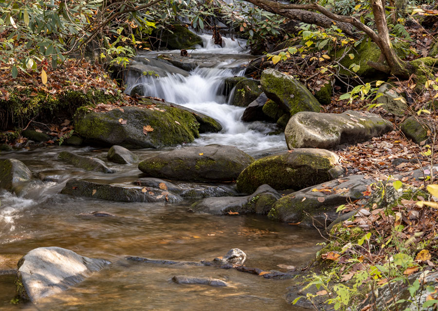
Thank you for your comments, Brenda. Here is the previous frame of the same scene, which shows more of the stream, but too me is not as dramatic. |
Jan 9th |
 |
6 comments - 4 replies for Group 69
|
11 comments - 5 replies Total
|