|
| Group |
Round |
C/R |
Comment |
Date |
Image |
| 26 |
Nov 19 |
Comment |
What an interesting rendition of this station. Without the clock it could almost be something from Star Wars! I like your crop so that the window is not centered. I would tilt even more to the left to get the center window panels more vertical. |
Nov 19th |
| 26 |
Nov 19 |
Comment |
I generally don't like to see a bird on a man made object - the fence, but it actually works well in this case. Your crop is good, and you have handled the background perfectly. I agree with Bobs comments about detail in the breast. |
Nov 7th |
| 26 |
Nov 19 |
Comment |
I like the black & white conversion as it tends to "hide" the bright blue sign in the center. However, on my monitor it looks very light and washed out. I think it needs more contrast or increase the blacks in "levels". The centered view works well here. |
Nov 7th |
| 26 |
Nov 19 |
Comment |
Tony, welcome to our group. I know you will learn a lot from our members.
I am really enjoying your first image. There is so much for me to look at, the colors are strong and vibrant, the story behind the image is wonderful and everything is perfectly sharp.
My only suggestion is to remove that piece of wood on the left side and maybe crop a little more from the left as Bob has suggested. |
Nov 7th |
| 26 |
Nov 19 |
Comment |
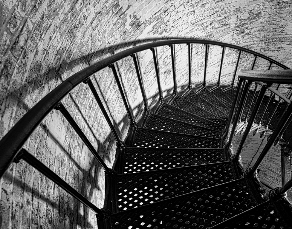
Bob, I love this type of photography. We know it is an architectural shot but it also has strong graphic content. The b&w conversion was a good choice as it concentrates my attention to the lines, circles, curves and other shapes in the image. Good idea to remove the signage on the bottom building. |
Nov 7th |
| 26 |
Nov 19 |
Comment |
Bob, you are quite right. It looks much better flipped. |
Nov 4th |
 |
6 comments - 0 replies for Group 26
|
| 69 |
Nov 19 |
Comment |
Your new crop makes the image too central for my taste. I would crop more from the left to take the flowers out of the center. In fact, I prefer your original crop as it shows more of the environment that these flowers live in. |
Nov 29th |
| 69 |
Nov 19 |
Comment |
What a perfect image to convert to black and white. My eye is drawn to the beautiful texture in the poplar trees and their reflection, while the brush in the background does not compete in any way. I would crop out the tree on the left which is different from the rest and detracts from the main subject. |
Nov 18th |
| 69 |
Nov 19 |
Comment |
The eye and beak are perfectly sharp. I think it is ok to have the wing tips blurred as it shows movement. Your second image does take the bird out of the centre which is an advantage. The background has been beautifully handled. |
Nov 8th |
| 69 |
Nov 19 |
Comment |
Brenda, the colors of the flowers and reflection are outstanding! I like the way you have handled the background. I have no problem with the greens or the reeds. It shows environment and you have muted them sufficiently. |
Nov 7th |
| 69 |
Nov 19 |
Comment |
I love the way you have improved this image by the crop and enhancing the saturation in the bushes. You have also created a lead in line from lower right. This would be better if you flip the image horizontally, so that the lead in follows the way we read from left to right. |
Nov 7th |
| 69 |
Nov 19 |
Comment |
Looks like the front sheep is smiling at you! I love the way that you have cropped this. By eliminating the sky, you have removed the bright background, concentrating my view on the sheep. How did you get them all to look at you - you must have worn a funny hat! |
Nov 7th |
| 69 |
Nov 19 |
Comment |
White pelicans are not easy to photograph due to the contrast between black and white feathers. But you have handled this well in this image. I love the stretched up wings which are so perfectly reflected in the water. Its also well cropped to give the bird plenty of space to swim into. I like this image very much. |
Nov 7th |
7 comments - 0 replies for Group 69
|
13 comments - 0 replies Total
|