|
| Group |
Round |
C/R |
Comment |
Date |
Image |
| 26 |
Dec 17 |
Comment |
Here is a revised version of this months picture. I used Nik color effex to bump up the colors as suggested. I lightened the water in the foreground, dodged the rock, and finally flipped the image so that the white water spray starts at the bottom left and moves the eye through the image.
Definitely more exciting, but is it too much? |
Dec 17th |
 |
| 26 |
Dec 17 |
Comment |
Difficult to know where to crop this one. I think your version is probably your best option as it eliminates the harsh shadow on the main animal. I think you need more contrast between the mud in the foreground and the snout of the hippo. I would also tone down the hot spots below the eyes of both animals. Time of day was probably your enemy here! |
Dec 12th |
| 26 |
Dec 17 |
Comment |
The colors make this image successful. Well done with the sharp focus, despite the subjects being underwater. |
Dec 12th |
| 26 |
Dec 17 |
Comment |
I find the wavy effect pleasing, but I would try to punch up the colors considerably. The blue sky is out of keeping with the rainy effect that you created. Did you consider cloning in a cloudy sky instead? People can be a distraction, but here I think they add to your composition. |
Dec 12th |
| 26 |
Dec 17 |
Comment |
Is this somebody else's art or have you done enough to make it your own? The angle that you present here is an improvement on the original. I find the reddish brown background to be too much in competition with the main subject. |
Dec 12th |
| 26 |
Dec 17 |
Comment |
This is a pleasing composition and the colors in the water are admirable. I find the bright blue area on the upper left to be a distraction that can be toned down. The curved lines in the foreground make the picture. |
Dec 12th |
| 26 |
Dec 17 |
Comment |
I agree with the previous comments. I also like your composition, as my eye travels across the buildings on the wharf to the cathedral towers on the right. The buildings on the hill are not distracting as my eye goes to the red house to explore that area. Your final result is a great improvement from the original. |
Dec 12th |
7 comments - 0 replies for Group 26
|
| 69 |
Dec 17 |
Comment |
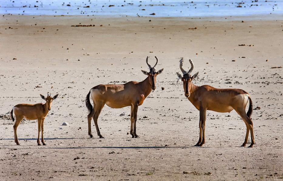
I have followed your comments and darkened the blue water at the top of the image, and added a vignette to the corners. I agree that this is a big improvement and the water becomes less distracting. |
Dec 17th |
 |
| 69 |
Dec 17 |
Reply |
I think if you had shown more of the concentric rings in the water, it would have provided the movement and been less static. |
Dec 13th |
| 69 |
Dec 17 |
Comment |
I understand all your comments about the bright area on the top of the picture. However, I feel it is an important part of the story to show the harsh environment that these animals inhabit on the salt pan. The close crop suggested by Candy does show the animals better, but could have been taken in a zoo! |
Dec 13th |
| 69 |
Dec 17 |
Comment |
The duck is nice and sharp except for the til, and the dark background helps to show it off well. The composition is somewhat static. |
Dec 12th |
| 69 |
Dec 17 |
Comment |
Nice capture of this unusual species (for us). I would crop off some of the right to take the bird out of the center. Wish you had waited for it to lift its head so that we could see the shape of the beak! Do you have more frames from this shoot? |
Dec 12th |
| 69 |
Dec 17 |
Comment |
This picture has a nice flow to it, starting with the light area on the top right and leading my eye to the running sand. I would like to see more at the bottom of the to see where the sand is collecting! |
Dec 12th |
| 69 |
Dec 17 |
Comment |
The black Anhinga against a white sky is difficult to handle. But the addition of the texture has solved this problem. The feathers are nice and sharp with enough detail. I am pleased that you did not convert to b&w as the green twigs add to the composition. |
Dec 12th |
| 69 |
Dec 17 |
Comment |
The squirrel is perfectly sharp on my monitor.It stands out well against the background, which has no distractions. I can see why you left in the tree on the right as it acts as a frame, but is out of focus and I think will be better without it. |
Dec 12th |
| 69 |
Dec 17 |
Comment |
An unusual presentation of the snake but it does work. Love the action and sharpness of the mouth and eye. I find the left side much too bright and is not clear to what it is. I tried burning it but maybe better to crop it out entirely. |
Dec 12th |
8 comments - 1 reply for Group 69
|
15 comments - 1 reply Total
|