|
| Group |
Round |
C/R |
Comment |
Date |
Image |
| 8 |
Feb 19 |
Comment |
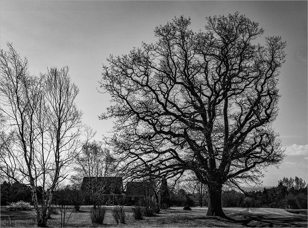
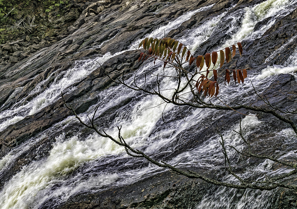
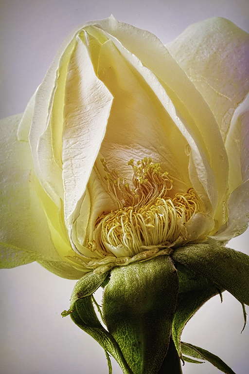
Nice graphic image Marcus. Winter ain't over, but still provides some great opportunities. I like the overall pattern of the branches and your decision to convert to B&W. You may like to strengthen the black levels and white levels to add contrast and bring definition to some of the stronger branches. |
Feb 22nd |
| 8 |
Feb 19 |
Comment |
Snehendu�� good composition and great colors. The reflections are very interesting and add to the image. The bird and the tree appear insignificant due to their size and placement. Possibly placing the bird as a silhouette against the moon would tie these elements to the composition. |
Feb 22nd |
| 8 |
Feb 19 |
Comment |
Mark.. nice and sharp image of spur and interesting embellishments. I like the idea of the "star" -but would have taken advantage of the natural highlight provided in place on the blue band. |
Feb 22nd |
| 8 |
Feb 19 |
Comment |
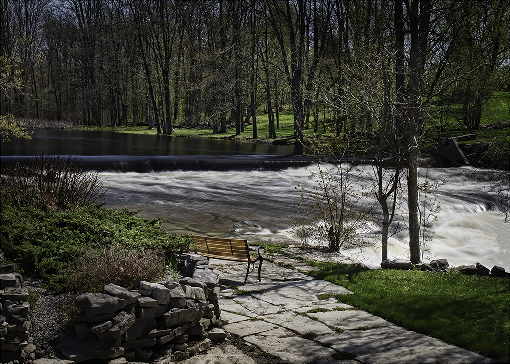
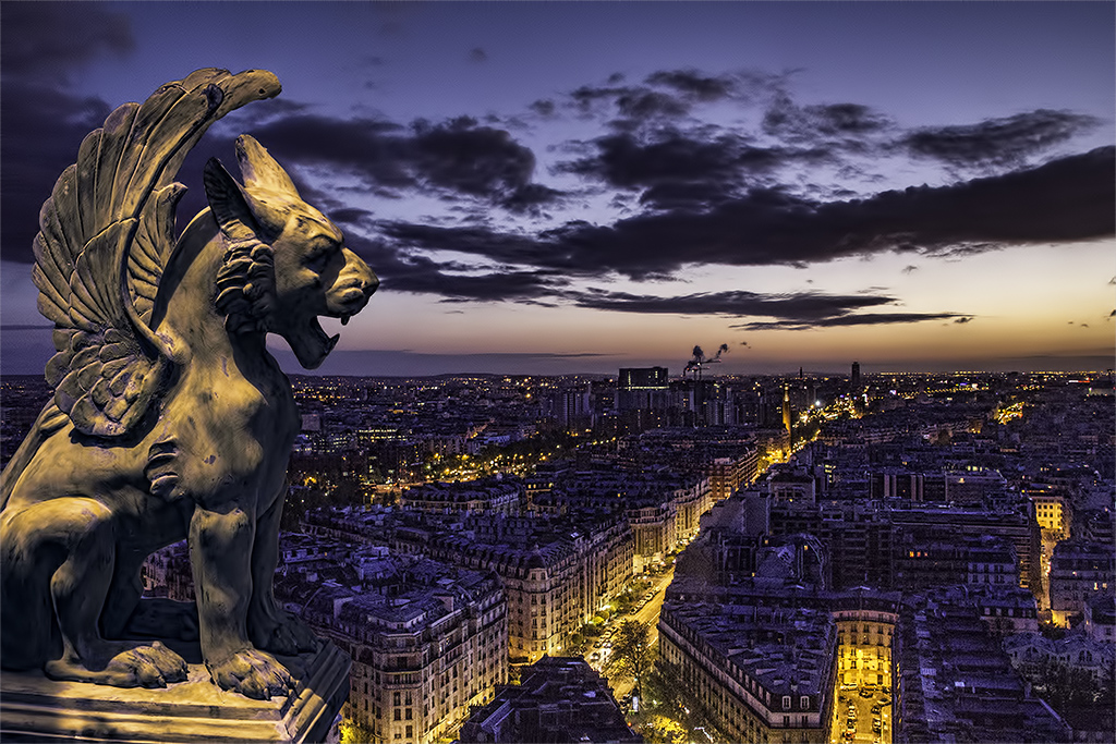
Alastair��this is in your backyard???Wow! This is a lovely image and the depth of layers takes the viewer from foreground to background to the skies. The complementary colors of orange and blues create an impact to the golden hour. You caught it just right..Great job! |
Feb 22nd |
| 8 |
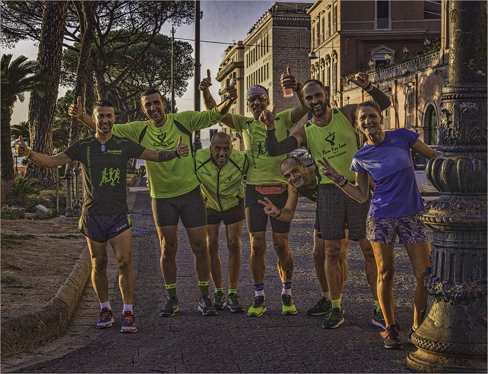
Feb 19 |
Comment |
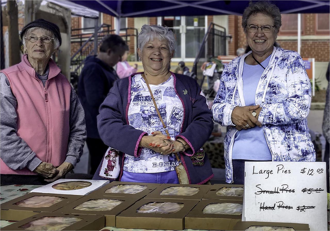
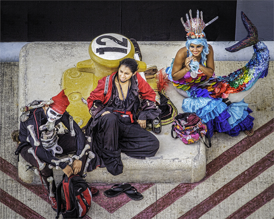
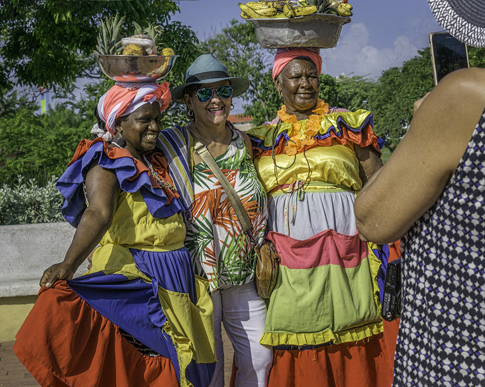
Nice memory of the event! The boy in the orange shirt is the center of attention although all are having a fun time. The composition is unified by the bright and vibrant colors of the kids' clothing which make them stand out in the crowd. These compositions are always difficult mainly due to trying to get the perspective and lighting right. |
Feb 22nd |
5 comments - 0 replies for Group 8
|
| 16 |
Feb 19 |
Comment |
Hi Terry...very creative idea and good post processing. Perhaps using the sponge tool to saturate the eye to bring out the yellow. I am not a big fan of the square crop which makes for a static image and makes the eye dead center. Perhaps an off-center crop to bring the eye area more into the "thirds". |
Feb 22nd |
 |
1 comment - 0 replies for Group 16
|
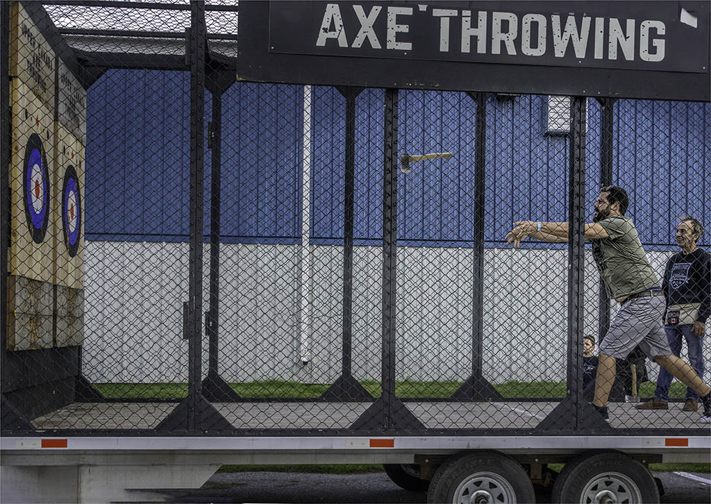
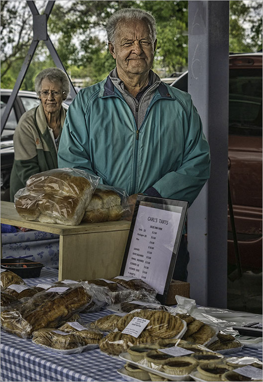
| 58 |
Feb 19 |
Comment |
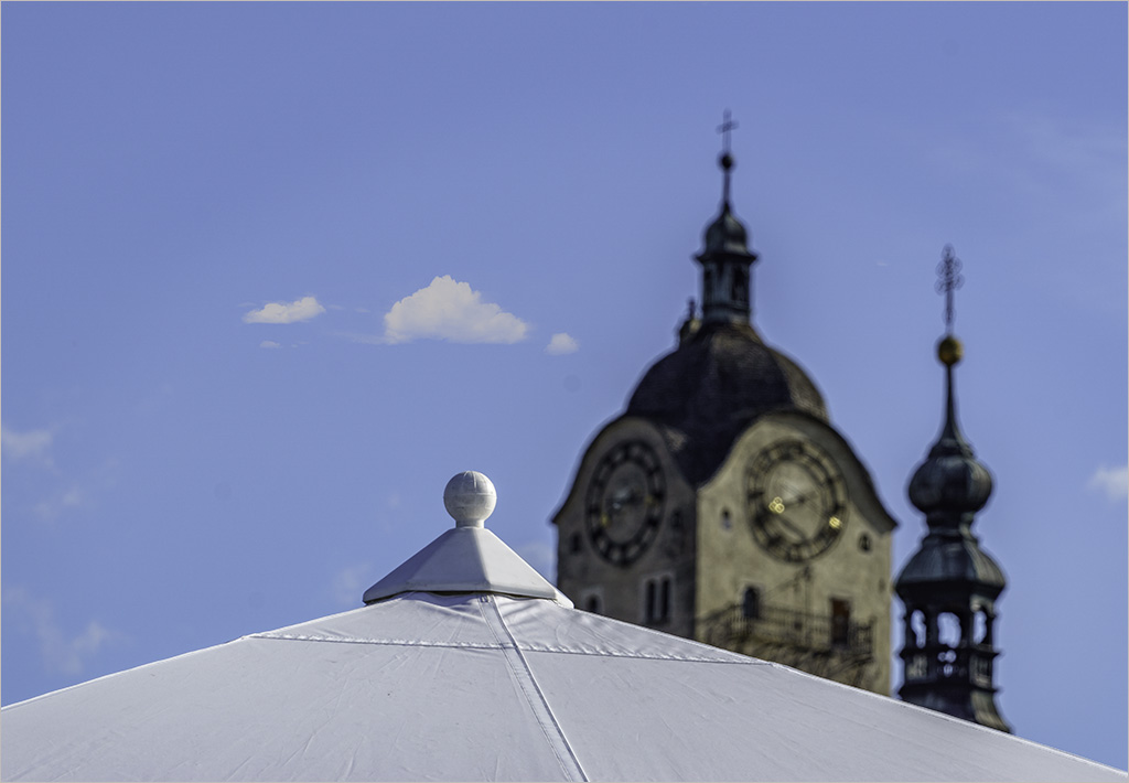
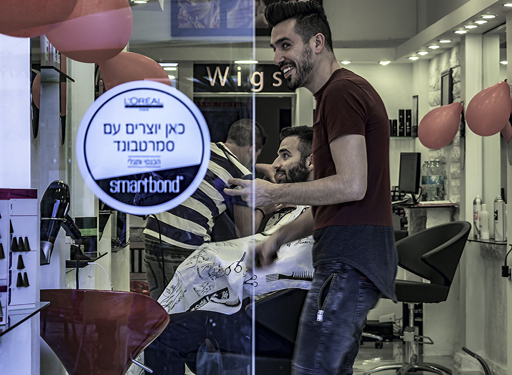
Daniel..a 'lil humor goes a long way. The tent also serves to advertise the owner's business - how clever. Your reflected image in the center also adds depth to the image. Nice capture! |
Feb 22nd |
| 58 |
Feb 19 |
Comment |
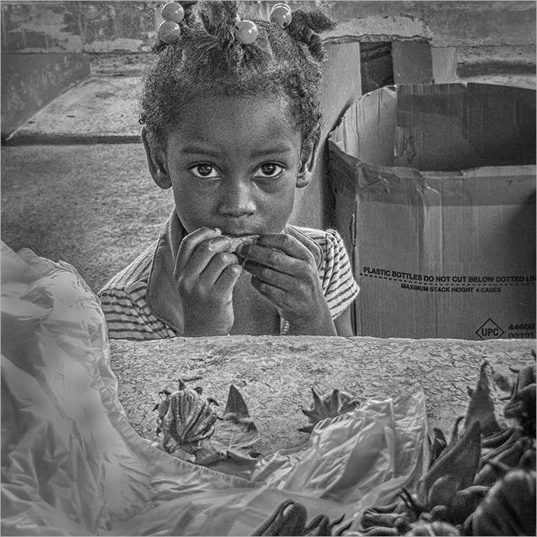
Jim��these events are always nice to attend and it looks like soup tastes best on overcast days. To me..the child's head and the smiley face bowl at the bottom edge of the frame is the story. As Dan mentioned�� at these crowded events it's hard to find an uncluttered frame. I agree with Isaac's adjustments. |
Feb 22nd |
| 58 |
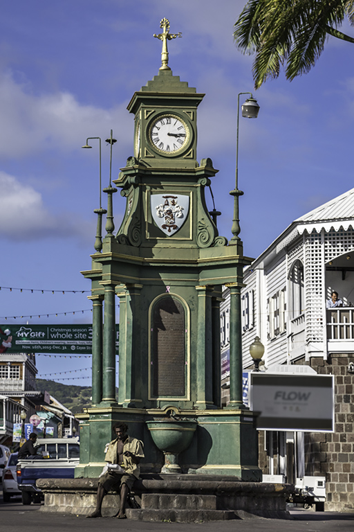
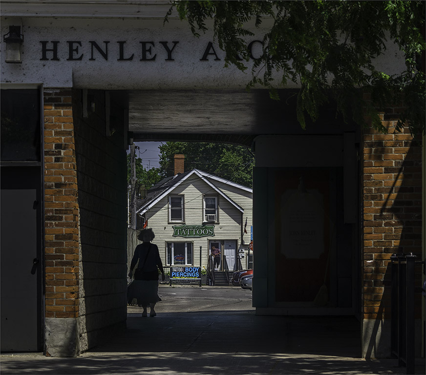
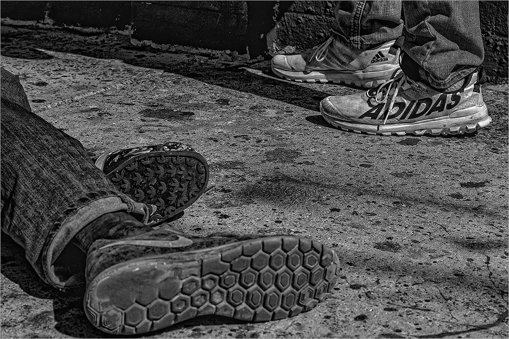
Feb 19 |
Comment |
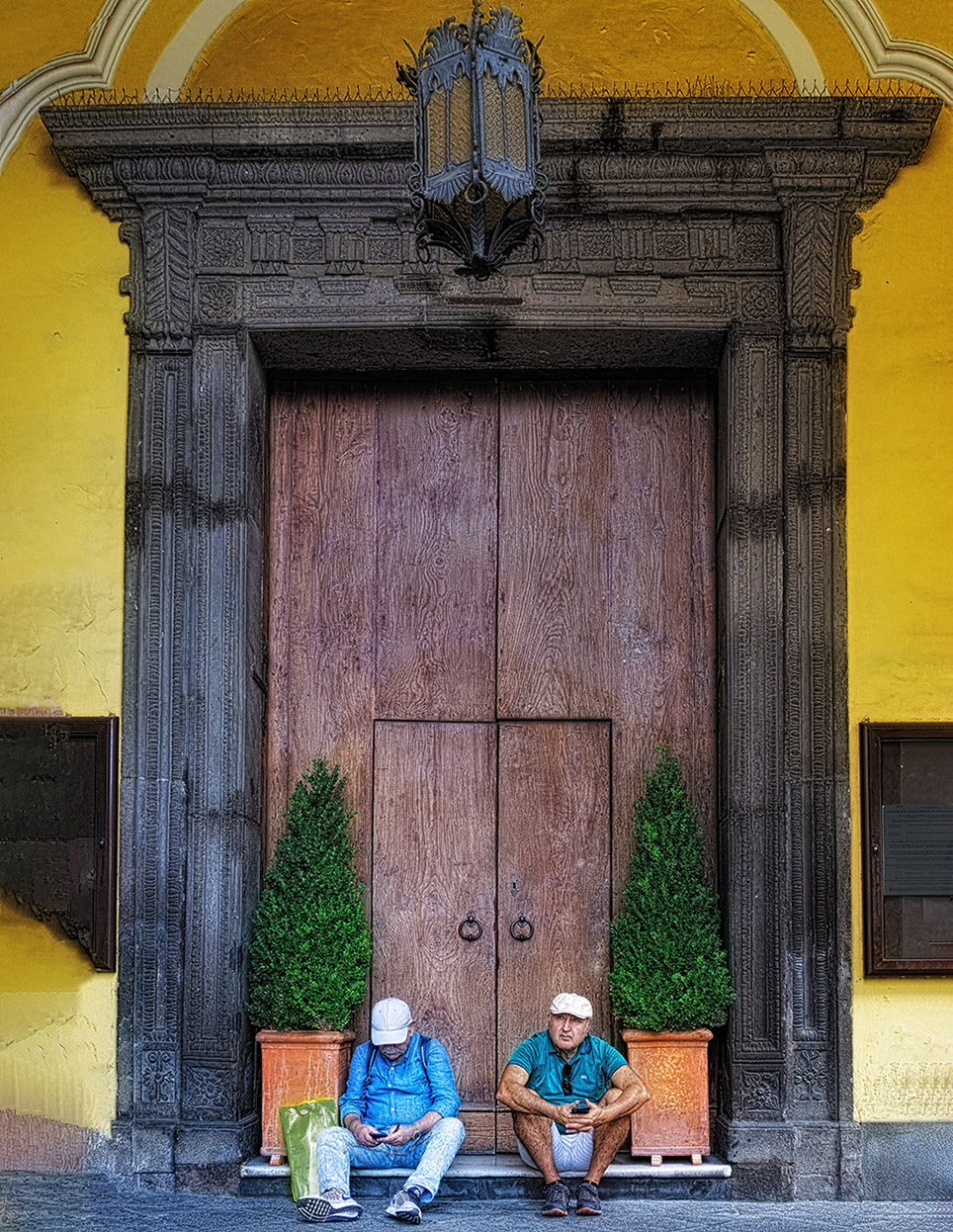
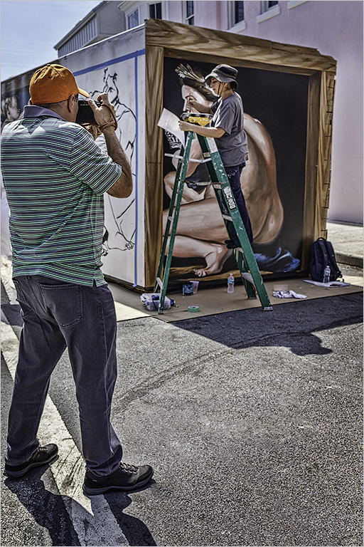
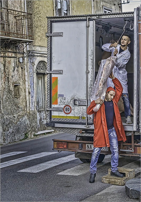
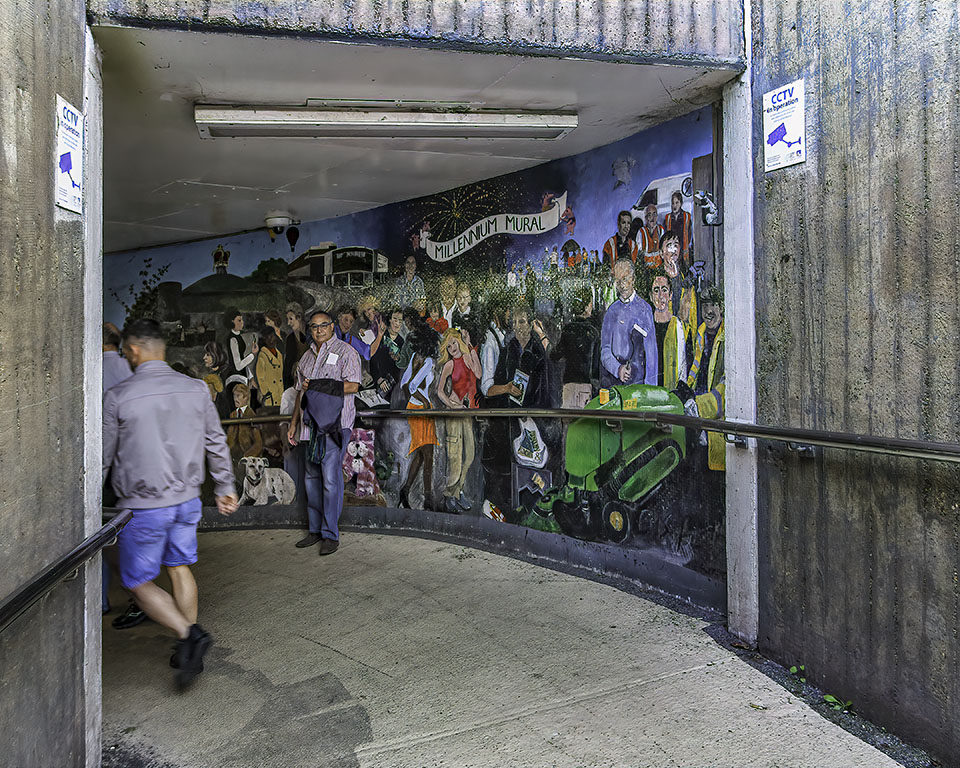
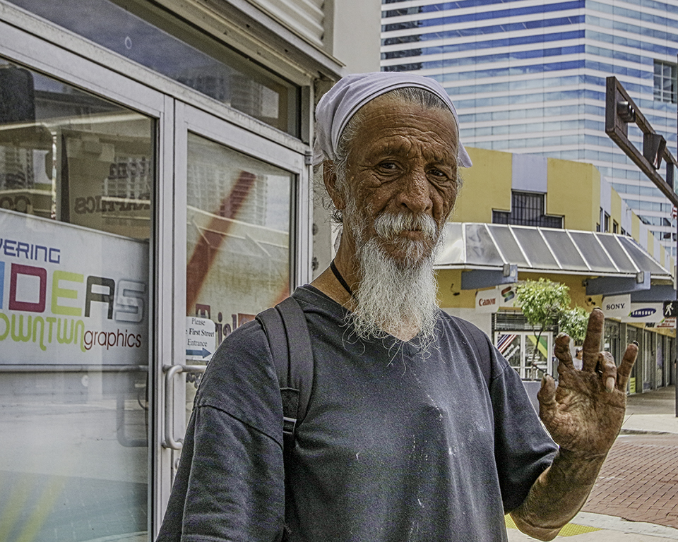
Dan�� good camera position!!!which shows a level beneath the sidewalk. The broom helps to make the connection between both levels of the street and to the man. The vertical crop emphasizes the poles and railing of the composition. The monotone conversion enhances the skin tones of the two men - is it a bronze sepia??? Nice job! |
Feb 22nd |
| 58 |
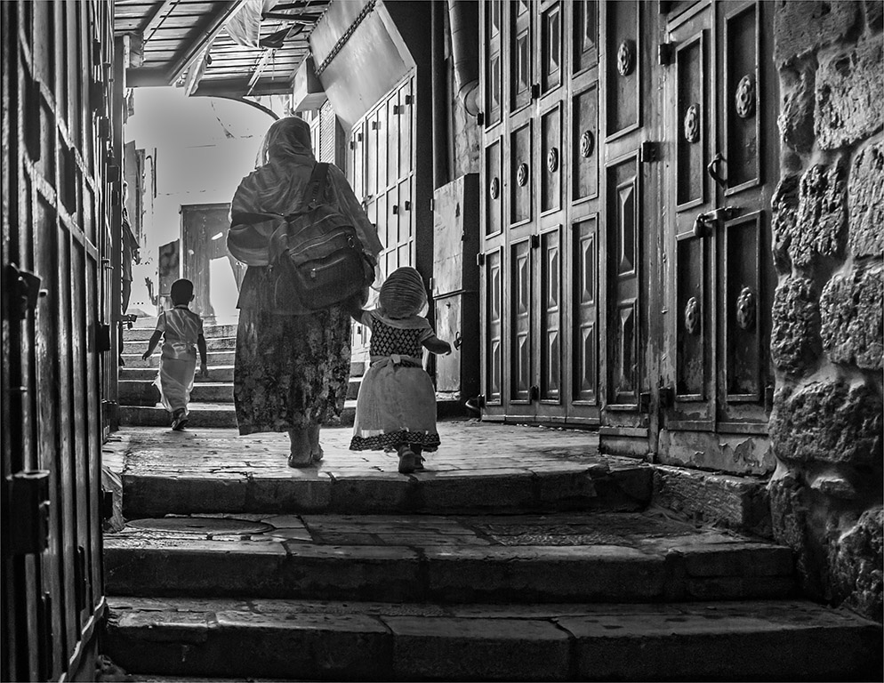
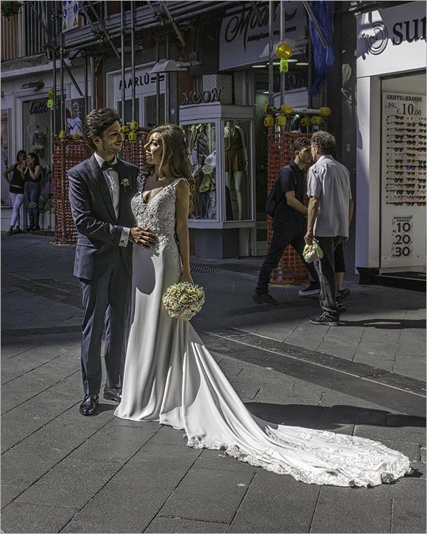
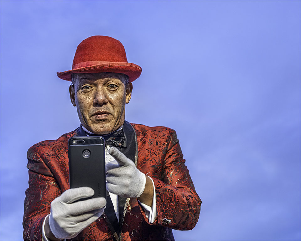
Feb 19 |
Comment |
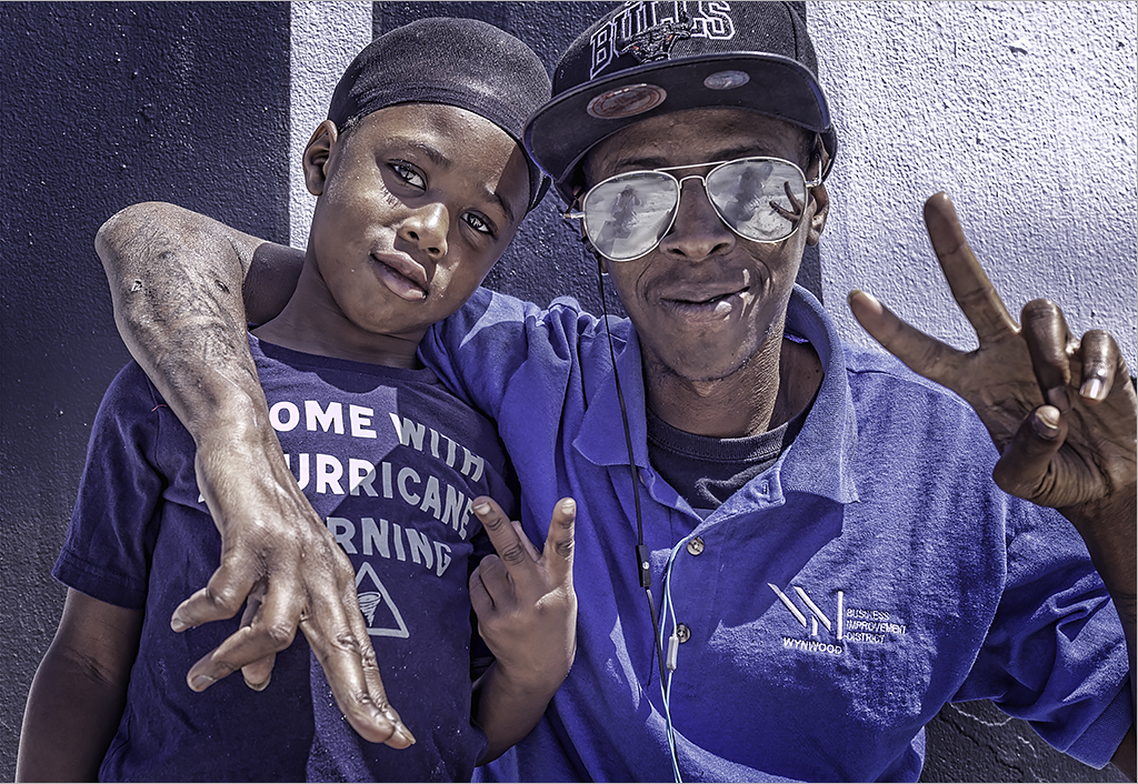
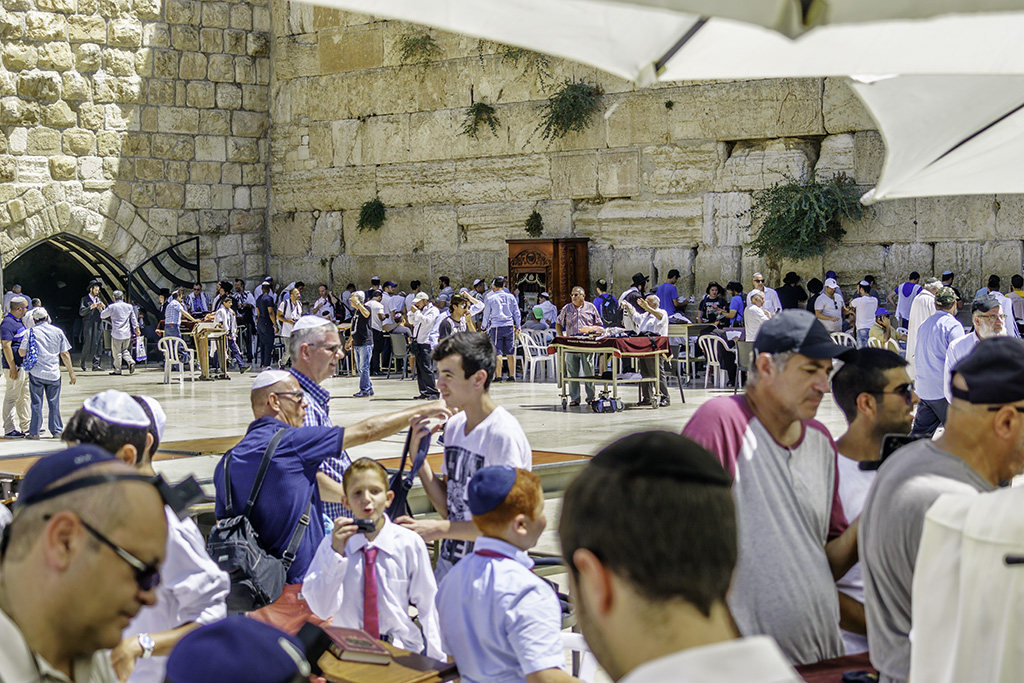
Lauren��welcome to the group and I look forward to seeing your images. Wonderful first image and so much to see. I presume the outstretched arm holding the cell phone provided the lighting to camera right---so I am in favor of keeping the whole image intact. I like the hands and feet of additional family members that surround the man and boy. There's a picture of an "imam???" watching the home from the ceiling. The textures of the walls and household goods add to the story of a home well lived in. Your image is sharp where it counts and converting to B&W simplifies the image and gives all the tones from deep blacks to whites. Well done! |
Feb 22nd |
| 58 |
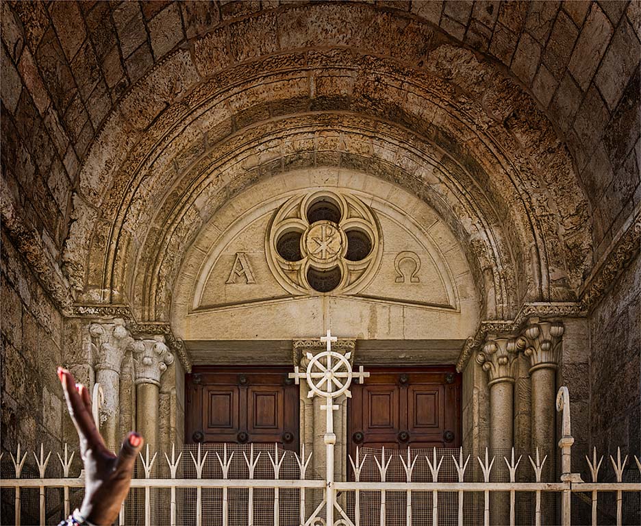
Feb 19 |
Comment |
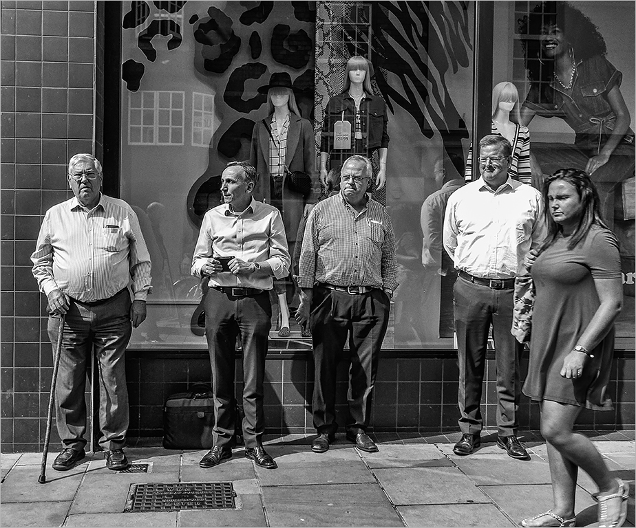
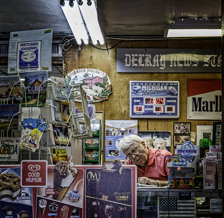
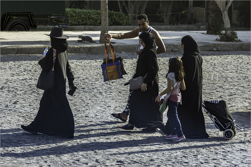
Hassan�� a "picture" within another "picture" and the reflections add another layer to the image. The cropped version removes some of the clutter in the background and adds more focus to the subject -the man who occupies the most area of the image. A B&W alternative would also be an option. |
Feb 22nd |
| 58 |
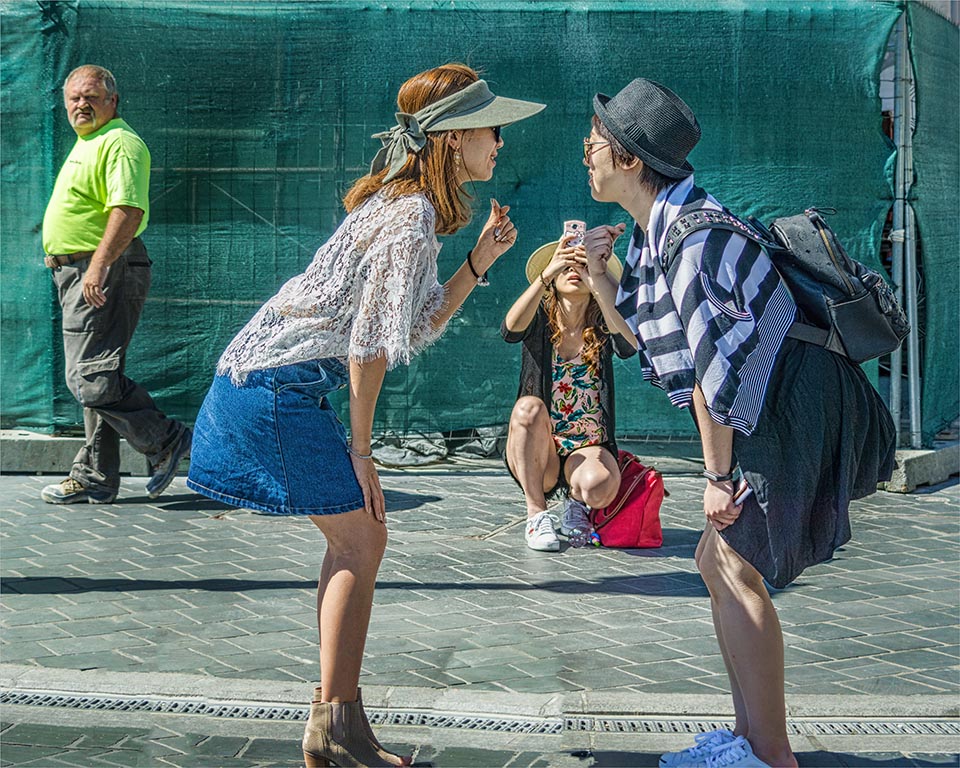
Feb 19 |
Comment |
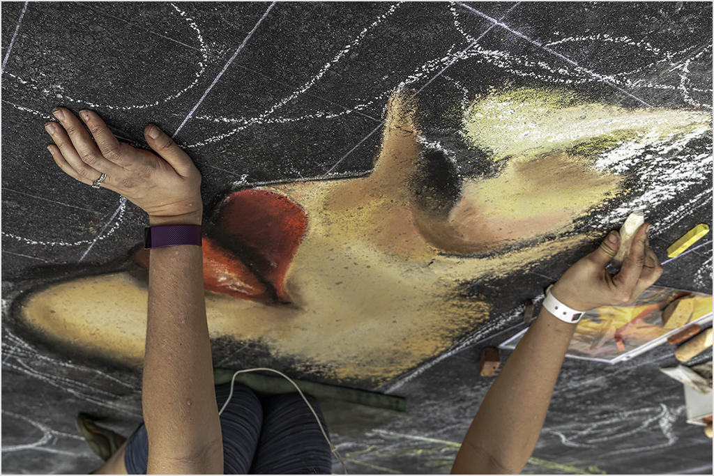
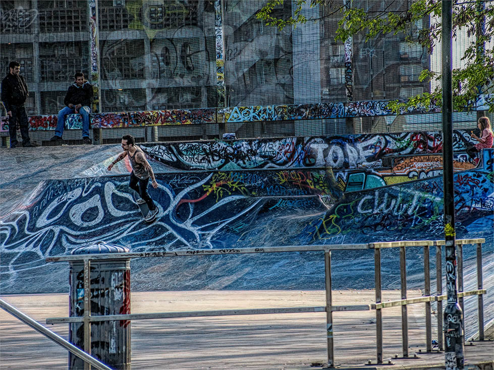
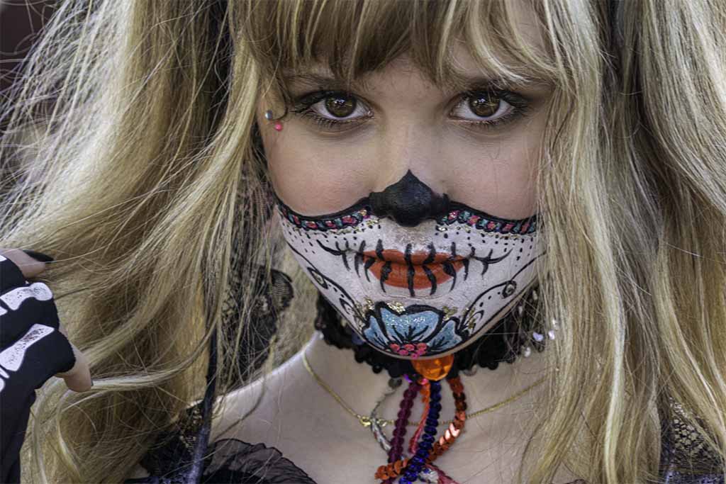
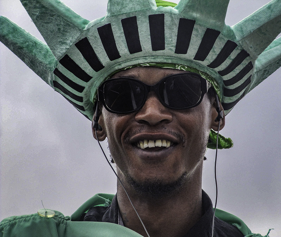
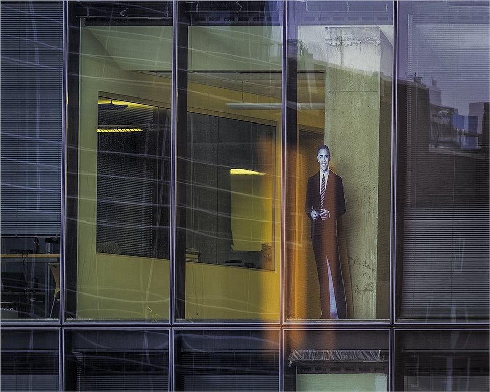
Isaac�� the interesting background adds to the story and the "hands" provide leading lines to frame the subjects. The color palette of blues and complementary oranges together with the graphic texture of the painted lines all add to make this a dynamic composition. You retained and included the screaming mouth at top left which provides tension and brings the viewer back to the focal point. Her closed body language does not indicate that she's buying whatever he's saying. Technically sharp and well processed.
|
Feb 22nd |
6 comments - 0 replies for Group 58
|
12 comments - 0 replies Total
|