|
| Group |
Round |
C/R |
Comment |
Date |
Image |
| 8 |
Oct 18 |
Reply |
Sounds like an interesting article...perhaps a submission to PSA magazine? |
Oct 24th |
| 8 |
Oct 18 |
Reply |
Permission granted. Appreciate your comments Stephen. Just an observation and not meant to be critical...by altering the perspective and straightening the vertical edges of the building, the horizon line of the image changes and brings the viewer's eye level to the base of the building. |
Oct 24th |
| 8 |
Oct 18 |
Comment |
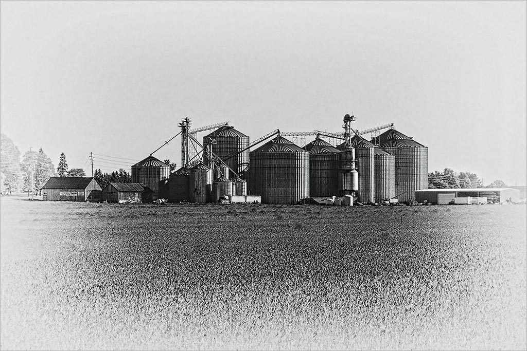
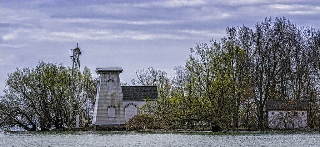
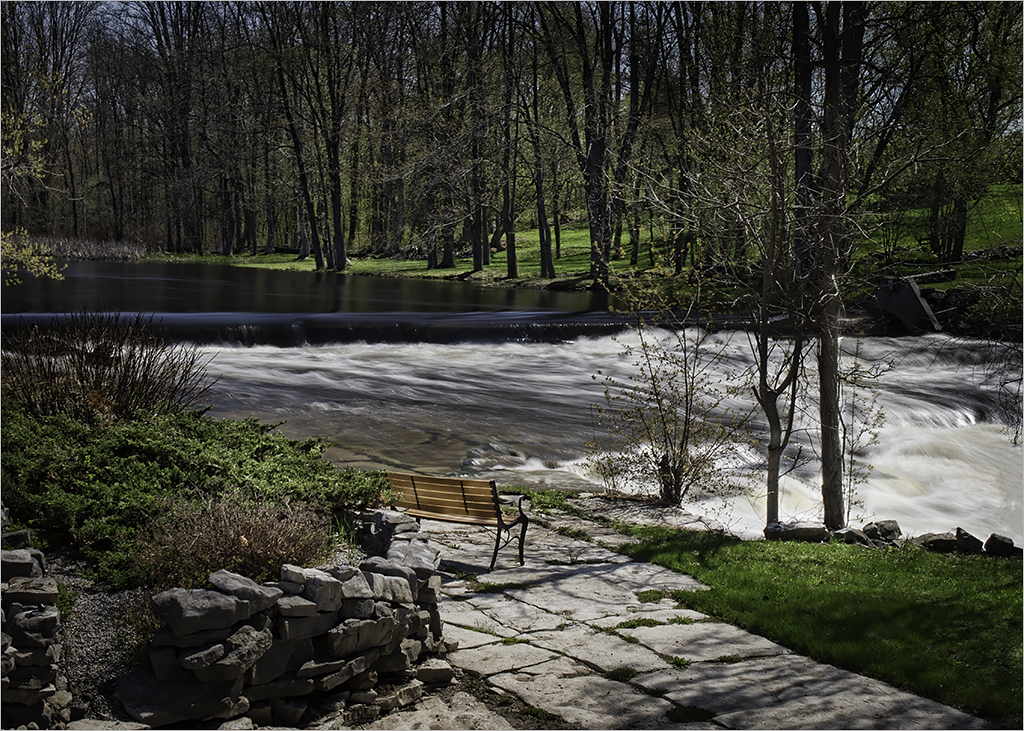
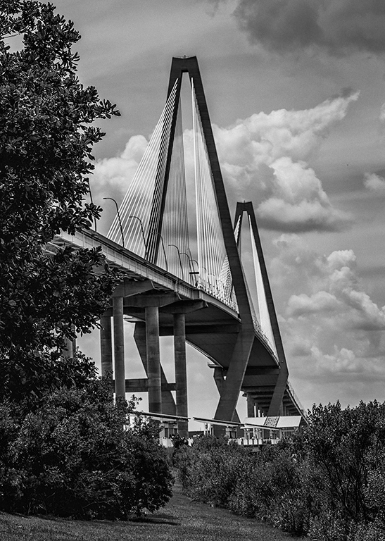
Marcus, awesome sky and 5 shots captured the tonal range. It certainly dwarfs the small town with the church. Interesting that the boats are all covered. Perhaps straightening the buildings on the extreme right and left of the image which appear a tad off. |
Oct 21st |
| 8 |
Oct 18 |
Comment |
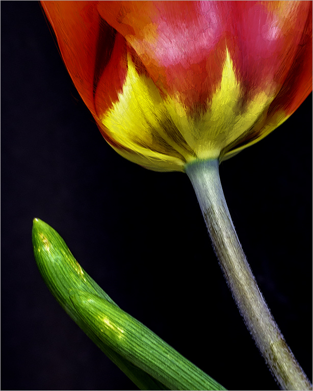
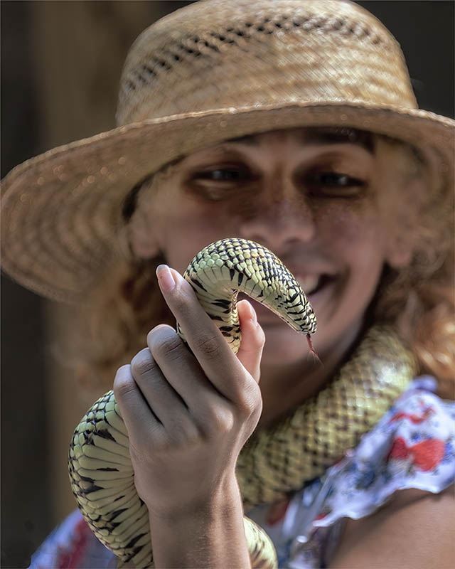
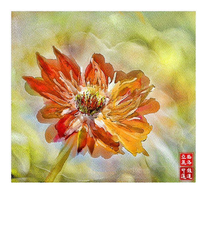
Very painterly Snehendu! The classic reds/whites/blues combination work well in this case. The S-curves of the necks and the triangular tails and beaks make this composition pleasing. The two ducks fills the odd space in the background. Making the old new again- ain't technology grand! |
Oct 14th |
| 8 |
Oct 18 |
Comment |
Nice shot Mark. I echo the sentiments make by the others. I also like how the apex of the mountain ridge provides a leading line into the back of the image. The vertical format and the 90/10 horizon line are also departures from the norm that make this so interesting. |
Oct 14th |
| 8 |
Oct 18 |
Comment |
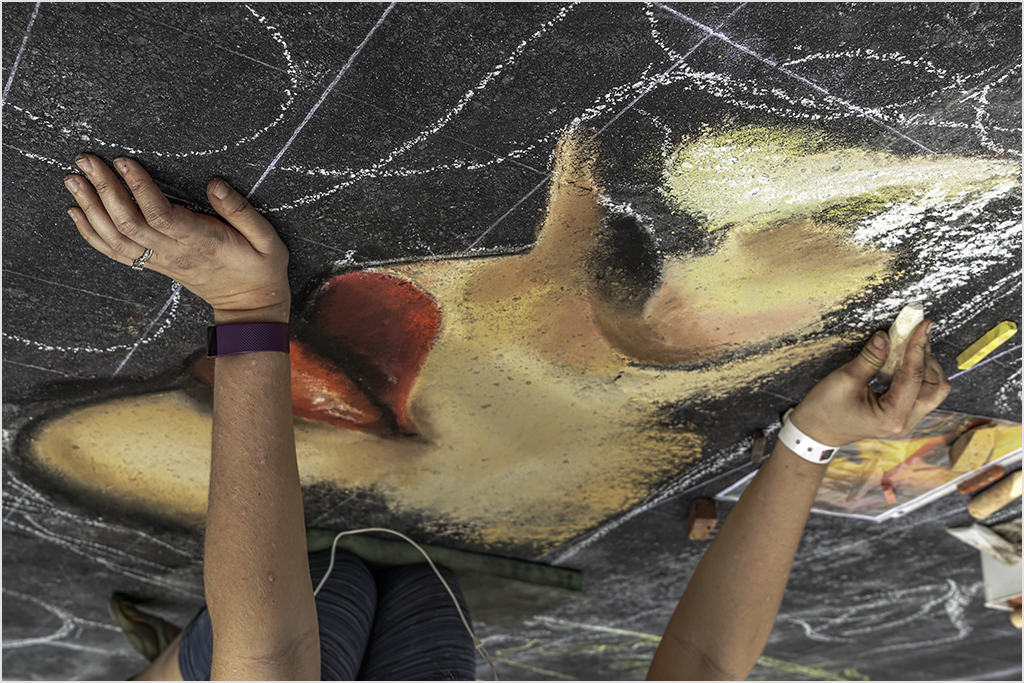
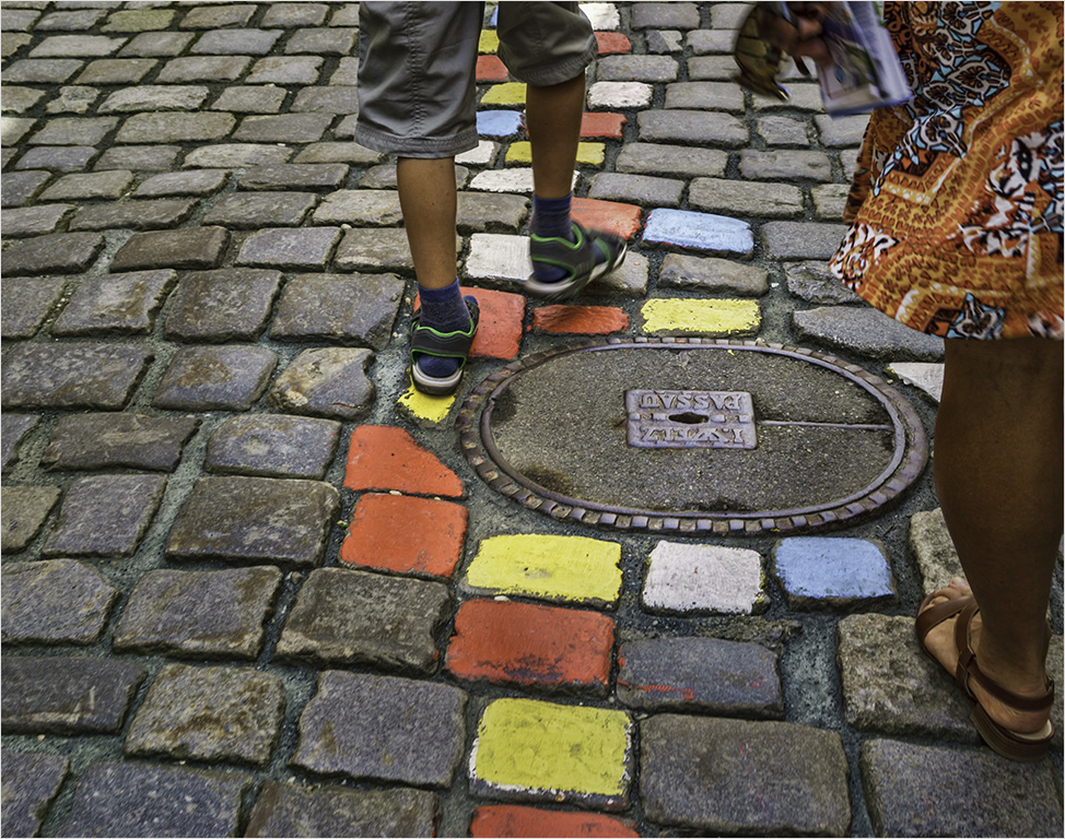
Alastair�� I like how the colors stand out against a black (or almost black) background. I have often used the "Levels" slider to pull the blacks further and this technique would easily remove the pot rims from view. I am drawn to the large puddle of water in the lower third of your image and the surrounding leaves "point" to this as a natural focus point; for this reason I would crop from the right (a/b 10-15%). Lovely image and the water drops are a bonus! |
Oct 14th |
| 8 |
Oct 18 |
Comment |
Interesting that you were able to combine two images into a composite. Composites require a lot of imagination (and work) and you did a good job! Perhaps placing your figures into an area of bare rock would have separated them from the background. The shadows of the figures and the lichens fall in opposite directions and flipping the image of the lichen horizontally (easier) would make the lighting on both images match up. |
Oct 14th |
5 comments - 2 replies for Group 8
|
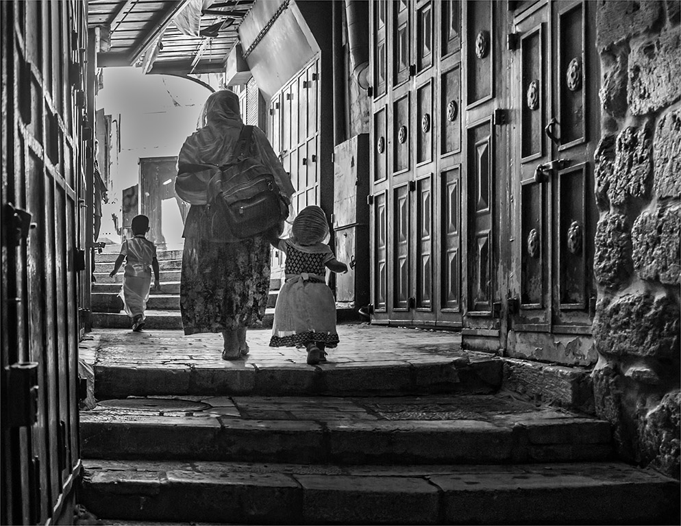
| 58 |
Oct 18 |
Comment |
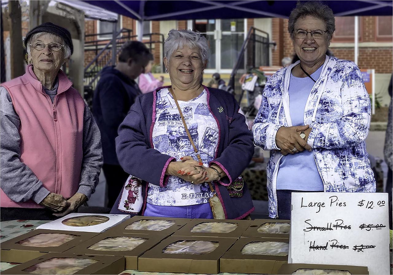
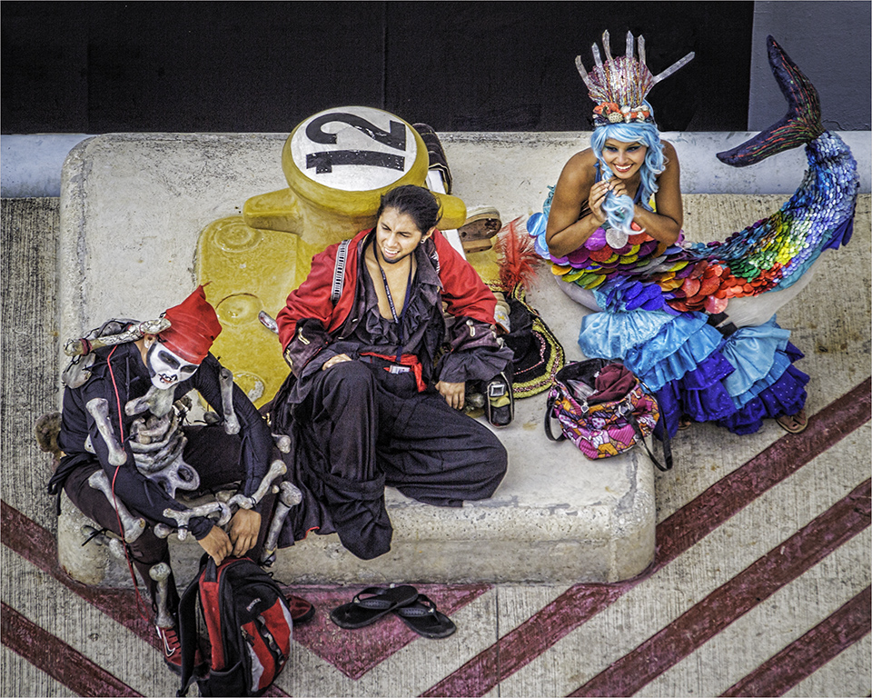
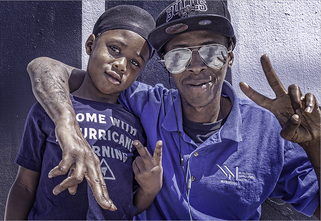
Jim... the composition with the group of three makes your image all the more interesting. The mother's arm gesture provides a leading line to the child's face - the only face that we see and providing a definitive focus point. The parents' clothing are unobtrusive and add to the color harmony. Very engaging shot. I agree w/ Isaac's crop. |
Oct 26th |
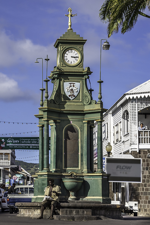
| 58 |
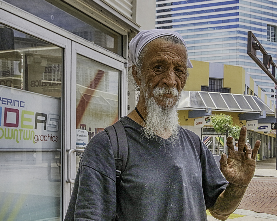
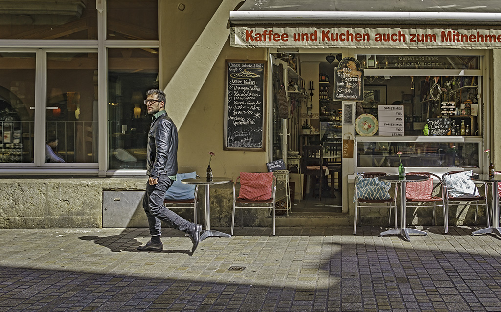
Oct 18 |
Comment |
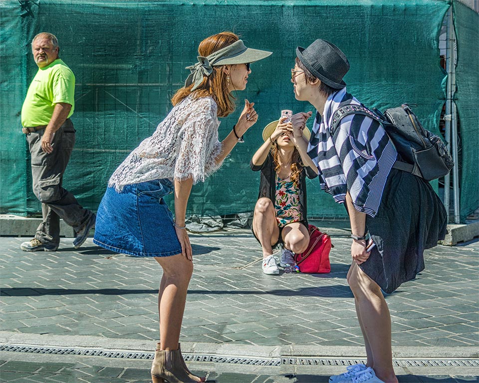
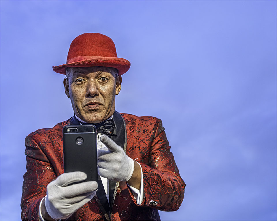
Deborah ��nice composition with the lone man in his own clean space. Lots of leading lines including the diagonal tiles on the sidewalk. Amazing how clean the sidewalk is and free of trash! What makes this man interesting is that he's not texting or on some digital device - just old school. The background adds depth and shows different architectural styles and textures. Perhaps cropping a bit from the right to exclude the lamp post. |
Oct 17th |
| 58 |
Oct 18 |
Comment |
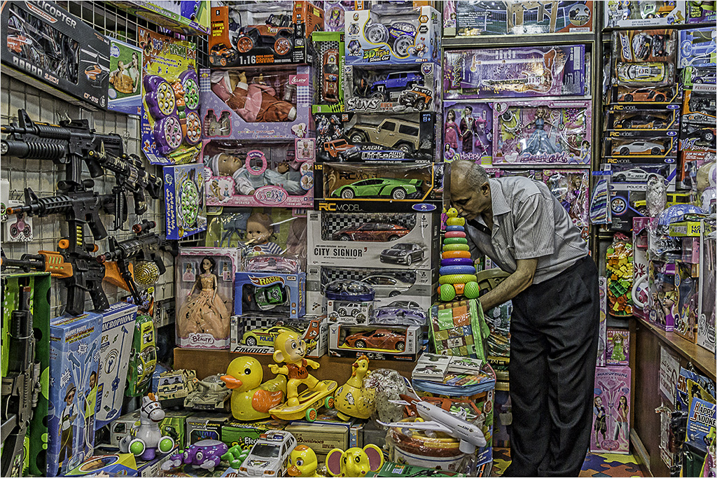
Daniel��this scene is sad but true. I like the pained expression on the statue's face and turned away from the activity. Composition-wise, I like that the youngsters are in their own floor space(2/3's) and the art is placed on the red carpet (1/3). The reflections/shadows adds interest to the shiny floor surface. The touches of black on the clothing and shoes of the three youngsters unifies them as a group and grounds the image. I believe this would also work well in Black & White. Thank you Isaac! for straightening the image. |
Oct 14th |
| 58 |
Oct 18 |
Comment |
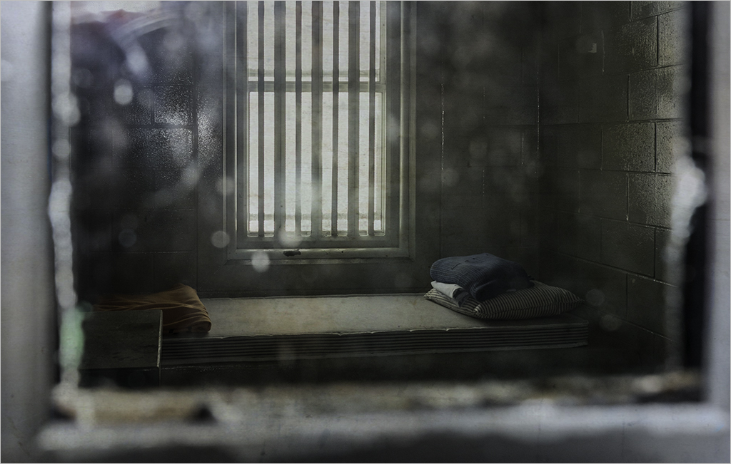
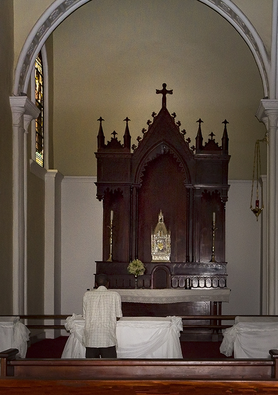
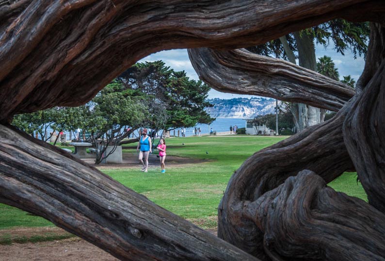
Dan ��good use of a framing device to take the viewer into the image. The gnarly tree texture adds curves and unifies the image with a subdued color. I offer an alternative crop to Isaac's. To clean up the edges/borders of the image, I have included the tree to completely surround the central window as far as possible which leaves only the lower left corner open. There are many alternatives to a crop with no right or wrong. Nice and interesting capture! |
Oct 14th |
 |
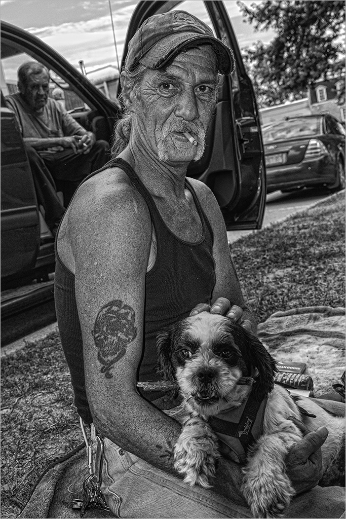
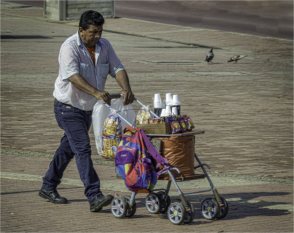
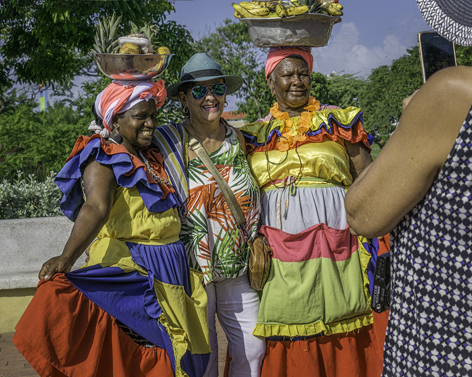
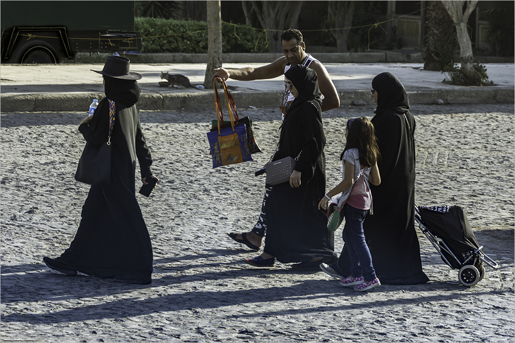
| 58 |
Oct 18 |
Comment |
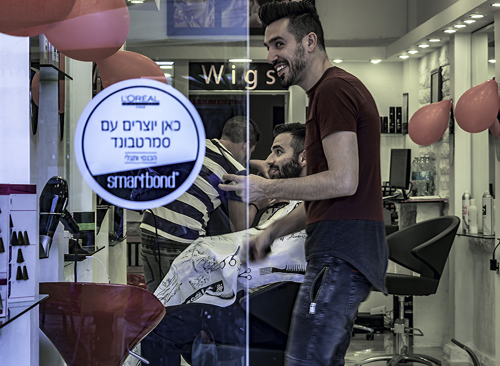
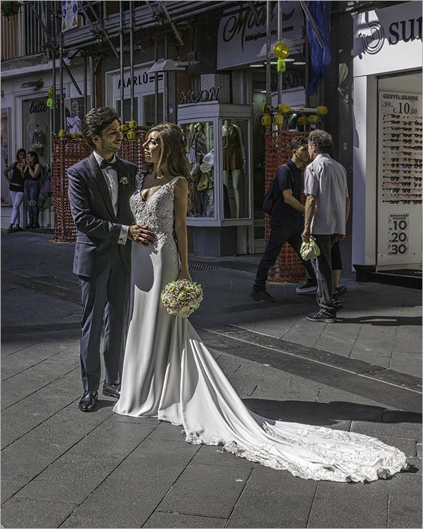
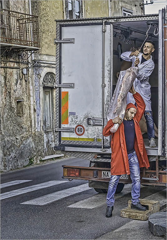
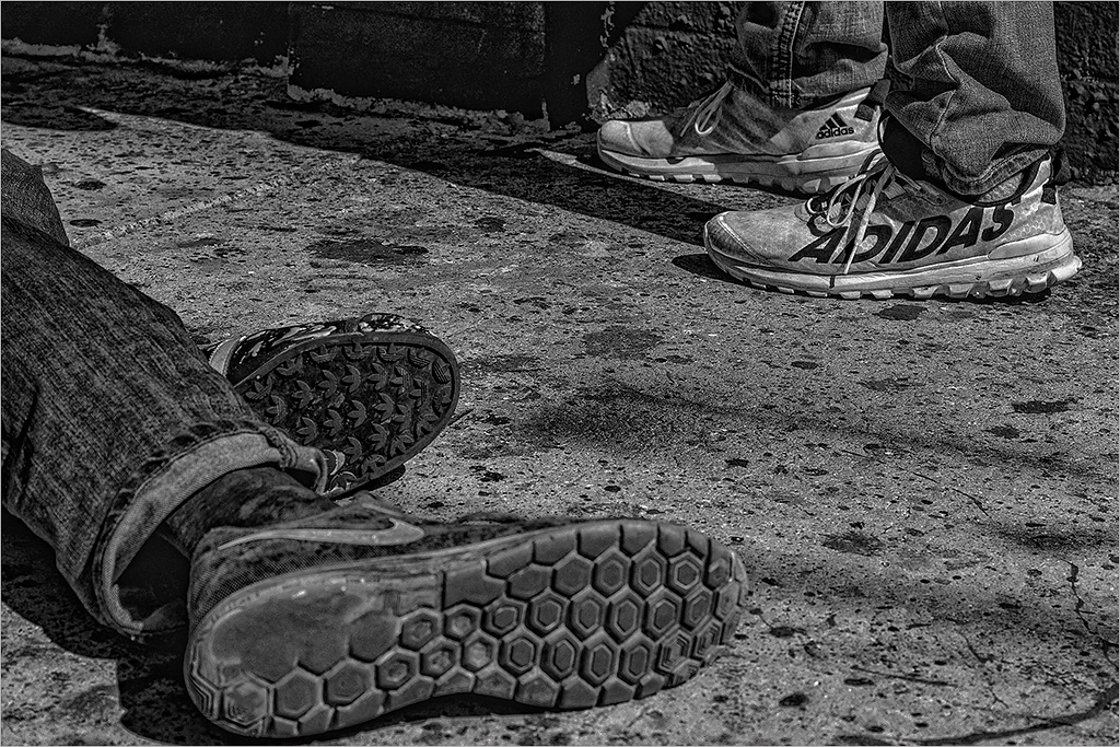
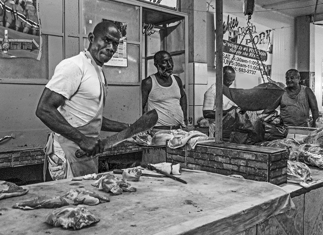
Hassan, I also like the two men headed in opposite directions with their trolleys. The oncoming man's face is shrouded by the towel on his head which makes for a story. The shapes and the sense of movement point to an active and busy hallway. Conversion to B&W is a good idea. I myself thought the image a tad soft on the subject/s, although sharp on the "exit" sign an area of high contrast. |
Oct 14th |
| 58 |
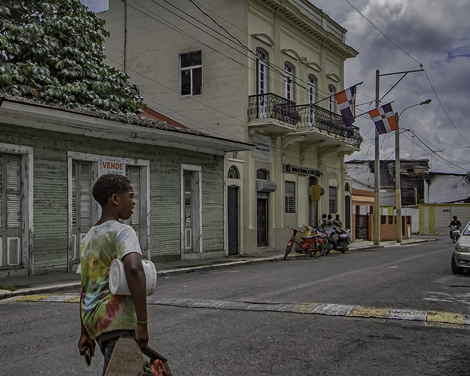
Oct 18 |
Comment |
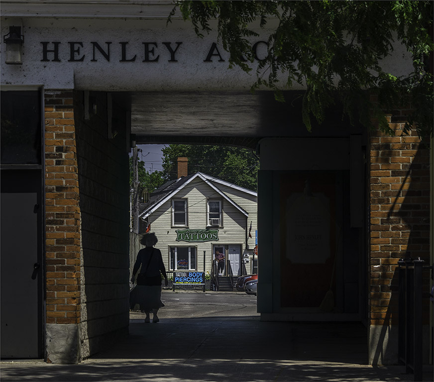
Hope you did not eat at this restaurant Isaac! All kidding aside- I like how this cook is framed in the doorway and the white smoke contrasts against the dark interior. The faceless man adds a sense of mystery to the story. The various textures of the wall, door and sidewalk and the red bits of paint on the wall which surround the subject, including the puffs of smoke all help to make this an interesting image. Good eye! |
Oct 14th |
| 58 |
Oct 18 |
Reply |
Stephen..thank you for taking the time to stop by to comment on the image and presenting an alternative version. For a little on the back story��the 3rd element includes the person in the background (Ernie) featured in my submission last month i.e. September. For my street photography I generally like to include the environment of the individual as I feel it adds to the story telling. I would like to encourage the other members of Group 58 to comment on Stephen's version as well. |
Oct 5th |
7 comments - 1 reply for Group 58
|
| 67 |
Oct 18 |
Comment |
Hi Larry...just discovered your group! I belong to Gr 8 and 58. Just thought I would chime in about your image. My only thought is that the main blue color in your image is more akin to a Prussian Blue and perhaps adding a bit of magenta to minimize the blue cast. |
Oct 26th |
1 comment - 0 replies for Group 67
|
13 comments - 3 replies Total
|