|
| Group |
Round |
C/R |
Comment |
Date |
Image |
| 8 |
Jan 18 |
Comment |
Very creative Marcus!! All layers are sharp and the black background make the ingredients stand out. These compositions require a great deal of effort and I hope you got top marks at your camera club. I am also not a fan of the letters myself - I think your creation speaks for itself. |
Jan 12th |
| 8 |
Jan 18 |
Comment |
The eyes have it!!! You mentioned using Photoshop to composite all the kids.. shows your creative side as well as your post processing skills. Just beautiful. |
Jan 12th |
| 8 |
Jan 18 |
Comment |
Mark I like the out-of-bounds technique used here and the strong verticals provided by the frame as well as the trees and the tower. The image itself looks like there are a nice range of tones and perhaps a simple B&W would be an alternative look. To me the water "channel" leads my eye out of the frame instead of in. |
Jan 12th |
| 8 |
Jan 18 |
Comment |
Alastair��I like the black silhouette of the boat against the colorful sky and the strong diagonal of the mast. The details of the dangling strings and hooks make this image all the more interesting; as well as the texture of the clouds and sky. Lovely image. Because the lower right corner of your image is lost and merges with the black background of the monitor, may I suggest a white stroke to frame your image. |
Jan 12th |
| 8 |
Jan 18 |
Comment |
Amparo.. Happy New year to you too!! Great shot and the eyes are tack sharp. I like the conversion to B&W. Presumably this was shot in a studio- because the lighting looks perfect. Perhaps you can share some details of how this image was taken. |
Jan 12th |
| 8 |
Jan 18 |
Comment |
Nice composition and well balanced - the horizon is on the thirds and the complementary colors of orange and purples work well together. The sky and clouds definitely are more interesting than the ocean. On the technical side.. I would be interested in knowing why you shot in "Shutter Priority" - I am assuming that this was handheld?? I also own this heavy lens and have difficulty holding it steady. |
Jan 12th |
6 comments - 0 replies for Group 8
|
| 58 |
Jan 18 |
Comment |
Elizabeth..this is a great architectural shot with strong leading lines and interesting details. The circular window at the end provides a focus and leads the viewer through the image. The vertical /portrait format adds to the image. |
Jan 25th |
| 58 |
Jan 18 |
Reply |
Thanks for your feedback Hassan. About the woman photographer to the right of the frame ��Except for straightening, the image is straight out of camera. I do feel that even if I had a complete shot of the woman photographer the "story" would be different.
|
Jan 15th |
| 58 |
Jan 18 |
Comment |
Isaac .. this store is chock full of stuff and the smoke and veil add to make the image very interesting. I am drawn to the intensity of the woman's eyes and the smoke adds to the mystery. This image has a clear and defined subject. May I suggest cropping the image to the left and bottom to make the woman more prominent in the frame and exclude some of the paraphernalia in the store.
|
Jan 12th |
 |
| 58 |
Jan 18 |
Comment |
Daniel - clean image and uncluttered background gives focus to the subject. The man is counterbalanced by the two boats in the upper background and the different textures of the sand, water and the rocks add interest to the image. I prefer the original image as presented because I feel that the man is walking towards and facing me as opposed to walking away from me. A suggestion is to also consider a vignette to darken the corners. |
Jan 12th |
| 58 |
Jan 18 |
Comment |
Jim this is a beautiful capture of your grandson and you managed to capture the catchlights in the eyes. I like the leaves framing the face of the "animal" and the face and eyes are in the clear. Well composed and balanced image and even lighting. I agree with Isaac's square crop. Probably also look good in B&W for a timeless image. |
Jan 12th |
| 58 |
Jan 18 |
Comment |
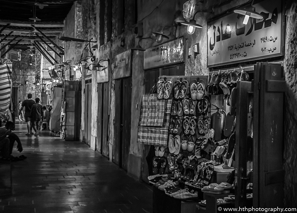
Hassan this is an interesting street scene and the early morning meant that you were able to capture the area before the crowds. Faced with difficult lighting conditions and the blue cast mentioned by Isaac, I offer an alternative version in B&W using one of the presets in Nik software without any adjustments. I like the original and included the shadowy figure on the left of the frame as I feel it adds some tension to the image and prompts the viewer to investigate further. |
Jan 12th |
 |
5 comments - 1 reply for Group 58
|
| 62 |
Jan 18 |
Reply |
Thanks Elinor... I didn't notice the "pointy" things until the file was closed..and by then it was too late :( (They are supposed to be cracks on sheets of ice..but my technique was off. |
Jan 15th |
| 62 |
Jan 18 |
Comment |
Gerhard.. sometimes we need to re-visit a painting because we have now achieved the skills and experience that we have gained with time. I compared your 2015 painting to this submission and I can immediately see the difference in skill. I like the leading lines that take you along the street to the back of the horizon line. The textures of the your painting and the brushwork add interest throughout. The colors you chose for the sky add to the painting without distractions. |
Jan 13th |
| 62 |
Jan 18 |
Comment |
Lovely painting Elinor and one creative way to save the memory of the flowers. The background you added harmonizes with the colors of the painting. The lemon colored rose in the center of your painting is the obvious focus and I like the way it stands out against the darks. |
Jan 13th |
| 62 |
Jan 18 |
Comment |
Tom.. the reds and greens work well together. The trouble with fruit in the supermarket these days is that they are devoid of leaves and I noticed a couple of leaves in this bushel which I personally would have emphasized to add to the appeal. Composition is straight from the photo- but you may want to consider a selective crop (pardon the pun) which would make one of these apples the focal point. |
Jan 13th |
| 62 |
Jan 18 |
Comment |
Angela, I love the colors and textures of your painting which looks almost like an abstract. I agree that the blue background is distracting- probably because it stands out as a complementary color - perhaps a richer, darker hue in the same color family ?I do like the brush strokes and the variation of lights, mediums, and darks ��reminds me of Georgia O'Keefe |
Jan 13th |
4 comments - 1 reply for Group 62
|
15 comments - 2 replies Total
|