|
| Group |
Round |
C/R |
Comment |
Date |
Image |
| 8 |
Nov 17 |
Reply |
Thanks for your suggestion - this helps! |
Nov 23rd |
| 8 |
Nov 17 |
Comment |
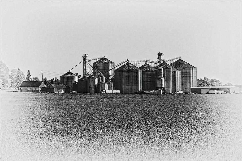
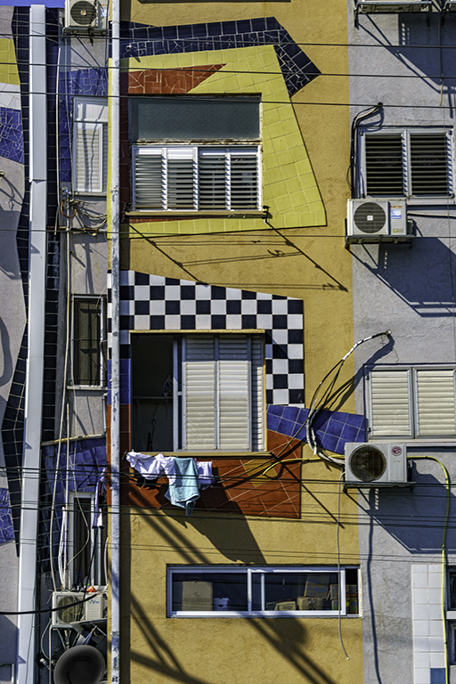
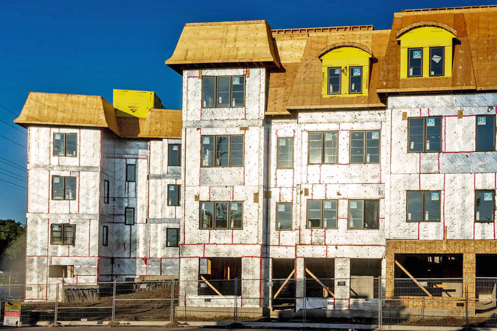
Hi Marcus.. I like the color version myself. The construction of the building shows the shell and the skin which makes for an interesting image. The cloudless sky also adds to the image and adds a touch of blue against the yellow. To me, there appears to be a color cast although this may be just the website. I added a curves layer twice to your image and opened up some of the shadows to reveal the back of the garages. It may be a brighter than what you experienced first hand. |
Nov 17th |
 |
| 8 |
Nov 17 |
Comment |
Your final image is well composed and the elements and suggestive meanings are all included. To me, the vertical tree ties in with the staff. I also like the diagonal streak of light from the sun. Very nice! |
Nov 17th |
| 8 |
Nov 17 |
Comment |
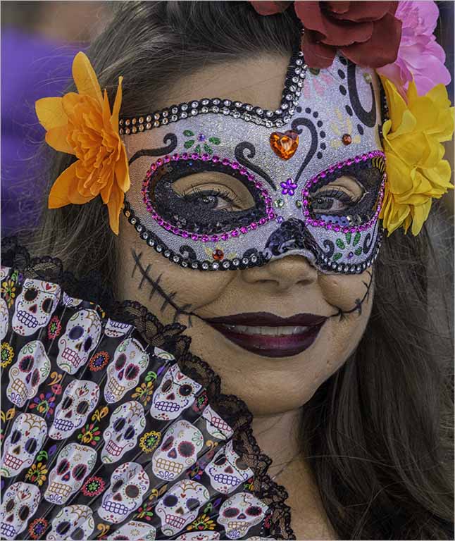
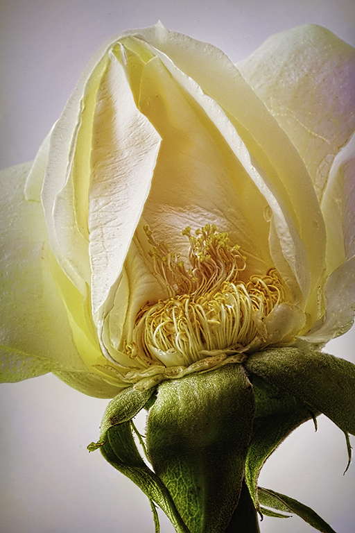
Mark.. very intricate details on the shell. Makes you want to look a little closer. I like the simplicity and symmetry of the subject on the black background. The starburst is a nice touch. To me, the crop is a lil tight on the subject and perhaps adding more room on the sides would help. |
Nov 17th |
| 8 |
Nov 17 |
Comment |
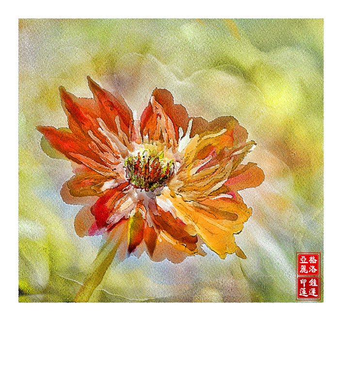
Alastair- Lovely colors and very painterly. Your composition is well balanced (to me) and the whites provides a resting place against all the beautiful color. I would have liked to see a tad more detail in certain areas of the boat -perhaps the tip of the bow and just the outline at the front which would provide a center of focus. This would involve 2 images- one a bit sharper and the use of layer masks. Up to you of course - the artist!
|
Nov 17th |
| 8 |
Nov 17 |
Comment |
Amparo.. the eyes of the child are haunting and engaging. You recovered enough details in his face as compared to the original. I presumed that you used a flash��seeing that you caught the catch lights in the eyes? I also like the B&W treatment which focuses on the subject. Good job! |
Nov 17th |
| 8 |
Nov 17 |
Comment |
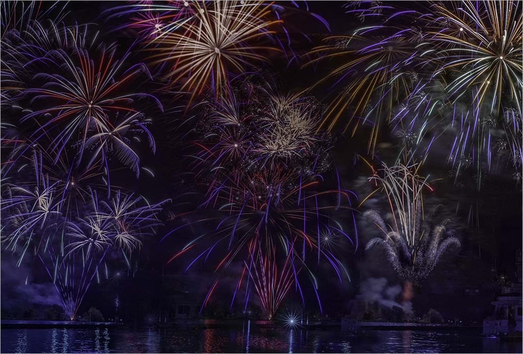
Very creative ��Thanks for the information on how you created the image. I like the black background which makes the vivid colors stand out. The image also conveys a sense of movement and although an abstract, the light trails are sharp. To me, the most interesting part of the image is the lower left corner where all the action seems to be happening. |
Nov 17th |
6 comments - 1 reply for Group 8
|
| 58 |
Nov 17 |
Comment |
Daniel I also agree that there are two stories in your image - the stronger being the woman on the left engaged in smoking. She is framed in her own space. Adding to the building's textures is the diagonal leading line provided by the stairs. I wonder if perhaps a stronger image would be to exclude the person on the right? Would any of my fellow members care to comment on this? |
Nov 17th |
| 58 |
Nov 17 |
Comment |
Jim, at first glance I thought these were members of the RCMP (Royal Canadian Mounted Police)as their tunics, colors and hats are almost spot on. The fans seem to be having a good time and the composition and various poses are interesting, especially the chap in the center. The score board leads you to the back of the image and provide depth as well as providing environment. |
Nov 17th |
| 58 |
Nov 17 |
Comment |
I also like the square crop Dan. Nice job on the post processing and thanks for the explanation. Colors appear very natural. You caught a happy spontaneous moment and the gleeful expressions on the faces. I too like the suggestion of movement caused by the blur. |
Nov 17th |
| 58 |
Nov 17 |
Comment |
Isaac...this image reminds me of a crumbling Cuba..both in the buildings and rubble on the street and tells an interesting story. Nice blue tones throughout and captured during the blue hour which keeps the eye moving.Image is sharp throughout. The group of three men form a secondary focus and it seems that Che is keeping an "eye" on them. Nice job Isaac! |
Nov 17th |
4 comments - 0 replies for Group 58
|
| 62 |
Nov 17 |
Reply |
Yup! The addition of the 3rd color definitely makes for a more interesting painting.Good Job. |
Nov 23rd |
| 62 |
Nov 17 |
Comment |
Thanks for your explanation on how you accomplished your painting Elinor. I think your working the background separately from the subject gives one more flexibility and makes it easier to fix things as you go along. I like your treatment of the background and the rose. As Angela mentioned the painting seems a little flat and I wonder if this is because there are no "darks" to provide some contrast as in the original photograph. One way to approach the rose would be to add a beveled edge to give it some dimension, before marrying it to the background. Keep up the good work! |
Nov 17th |
| 62 |
Nov 17 |
Comment |
This is another excellent capture of yours Gerhard. I like your painting better than the original - you handled the back wing beautifully and the feathers have lovely colors. To me the background is plain, and perhaps a mountainous scene to show the bird in a natural environment or clouds would add another element. Look forward to seeing more of your bird paintings. |
Nov 17th |
| 62 |
Nov 17 |
Comment |
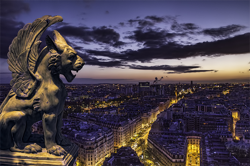
Very Gothic Tom! As Angela suggested, perhaps adding yellow/orange to your painting - even to the eyes and making it extreme would add a Wow factor. Another possibility is adding another pair of wings? I like the grey skies and and the blackness of the creature. As Angela says - there is nothing wrong with your painting but I feel that you're looking for more feedback. |
Nov 17th |
| 62 |
Nov 17 |
Comment |
Thanks for your explanation on how this was done Angela- a lot of hard work that has paid off in a beautiful painting. The kitten is very expressive and the eyes are extremely well done. I love the bubbles and sparkles - looks like bokeh. Wonderful job! |
Nov 17th |
4 comments - 1 reply for Group 62
|
14 comments - 2 replies Total
|