|
| Group |
Round |
C/R |
Comment |
Date |
Image |
| 8 |
Sep 17 |
Comment |
To me..this is an abstract image and so totally different from the original. I do like the pinks and blacks of the image and the textures that are added keep the image interesting. You have certainly used your creativity and imagination to transform the original. |
Sep 15th |
| 8 |
Sep 17 |
Comment |
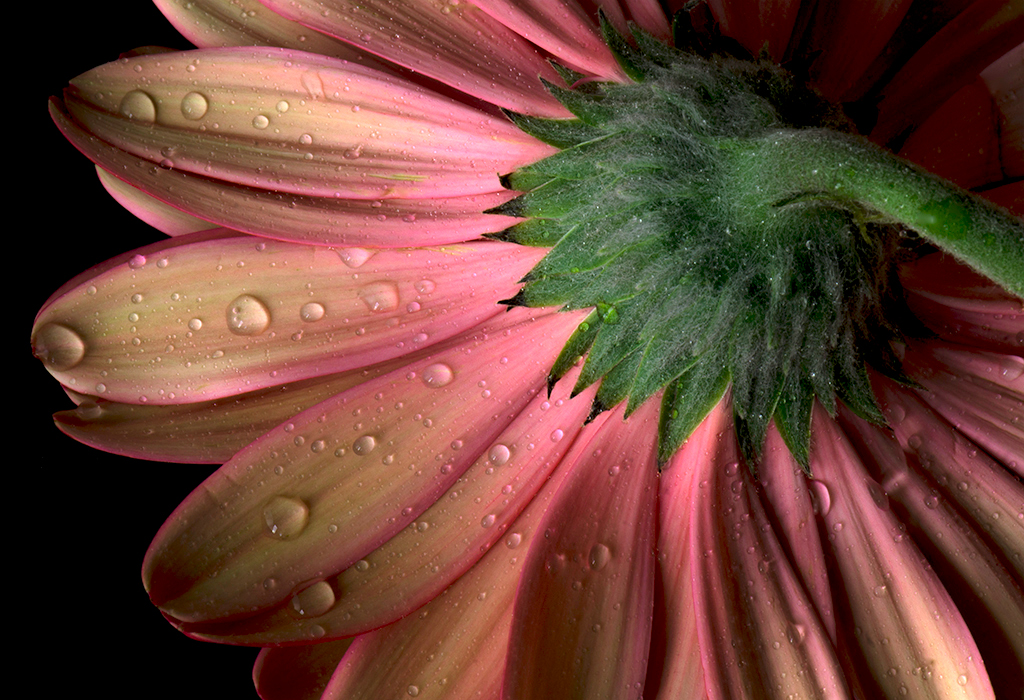
Marcus...nice and sharp image with lots of detail in the petals. The water drops are a nice touch and keeps my eye moving around. The black background is simple and keeps focus on the flower. As an alternate version, I offer a flipped version so the light is from the top left. |
Sep 15th |
 |
| 8 |
Sep 17 |
Comment |
Snehendu.. I echo Marcus's sentiments. The sky is an unusual color but it works well with the modern building. The composition is nice and I like how the subject fills the frame and dwarfs the human activity on the street. |
Sep 15th |
3 comments - 0 replies for Group 8
|
| 58 |
Sep 17 |
Comment |
Dan... Definitely a motley crew. I wonder how much of the lesson sank in. I like the vibrant colors of the boats and oars and the overcast sky adds to feeling. I also like the small girl on the left and the fact that she stands out among a group of bigger kids. I agree with Isaac's pp. Nice job! |
Sep 15th |
| 58 |
Sep 17 |
Comment |
Isaac...I like the fierce expression on Scary's face and the headpiece says it all. Your image is tack sharp including the eyes and the details of the feathers. Good bokeh and color which adds to the image and the overall feeling of swirls. Beautiful job! |
Sep 15th |
| 58 |
Sep 17 |
Comment |
Dan..your image works as a square crop, and composition also works with three figures in the frame. The metal scaffold provides nice diagonals and ties the three people together. Nice story and good eye! |
Sep 15th |
3 comments - 0 replies for Group 58
|
| 62 |
Sep 17 |
Comment |
Elinor...definitely a unique technique for the background. I like the relief of the stucco wall which is a nice contrast against the softness of the flower. The flower is nicely placed off-center - and reminds me of a postcard. Beautiful painting. |
Sep 15th |
| 62 |
Sep 17 |
Comment |
Gerhard... I quite like the details of the petals which draws my eye to the center focus. Very labor intensive I know to work on individual petals but I think that it contributes to the overall beauty. Your smudged background is your "signature" and the colors make the rose stand out. Just a suggestion but have you tried smudging in a circular manner to echo the curves of the flower. Great job! |
Sep 15th |
| 62 |
Sep 17 |
Comment |
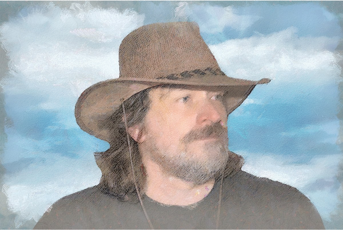
Hi Tom...thank you for submitting all these variations. This is a wonderful image of you. I personally like the top one of Samples 2 (3rd one) the best. To me, your final submission looks soft and lacks detail. I tried combining my preference at 73% opacity on top of your final and merging both to achieve a blend of both. The eyes still lacked clarity and I did not have the original to work with. In the end you are the artist of course. |
Sep 14th |
 |
3 comments - 0 replies for Group 62
|
9 comments - 0 replies Total
|