|
| Group |
Round |
C/R |
Comment |
Date |
Image |
| 8 |
Aug 17 |
Comment |
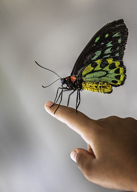
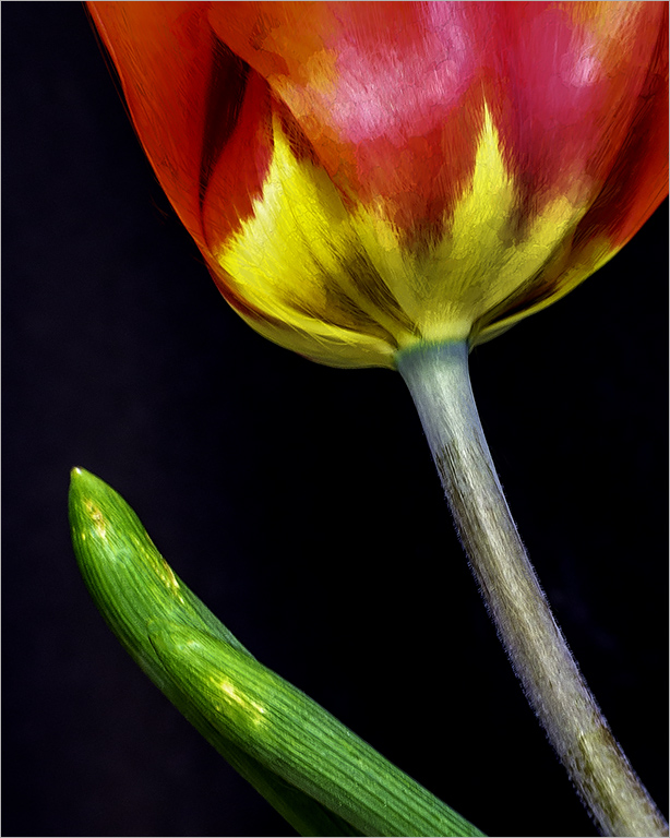
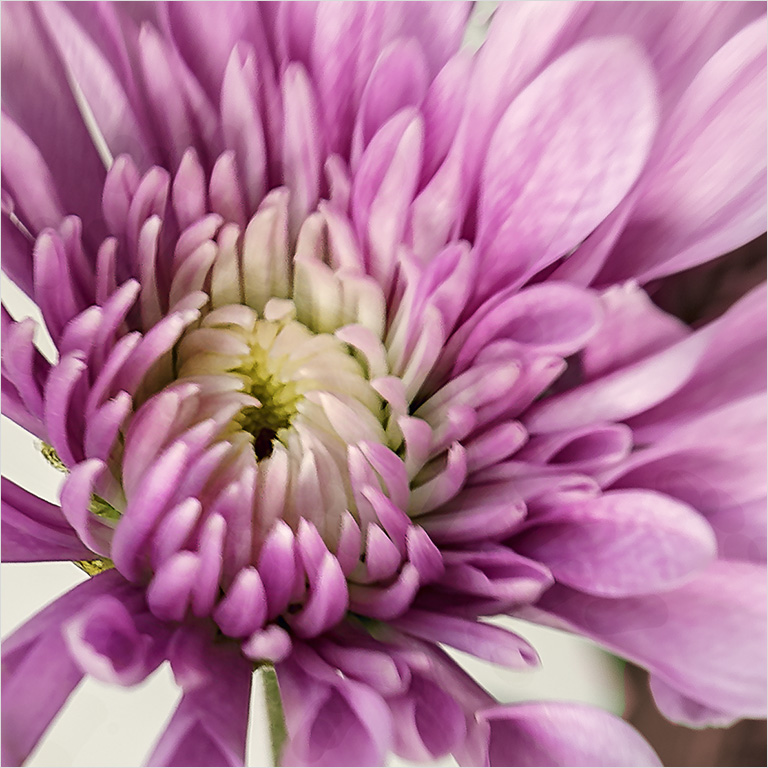
Interesting technique Marcus. You didn't mention whether you used a flash or not,but I am assuming that you did not. I'll have to give this a try. I like the simplicity of the subject and the translucent quality of the flower, yet still retaining the color. I also like your camera position, aiming high against the sky to get a clean image. Great job! |
Aug 22nd |
| 8 |
Aug 17 |
Comment |
Your image tells a story. I like the composition of the two animals together. The animals are separated from the background and the details of the fur makes the image more interesting. |
Aug 22nd |
| 8 |
Aug 17 |
Comment |
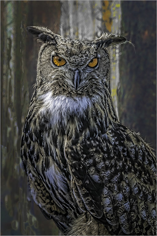
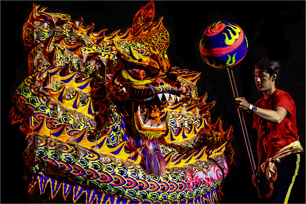
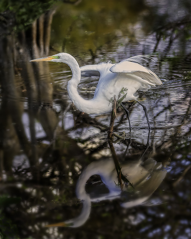
Interesting subject and lovely vibrant colors.The green leaves form a perfect background for this creature. |
Aug 22nd |
| 8 |
Aug 17 |
Comment |
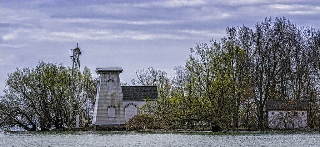
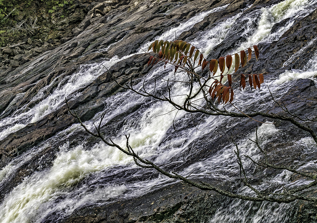
I also prefer the second image Alastair. Also agree with Marcus that the pattern on the water only without the grass would make a great image. Could also try B&W. The patterns are very intriguing and the diagonal flow moves the eye through the image. |
Aug 22nd |
| 8 |
Aug 17 |
Comment |
Very creative use of the lens. I like the camera position looking up through the green. I believe the image would have been stronger with a single model, perhaps the one on the left only since the model on the right seems to have been cropped off at the neck. |
Aug 22nd |
5 comments - 0 replies for Group 8
|
| 58 |
Aug 17 |
Comment |
Nice geometry Dan. I like the shadow of the light standard and your high camera position makes the image interesting. The yellow circle centers the subjects and draws the eye in. I like the simplicity of the image. |
Aug 22nd |
| 58 |
Aug 17 |
Reply |
Thanks Isaac. I agree with your crop and lightening the man's head. |
Aug 22nd |
| 58 |
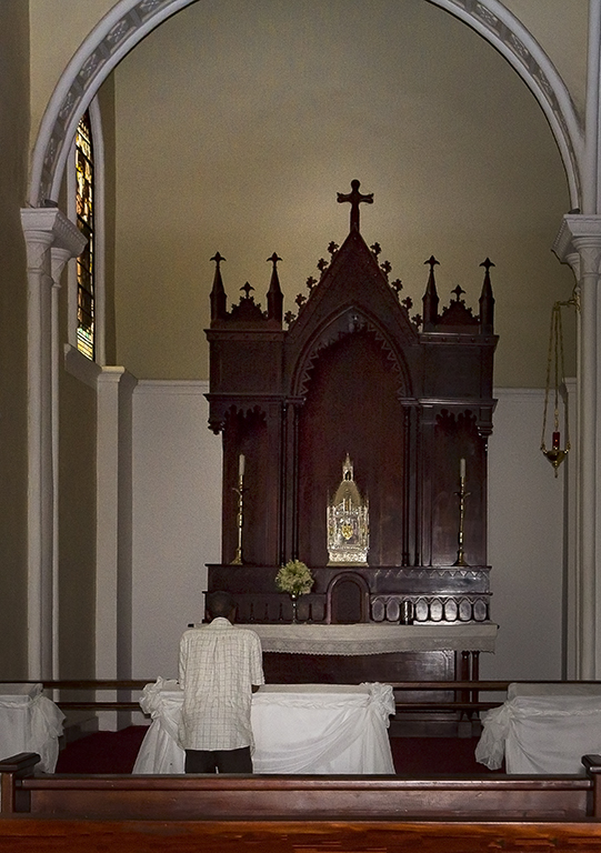
Aug 17 |
Reply |
Dan.. the flash appears to the right of the altar because of cropping a bit of the right side of the image: I am directly positioned behind the flash. |
Aug 22nd |
| 58 |
Aug 17 |
Comment |
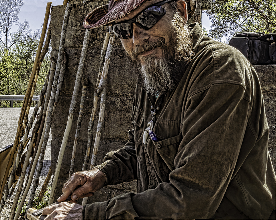
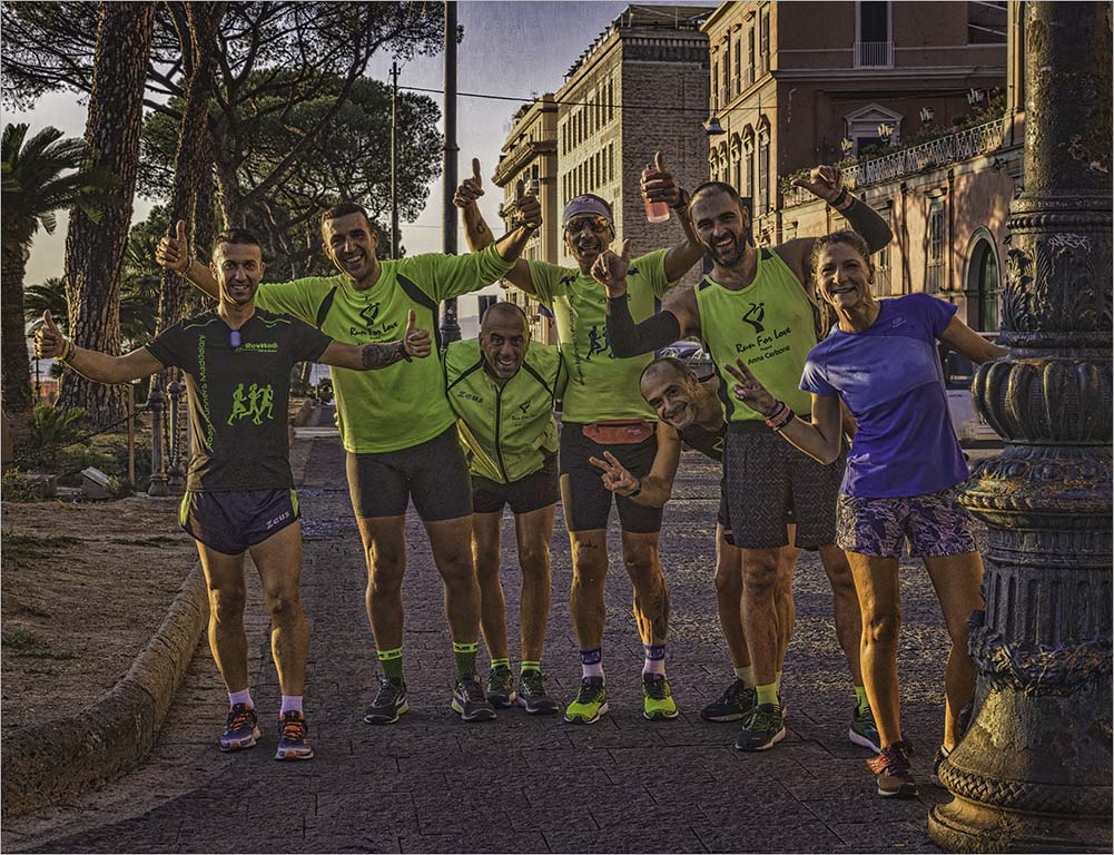
Mofassirul...an interesting story and composition. I like Isaac's idea of opening the shadows under the house to show more details. The woman and child are part of the story and stand against a clean background. Camera position from below adds interest. Thanks for sharing. |
Aug 22nd |
| 58 |
Aug 17 |
Comment |
Dan,good idea to convert to black & white. There are a lot of interesting textures to your image - the sky, beach and the water. I prefer your original submission (without the flip) as I feel that the subject occupies a stronger position in the frame at the bottom right. I like the diagonals of the wave on the beach which takes you to the back of the image and creates a feeling of depth. Good capture. |
Aug 22nd |
| 58 |
Aug 17 |
Comment |
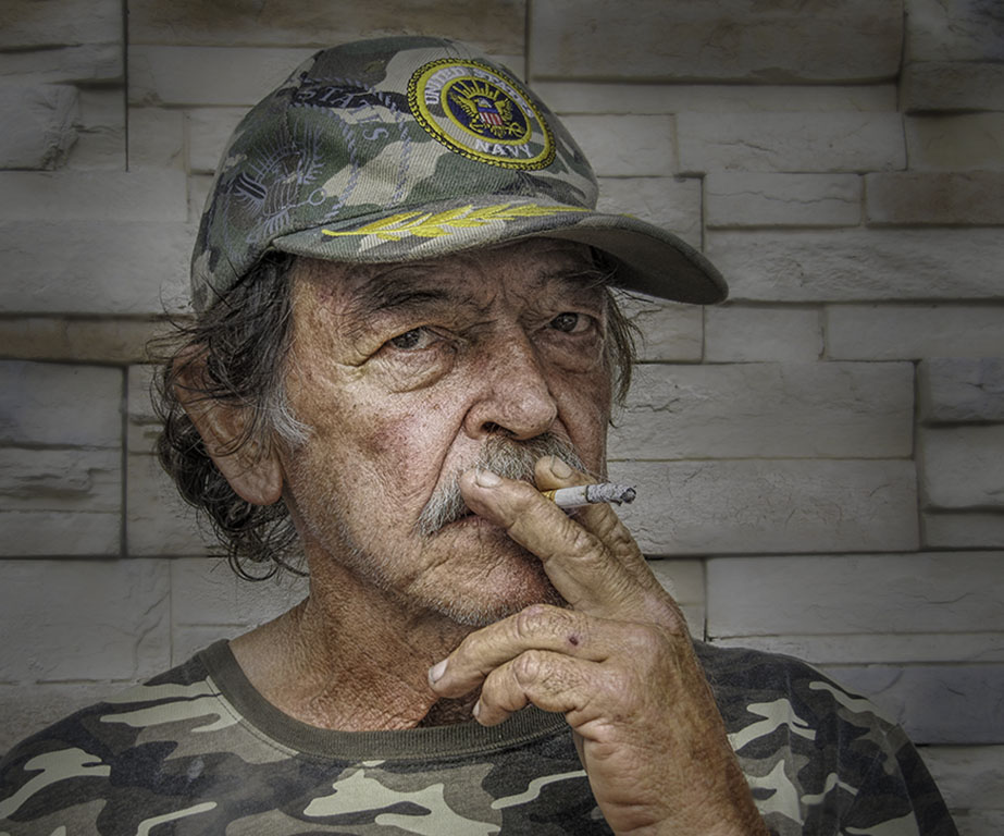
Interesting comments on the post processing. I prefer Isaac's version which brings out the details of his face and the folds on his jacket and pants. I also like the fact that a wider range of tones are revealed which makes for a more interesting image in my opinion. The shadow on the road is a bit of a mystery. |
Aug 22nd |
| 58 |
Aug 17 |
Comment |
Liz, as the others have indicated- difficult lighting conditions. A clear separation of the subject against the background and the man is linked to the kite by the string and the tail. I am not bothered by the plain sky as it provides negative space for the eye to rest- a cloudy sky would have been too busy in my opinion. I agree with Isaac's crop and post processing. |
Aug 22nd |
| 58 |
Aug 17 |
Comment |
Isaac,nice story telling image of a couple in love in the springtime. I like the framing of the couple between the two trees as well as their placement on the thirds. Your vertical crop accentuates all the verticals in the image. You were able to catch their faces in the light which is not always easy. Composition is well balanced and colors are very natural. Well done! |
Aug 22nd |
6 comments - 2 replies for Group 58
|
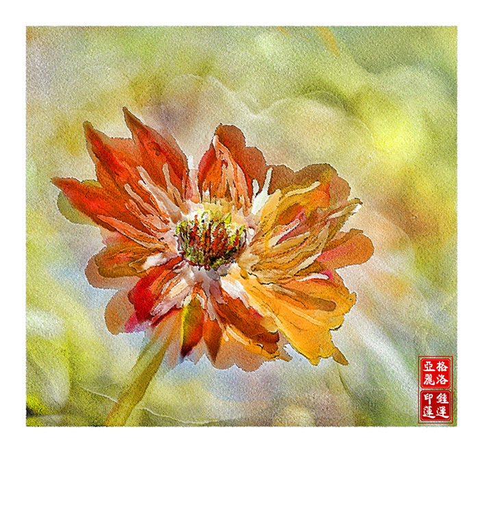
| 62 |
Aug 17 |
Comment |
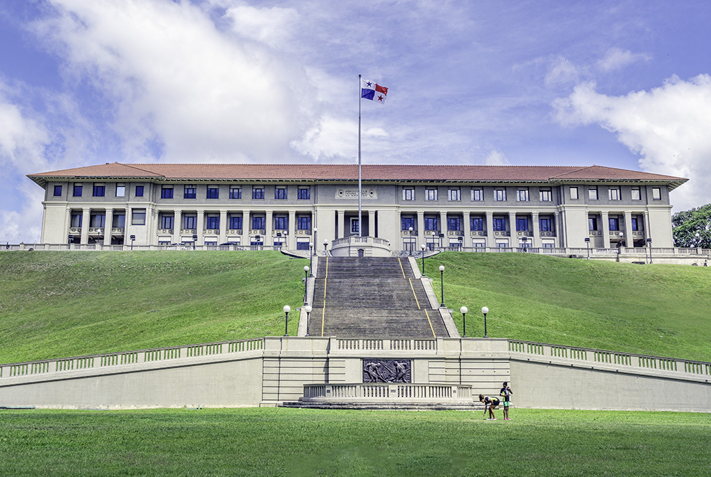
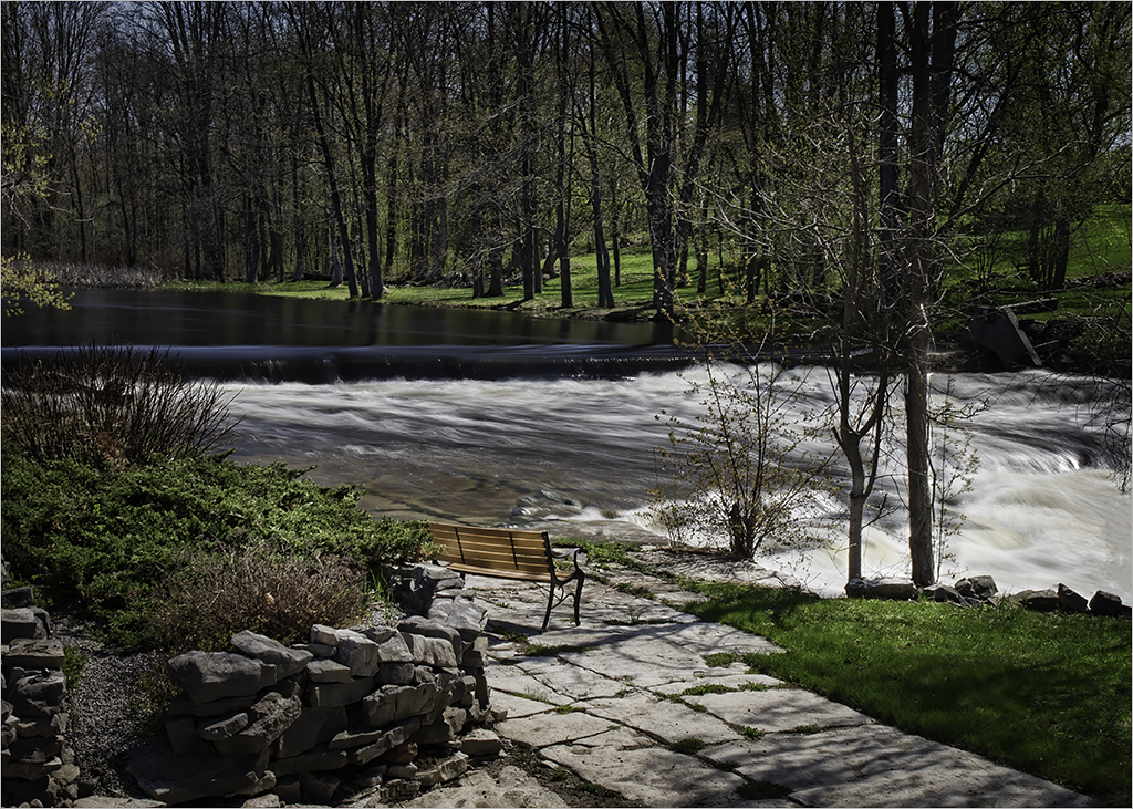
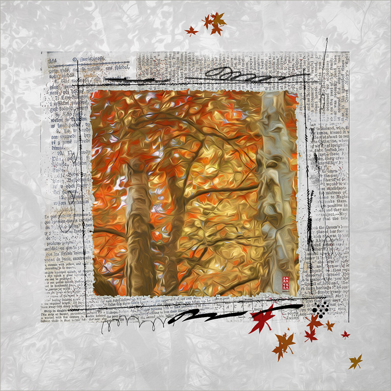
Elinor ...love the colors of early fall. The dark bench grounds the painting and invites me to sit. Lovely brushwork! Would love to know why you just painted the one tree instead of three as in the original? Looks just as good all the same. |
Aug 22nd |
| 62 |
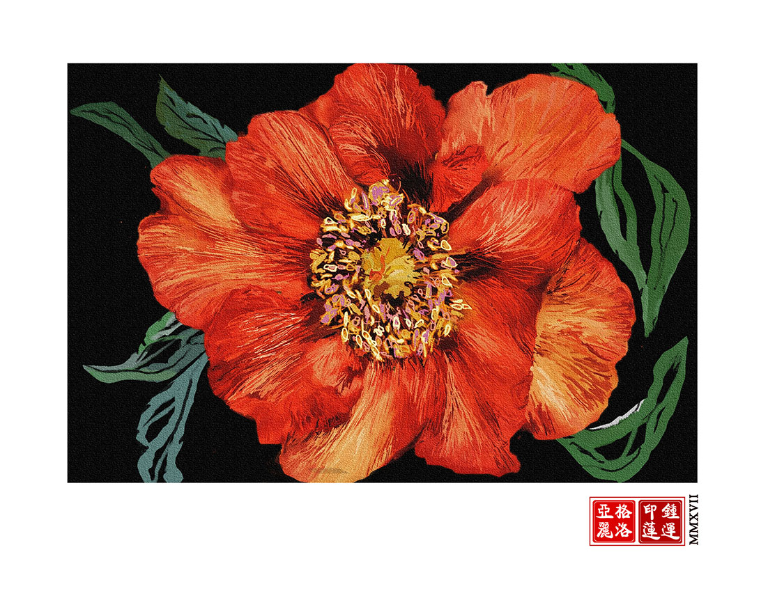
Aug 17 |
Comment |
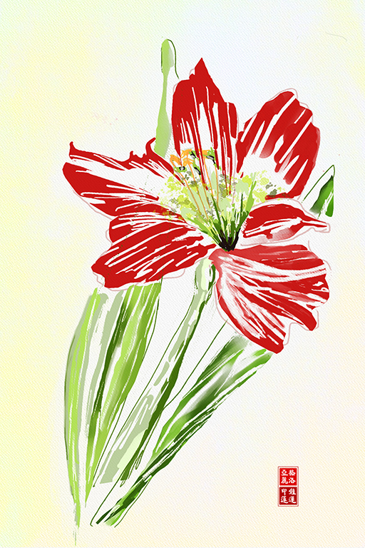
Gerhard.. I like the vibrant colors against the dark blue background. This almost seems like an abstract to me and I love the stylized flower. Wonderful job. |
Aug 22nd |
| 62 |
Aug 17 |
Comment |
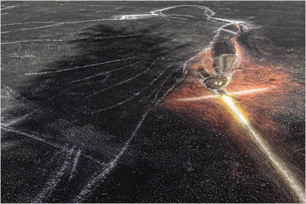
Thank you for sharing the process Angela. Your image certainly conveys the pain of migraine. I like the shock waves and hot colors exploding from a central point. I think the final version of the book cover on shiny paper will be something you will be proud of. |
Aug 22nd |
3 comments - 0 replies for Group 62
|
14 comments - 2 replies Total
|