|
| Group |
Round |
C/R |
Comment |
Date |
Image |
| 8 |
Apr 17 |
Comment |
Mark...very creative! I like the monochromatic look and the limited color range which keeps your eyes centered on the feet. I also like the idea of "three" an odd number, and that one foot is different from the others. |
Apr 21st |
| 8 |
Apr 17 |
Comment |
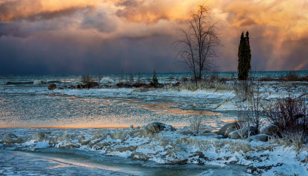
Beautiful lighting Marcus! I like the layering in your image and the rough textures of the shore and shrubbery against the smoothness of the sky. I offer an alternative HDR version, perhaps not as you saw it, but which intensifies the light. Used Nik's HDR - Deep 1 with no adjustments. Brought it back in PS at 81% opacity. |
Apr 17th |
 |
| 8 |
Apr 17 |
Comment |
Congratulation on your image in this month's digital dialogue home page, Snehendu! As a long time photographer you must have collected a lot of images in your travels and it's nice to see some of your collection. Your Sakura shot is postcard material and wonderful of traditional Japan. Good job. |
Apr 17th |
| 8 |
Apr 17 |
Comment |
Alastair..I like the simple composition and the touch of orange to the blue. You can almost feel the coolness of the condensation on the glass. I also like the ragged frame border. Perhaps a square crop? |
Apr 17th |
| 8 |
Apr 17 |
Comment |
Dan.. this looks to me like it was processed in HDR. There are a lot of wonderful edgy textures and details in the clouds and the canyon. I like the contrast of the blue against the orange cliffs and the blue adds a sense of depth to the image. |
Apr 17th |
| 8 |
Apr 17 |
Comment |
The diagonals in the reflection add to the image. I also like the blackness of the water and the limited color palette which to me looks like an abstract painting. |
Apr 17th |
6 comments - 0 replies for Group 8
|
| 58 |
Apr 17 |
Reply |
I also love my 10-22mm (Canon) lens for shooting, tight,interior shots - churches (handheld and no flash). I have a tilt screen on my camera which helps with the composition - perhaps not practical in street photography; but experience and practice helps over time. |
Apr 23rd |
| 58 |
Apr 17 |
Reply |
With a wide angle lens...the distortion is especially noticeable on people. Maintaining sufficient distance from the subject, (you'll need to experiment) and keeping the lens plane parallel with the subject are ways to overcome. |
Apr 22nd |
| 58 |
Apr 17 |
Comment |
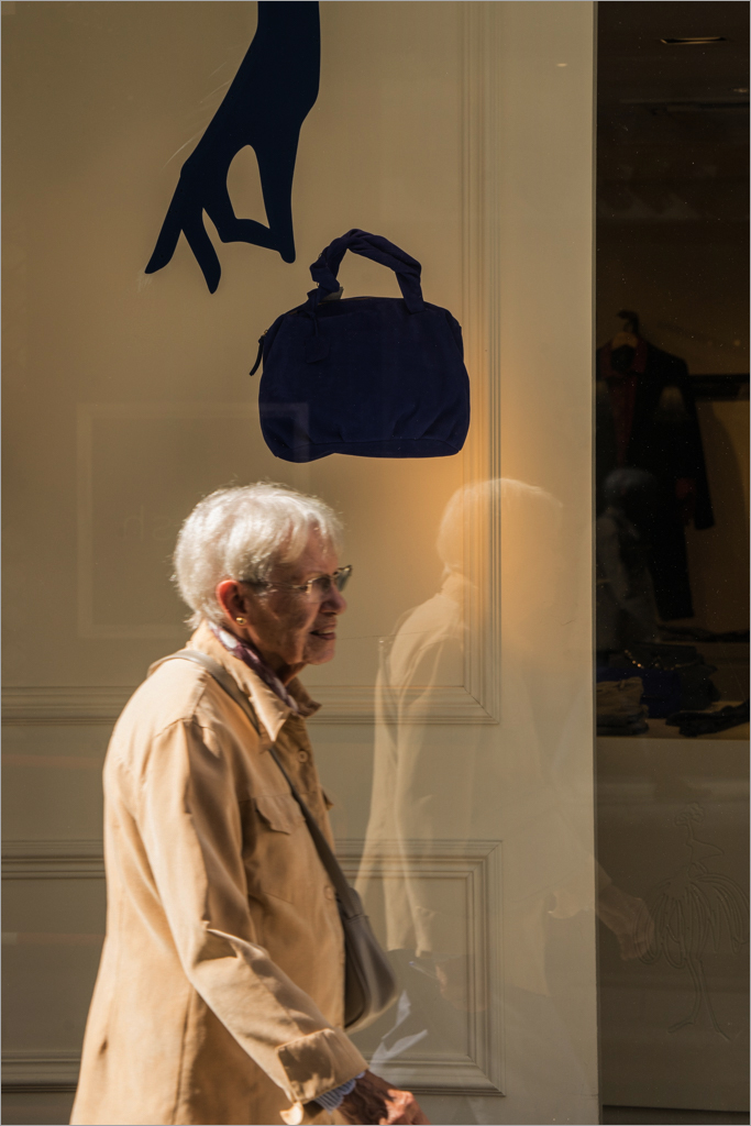
Daniel ...very nice, well balanced, monochromatic image. I like the back lighting on her hair and shoulders and the reflection in the shop window. I also like the right side of the image where part of the shop is included. To balance the darkness on the right side - I offer an alternative version, where I added a linear gradient to the left side in multiply mode and lowered the opacity to where it appeared to work. Cloned out a minor distraction on bottom right of the image. PS added a 1 pixel grey stroke to define the image. |
Apr 17th |
 |
| 58 |
Apr 17 |
Comment |
Dan.. good idea to convert this to a B&W. I also like the expression on her face. This is good "hip" shot and difficult to capture considering the back lighting. You didn't mention whether you were using a wide angle lens as it appears there is a slight distortion to the size of the girl's head relative to the rest of her body. |
Apr 17th |
| 58 |
Apr 17 |
Comment |
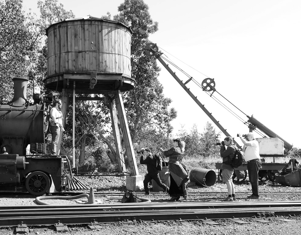
Liz..I like this scene because you caught the group in profile - which clearly make us part of the audience. There is clear separation of each figure against what may be considered a busy background. I also like the geometry provided by the diagonals of the crane, cylindrical water tank and the tracks, To me, this is a B&W image and I offer an alternative version. |
Apr 17th |
 |
| 58 |
Apr 17 |
Comment |
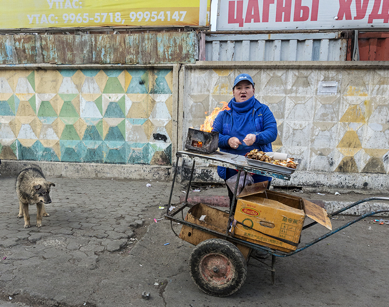
Isaac..Very nice hip shot. I like the flames and the expression on the vendor's face. The dog waiting for scraps adds a nice secondary subject and forms part of the street environment. To me, the smoking woman does not add to the story... because she's facing out of the frame and not close enough to the action. The crop is unusual with an aspect ratio of (14 x8) and is almost a panoramic, perhaps to include the 2nd woman, yet I don't envision this as a panorama image. I am glad you included the original and I offer an alternative version cropped (approx 8x11). I also included part of the signs, which to me adds another layer of texture and shows part of the culture. |
Apr 17th |
 |
4 comments - 2 replies for Group 58
|
| 62 |
Apr 17 |
Comment |
Nice job Elinor! I like the detail in the center of the flower and like Gerhard, I would have liked to see more definition of the individual petals. You'll have to let us know whether Art Rage is easier to work with than Painter. |
Apr 11th |
| 62 |
Apr 17 |
Comment |
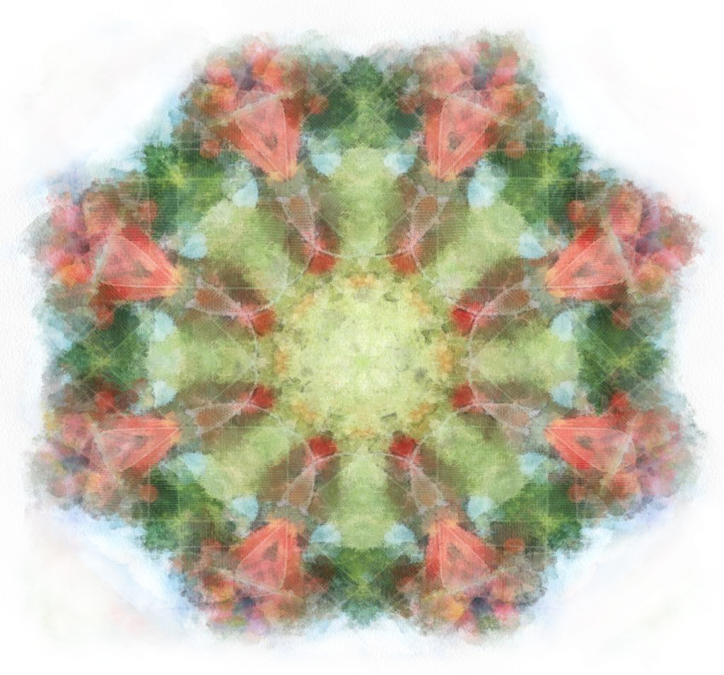
Tom.. your painting looks nothing like the original image; who would have guessed? I like the soft pastel colors and the symmetry of the image lends itself to a square format. This reminds me very much of a flower... and in an alternative version for your consideration, I removed the corners to focus on the central part. |
Apr 11th |
 |
| 62 |
Apr 17 |
Comment |
Gerhard...Congratulations on your image in this month's Digital Dialogue members' showcase. Wonderful Nature photographer! Your painting this month is another fine example of your work. I also like your clean background, and the fact that you were able to retain the furry textures of the animals and the details of the eyes. Although I have also tried my hand with the smudge tool, I find that it takes on a life of its own and I am unable to control the direction and spin (and for this reason I prefer the mixer brush myself.) |
Apr 11th |
3 comments - 0 replies for Group 62
|
13 comments - 2 replies Total
|