|
| Group |
Round |
C/R |
Comment |
Date |
Image |
| 8 |
Mar 17 |
Reply |
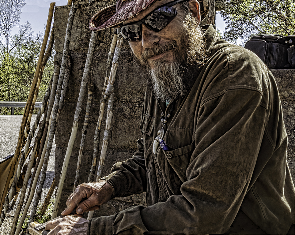
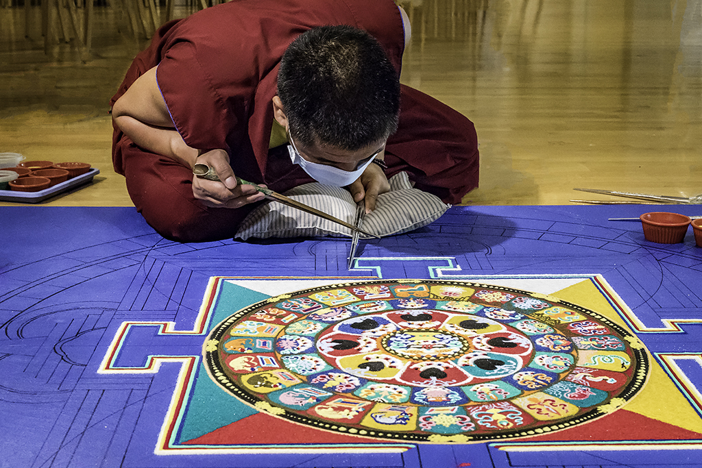
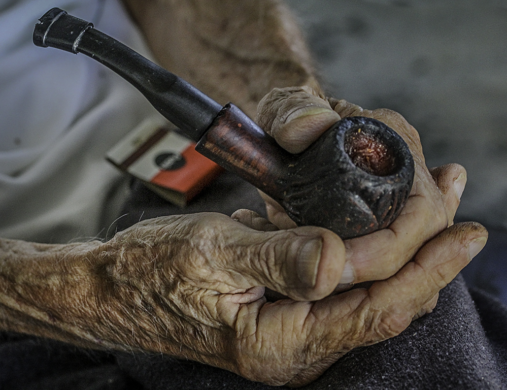
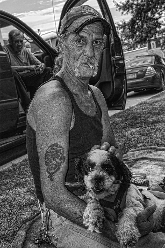
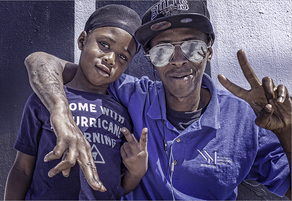
Thanks for your comment Marcus. I actually focused on his hands and his tools. To me, the Mandala is the secondary subject and incidental to the "action". I actually have an ongoing photography project of "hands" and I use every opportunity to take them as often as I can. |
Mar 24th |
| 8 |
Mar 17 |
Comment |
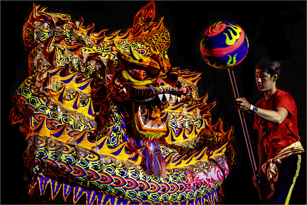
Good capture and conversion to B&W. These types of images are difficult to capture considering the low light conditions, the movement and the crowded room. Nice and sharp and interesting shot. Well done! |
Mar 15th |
| 8 |
Mar 17 |
Comment |
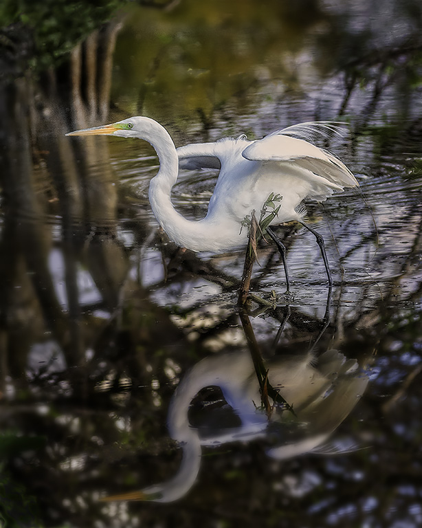
Marcus, good monochromatic image.. the only giveaway that this is a color photograph is the sliver of brown of the broken limb. You caught the details of the ice laden branches against the white sky. If this location is near to you, it would be interesting to see this scene at different times of the year...in the spring, summer and fall. |
Mar 13th |
| 8 |
Mar 17 |
Comment |
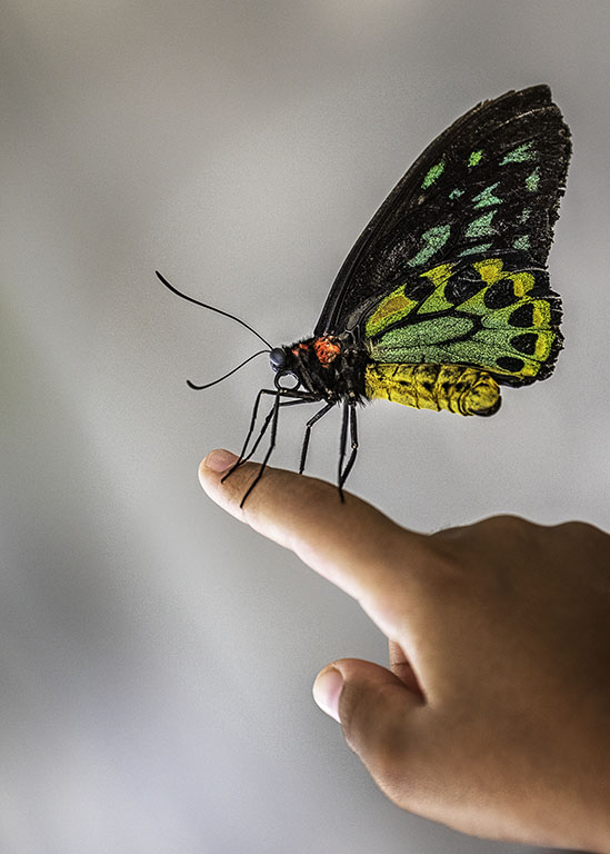
Snehendu...good idea to convert this to a B&W. There is good contrast with the markings of the butterfly and nice symmetry. The butterfly placed on the diagonal fills the frame. |
Mar 13th |
| 8 |
Mar 17 |
Comment |
Mark, your subject stands out against the background because of the furry texture vs. the hard surface. The spider is framed by the circular rock and is off center; both of which adds interest to the composition. Nice detail in the hairs. Good job! |
Mar 13th |
| 8 |
Mar 17 |
Comment |
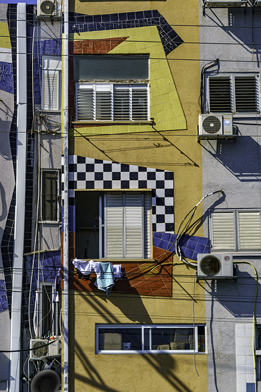
Alastair, nice abstract framing of the building. There is enough negative space to give interest to the image and the touch of red makes the building come alive. The exit points at the bottom right and left are nice and clean. |
Mar 13th |
| 8 |
Mar 17 |
Comment |
Nice textures of the old boat, the sand beach and the leafy background. The replacement sky is a good idea because the colors are harmonious. The halos around the tree line are quite prominent and detract from the image - perhaps burning would help. |
Mar 13th |
6 comments - 1 reply for Group 8
|
| 58 |
Mar 17 |
Reply |
...Mofassirul..in a way the green leaves add to the image because it frames the bottom of the photo and allows the viewer to move past the blur into the sharper details of the feet and below the counter. The "green" leaves are harmonious with the colors in the rest of the photo as well. |
Mar 20th |
| 58 |
Mar 17 |
Comment |
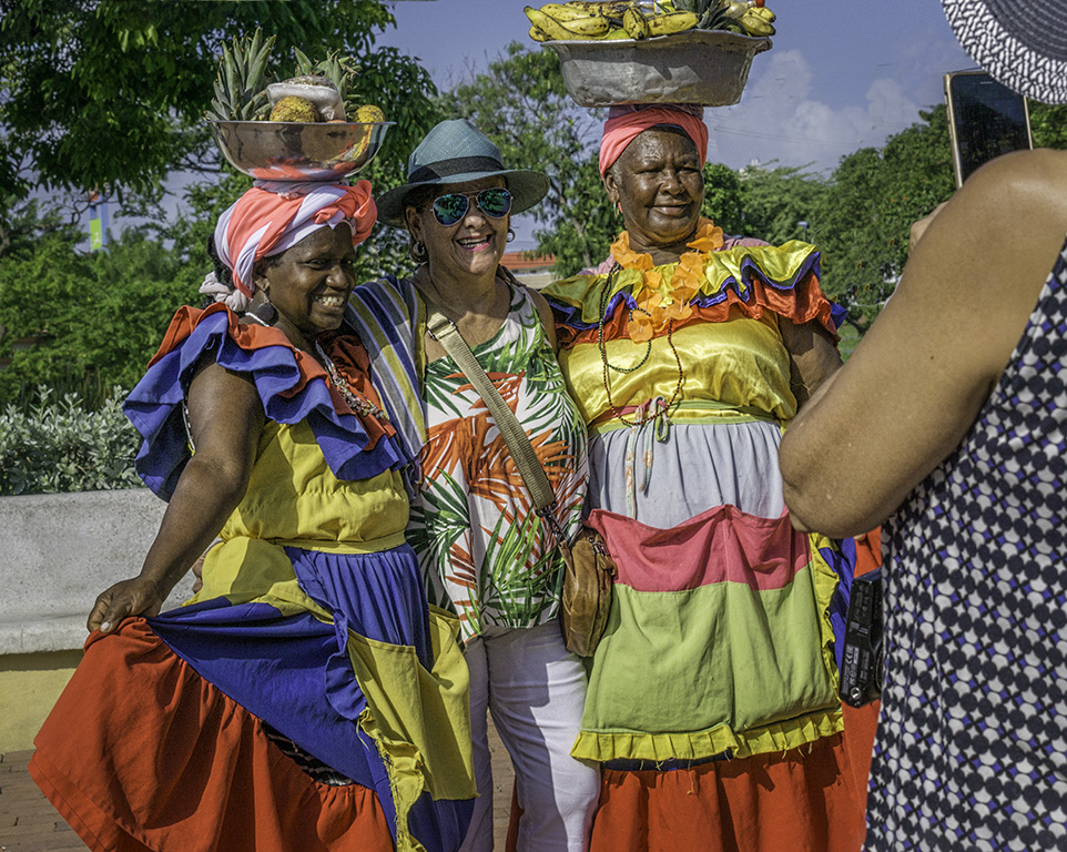
Dan, here is a group of three clearly engaged in a boisterous discussion and nicely framed in a square crop. The subjects appear sharp and the background is sufficiently blurred to indicate an outside environment. There are nice textures in your image that makes it interesting and keeps the eye moving -the hair, the smoothness of the clothing, the rough stone background etc. The arm of the man in the center provide a leading line and frames the face of the man in the back. Perhaps a B&W version? |
Mar 14th |
| 58 |
Mar 17 |
Comment |
Great capture Mofassirul!..The 3rd eye in focus adds depth to the image and lead the viewer to the front of the vehicle. It is nicely framed and in its own space. Good separation of ideas with the foreground subjects slightly out of focus. |
Mar 14th |
| 58 |
Mar 17 |
Comment |
Good capture Dan! The image is timeless and could have been taken in the 60's - the old car in the background, who knows?
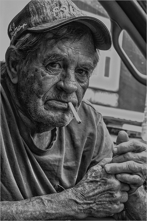
Good choice to convert to B&W (Sepia?) to remove the color. The camera position is good and the subjects fill the frame. The hands of the man on the left are very interesting, both in their position and the gesture. |
Mar 14th |
| 58 |
Mar 17 |
Comment |
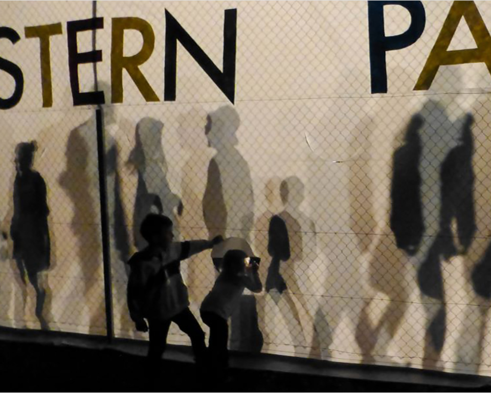
Nice layering to your story, Liz - in front of the fence, the fence, and behind the fence; and the window provided by the children. The monochromatic colors simplify the the image and the shadows (ghosts) add to the story. Capturing the image on the diagonal adds perspective to your image. A suggested smaller version is included, which brings the children on the "thirds" and eliminates the post and right edge. Not including the full word "park" does not detract from the image. A stroke around the image helps the viewer with the black digital background. |
Mar 14th |
 |
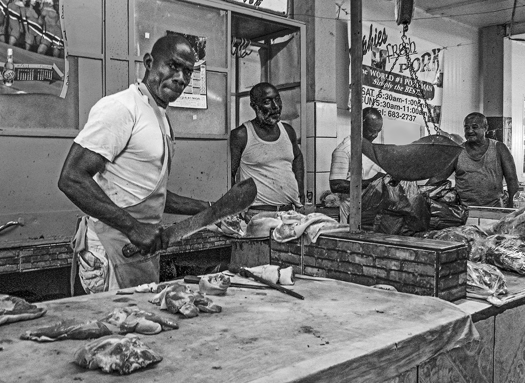
| 58 |
Mar 17 |
Comment |
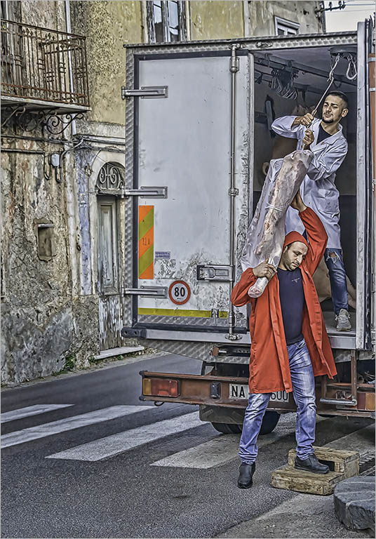
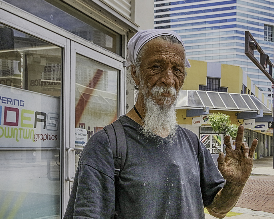
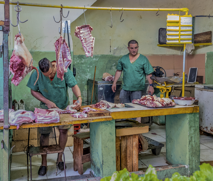
Very interesting image, Isaac. There's something waiting to discover in every nook and cranny- the pair of sneakers carefully set aside against the wall, the pig's tail acting as a leading line towards the butcher's hands, the yellow price? menu hanging on the frame. The butchers are separated from the background and the hooks and pipe stand frame the subjects naturally so there's no need to eliminate this important element. The butchers' shirts are so very similar in color to the background wall, please consider a warming photo filter on that part of the image as suggested below. |
Mar 14th |
 |
5 comments - 1 reply for Group 58
|
| 62 |
Mar 17 |
Reply |
Thanks for the tip, Angela. |
Mar 15th |
| 62 |
Mar 17 |
Reply |
I would be interested in the group's experience regarding ArtRage as it pertains to Watercolor. Coincidentally B&H has Painter on sale for $149 limited time.. and I was thinking of breaking down and buying it. Perhaps ArtRage has a less steep learning curve? |
Mar 14th |
| 62 |
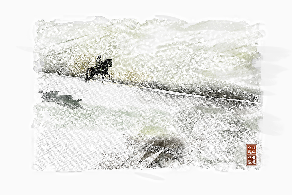
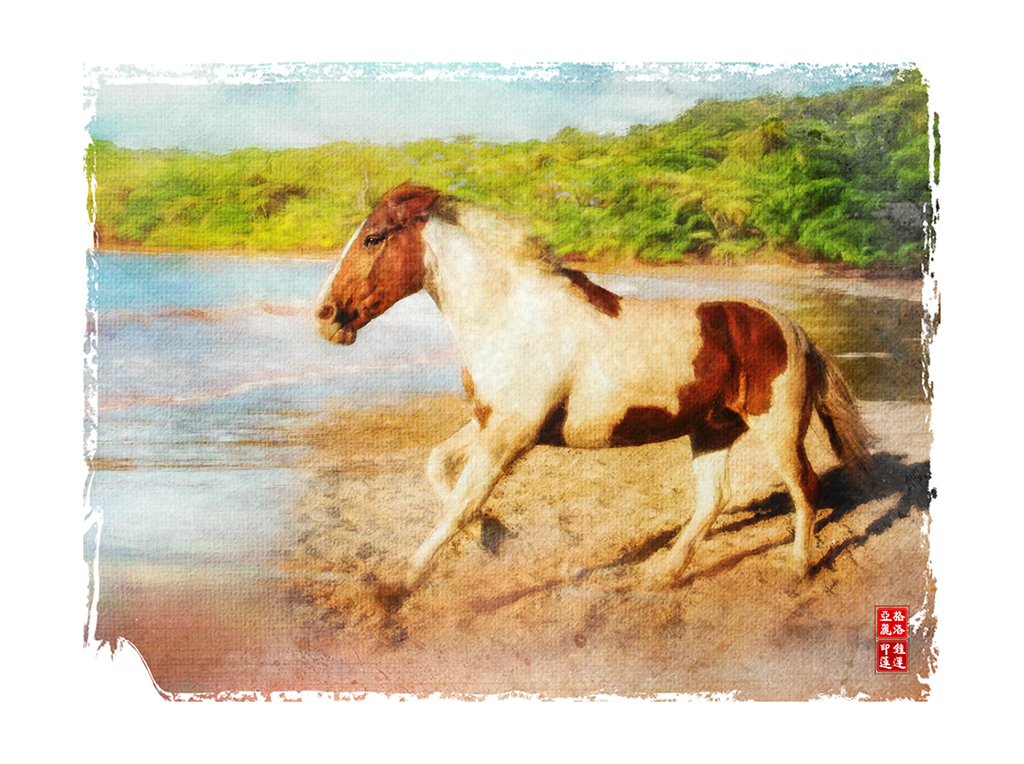
Mar 17 |
Reply |
Thanks for your suggestion Angela. Less is more.. I do like the negative space around the horse which gives it breathing room. |
Mar 13th |
| 62 |
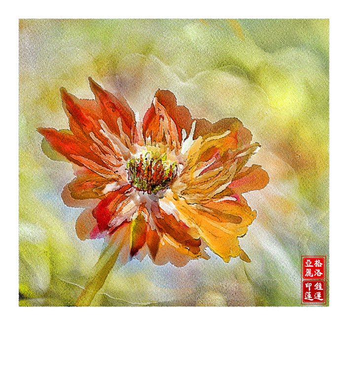
Mar 17 |
Comment |
Elinor... nice and seamless composition. Didn't notice the 3rd flower until Tom pointed it out. The blue and orange colors make a vibrant combination. The addition of the stems ground the flowers to your painting. The brushwork on the background and the flowers are also very good. |
Mar 13th |
| 62 |
Mar 17 |
Comment |
Gerhard... the colors of your painting are lovely and ethereal. You kept sufficient detail in the mountain caps and the whites to keep it real. Nice brushwork in the sky and the reflected water. |
Mar 13th |
| 62 |
Mar 17 |
Comment |
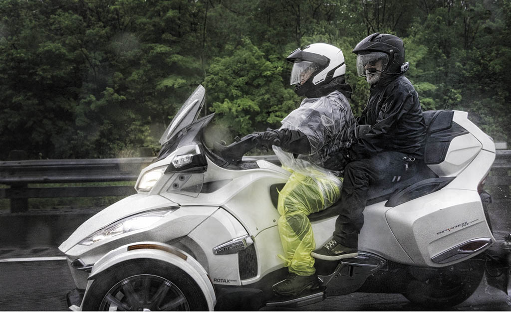
Tom... your painting looks better than the original photograph and you did an excellent job to extract the original trike. This is an interesting subject and the composition is nice and balanced. The blues and yellows of the trike are complementary colors and to me the introduction of another color palette in the background colors almost compete for attention with the subject. |
Mar 13th |
| 62 |
Mar 17 |
Comment |
Angela...this is a nice study in lights and darks. The flames and the highlights on the buckets, and the side lighting on her face all make for an interesting painting..very Chiaroscuro. By removing the details and simplyfing the background - the emphasis was on the woman and you captured the emotion on her face. Very nice job! |
Mar 13th |
4 comments - 3 replies for Group 62
|
15 comments - 5 replies Total
|