|
| Group |
Round |
C/R |
Comment |
Date |
Image |
| 8 |
Jan 17 |
Reply |
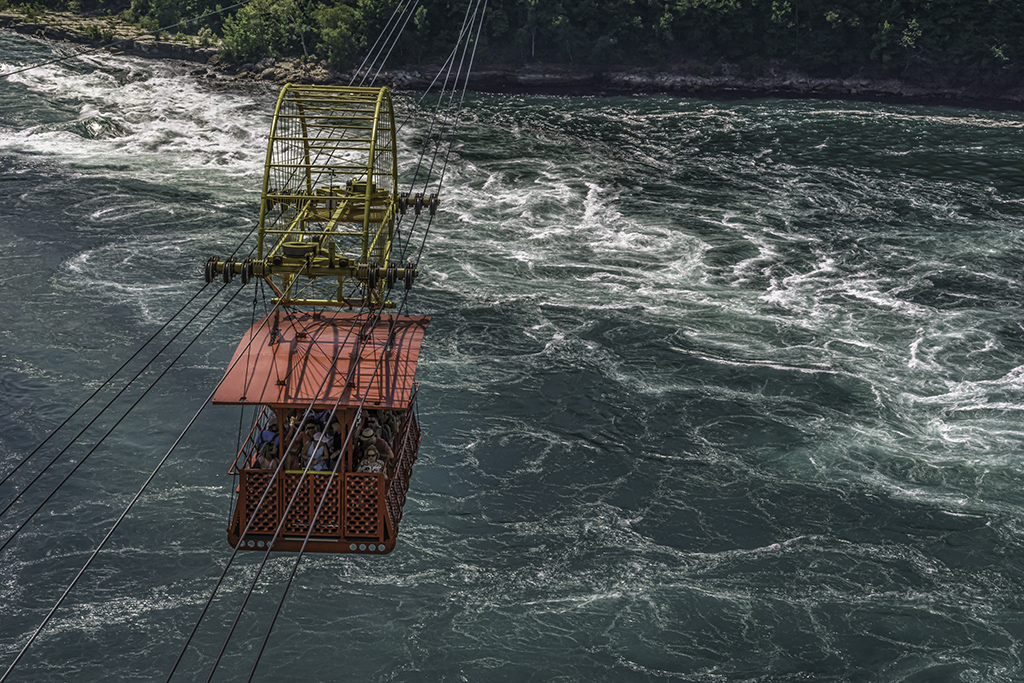
Alastair... this image was taken on the Canadian side of the Niagara River which is one of the geographical boundaries between the US and Canada. We did not venture to ride the cable car this time, so unfortunately no pixs :( |
Jan 12th |
| 8 |
Jan 17 |
Reply |
Definitely a plan! - on the Canadian side? |
Jan 12th |
| 8 |
Jan 17 |
Comment |
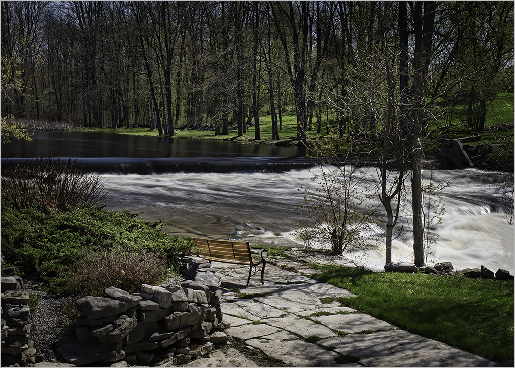
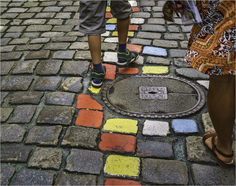
Comprised of a foreground (in focus), middleground and background, your image is definitely very interesting. The limited colors and the textures of the snow, leaves and tree barks of a winter scene almost make me wish I were there - I said "almost" :). Beautiful capture Marcus! |
Jan 12th |
| 8 |
Jan 17 |
Comment |
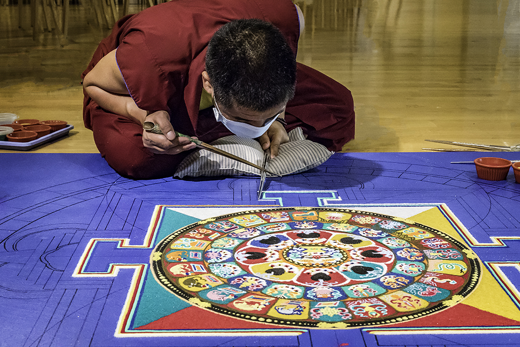
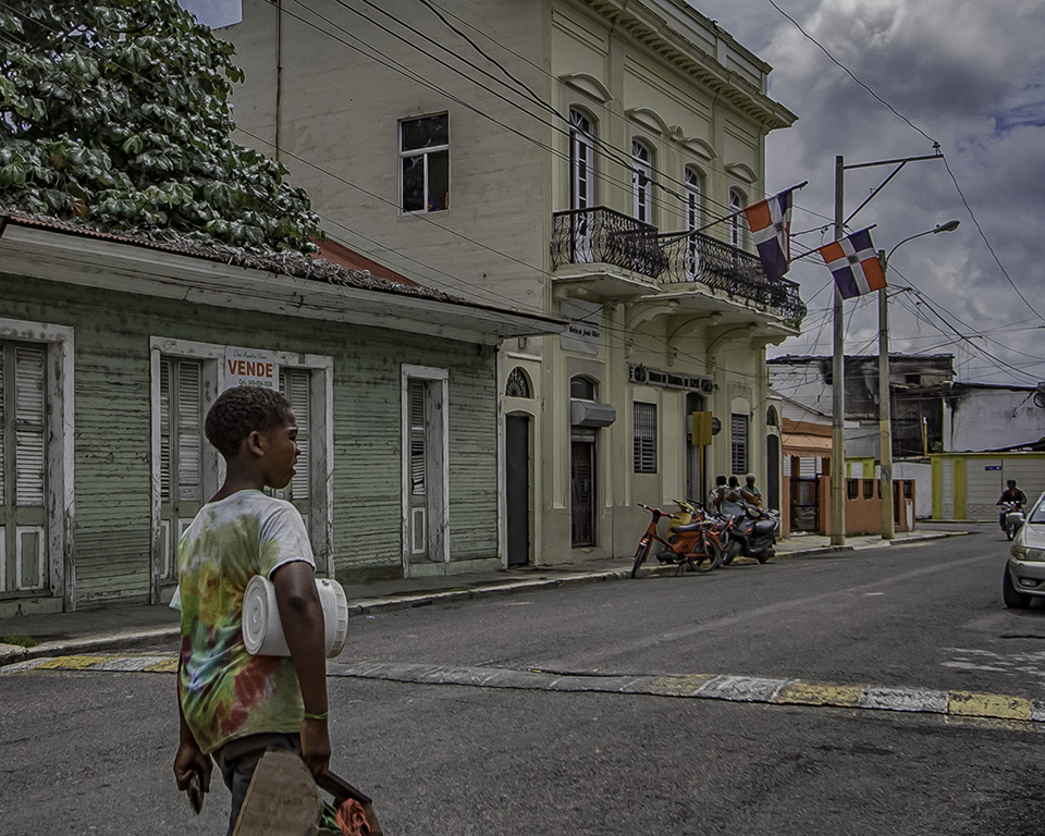
Colorful people shot Snehendu. It was a good idea to include the photographers at the base of the image. Although there are a ton of people, your camera position enabled you to separate the subject through the smoke and color of his clothing. |
Jan 12th |
| 8 |
Jan 17 |
Comment |
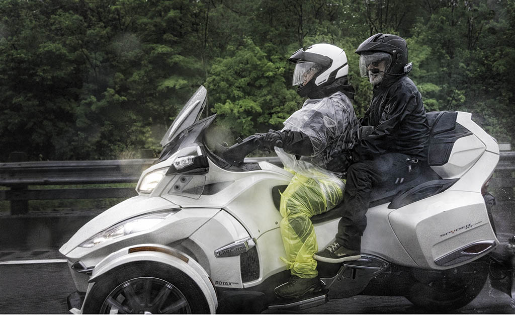
Mark ...black, white and gold is a great color theme. The black gradient background is also a good idea. May I suggest relocating the bright spot (focus) of the gradient to the right and behind the axle(?) of the big wheel. |
Jan 12th |
| 8 |
Jan 17 |
Comment |
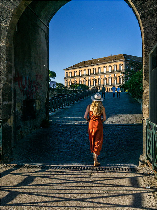
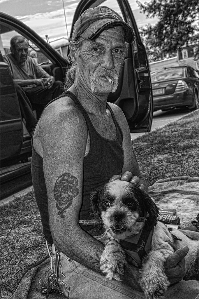
Alastair... wonderful ongoing project which always keeps you on the hunt. I feel the woman looking out of the frame begs for a flip horizontal. Since you are "square crop" fan, I also suggest a tighter crop to exclude the legs and bring the focus on the two individuals. The photographer (you) is included in the image and this to me is a bonus - making the image stronger and comprised of three. I added a heavy vignette to your image. Good Luck with your project and hope to see more of these as you progress!! |
Jan 12th |
 |
| 8 |
Jan 17 |
Comment |
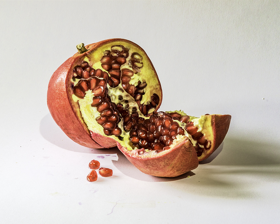
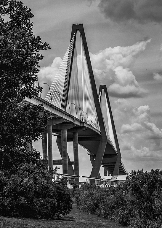
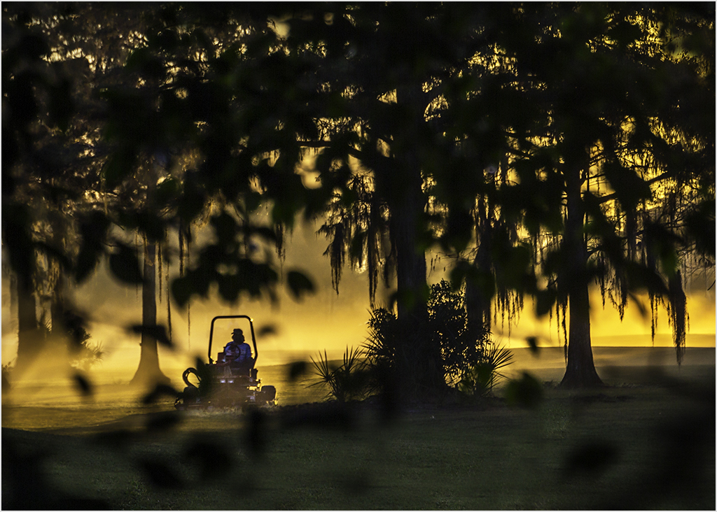
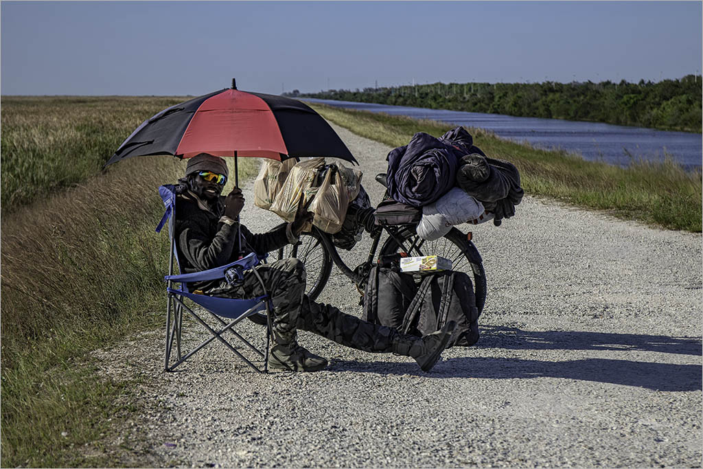
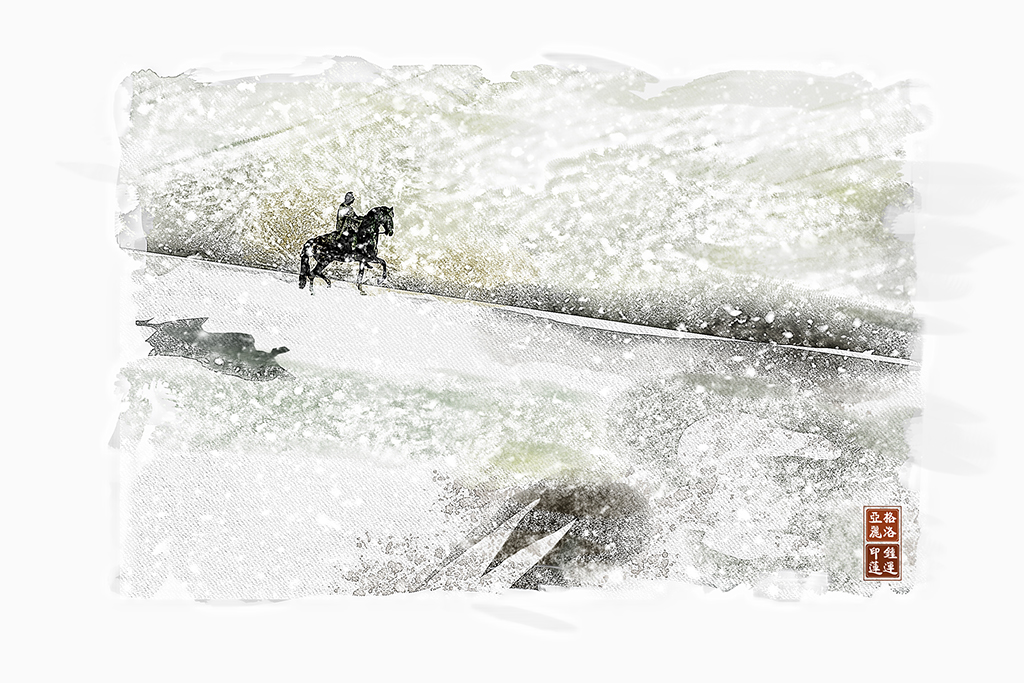
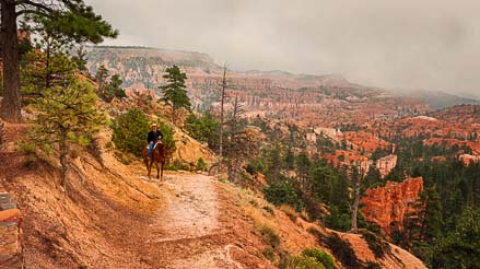
What luck - the image and story would be completely different without the cowboy! The path leads to the rider and the tree frames the subject. Your crop is a bit unusual resulting in an almost 5x2 aspect ratio. I would suggest cropping to a 16X9 panorama format taking off a bit on either side of the image. This also serves to bring the rider on the "thirds". May I also suggest darkening the sky and trying to create some separation of the rider. Definitely a keeper! |
Jan 12th |
 |
| 8 |
Jan 17 |
Comment |
Sukumar.. very creative and painterly. I like the overlay of the paint layer over the zoom effect. Like Alastair,I feel a square off center crop might be worth trying. |
Jan 12th |
6 comments - 2 replies for Group 8
|
| 58 |
Jan 17 |
Reply |
Thanks Isaac...I prefer this improved crop with nice clean edges. |
Jan 21st |
| 58 |
Jan 17 |
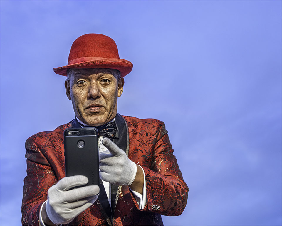
Reply |
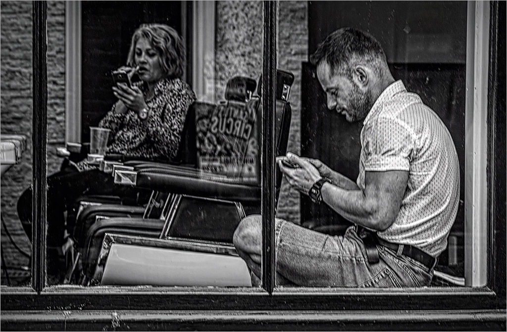
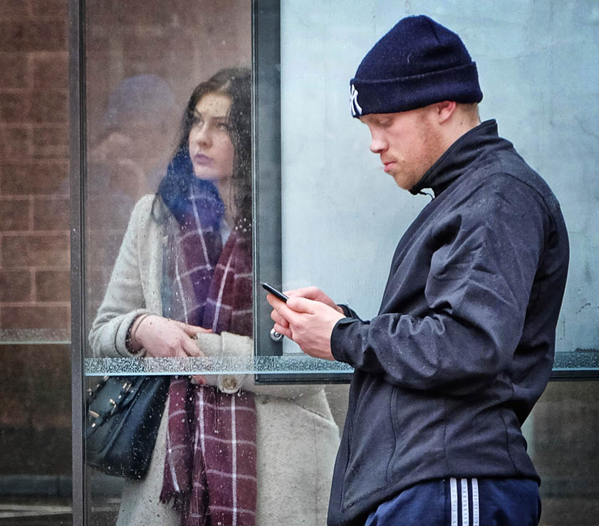
Thanks for your honest feedback Dan. On reflection, I do believe that your crop changes the composition and intent of my image. Your version places the subject in the dead center of a square image which makes the composition static and my eye is drawn to the red pillow first which is on the edge of the crop. My intention when photographing is to fill the frame and if I had wanted to shoot the man I would have changed the camera to a vertical format and zoomed in. By himself - he's not that interesting of a character except that his eyes are not glued to a cell phone. Typically in a street scene, I would choose the background stage and wait for a "character" to walk in. |
Jan 21st |
| 58 |
Jan 17 |
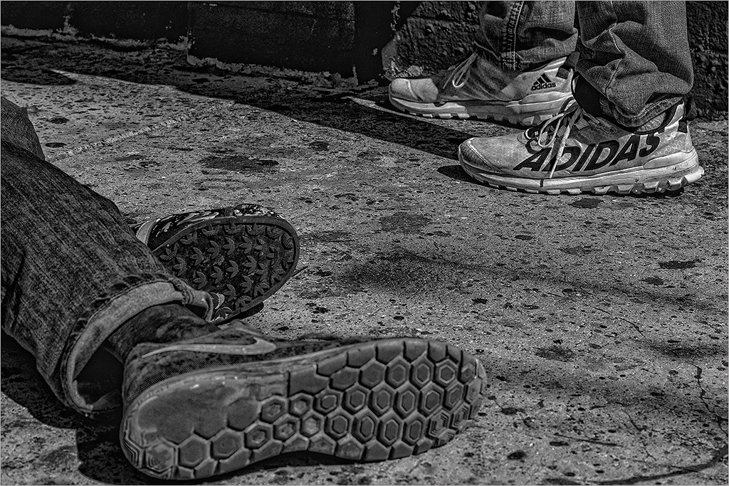
Comment |
Hi Dan...I agree with Isaac's crop of the extraneous and his edits. Conversion to B&W is a good idea. Although the lighting is harsh I do like the back lighting on the man's shoulders and his form which gives him definition. The bicycle adds to the story and the fences on the diagonal leads you to the back fields and shows the environment. |
Jan 12th |
| 58 |
Jan 17 |
Reply |
Thanks for the alternate B&W version Isaac. To me, this does not carry as much impact as the color one which I prefer. I think this is because everything is in focus. Our character now becomes part of the wall on which he is leaning and the "white" advertising on the glass window draws the eye. |
Jan 12th |
| 58 |
Jan 17 |
Comment |
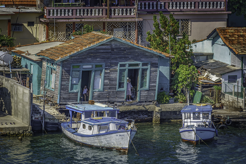
Liz...usually pianos like these are placed in busy train or bus stations inviting someone to play and enjoy the sound of music; and I have also come across them in the oddest places. Your image tells a story and the "seat" invites the viewer to sit down and enjoy the view beyond. I like the harbor scene and the human figures on the pier. There is a good tonal range in the image from the dark black of the piano and to whites of the clouds beyond. I agree with Isaac's crop and treatment which brings focus to the instrument. I think that I would have preferred to crop the piano off-center to improve the composition. I enjoy seeing your images from the other side of the world, to me anyways. |
Jan 12th |
| 58 |
Jan 17 |
Comment |
Isaac... a man in his environment for sure and a camera theme!! I like the man's pose, the crossed legs and his coffee cup almost raised as in a toast. I also like his clothing (a suit & hat in today's casualness). Good depth of field to capture the reflection in the window as well as the pedestrians in the background to lead the eye to the back of the image. Although he is camera aware, his eyes engage the viewer. The best camera is the one you have with you, right? |
Jan 6th |
| 58 |
Jan 17 |
Comment |
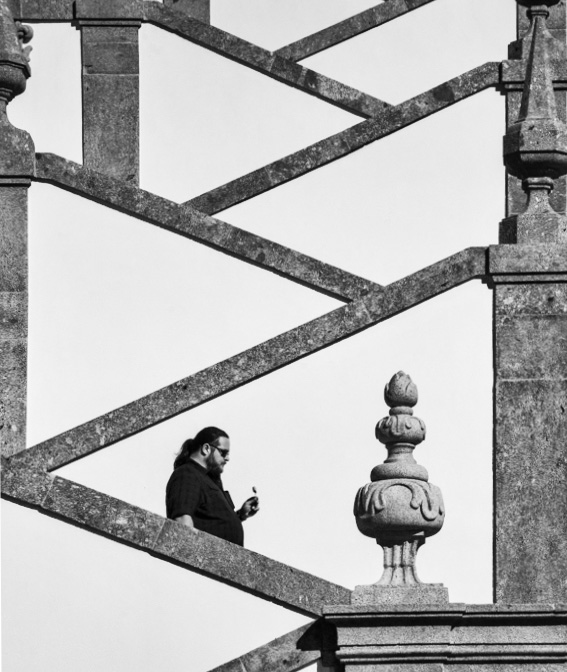
Daniel I like the diagonals which lead to the man with the lolly. The contrast of the curvature of the pedestals which mimic the man's form add interesting textures. I also agree with Isaac's crop because the right side of the image is so very different from the rest. I further refined Isaac's crop to exclude the Horizontals on the right which to me appear to be "hanging" in mid-air. I also converted to Black & white to simplyfy the "color". |
Jan 6th |
 |
| 58 |
Jan 17 |
Comment |
Beautiful capture Mofassirul.. The hands says it all and the lil boy with his fists up in the air is delightful. Camera position is excellent and conversion to B&W is a good choice. I agree with Isaac's crop to exclude the stick. |
Jan 6th |
| 58 |
Jan 17 |
Reply |
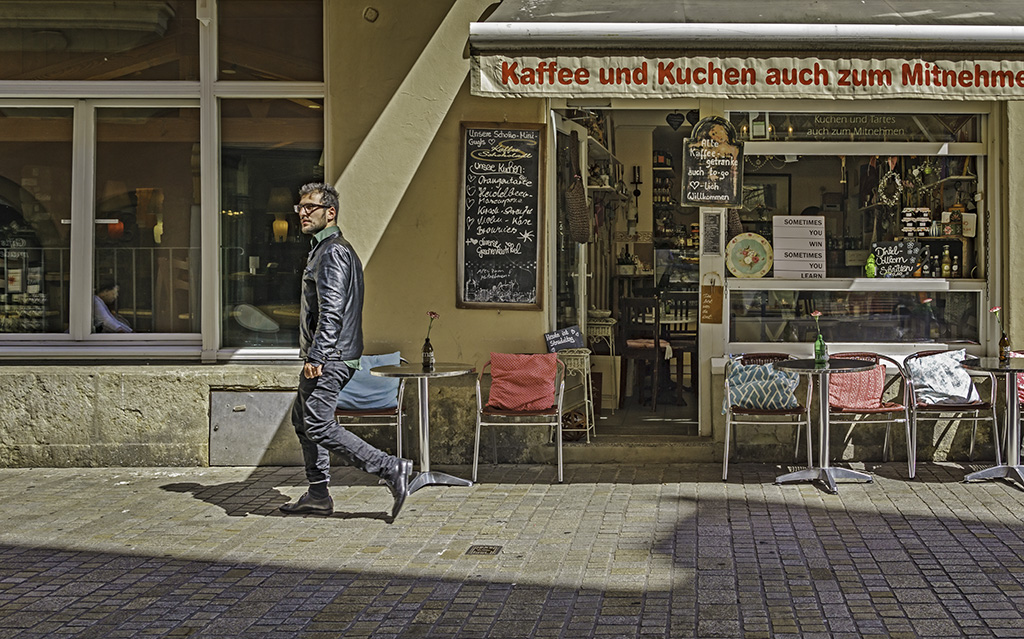
Thanks! In harsh light shadows are your friends. The only words I comprehend in English is the white one that says "Sometimes you win, sometimes you learn." :) |
Jan 6th |
| 58 |
Jan 17 |
Reply |
Thanks for your comment Daniel.. I appreciate your feedback. |
Jan 6th |
| 58 |
Jan 17 |
Reply |
Thanks Isaac...I waited until someone walked into the shaft of directional light on the wall which is just enough of a background to create a separation of subject. I love shadows which adds dimension and is a creative element on its own. |
Jan 6th |
5 comments - 6 replies for Group 58
|
| 62 |
Jan 17 |
Reply |
Angela.. I believe they're alluding to the "rule" of odd numbers in composition i.e that odd numbers are more appealing than even numbers. |
Jan 14th |
| 62 |
Jan 17 |
Reply |
Thank you for the free download website - got my own "bubbles" too! |
Jan 14th |
| 62 |
Jan 17 |
Reply |
I appreciate your insight into the faded water color effect. I'll have to try to remember this tip and not get carried away. Thanks Angela - I keep learning and learning. |
Jan 12th |
| 62 |
Jan 17 |
Comment |
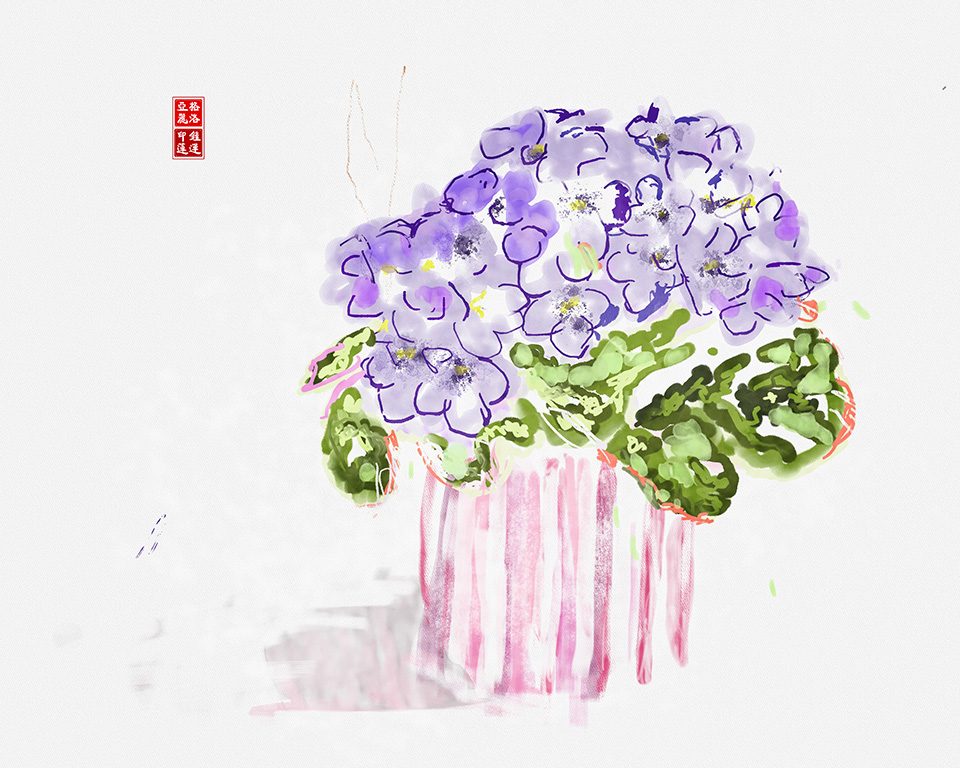
Angela, you took your inspiration and made it your very own artwork. Lovely colors that range from the lavender purples and fade to pinks. I also like the luminosity of your brush work probably achieved with your choice of the different blending options. Bubble Brush? In Photoshop, you say? Bubbles add another dimension and a playful layer to your painting. I would tend to agree with Gerhard about the crop and the group of "two" but an original, for sure! |
Jan 12th |
| 62 |
Jan 17 |
Comment |
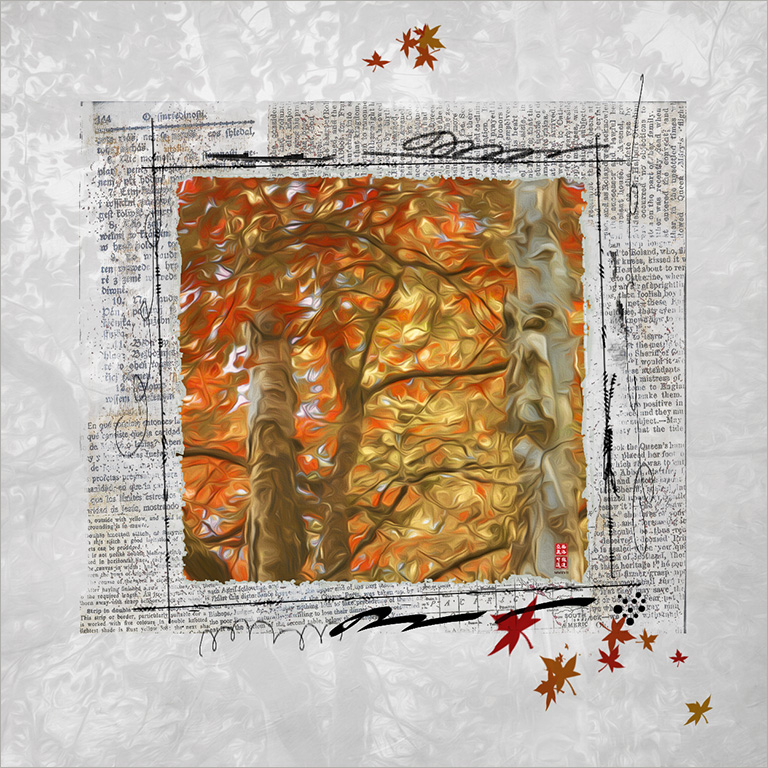
James,very nice image in 3/4 profile to create a sense of depth and great architecture framed and softened by the trees. I love the various hues of the trees indicating that its autumn. I too, think that the foreground foliage is very interesting and add texture and would have included more of it. I also like the overall cackle effect which makes it look aged. Lovely. |
Jan 12th |
| 62 |
Jan 17 |
Comment |
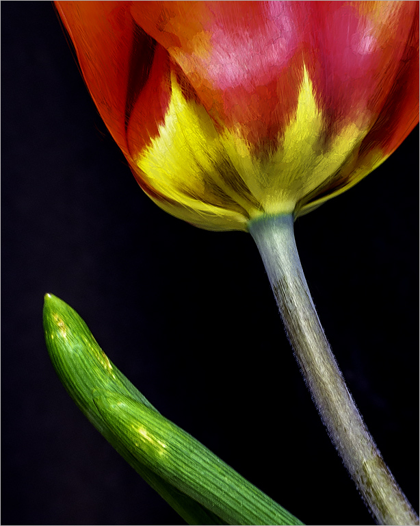
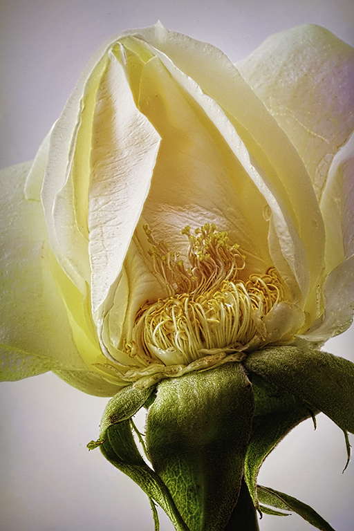
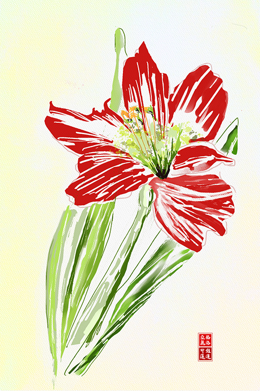
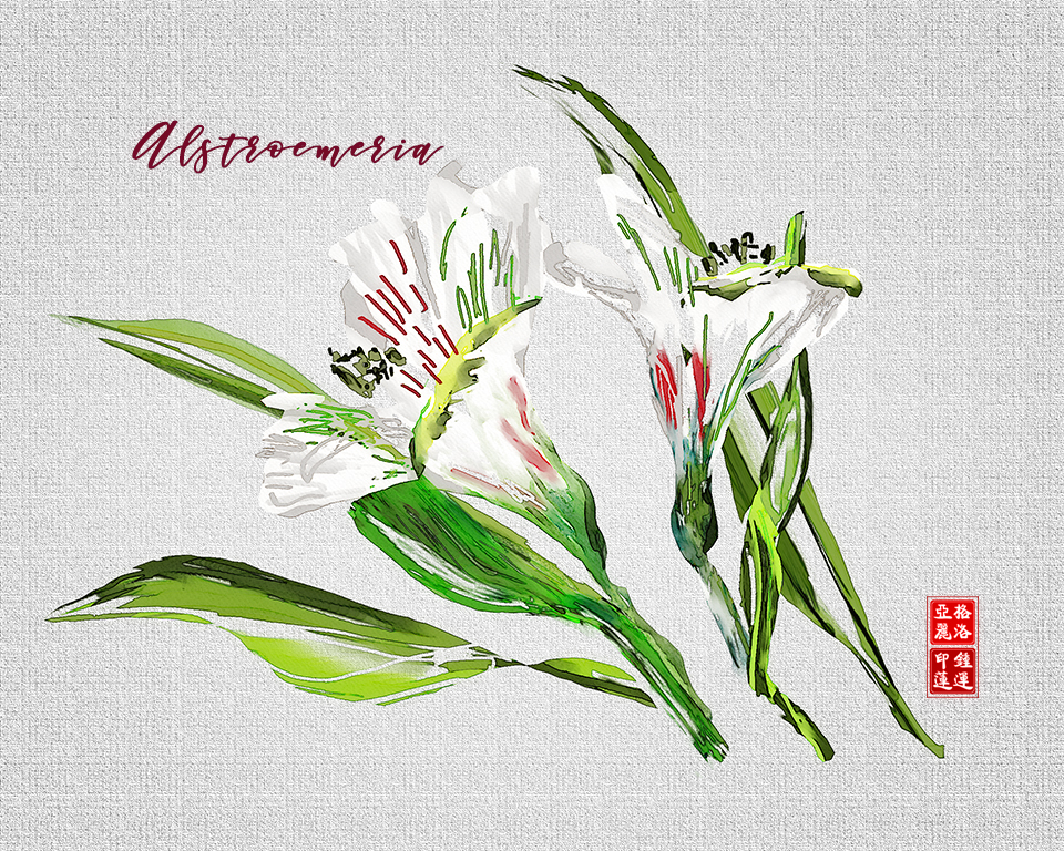
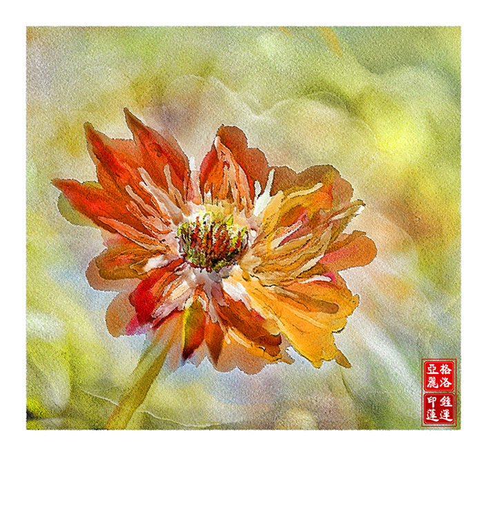
Elinor.. you must be doing something right, very nice brushwork and very painterly. I like the colors and the dark specks on the petals which make your painting interesting. I feel that the lines draw your eye down to the bottom of the painting and without a flower center there is no where to focus. The stamens are not defined and this could have provided a focus point. |
Jan 12th |
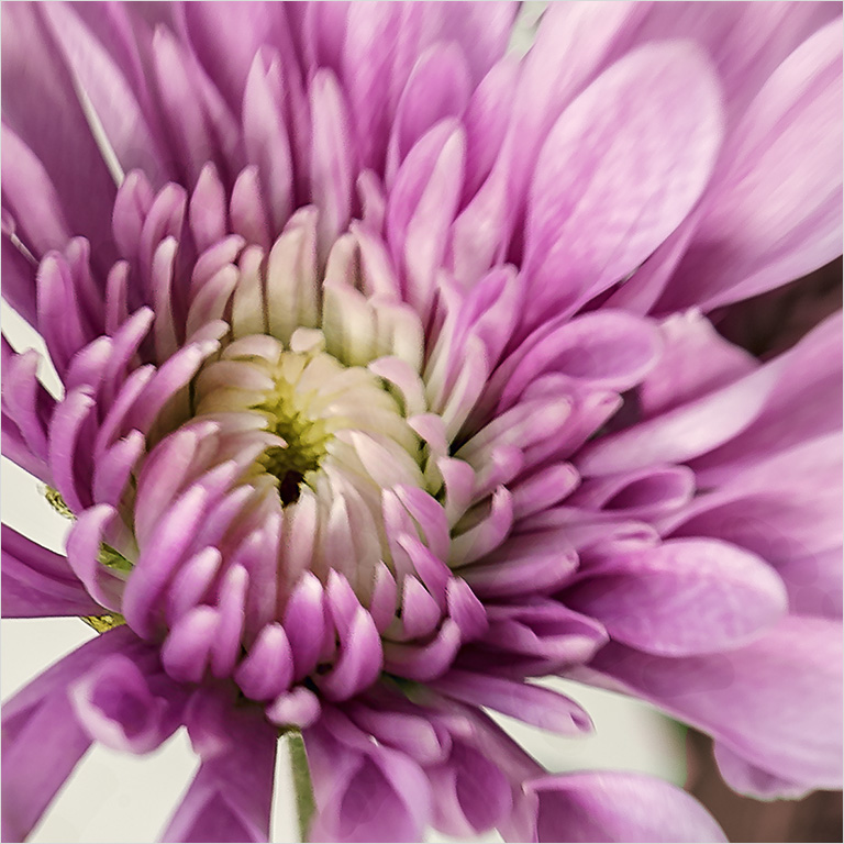
| 62 |
Jan 17 |
Comment |
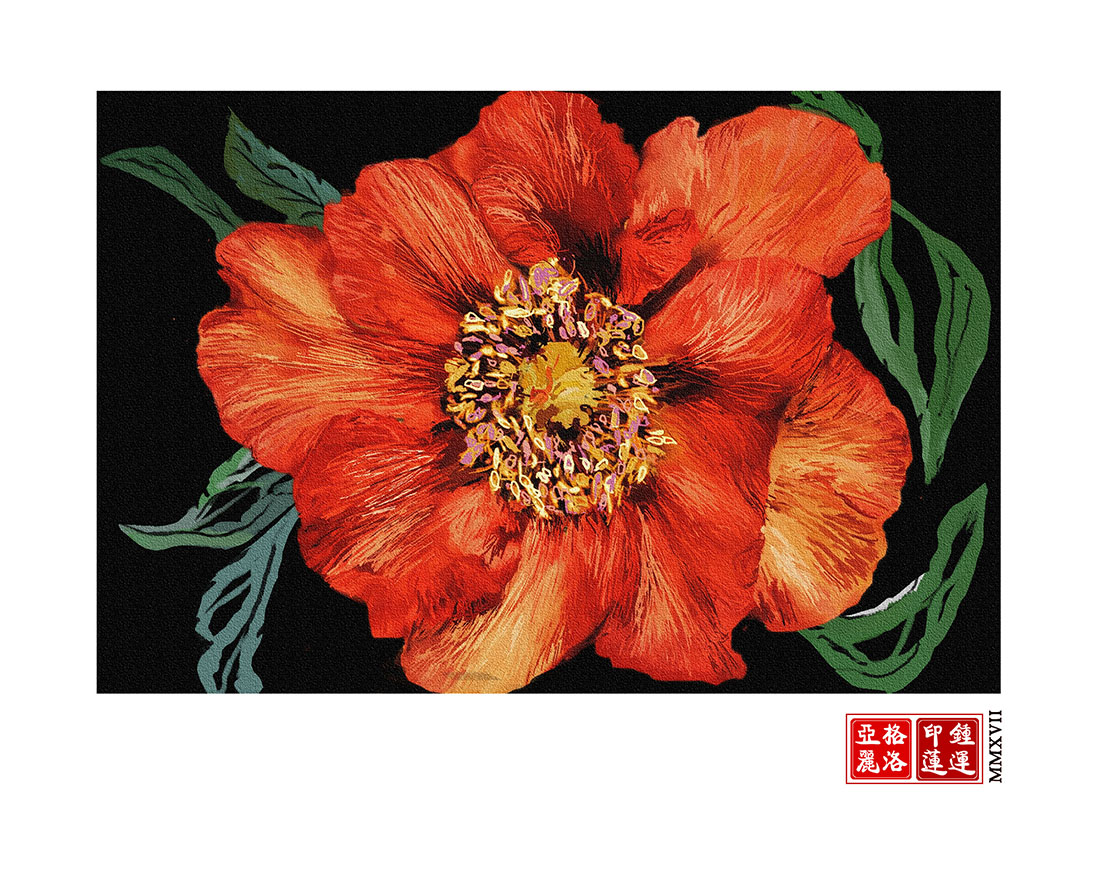
Gerhard... lovely vibrant colors. I like the rings of concentric color which leads you to the centre of the flower. I also like the green-black background which does not compete with the flower. The brush work is nicely done. Perhaps situating the flower dead center makes the composition a bit static and cropping off center would be a suggestion. |
Jan 12th |
4 comments - 3 replies for Group 62
|
15 comments - 11 replies Total
|