|
| Group |
Round |
C/R |
Comment |
Date |
Image |
| 7 |
Oct 18 |
Comment |
Beautiful. I wouldn't touch a thing. Especially love the color tone throughout. I hope you remembered to give the flip flops back to your wife. |
Oct 21st |
| 7 |
Oct 18 |
Comment |
Not much to add, Tony. Beautiful image of beautiful young lady. |
Oct 21st |
| 7 |
Oct 18 |
Comment |
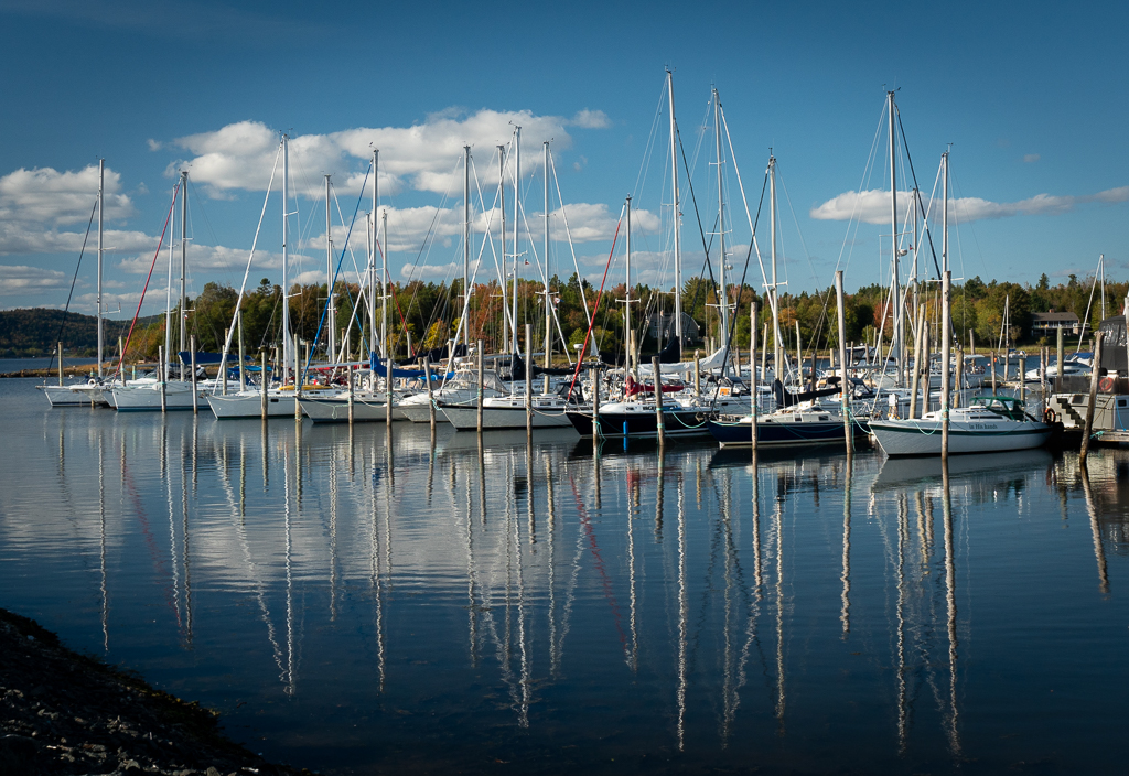
Beautiful. Especially like the contrast of the birds with the water color and the reflections complete the picture. |
Oct 21st |
| 7 |
Oct 18 |
Comment |
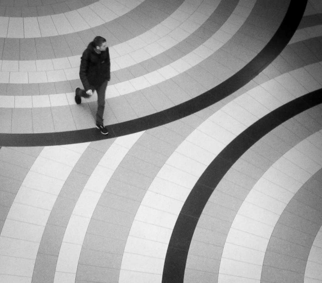
Great shot, Rich. Nothing to add but agree that the walls don't seem vertical. Beautiful. |
Oct 21st |
| 7 |
Oct 18 |
Comment |
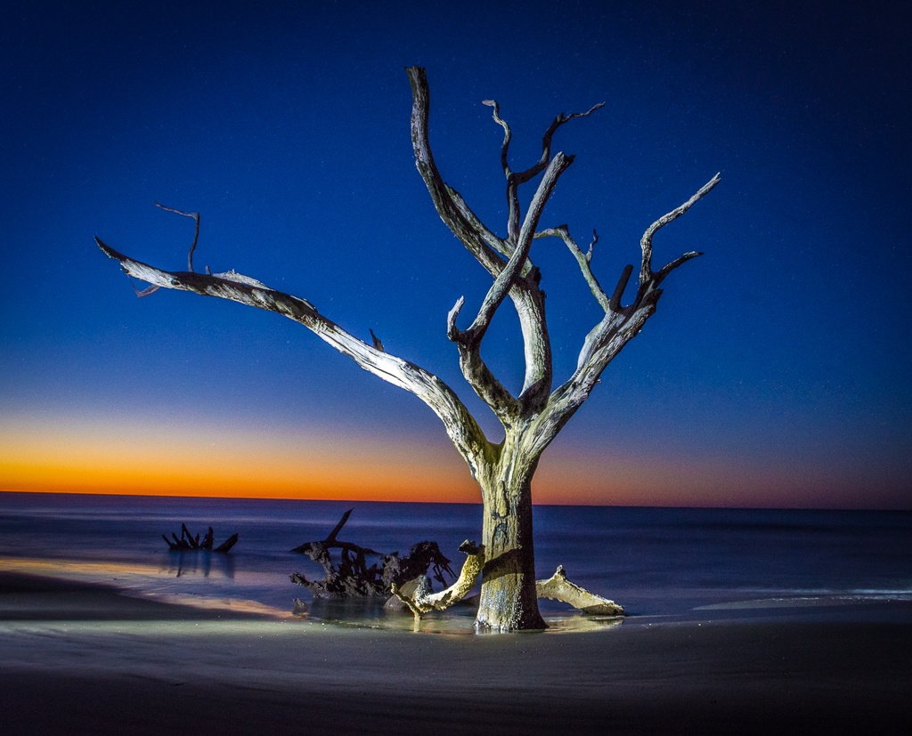
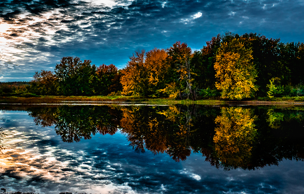
Great job on the sky. The detail is excellent. The feeling of a storm coming is certainly there. |
Oct 21st |
5 comments - 0 replies for Group 7
|
| 33 |
Oct 18 |
Comment |
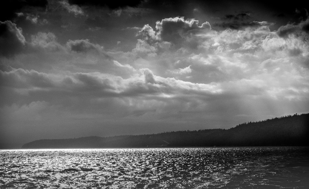
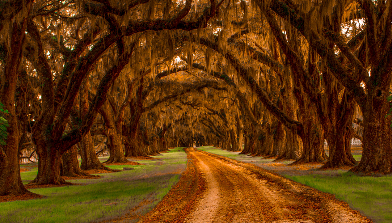
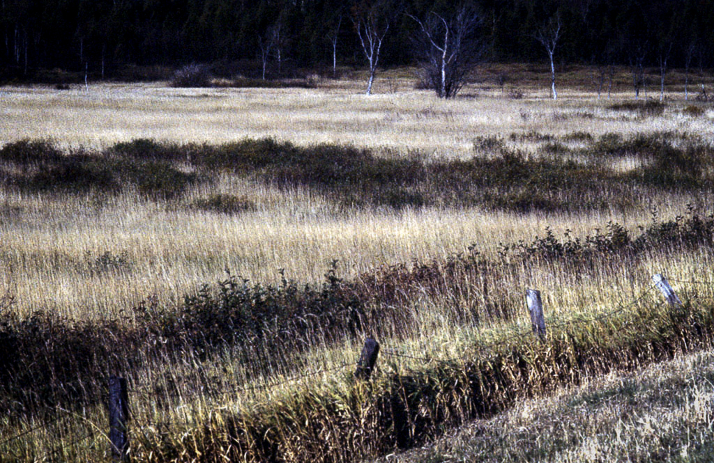
Sometimes very early light is much too dull to provide good definition and I believe that's the situation here. Adding contrast might help but could hurt the mood. Might be worth a try to see the result. It might also help to bring more detail to the sky. |
Oct 21st |
| 33 |
Oct 18 |
Comment |
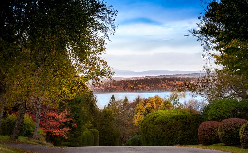
Beautiful image, Elizabeth. Focus seems fine to me. My personal taste would be to crop a bit of the sky because it really doesn't add much to the scene and perhaps see what it looks like with a bit more contrast as it seems a bit flat to me. Lovely. |
Oct 21st |
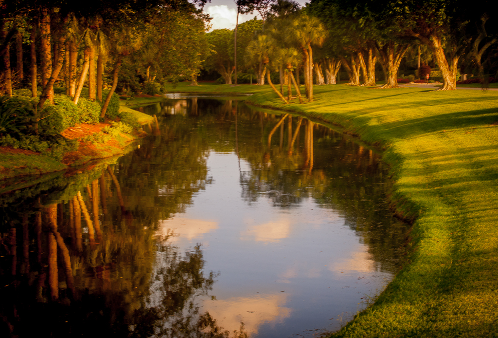
| 33 |
Oct 18 |
Comment |
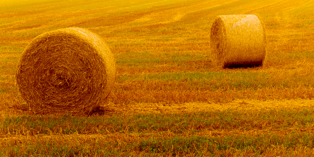
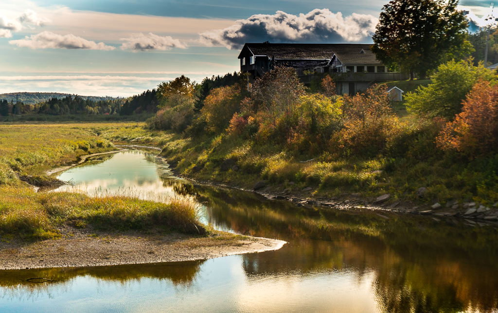
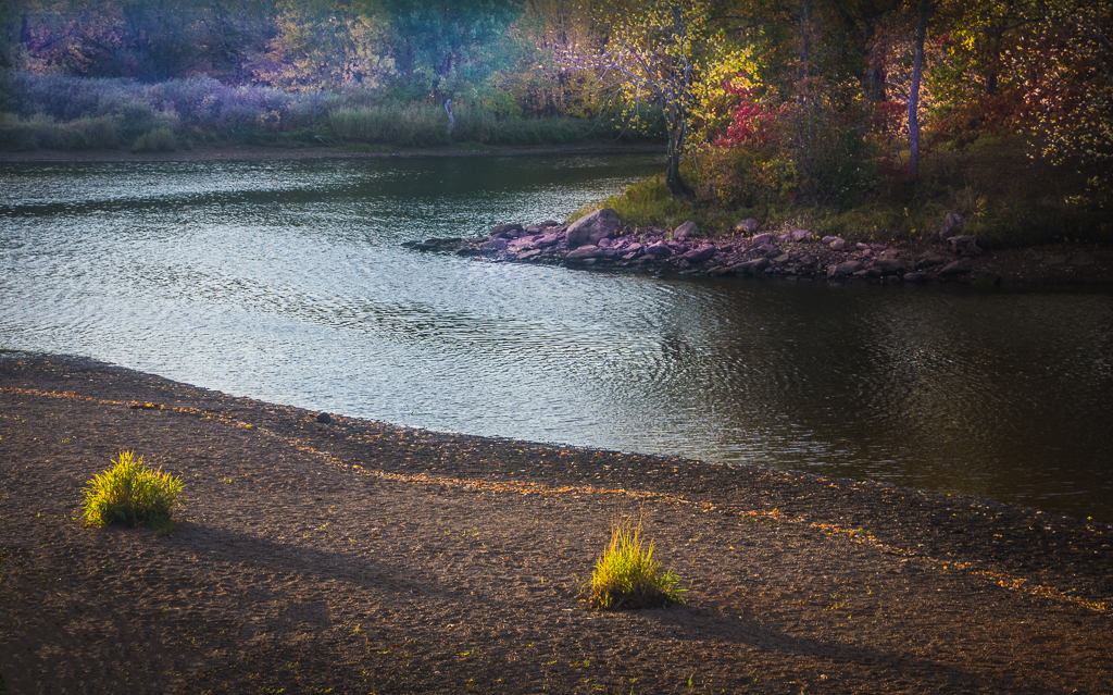
Nice image and good color. Just wondering if the overall exposure were dropped 1/4 to 1/2 stop if it would heighten the impact of the colors. And I would try to clone out the tree on the right. Well done. |
Oct 21st |
| 33 |
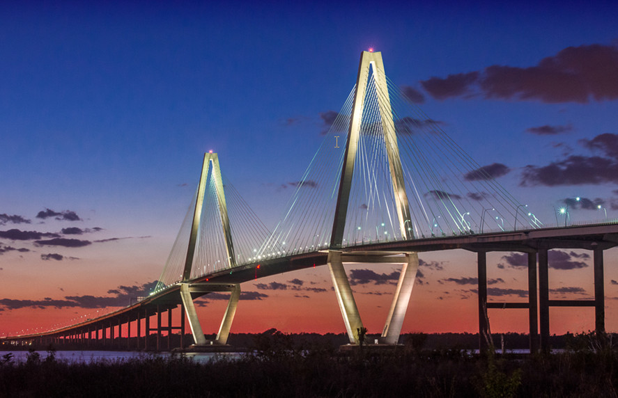
Oct 18 |
Comment |
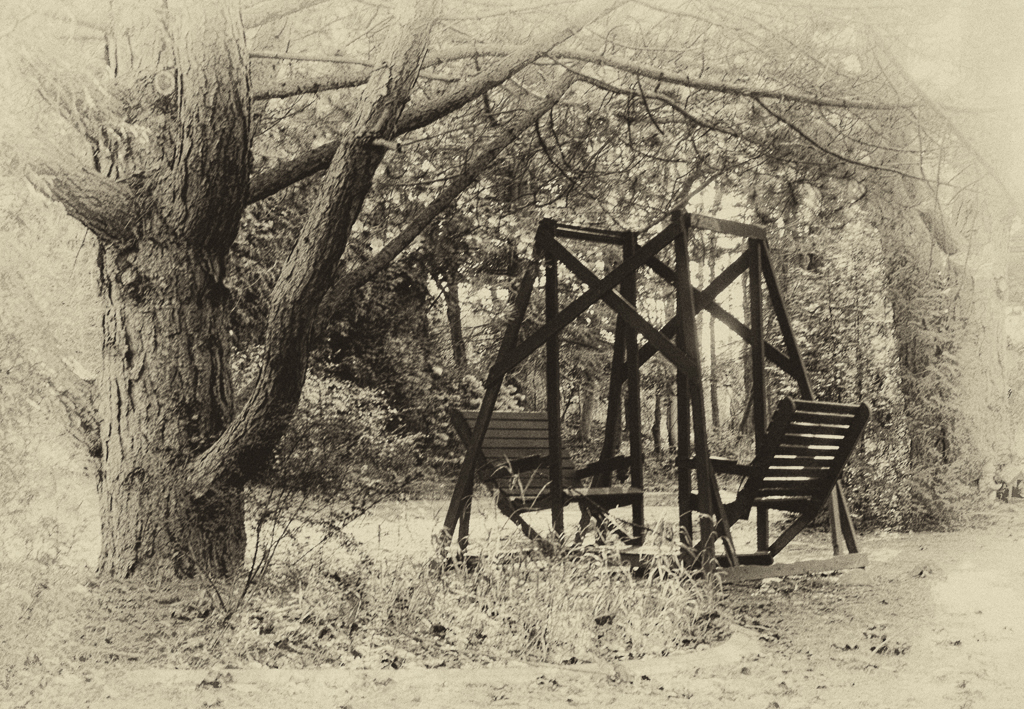
Great job, Ken. My little nit picks are: (1) It would have been good to have a bit more on the left because the trestle doesn't look like it's reaching anything solid. (2) The reds still seem a little too bright at least in comparison to the colors in our neck of the woods. Beautiful composition and great rendition of the water. |
Oct 21st |
| 33 |
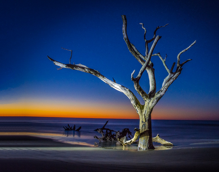
Oct 18 |
Comment |
Nice image, Larry. Two things bother me. There seems to me there is a yellow caste to the whole image and the clouds that seem to be sitting on the ground look strange to me. And I think it would enhance the wind thingy if those clouds were removed. |
Oct 21st |
| 33 |
Oct 18 |
Reply |
I see what you mean, Larry and like it but I think the colors on the foliage are a little overdone. I'm going to redo it as you suggest with more subdued colors. Thanks. |
Oct 16th |
5 comments - 1 reply for Group 33
|
10 comments - 1 reply Total
|