|
| Group |
Round |
C/R |
Comment |
Date |
Image |
| 7 |
Mar 18 |
Comment |
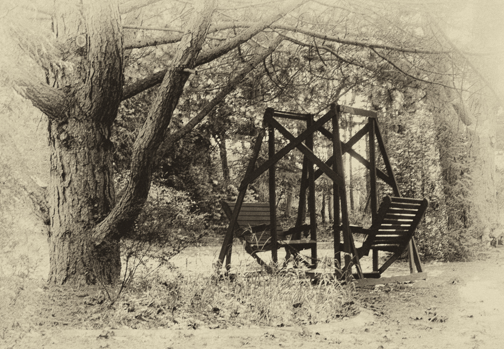
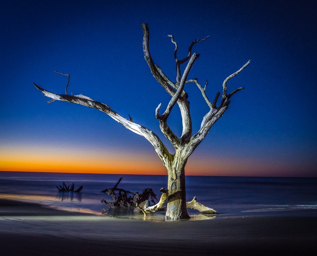
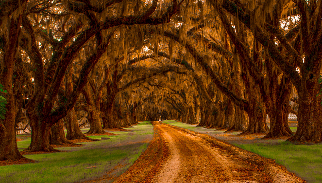
The idea of this shot is really good. The structures stand out nicely and their shapes create an interesting comparison. The exposure is good but I think there could be a bit more contrast. For me, the problem is the trees. I think there is too much of them. If you crop half way down from the top it puts all the emphasis on the structures which stand out much better, as they should. The lower branch sticking out of the tree on the left is, unfortunately, something you have to live with. |
Mar 13th |
| 7 |
Mar 18 |
Comment |
Tony, as someone who is now enjoying great-grand-daughters I can tell you that this is one of the joys of family life. Take lots of pictures of this beautiful little lady and keep taking pictures as she becomes a beautiful mature lady.
As for the picture, it's just what you want. The expression is great, the eyes are sharp and sparkle and the little bit of spittle makes it real. The dark area in the upper left of the background is unfortunate and perhaps with your expertise you can get rid of it. Other wise the background is perfect being thrown out of focus nicely. The colors are nice and soft and make her beautiful black hair stand out. Great shot. |
Mar 13th |
| 7 |
Mar 18 |
Comment |
Super shot, Barbara. Composition is excellent despite bird being in the middle. Lots of room in front of him and the splash tells the whole story. Could be taking off or landing, it doesn't matter. Colors are dead on and the focus seems ok to me. Beautiful. |
Mar 13th |
| 7 |
Mar 18 |
Comment |
Beautiful flowers and pot. I don't think I'd darken the background too much but I would try to throw it out of focus so it's recognizable but not so obvious. What I would suggest is that you get rid of that plant on the lower right especially the big leaf that seems to be intruding on the scene and drawing the viewers eye. Really good shot. |
Mar 13th |
| 7 |
Mar 18 |
Comment |
Really good job of combining the two images. Might have made the man a bit smaller...seems out of proportion. Great colors and mood. Could the trees been opened up a bit more? |
Mar 13th |
5 comments - 0 replies for Group 7
|
| 33 |
Mar 18 |
Comment |
Dan, I think your original thinking is the way to go. The aspen leaves are an important aspect of the scene and should be more prominent. I think I would use more clarity and vibrance on the leaves to make them pop. Before doing that I think I would take a look at the color blue which seems to be very heavy. Usually don't see the bark of trees with a blue caste. Reducing the blue may also strengthen the color of the leaves. This won't help now but this is another case where a lower camera angle would have made a really interesting perspective. Beautiful scene. |
Mar 16th |
| 33 |
Mar 18 |
Comment |
Beautiful shot, Elizabeth. I agree with Ken and Dan except for the cropping. Leave it as is. I particularly like the way the pier leads to the reflection of the sun which leads to the sun. Well done. |
Mar 16th |
| 33 |
Mar 18 |
Comment |
I agree with Ken in that I find the image somewhat flat. I use LR where I would probably add some vibrance and/or clarity with a touch of contrast. I think the signs hurt the scene and should go. This image has a lot of potential because it's well done. One thing that I'm guilty of is not getting down on one knee to give the scene an entirely different perspective. In this case getting low would have emphasized the road and the texture of the rocks. |
Mar 16th |
| 33 |
Mar 18 |
Comment |
I think you've captured the essence of the storm with stretched flag on the bent flagpole and the breaking wave coming over the rocks. I like it as is but you might consider using a vignette to emphasize the wave and darken the sky. I think it would give it a more somber mood. After 500 shots you must have been soaked. |
Mar 16th |
| 33 |
Mar 18 |
Comment |
My first inclination was to crop some off all sides to reduce some of the darkness and make the houses more prominent. I then was able to get more detail on the houses in LR. However I found that I liked the composition better in your image better so I scrapped mine. But I can tell you there is a bit more detail in the houses which could be brought out. Good shot. |
Mar 16th |
5 comments - 0 replies for Group 33
|
10 comments - 0 replies Total
|