|
| Group |
Round |
C/R |
Comment |
Date |
Image |
| 22 |
Jul 17 |
Reply |
Thank you Marti. |
Jul 23rd |
| 22 |
Jul 17 |
Reply |
Thank you Mike. Street photography is my favorite subject to photograph. |
Jul 23rd |
| 22 |
Jul 17 |
Reply |
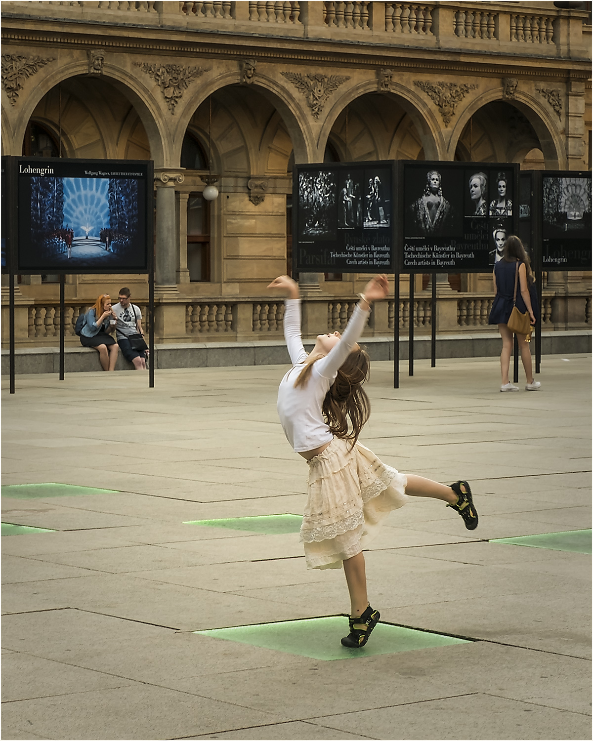
Jerry, That is exactly what I saw in this image - Future ballerina! |
Jul 23rd |
| 22 |
Jul 17 |
Reply |
Thank you Jerry.I was going to convert this photo to B&W at first, but left it in color because of the green squares. I still want to try this in B&W, but the color works too. I also wished I catch girl's eyes... |
Jul 23rd |
| 22 |
Jul 17 |
Reply |
Thank you Joe for your comments about cropping. I was tempted to leave small boy in the composition, but was not sure if it would take away from the girl. |
Jul 23rd |
| 22 |
Jul 17 |
Reply |
Thank you John.Street photography is my favorite subject to photograph. I will try convert this to B&W for my street photography album. |
Jul 23rd |
| 22 |
Jul 17 |
Reply |
Thank you Peggy. |
Jul 23rd |
| 22 |
Jul 17 |
Comment |
Mike what do they say? That good things come to those who wait..? You envisioned your photo and waited for perfect composition to take this photograph, and it paid out. Nicely done. I think the orange water is too bright. I like the original better. Well done. |
Jul 23rd |
| 22 |
Jul 17 |
Comment |
Joe, Excellent idea and very nicely done. |
Jul 23rd |
| 22 |
Jul 17 |
Comment |
Good work in low light conditions. Nice detail recovery, and removal of tools box in the background. There is a long red horizontal object (dolly?)behind the wheel, which I also find distracting. I would recommend to remove it or change the red color to something less distracting. I understand Marti's comment, but I would prefer to leave the rope on the chocks. I think it emphases the inactive motionless status of this plane (tighten down by the rope, grounded). Nice photo.
|
Jul 23rd |
| 22 |
Jul 17 |
Comment |
Beautiful photo. Perfectly sharpen detail and soft contrast. nicely done. I agree with Marti's comments about leaves. |
Jul 23rd |
| 22 |
Jul 17 |
Comment |
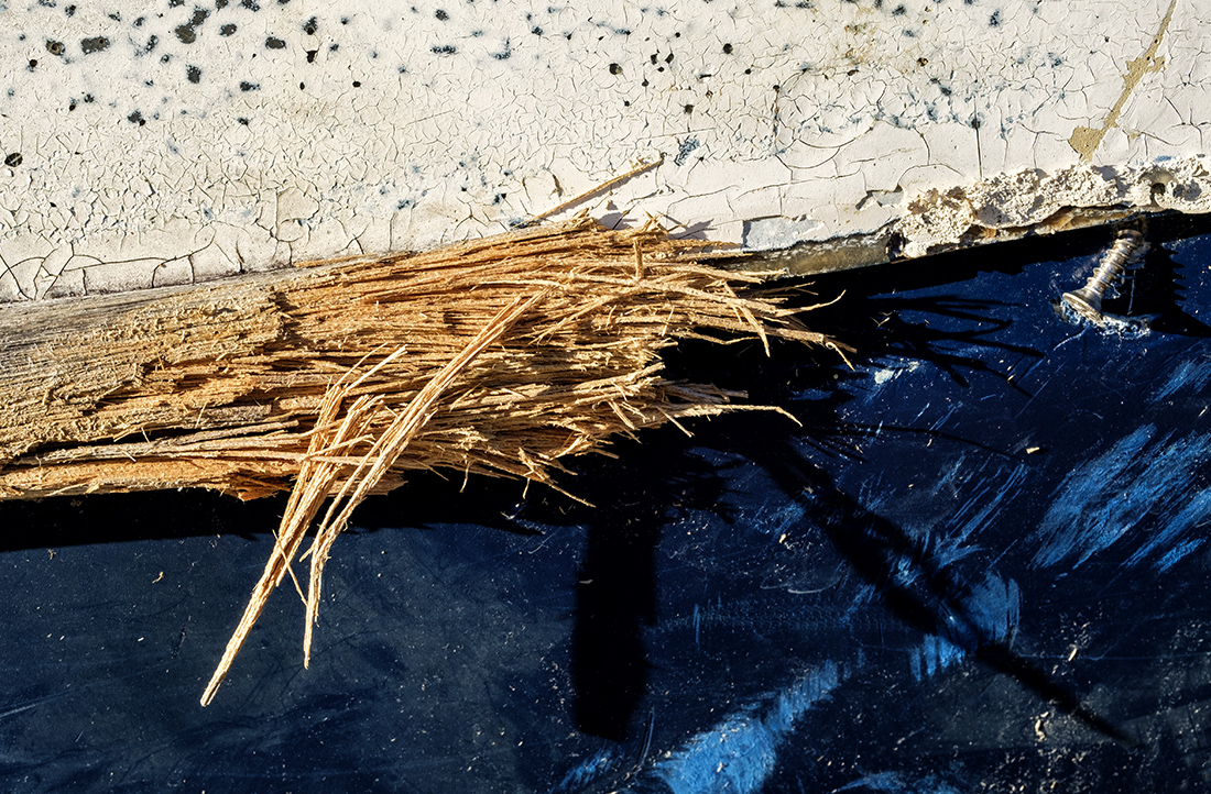
Great old wood character. I liked the golden tone of entire adjusted image, but in overall effect is somewhat distracting, because it also pulls in the background and stump edges. I would recommend to darken the background and stump edges to get better separation between highlighted center and shaded rest of the stump. |
Jul 23rd |
| 22 |
Jul 17 |
Comment |
Interesting geometric shape. Good sharpness. I like that contrast of frame is softened by clouds and the building with window details. I also like the monochrome color. I find the tree distracting as well. |
Jul 23rd |
6 comments - 7 replies for Group 22
|
6 comments - 7 replies Total
|