|
| Group |
Round |
C/R |
Comment |
Date |
Image |
| 22 |
Apr 17 |
Reply |
Jerry, I agree with darkening the trees. your suggestion of cloning the bird in different position is interesting, but I do not think my skills are that good yet ... I will try, but may not be for publishing:-) Looks like I need to spent more time on this image. |
Apr 23rd |
| 22 |
Apr 17 |
Comment |
Mike it is very challenging shot to capture entire waterfall. I agree with above comments, this could be a great candidate for a vertical panorama. As Marti mentioned for vertical pano is best to shoot the sections horizontally. Also remember to change White balance from AWB to something else (daylight, shadows etc) so the white balance stays same in all shots and there is no problem stitching images in post process..
Nice work adjusting your image, it is very sharp and great colors. The bottom right edge is little too bright, and this is pulling my view away from the waterfall. I would recommend to darken the rock wall on the right side (bottom) to bring the eyes back to the falling water . Great shot. |
Apr 23rd |
 |
| 22 |
Apr 17 |
Comment |
I think murals should be our next assignment. It would be very interesting and fun to see what we would all come up with..
Joe, I like title "Stone Face". Adding brick wall behind the face mural is a creative move. It changed the photo's dynamic (face mural on the cement block wall), and now it looks like a poster. I think it is because it appears like there is a shadow cast on the brick wall from flat surface with the face. Interesting effect. |
Apr 23rd |
| 22 |
Apr 17 |
Comment |
John, I think you succeeded to show man's irritation with you taking this photo. It shows on his face. I like it. Sometimes it happens that people do not like being photographed.
Yes, the woman in pink hat(with backpack) is distracting to me, it could be removed. It has no value to your story of irritated man. |
Apr 23rd |
| 22 |
Apr 17 |
Reply |
Jerry, Thank you for showing me the recomposing tool. I like to find if there is some like this in Photoshop CC.
|
Apr 23rd |
| 22 |
Apr 17 |
Reply |
Peggy, I agree with Marti and Mike. You aced it. This is a wonderful composition. I like your final adjustments. In the first edit - the yellow and skies were much brighter, and it was pulling my eyes away from the subject (house), now it is perfect. Nice work. |
Apr 23rd |
| 22 |
Apr 17 |
Comment |
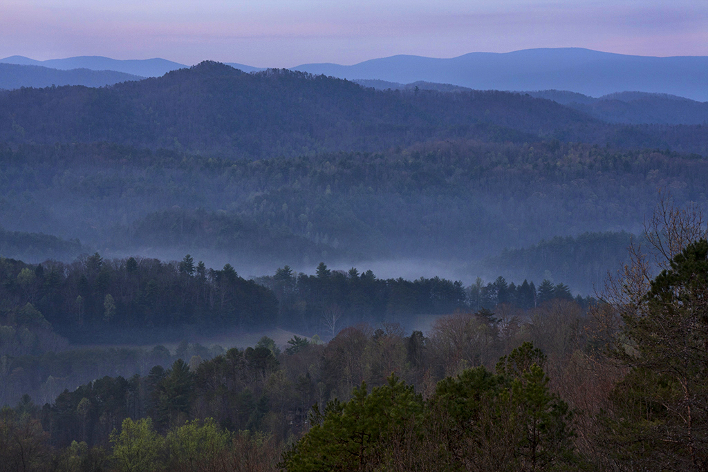
I very much like the original image composition with the fog rising from the mountains. I like the hint of blues and little pink on horizon. I think the edited version is a little over-saturated, and the Topaz detail too strong. I prefer the original image with soothing colors. My recommendation would be to make the image brighter, add contrast,and adjust shadows to bring separation between trees. I also used burn brush to darken horizon just a little (after I adjusted brightness); it added the touch of pink. I hope you do not mind that I used your image to show my recommendation. |
Apr 23rd |
 |
| 22 |
Apr 17 |
Comment |
Jerry, I think you did an excellent job adjusting this image in RAW. It looks great. It is amazing what data was hidden there! I am not familiar with "Photoshop Elements recompose tool". What changed in the composition? I tried to compare composition of original and final, but I do not see what changed? |
Apr 3rd |
5 comments - 3 replies for Group 22
|
5 comments - 3 replies Total
|