|
| Group |
Round |
C/R |
Comment |
Date |
Image |
| 22 |
Mar 17 |
Reply |
I do not know Topaz Remask yet. I used Photoshop CC Mask and Select tool and found it helpful when selecting the smoke. |
Mar 20th |
| 22 |
Mar 17 |
Comment |
Joe, I like the cartoon-like look. The smoke and shrubbery colors and added person are cheerful additions. Topaz Simplify treatment is interesting. |
Mar 19th |
| 22 |
Mar 17 |
Reply |
Marti, you are killing me! We just finished one challenging theme and here you are proposing another even more challenging one?! HAHa
I guess I need to watch more CreativeLive.com couses! Lol |
Mar 19th |
| 22 |
Mar 17 |
Comment |
Mike, as John indicated, this was not an easy assignment. I am not sure how much modification can be done in LR, because there are no Layers. You can apply presets, various textures, or use of additional plug in software like Topaz. I agree with your comment on composition of this image. The backround is too busy and distracting. |
Mar 19th |
| 22 |
Mar 17 |
Comment |
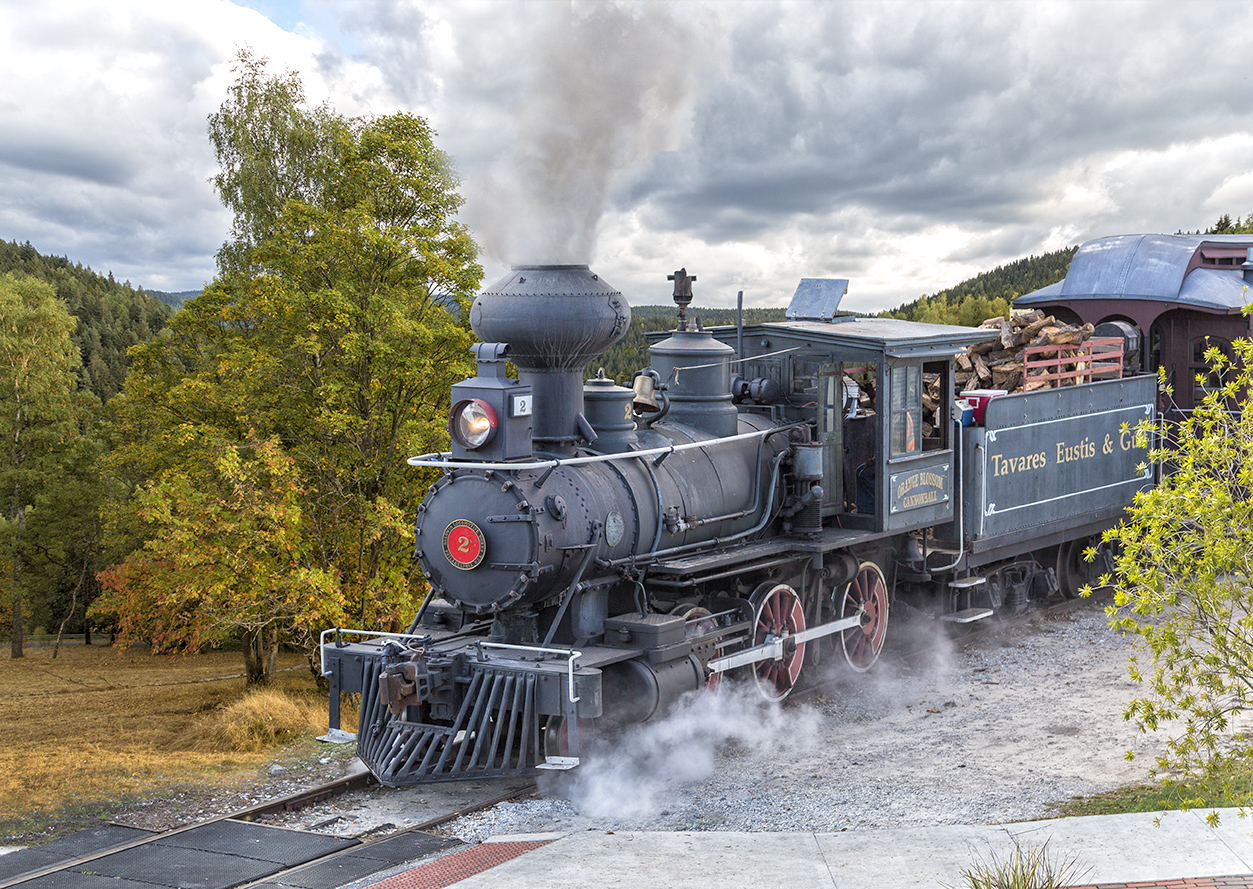
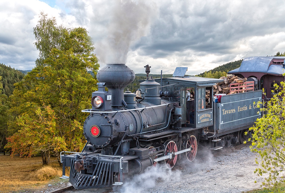
Marti, I like the backround you choose. The color and theme works well with the overall composition. It could be used for an old western movie poster. Only one thing, as others already mentioned, the smoke need to be blended in little better. It looks cut out. I know selecting smoke is not easy, it was the most chalenging part for me too. Overall good job.
|
Mar 19th |
| 22 |
Mar 17 |
Comment |
Jerry, I am impressed by your imagination. Vibrant colors and great texture. Great job. |
Mar 19th |
| 22 |
Mar 17 |
Comment |
John, this is very creative . I expected various versions of Photoshop or Topaz renditions (like mine attempt) .. But this is very diffrent and cool! Definitely out of the box thinking! I like the symetry and cooler and warmer square tones. I am not sure about the letters thought. I see that you meant placing these letters as an abstract objects, however my brain is looking for meaning for these letters. The placement is distracting to me. I keep wondering and jumping from letters to another parts of the image, looking for reason why are these letters positioned this way, especially the bottom row. For me the placement has distracting effect, not settling. Wonder if the letters were moved from the bottom into diffrent squares, or even deleted at all... ?
Great effort and creative out of the box thinking! Thanks. |
Mar 13th |
| 22 |
Mar 17 |
Comment |
Peggy, very nice work. I like the old antique feel. Nice job removing the distracting pole, sign and electrical wires. Maybe suggest darkening the smoke a little, or just add a few darker puffs of smoke ... |
Mar 13th |
| 22 |
Mar 17 |
Reply |
Jerry, great mind think alike! Seems that the crossng needs more work. Other membes suggested similar solutions. Thank you! |
Mar 13th |
| 22 |
Mar 17 |
Reply |
Mike thank you for your suggestion. Peggy and Jerry also suggested similar solutions. |
Mar 13th |
| 22 |
Mar 17 |
Reply |
Peggy, I like the crop suggestion. Thank you. I tried quick crop on my ipad, later I could add more canvas in PS. |
Mar 13th |
 |
| 22 |
Mar 17 |
Reply |
John, I agree that the light direction is mismatched. Good observation, I missed it. Thank you. Something I need to learn to look for.. however I am not sure how to fix it. |
Mar 13th |
| 22 |
Mar 17 |
Reply |
Joe, I agree with darkening of the two areas, the train and concreate and bricks on foreground. Thank you! |
Mar 13th |
6 comments - 7 replies for Group 22
|
6 comments - 7 replies Total
|