|
| Group |
Round |
C/R |
Comment |
Date |
Image |
| 52 |
Apr 26 |
Reply |
Now that you mention it I see it too. Thanks Tom |
Apr 11th |
| 52 |
Apr 26 |
Reply |
Oh, and I now see the face! |
Apr 10th |
| 52 |
Apr 26 |
Reply |
Your artistry inspires me. Thanks! To answer your question, there are a lot of ways to increase contrast and the contrast slider is the one I almost never use. Just by increasing the whites and decreasing the blacks, contrast is increased. I also use the curves tool and about 1/3 of the way up the line I bring it down and about 1/3 of the way from the top, I bring it up. That is the classic S curve and is a default setting. You can make your own presets in the tone curve and save them if you use them a lot. For example, I have a simple one that pulls the line down to darken the whole image that I've saved. I then mask the effect out on the subject or where ever else I don't want it in various opacities. |
Apr 10th |
| 52 |
Apr 26 |
Comment |
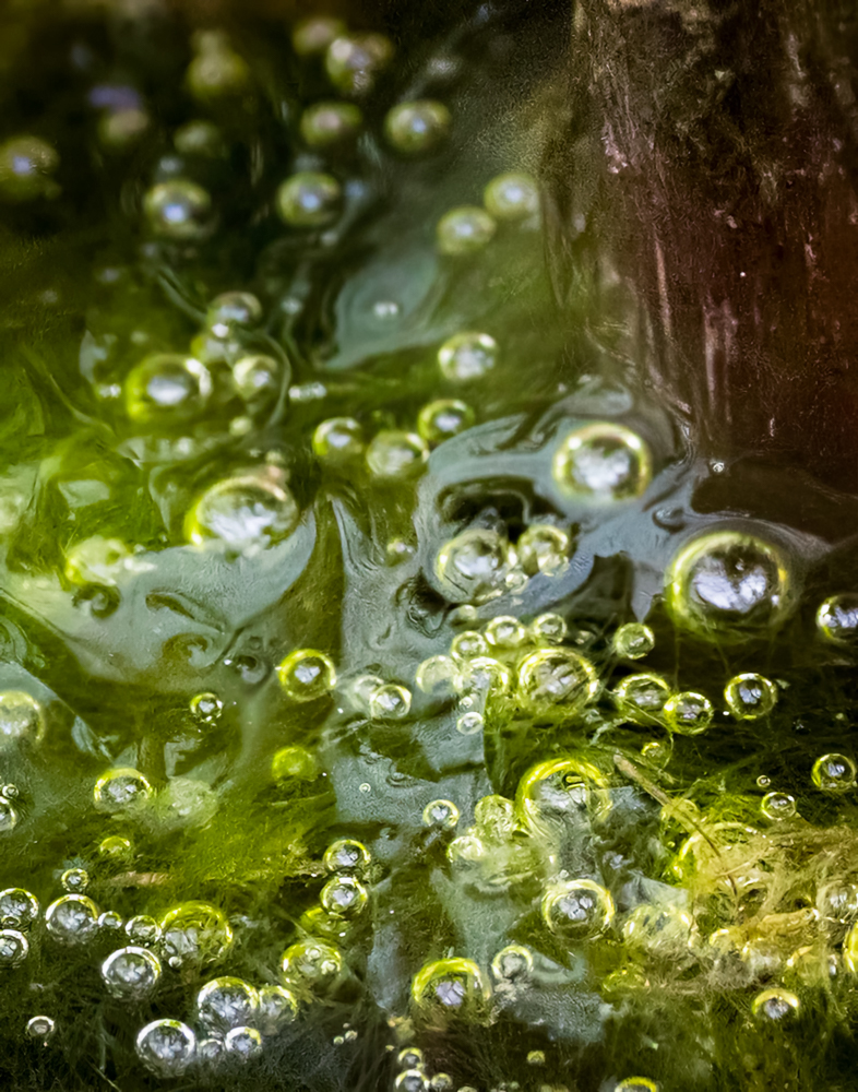
This is a tough one for me. I love your out of the box artistic eye and can see what you were going for here but it is too conffused for my taste. Also, the bright refection around the edge of the vegetation toward the upper right grabs my eye and pulls it away from the bubbles, which I think are the most interesting subject of the image. All that said, I do find the image interesting and thought I'd play with it to see what I could change. I used. AI to remove the reflection and using a diagonal lineal mask, darkened the lower left. I made a strong S curve to exaggerate the constrast. I also removed the line in the lower left and the little brown item in the lower right. |
Apr 7th |
 |
| 52 |
Apr 26 |
Comment |
A perfect Easter image. Very cute little rabbit and I like the angle which favors its face and ears. I like how you separated the subject by darkening the background and the crop works for me. I don't have any suggestions. Nice job. |
Apr 7th |
| 52 |
Apr 26 |
Comment |
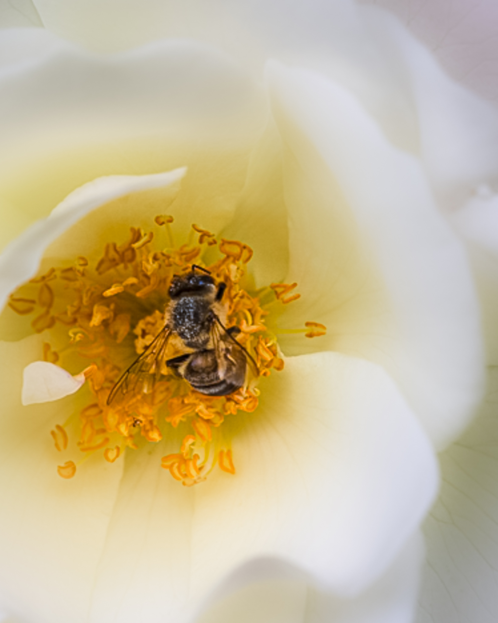
Nice image. My initial impression when I first looked at the image was that the whites looked a bit dull and I thought puttng the bee off center would be more dynamic. I placed with it, boosting the whites and adding some sharpness in the center, descreasing sharpeness outside the center and increasing the vibrance. I could have played with many alternative crops to see which I liked best but just wanted to give you one to look at and consider. |
Apr 7th |
 |
| 52 |
Apr 26 |
Comment |
Great shot Tom. I know that nest and have been meaning to photograph it. Last time I was downt there I couldn't see any chicks and mom was getting to nervous when I walked into the field. The eye contact on the adults is great and it's wonderful to see the whole fish. |
Apr 7th |
| 52 |
Apr 26 |
Comment |
Lovely image. I'm sure this looks fantastic in print. My only suggestion, purely a subjective taste thing, would be to reduce the blue in the water, which is not in the original. I might also paint in some clarity in a few areas of the water. However, it looks great as is so I'd just leave it on the wall and enjoy it. |
Apr 7th |
| 52 |
Apr 26 |
Comment |
I echo what Judith said. Wonderful image. The wake from the bill makes it a standout. One thing I might try is to add a touch of clarity to the water and possibly adjust it's saturation a touch. Something just worth experimenting with and comparing. If you're permitted, there are a few small white spits that I would remove but that's only a nit pick. Great shot. |
Apr 7th |
6 comments - 3 replies for Group 52
|
6 comments - 3 replies Total
|


