|
| Group |
Round |
C/R |
Comment |
Date |
Image |
| 40 |
Aug 25 |
Comment |
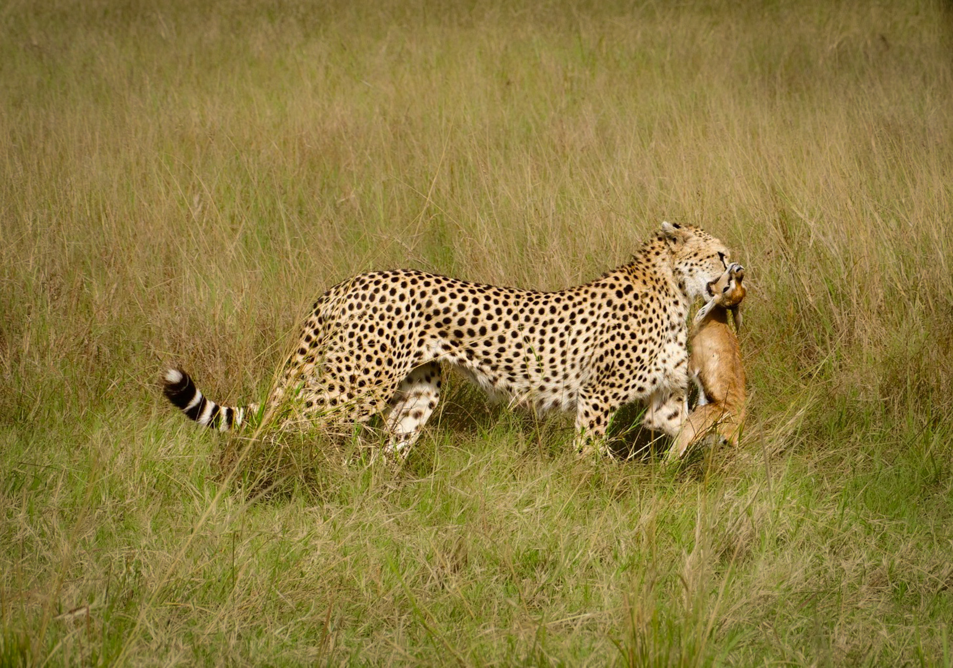
Hi Ling Ling. Andrew invited me to comment on your nice image. I find that it is often difficult to separate a cheetah from its environment as they often share the same tonality. As such, I first selected the cheetah in LR. I slightly reduced the highlights and added a bit of texture. I duplicated and inverted the mask and slightly darkened the background and added negative clarity and dehaze. I used a separate mask to brush in some shadow to the back of the gazelle and a bit to the back of the cheetah's head. Finally, I added a touch of vignette. Just some ideas. |
Aug 21st |
 |
1 comment - 0 replies for Group 40
|
| 52 |
Aug 25 |
Comment |
I couldn't agree with everyone more. Very powerful image and wonderful composition. Bravo. My only suggestion, that I would at least try and compare to your handling, would be to darken the area under the main mushroom to match the blackness everywhere else. |
Aug 14th |
| 52 |
Aug 25 |
Comment |
I love all the birds lined up and looking in the same direction. I think you processed it well and don't have any suggestions. Great image. |
Aug 14th |
| 52 |
Aug 25 |
Comment |
I agree with everyone's comments on this very nice image. If it were mine, I'd probably crop in on mother and baby. It's a close call, but I favor the black and white. I think I would darken the background a bit to let the subject stand out from it a bit more. Did you happen to learn what type of monkey this is? I'm just curious. |
Aug 14th |
| 52 |
Aug 25 |
Comment |
Nice one Tom. I see the logic of your crop, which showcases the beachmaster and a wonderful pose and places him in a dominant position. I also like the original which I think would look good as a 16x9. The colors, after processing, look to warm to me. I don't think I would have enhanced the colors on the rock wall or sea as much and as you chose to do. Lovely image. |
Aug 14th |
| 52 |
Aug 25 |
Comment |
Beautiful image. I love the colors of the rock but do feel that they may be slightly over saturated. I like the greens in the original which reflect the cloudy scene to me more realistically. I might also suggest removing the color from the sky. The original looks more natural to my eye. Finally, by cropping the left side of the image, it cut off the line of rock outcroppings and I also like how it looks in the original which allows some space after the rocks end. |
Aug 14th |
| 52 |
Aug 25 |
Comment |
I like this image a lot. I also like the original, which to my eye more clearly shows the bird seeking shelter under the branches. I love shots in the rain and imagine how much less attractive this image would be without it. |
Aug 14th |
6 comments - 0 replies for Group 52
|
7 comments - 0 replies Total
|