|
| Group |
Round |
C/R |
Comment |
Date |
Image |
| 52 |
Sep 24 |
Reply |
Hi Judith. Sorry for the late reply. I don't recall the river but it the pics were taken during the time I was wandering around The Ghost Ranch area in New Mexico. I was driving and hiking but have the impression that I saw this from the road. Thanks for the feedback. |
Sep 23rd |
| 52 |
Sep 24 |
Reply |
Thanks Pamela, I've been traveling without a signal most of the time and missed your comment. I'm guessing that I did use a tripod and had the camera in portrait orientation which is what I usually do for a stitched composit. I'm not at home to look at the individual frames to confirm. If I did handhold, by holding the camera that way I can zoom a bit wider to leave room for error. In fact, looking at what LR produced makes me think I may have handheld. Not sure. |
Sep 23rd |
| 52 |
Sep 24 |
Reply |
Thanks to everyone for your feedback. To answer Ally, frankly I don't recall my thinking at the time but a wide angle would distort the scene, emphasizing the foreground and diminishing the background. In this scene, there is no prominent foreground. Composites also increase the resolution but that is never my motivation as I rarely print. But to get a landscape 16x9 with a wide angle would require cropping the top and/or bottom reducing the resolution a good bit.
|
Sep 23rd |
| 52 |
Sep 24 |
Reply |
Now that you mention it, I see it too. Thanks |
Sep 15th |
| 52 |
Sep 24 |
Reply |
Now that you've rotated it, I see it too. Wonderful! |
Sep 10th |
| 52 |
Sep 24 |
Reply |
Thanks Ann. If you have Photoshop, try the new generative fill. Just make a loose selection around what you want to remove and then there's a little box that should be open. Hit generate then don't put in a prompt but hit generate (the right side of the box) and the program will use AI to figure out what to remove. It gives 3 choices to pick from and you can continue to do it until you get one you like. It comes in on a separate layer so you need to stamp a new layer or merge it to the layer(s) below. It's very powerful. |
Sep 5th |
| 52 |
Sep 24 |
Comment |
Very artistic, as usual. I like it a lot. At first, I thought maybe it would be stronger without the diagonal shadow on the lower right, but is somehow balances the scene and, to me, makes it stronger. It's an image of contrasts: lights, shadows and contrasting texture. |
Sep 4th |
| 52 |
Sep 24 |
Comment |
I think you did a great job in post, taking a very busy scene and simplifying it well. I particularly like how you handled the branches behind the bird's head. Nice pose and great eye contact make this one a winner. I do think there is a very slight purple color cast to the image but would probably only correct it a bit on the chest feathers of the bird. |
Sep 4th |
| 52 |
Sep 24 |
Comment |
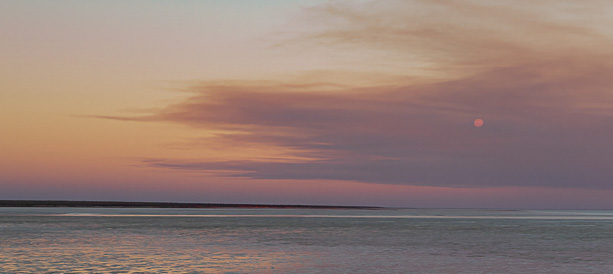
I have a friend whose work is very similar to the style of this image. It's very pretty and I like the color palette. It's too bad the moon is so small which is the effect of your wide angle lens. I tried it with a different crop, attached. I also used the color tool in Lightroom and slightly changed the hue of the color of the sky in the upper left and added a bit more light to the moon. |
Sep 4th |
 |
| 52 |
Sep 24 |
Comment |
I see this as an interesting study in light and shadows but have mixed feelings about the image itself. The head of the bird, is emphasized by being dark against the lit feathers, but my eye is drawn more toward the green leaves than anything else. The birds legs could be confused as stems, being is such close proximity to the leaves. That said, it is an image I spent some time looking at, always a successful outcome.
I thin if would clone out the shadows on the upper right of the bird's body as well as the few green leaves by its tail. In fact, I think I'd get rid of all the green leaves which, in my opinion, would result in a more powerful image.
I like going for something different and often use this group to share images that I'm not sure about and if often clarifies my thinking about them. |
Sep 4th |
| 52 |
Sep 24 |
Comment |
I like this image a lot. Great subject and you handled the post processing very well. I think I would do some dodging and burning if this were mine with the goal of reducing the exposure on the nest, which appears a bit too bright for my taste. I would also darken the fence in the background on the right hand side. Last, I would add a touch of exposure around each of their eyes and a bit on the top of the heads on the right to provide a bit more separation from the background. Terrific shot definitely worth bringing out of the archives! |
Sep 4th |
| 52 |
Sep 24 |
Comment |
I like the image and how you processed it. The composition is strong. The perfect head angle is right at a rule of thirds interection and all four legs are visible. There's a nice glint in the eye and there's nothing I could suggest with regard to processing. Nice job. |
Sep 4th |
6 comments - 6 replies for Group 52
|
6 comments - 6 replies Total
|


