|
| Group |
Round |
C/R |
Comment |
Date |
Image |
| 40 |
Feb 22 |
Comment |
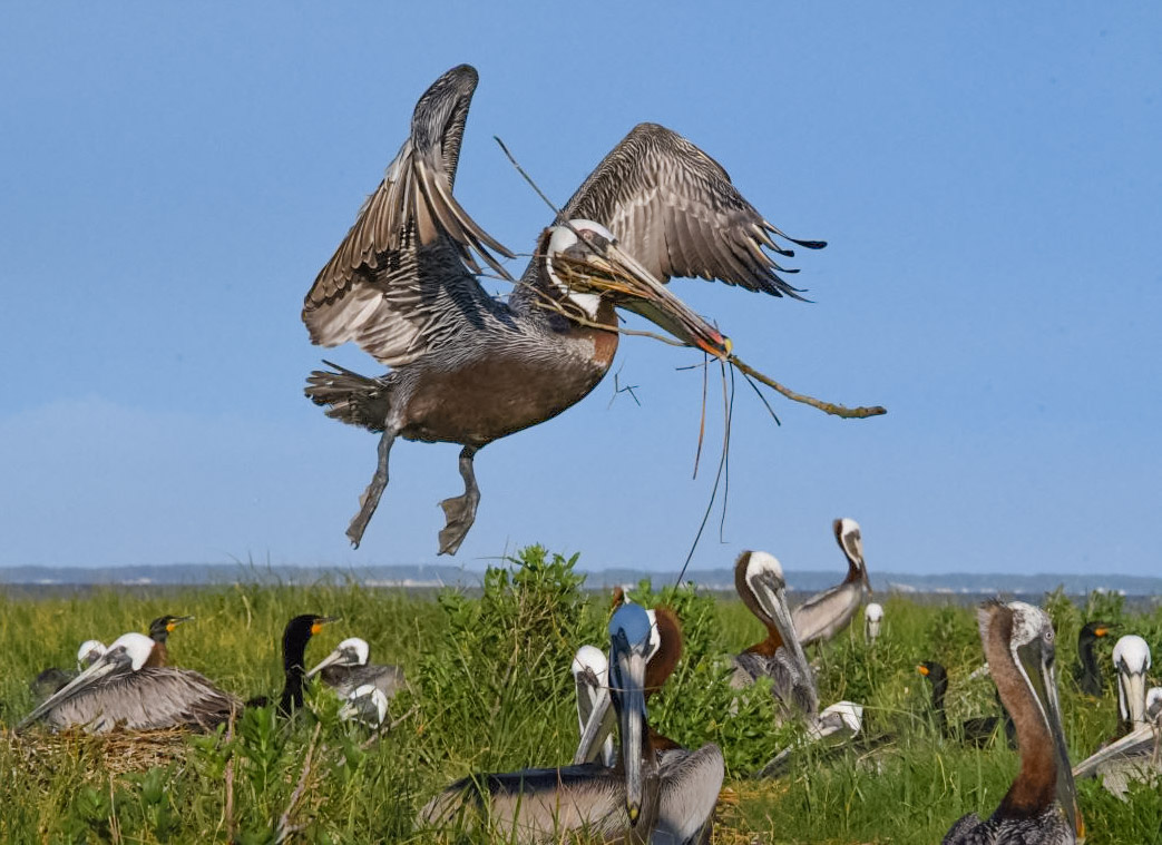
Hi Catherine. I love the image. It grabbed me from the start. Looking at it critically, I thought the main subject was a tad underexposed and I didn't care for its position in the frame. In that same regard, the stick poking in on the left border bothered me. I saw what looked to me to be a natural crop by bringing in the left side just before it would begin to clip the pelican on the ground facing that direction. I then removed that white thing on the horizon, which became more distracting in the crop I applied. I lightened up shadows in LR and added a linear gradient to vignette just the bottom of the image. Last, in the HSL panel I attempted to warm the image up a bit. Nice job getting this lovely pelican in flight carrying nesting material and including rookery as part of the story. Bravo. |
Feb 8th |
 |
| 40 |
Feb 22 |
Comment |
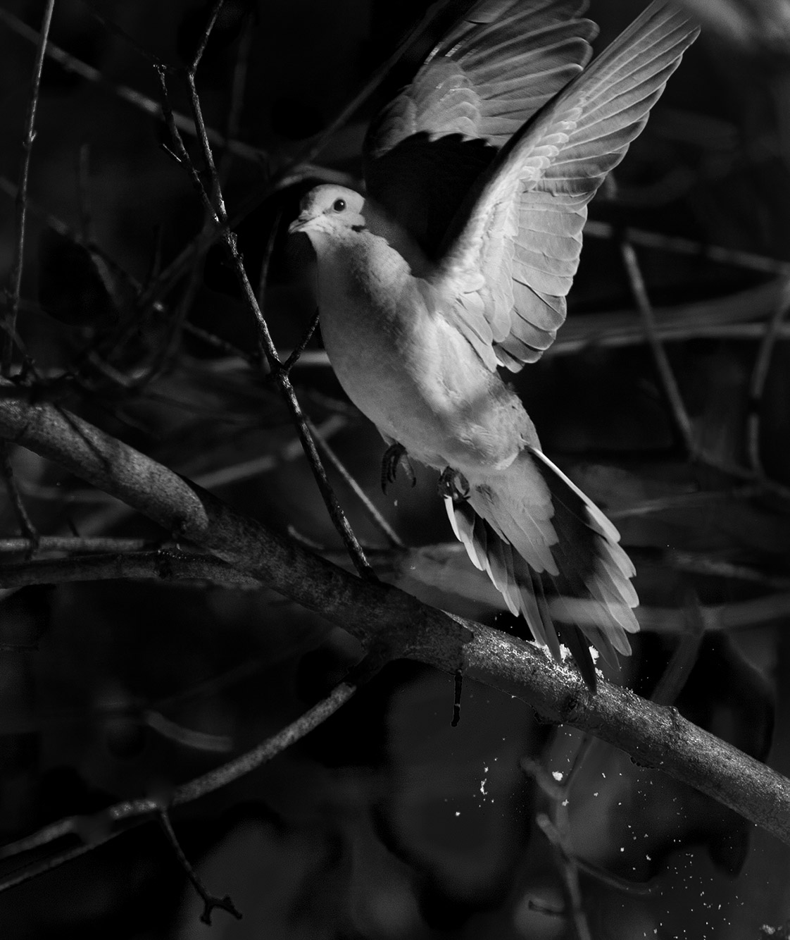
Hi Allison. I'm a bird shooter from group 52. Living in Florida, where we have an abundance of birds, many of which are used to people and relatively easy to get close to, it has become my favorite local target. I'm always in search of background where I might be able to get a bird in an interesting composition. I like the bird's position and the falling snow, which tells the takeoff story well. I'm not a fan of the background, however. I thought I'd play with your image to see if I could address that concern. Using just Lightroom I rendered it as a black and white and darkened a lot of the background, in particular the bright branches which may have competed in my eye with the subject. Bravo on getting the head and eye sharp, the key to a good image in my opinion. |
Feb 8th |
 |
| 40 |
Feb 22 |
Comment |
Very nice work. I like botht he original look and the the textured. Removing the lower blossom was a good idea in my opinion. I'd go a bit farther nnd remove the little leaf going off to the left on the left stem, the one drooping leaf of the center flower and the black dot of decay in front of that flower, which caught my eye. I love the mood and feel of the image and think it is outstanding. |
Feb 8th |
| 40 |
Feb 22 |
Comment |
I love the expressions of the young lady and the gentleman appraising the bull from behind. Is that you reflected in the glass window? I wouldn't worry at all about having everything in the image sharp. I prefer sharpness and softness to help separate the subject from its surroundings. Depending on your philosophy concerning post production, I would dodge and burn this image along the same lines to emphasize the subjects and de-emphasize the background. Maybe a slight vignette would do the trick. I might also remove the drool fromt eh bull's mouth, although that's part of being a bull. |
Feb 8th |
4 comments - 0 replies for Group 40
|
| 52 |
Feb 22 |
Reply |
Good catch. I went back and double checked and the ISO was 1250 not 125. Good comments. As I get used the the image I think a score of 5 is generous. Thanks |
Feb 10th |
| 52 |
Feb 22 |
Reply |
Thanks Don. Good feedback. |
Feb 10th |
| 52 |
Feb 22 |
Comment |
Now that's the way to have fun! I love your spirit of photography adventure. When I first looked at the image I didn't think the bird was real, then I read your description. I think it makes an neat abstract and the twigs behind the subject enhance rather than distract from the effect. I have to say I'm not sure if I like it or not but really like that it is out of the box and different. The final result to me looks like an abstract of the moon behind a weirdly outlined bird. |
Feb 8th |
| 52 |
Feb 22 |
Comment |
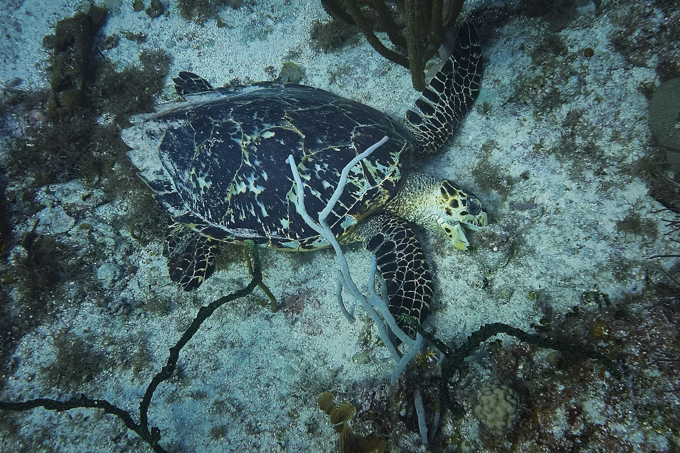
I'm sure you were having a blast when this was taken. I like that the turtle turned its head to get a better grip, giving you nice eye contact. I wondered how it would look darkening around the turtle, and maybe adding a bit of contrast to the turtle as well. In LR I made a radial mask around the turtle, inverted it, and darkened it a bit. Then I make a radial mask around the turtle and added some black and some white for contrast and a bit of texture. |
Feb 8th |
 |
| 52 |
Feb 22 |
Comment |
I like this one a lot. I love the color combination and the shark position balances the open water for me. Nice job. |
Feb 8th |
| 52 |
Feb 22 |
Comment |
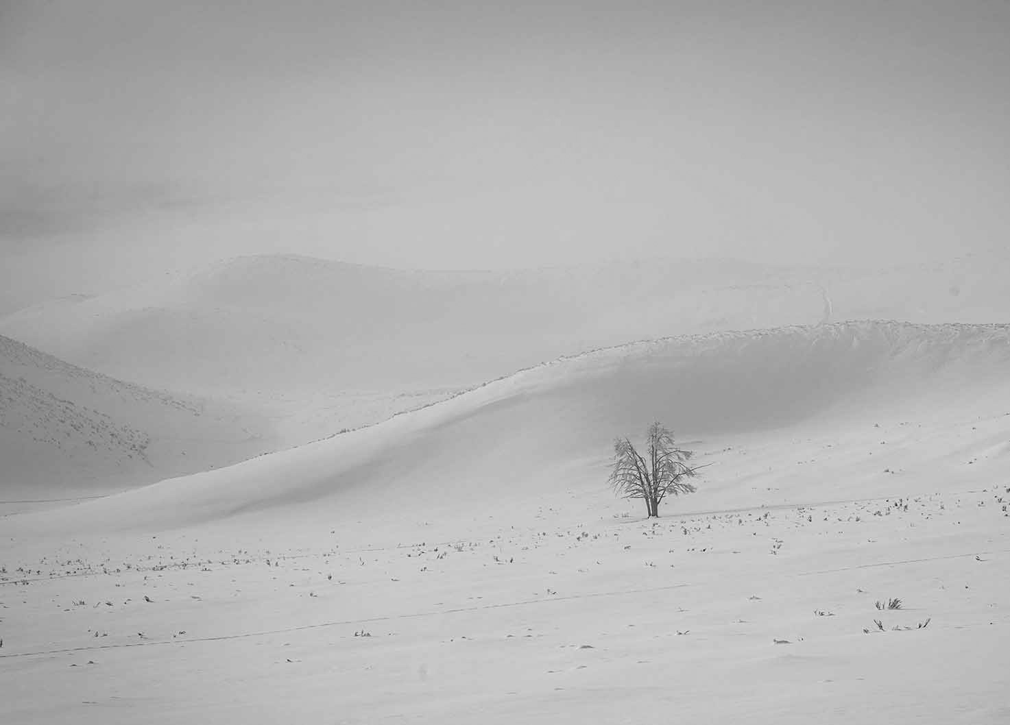
Lovely image Lisa. On the ISO issue, you don't mention what ISO you used. I often use auto ISO in a situation like this, dialing in probably a plus 1.5 stop exposure compensation to deal with the amount of white in the scene. In manual mode I'd be using the meter and histogram to achieve the same exposure. With auto ISO, you need to keep an eye on it and if it gets too high, either open the shutter or decrease the shutter speed.
Compositionally, I like what you've done but prefer your original, particularly the hills that you cropped out. I thought the trees on the right were a distraction so I took an opposite approach and cropped that side out. I added a touch of contrast in LR to bring out the the shadows just a bit, which I'm not sure if I like or not. Either your approach or mine, it's a beautiful image. |
Feb 8th |
 |
| 52 |
Feb 22 |
Comment |
Congratulations on your new lens. It's a remarkable lens and one of my favorites. There might not have been time to consider it when the shot was taken but I think I would have shot it wide open, 6.3 on that lens when extended, which would have significantly reduced your ISO. That said, I can't see any evidence of noise and the bird looks quite sharp so I don't think the f stop would have improved it at his resolution. I think you made a wonderful portrait. I looked up the grebe, which I've never seen in the wild and believe it's a Horned Grebe.
By the way, I wouldn't hesitate to use a 1.4 teleconverter with that lens if there is enough light to get by with f/9. |
Feb 8th |
| 52 |
Feb 22 |
Comment |
Beautiful shot and wonderful post processing. It looks sharp to me. I've found very little difference on my cameras using a 1.4 teleconverter but noticeable difference using a 2x.
If this were my image, I might consider processing it a bit differently. I like the golden tones of the original and might try to preserve some of that tonality, which also serves to make the swans webbed feet more visible. I think I would also either remove the one duck that you left on the water, or leave in the ones behind the swam. To my eye, the one duck is distracting. Lastly, some of the whites on the back of the swan look blown out. If they are on the raw, I'd leave it alone on the wing edges but lightly clone in some detail from other nearby areas. If this is competition bound, I know that cloning is off limits but if not, I'd consider it. All minor or subjective considerations of a lovely image. |
Feb 8th |
6 comments - 2 replies for Group 52
|
10 comments - 2 replies Total
|


