|
| Group |
Round |
C/R |
Comment |
Date |
Image |
| 40 |
Apr 21 |
Comment |
Hi Anne. Great work on the post for this lovely little fella. I noticed that you missed a tiny bit along the right side. I might suggest also slightly lightening the shadow on the side of the subject toward the head, just slightly. Nice work! |
Apr 15th |
1 comment - 0 replies for Group 40
|
| 52 |
Apr 21 |
Comment |
I think you did a masterful job with the crop and think this is a beautiful image. I'm in general agreement with Pamela (again) and can only add one other suggestion. There's a straitish line of brown on the left petals of the flower that I would either clone out or soften. To my eye, it pulls me away from the flower. Lightening up the purple and darkening down the green (which often requires use of yellow) might do what Pamela suggests. |
Apr 12th |
| 52 |
Apr 21 |
Comment |
I was thinking the same thing that Pamela said. The large shadow commands too much of my attention and I would suggest following Pamela's advice. |
Apr 12th |
| 52 |
Apr 21 |
Comment |
I agree with the top of the image but a simple fix is available in PS. With the crop tool, add some space to the top and check content aware fill. On an image like this it should work perfectly. I like the scene and the atmospherics. |
Apr 12th |
| 52 |
Apr 21 |
Comment |
I'm with Ally. It looks like you may have had to blend multiple exposures in order to capture the dynamic range of the scene. It looks to me like you exposed for the sky, which is what I would do as well, but that left the rest of the scene underexposed. They your interpretation cropped the sky out, leaving the underexposed rocks. This might have been a good opportunity to take a one shot for the waves, at a shutter speed that provided the sense of movement you were after, another slower speed to bring out the dark areas, and a faster exposure for the sky. Once taken, you do use LR or an HDR program or blend the images manually for complete control |
Apr 12th |
| 52 |
Apr 21 |
Comment |
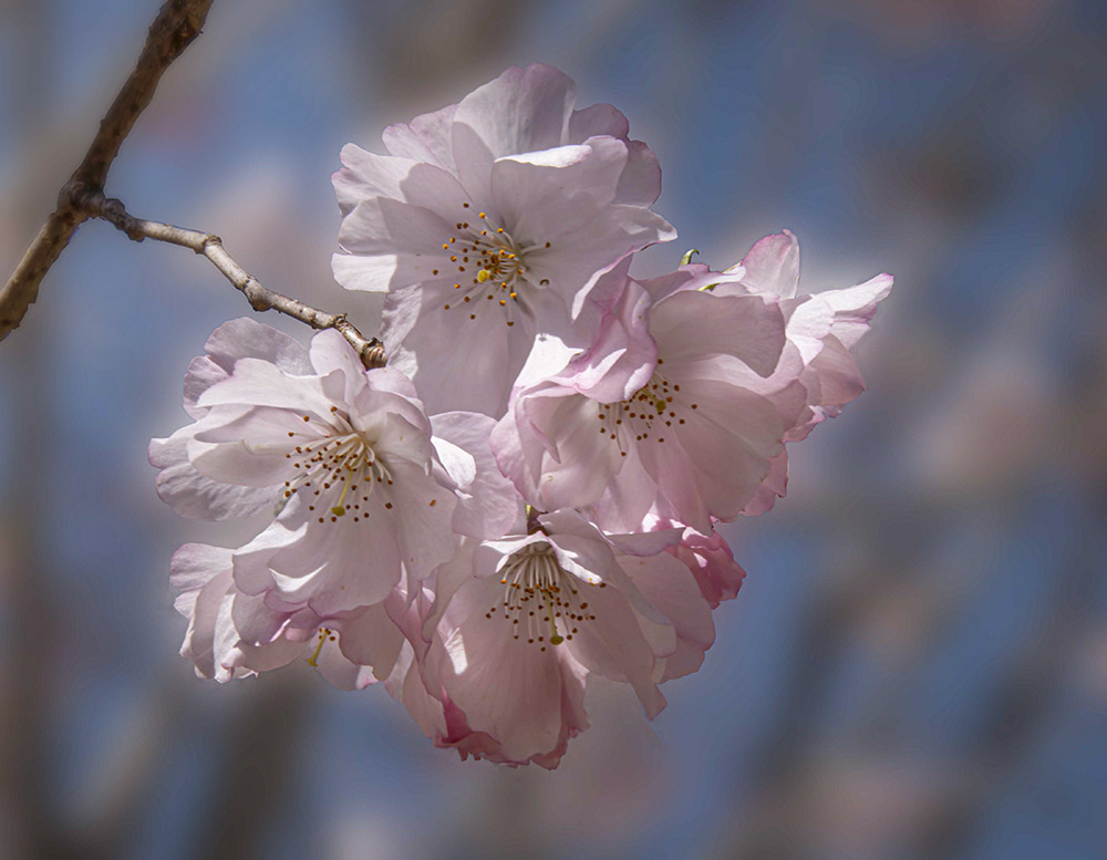
Very pretty blossom. I see the glow but don't find it offensive. I would guess that Photoshops select subject would make a pretty good selection and then maybe reduce it a pixel or two to keep your adjustments away from the edges. I should but rarely make selections and usually just paint with a brush or use a radial filter in LR or Camera Raw.
I am a bit distracted by the branch which drags my eye to the upper left. I brought your image into PS and lightened that corner, so that it was more consistent with the rest of the background, and added some blur. |
Apr 8th |
 |
| 52 |
Apr 21 |
Reply |
Thanks Sharon. Did you ever see its feet, which are yellow on a snowy? The bill is throwing me off and while it doesn't look like a Great Egret, it's possible it might be. Yellow feet would clinch it. |
Apr 3rd |
| 52 |
Apr 21 |
Comment |
Hi Sharon. The first thing that caught my attention was the unusual appearance of the bird. I've never seen a snowy that didn't have a black bill or the extensive head feathers that this beauty had. It could be an oddity or a species I'm not familiar with. Were you able to see the bird fly off or walk such that you could see the telltale yellow feet? If so, it's probably a one-off.
I think you did a masterful job on the processing and the water now sets off the bird nicely. I might prefer a 5x4 aspect ratio for this essentially horizontal subject. A very slight vignette might also be nice. I do my vignette's by hand, making a curve layer darkening the image, then masking out at 100% over the subject and then 30, 20 and 10% to taste to blend in the vignette to look natural. |
Apr 3rd |
6 comments - 1 reply for Group 52
|
7 comments - 1 reply Total
|


