|
| Group |
Round |
C/R |
Comment |
Date |
Image |
| 40 |
Feb 21 |
Comment |
Hi Julie. Mike from Group 51. I think you've made a wonderful detailed image of this interesting bat and I appreciate the lifestyle details. My first impression was that it was a studio shot based upon the almost pure grey monotone background. You might consider adding some grain or compositing in some texture into the background. Nice work. |
Feb 4th |
1 comment - 0 replies for Group 40
|
| 52 |
Feb 21 |
Reply |
Hi Gerry. Thanks so much for your feedback. That experience was beyond special. Very emotional. Take care, Mike. |
Feb 25th |
| 52 |
Feb 21 |
Reply |
Thanks LC. Good suggestions.
|
Feb 20th |
| 52 |
Feb 21 |
Reply |
Thanks Judith. The giraffe would have gotten away if it had any predatory instincts. It landed some heavy kicks and had the opportunity to injure or kill them but only acted defensively. In the end, the lions ate well.
We are lucky in Florida to have an abundance of birds, many acclimated to human presence in local nature areas. Glossy's are common here. The light has to hit them right to show off the colors.
Thanks for the feedback,
Mike |
Feb 17th |
| 52 |
Feb 21 |
Reply |
Hi Ally. I'll shoot you an email. I'm also interested in your Africa experience and where you show your work.
Mike |
Feb 16th |
| 52 |
Feb 21 |
Reply |
I'm smiling back. |
Feb 13th |
| 52 |
Feb 21 |
Comment |
Thanks Pamela. I see that when I submitted the original I must have picked one next to the one I processed. I can tell from the ruffled feathers you pointed out and the Bill position. Sorry to have confused things. I'm sure the original taken in close sequence. |
Feb 11th |
| 52 |
Feb 21 |
Comment |
I feel your pain and admire your making the best of it. Hopefully the computer woes will resolve soon. I think this image is wonderful. It reminds me of a coral reef and I love the textures and composition in general. The only thing I have to suggest would be to remove some of the leaves that are sticking in from the edges. Particularly on the right side. Nice work! |
Feb 9th |
| 52 |
Feb 21 |
Comment |
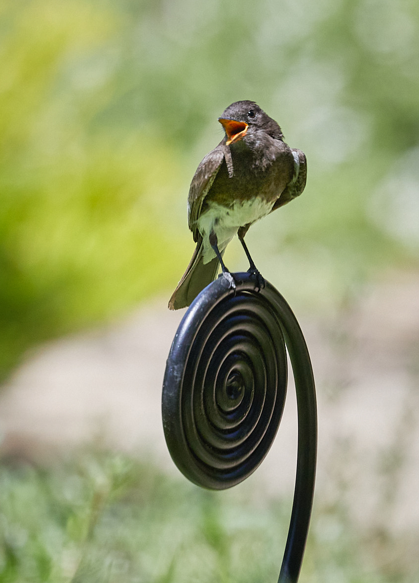
Your place sounds amazing. I'm jealous. I like your image and the wonderful posture and action of the Phoebe. For my taste, I felt there is too much empty space. I took my hand at it, cropped it substantially tighter. I also lightened up the bird, added a bit of sharpening and to its face and took a few spots off the metal it was perched on. All in Lightroom very quickly. Lastly I added a vignette. |
Feb 9th |
 |
| 52 |
Feb 21 |
Comment |
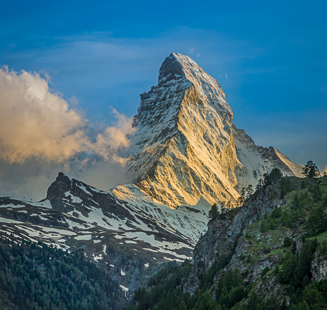
What a majestic mountain and I love the clouds. My impression when I first looked at it was that the foreground was a bit too blue and that the whole image could be punched up a bit. There is also a lot of sky but the nature of the mountain does seem to call for a vertical interpretation. I played with it and added some warmth to the side of Matterhorn facing the light, a bit of blue to the sky and warmth to the trees and foreground, lightening it up a bit. Finally, I added a vignette to draw the eye toward the mountain. |
Feb 9th |
 |
| 52 |
Feb 21 |
Comment |
Nice work. I like the revised version better. |
Feb 7th |
| 52 |
Feb 21 |
Comment |
I was a bit torn when I first looked at your image. I like how the left side of the pond curves around the reflective tree tops. Looking at it that way the bridge is a side detail. However, I didn't like the other manmade structures which were what was catching my eye. As an experiment, I cropped in to make the bridge the center of attention. I also added blue to the shadows and darkened and added clarity to the water to provide some contrast to the scene. Just a different approach. |
Feb 2nd |
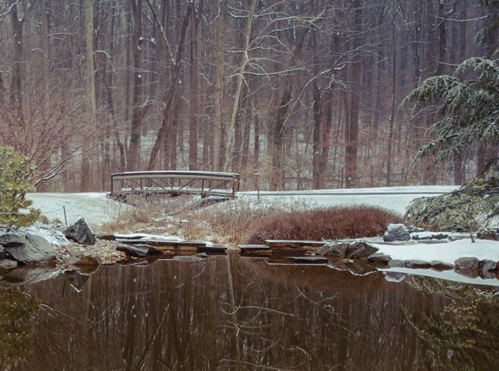 |
| 52 |
Feb 21 |
Comment |
I love your crop. It makes the bill the star of the show and emphasizes it's length. Great job. I suggest slightly lightening up the eye and face area. The feathers on the crown of the head look blown but I brought your original into LR and was able to at least draw some attention away from that area and with the raw you may be able to do even better. My last nitpick is the feathers peaking out from the top of the head. I would either remove them or make your crop slightly larger so they have more of a source. These are all nitpicks to this very nice image. |
Feb 2nd |
| 52 |
Feb 21 |
Comment |
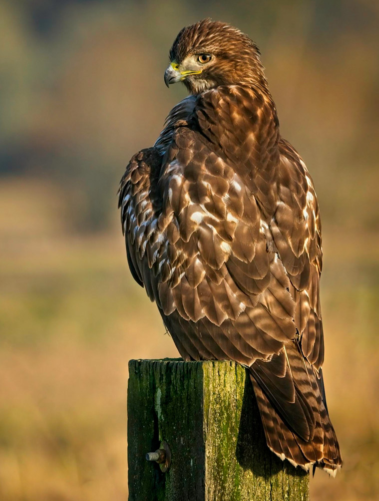
My favorite hawk. I think you did a great job with the processing and would have also removed what you removed. You might want to compare the final result with a vertical crop as in my opinion the subject lends itself to that orientation.
The post may have not been vertical in real life but I think the image would be better if it was straightened. |
Feb 2nd |
 |
8 comments - 5 replies for Group 52
|
9 comments - 5 replies Total
|


