|
| Group |
Round |
C/R |
Comment |
Date |
Image |
| 40 |
Nov 20 |
Comment |
Hi, I'm from Group 52. Thanks for posting this image. I'm primarily a bird photographer and have never seen this species of spoonbill. I love the pose with their wonderful head feathers. To my eye the crop is a bit too tight on the sides. I would dodge the birds a bit and burn in the background to bring out and separate the birds from the background. I might also brighten the eyes a bit. |
Nov 10th |
1 comment - 0 replies for Group 40
|
| 52 |
Nov 20 |
Reply |
Thanks LC. I see your logic but since the perch is on the bottom third of the image it doesn't make sense to me to leave a lot of empty space above it. It seems out of balance to my eye but you may like chocolate and I vanilla. It's all good. |
Nov 16th |
| 52 |
Nov 20 |
Comment |
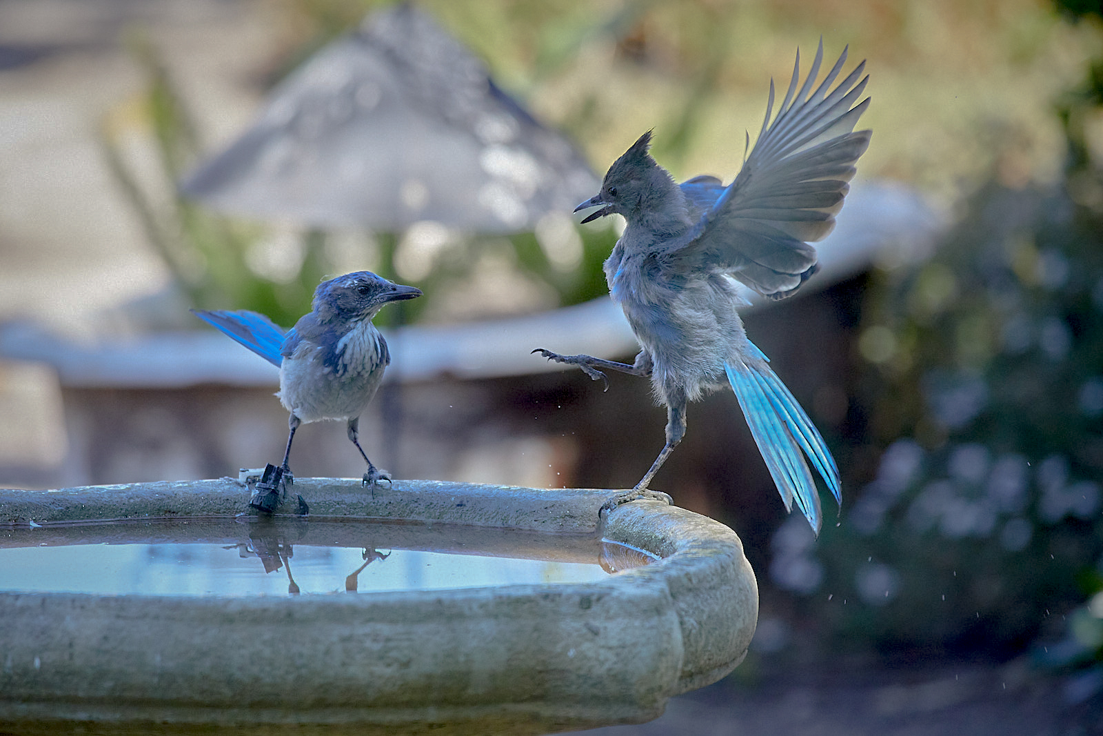
I love the interaction and particularly the behavior of the Stellar Jay. I agree with the comments regarding the background. In your settings you said that you auto bracketed. Do you have a brighter exposure you could use for the birds and blend with a darker for the background? You could try an HDR blend but I'm guessing it would have trouble with this image, but it may be worth a try. I don't use Capture One but it may have an HDR function.
I brought it into Lightroom and found that if I added black to the bird while reducing contrast I was able to bring out a lot more detail. I also added a touch of black to the Stellar's eye and reduced the highlights of the entire image, plus added a slight vignette. |
Nov 11th |
 |
| 52 |
Nov 20 |
Reply |
Thanks for playing with it LC. (I assume you go by LC) I think if I were going to go for a vertical crop, I would add space below the bird, in the direction of the dive and not above it. Certainly worth considering. Thanks |
Nov 11th |
| 52 |
Nov 20 |
Reply |
You're very welcome. If it's the white's you are referring to, I'd pull the exposure back just to see if there is some detail in those areas. If so, return the exposure to where it was and selectly reduce the highlights by whatever tools you have at your disposal in the areas in question. It wouldn't work for this image, but if the areas are totally blown out, you can clone in some detail from other bright areas that aren't blown out. If you use PS, change the blend mode to luminosity to avoid adding a color cast to the area you are working on. There are some other methods as well but it all comes down to either bringing out what's there or cloning in from somewhere else. |
Nov 8th |
| 52 |
Nov 20 |
Comment |
Nicely done with the isolation of the bird and branch from the background. It looks great at the resolution on my screen but when I clicked to look at it larger, there seems to be a loss of detail and the white's look like they are over exposed. They are such a small portion of the image I don't think it is a big deal. I only mention it in case you can bring out some detail from the original in those areas. It's possible that shooting through the window may have resulted in the loss of detail. Again, not a deal breaker as normal viewing distance would be fine. |
Nov 8th |
| 52 |
Nov 20 |
Comment |
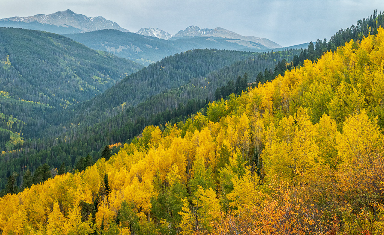
There's nothing like fall colors. I love the composition with the rolling hills and colors. I agree with Pam's comments and wanted to see if there was more detail in the sky. I brought it into LR and added some dehaze and a slight touch of blue. In PS I could have done more but even this little bit seemed to balance the image to my eye. |
Nov 8th |
 |
| 52 |
Nov 20 |
Comment |
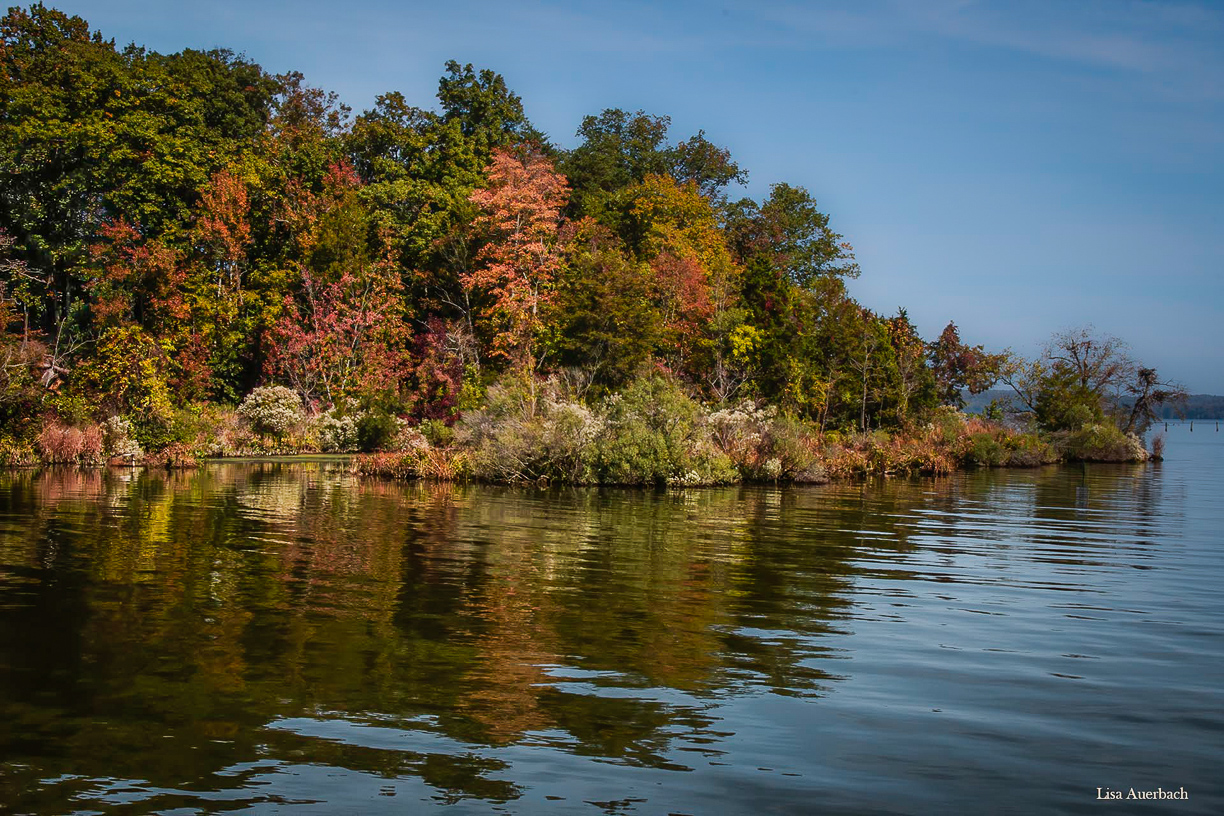
Nice scene Lisa. I agree with the flip but agree with Pam that the shadows are too dark and the colors could use more pop. Using Lightroom, I added a bit of blue and contrast to the sky with a gradient mask. I used another to add clarity to the water. I globally increased the luminosity and saturation of green, yellow and orange. I also dodged the dark area of the trees along the left upper side to make the light look for uniform. I might have also taken the image into PS and extended some canvas on the right. I like the pilings and it feels a bit cut off to me there. It would require creating some pixels if you don't have another wider shot, but I think it would come out fine. |
Nov 8th |
 |
| 52 |
Nov 20 |
Comment |
Terrific image Pam. I like your post processing, including the crop. Compared to the original, I can see that the colors have been punched up nicely on the subject, but I would mask that effect off the background areas to increase the separation between the background and subject. Nice image and nice job! |
Nov 8th |
| 52 |
Nov 20 |
Comment |
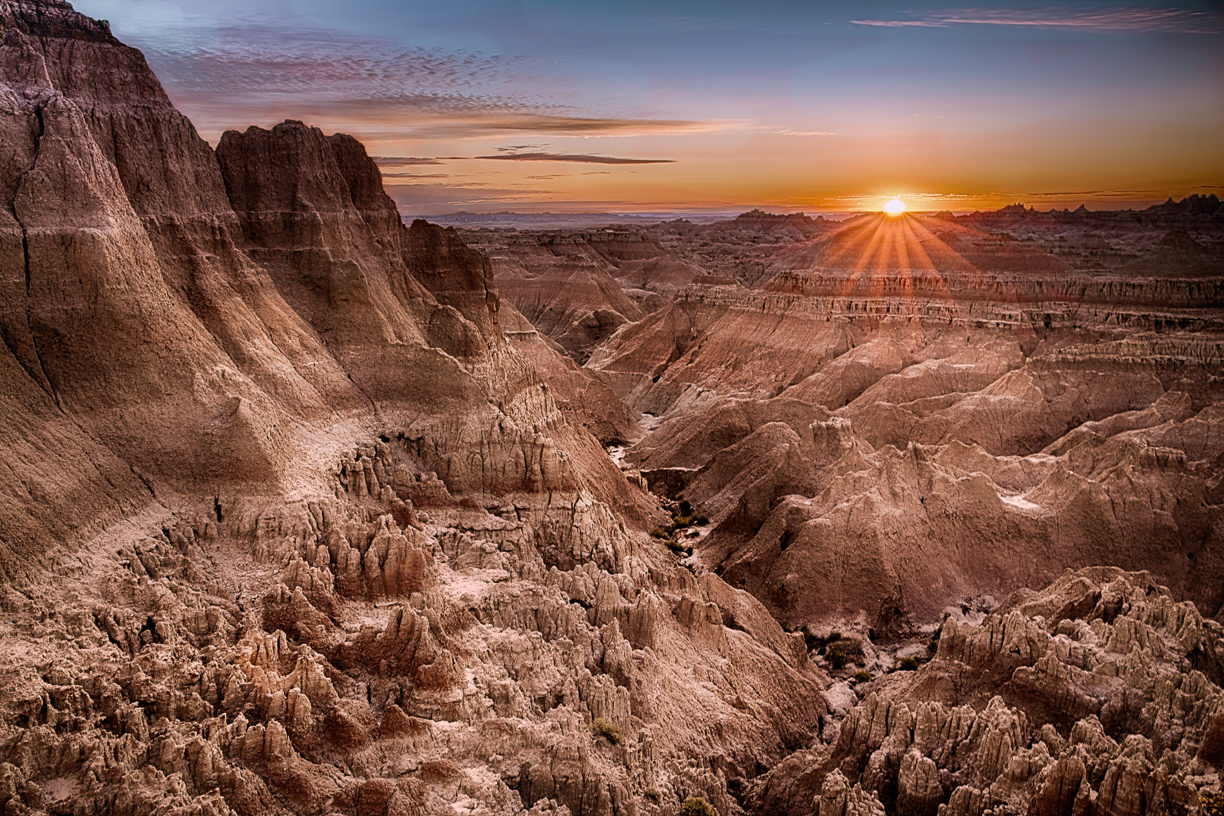
This is breathtaking. What a scene! Of the three, I like the one you choose the best. One black and white looked too crunchy to me and the other too monotone. For this one, I would do a good bit of dodging and burning with the goal of adding more depth or dimension to the scene. Also, I find the darkness in the upper left, which is also on one of the black and white's, a bit distracting and would lighten it up a bit. All that said, you could do absolutely nothing and have a winner.
Your image gave me a great image to practice some luminosity techniques I've been trying to get good at. I made a mask for the shadows and one for the highlights and used them to do some selective dodging and burning. |
Nov 8th |
 |
6 comments - 3 replies for Group 52
|
7 comments - 3 replies Total
|


