|
| Group |
Round |
C/R |
Comment |
Date |
Image |
| 52 |
Jun 20 |
Reply |
Good point Tom. |
Jun 19th |
| 52 |
Jun 20 |
Comment |
Squirrels are fun. Cute picture which definitely tells the story of break time. I think it is very monitor dependent but the colors look a bit off to me. The oranges in the original look more natural. Purely subjective taste, but I would reduce the crop along the top to add just a bit more space there. I would also remove what looks like leaf litter right in front of the little guy's nose. |
Jun 8th |
| 52 |
Jun 20 |
Comment |
Great image. I love the quiet interaction and the way they are lined up just perfectly. It could be way the ripples appear in the water but it gives me the impression that the horizon is slightly off, although the otters look straight. I'm not sure if I would change that or not but wanted to point out my reaction. Very nice. |
Jun 8th |
| 52 |
Jun 20 |
Comment |
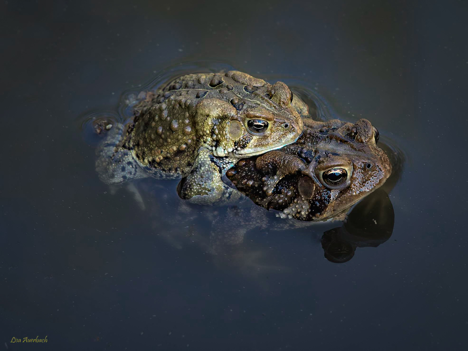
Nice shot of this intimate moment. I decided to play and using LR radial filters added some clarity and color to the frogs and reduced the exposure to the area areound them. I then, under effects, added a vignette. |
Jun 2nd |
 |
| 52 |
Jun 20 |
Comment |
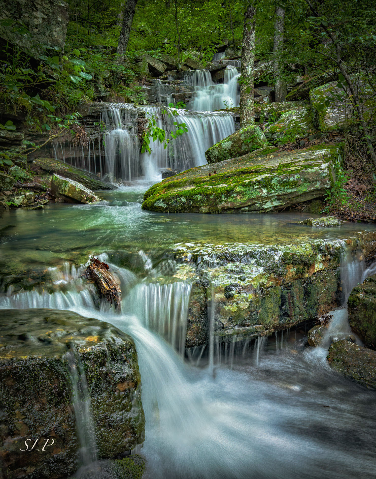
I love the flowing water and the colors are wonderful. Green, orange and blue go well together. I don't have any suggestions. If you have any wider shots I think I would process both wide and tight and see which I liked better. |
Jun 2nd |
| 52 |
Jun 20 |
Comment |
I think this is a masterpiece. It's also funny in light of the response I just gave Lisa to how I perceive sharpness. It looks perfectly sharp to me. Good "old" eyes serve me again! I wanted to play with the image and my goal was to address your perceived lask of sharpness and a couple of things I would have done were this my image. I didn't like the area where the walling water hit the pool at the bottom. It looked distorted and blown out on my monitor. This could easily be a result of a sizing issue and not exist on the original. Nonetheless, I addressed it by running a blur layer and partially blurring that area and cloning in some detail from adjacent areas.
Next, I ran my 30/30 unsharp mask action, the effect of which was oversharpening. I left it in but reduced the opacity of that layer. Frankly, it looks sharp to me without it.
I then added clarity and darkness to the pool about the lower fall to bring some richness to that pool, since it commands a center of attention above the main falls.
Last, I ran from NIK a Glamour Glow, which I think is an Orton effect. (An effect where a blurred layer is placed over a sharp layer to create a glow without destroying sharpness.) I actually meant to run the darken edges lighten center filter but this came us as I had last used it and it created an effect I liked.
Bravo Sharon, this one belongs on a wall. |
Jun 2nd |
 |
| 52 |
Jun 20 |
Reply |
Thanks Lisa. I don't recall how I processed the image but it was before I began to use Topaz to take care of noise and sharpen. I usually run NIK's Tonal adjustments and from looking at the image, I think that's what I used here. I probably didn't add sharpening, as NIK's Tonal adjustment adds enough contrast for my taste although, as you pointed out, I could have added some to select areas. The good thing about being my age, everything looks sharp! (Or, I guess you could say "unsharp")
On the unsharp mask 30/30 technique, which I learned from Glenn Randal, it's a setting I don't use on wildlife. I use it on very detailed subjects like rocks.
My favorite sharpening tools for wildlife are Topaz, which I usually use globally, and Photoshop's Highpass filter, typically applied to just parts of the image. Very image dependent. |
Jun 2nd |
5 comments - 2 replies for Group 52
|
5 comments - 2 replies Total
|


