|
| Group |
Round |
C/R |
Comment |
Date |
Image |
| 40 |
Apr 20 |
Comment |
Hi Andrew. Mike from group 52. I like this image a lot. Great tonality and I like the inclusion of people on the entrance side. To answer your question, I do think that the distortion does matter but believe it can be corrected in post. Architectural photography is not my forte but I believe Photoshop has tools that would work in this instance. That said, the image has a lot of immediate impact and is very nice. |
Apr 8th |
1 comment - 0 replies for Group 40
|
| 52 |
Apr 20 |
Comment |
Thanks everybody for your comments. I think for the various reasons you mentioned, I originally passed up doing anything with this image. That said, with all its flaws, I've grown to kind of like it. I think a more realistic version would bring out its flaws. That said, I probably fell in love with my own processing and in a bit more time will dislike it again!
Take care of yourselves. I'm an optimist and think we're in at least the middle of this epidemic ready to head for the stretch. My greatest fear is for the third world which is going to be hit the hardest. |
Apr 17th |
| 52 |
Apr 20 |
Reply |
I think you're right about the water. White looks better. |
Apr 8th |
| 52 |
Apr 20 |
Comment |
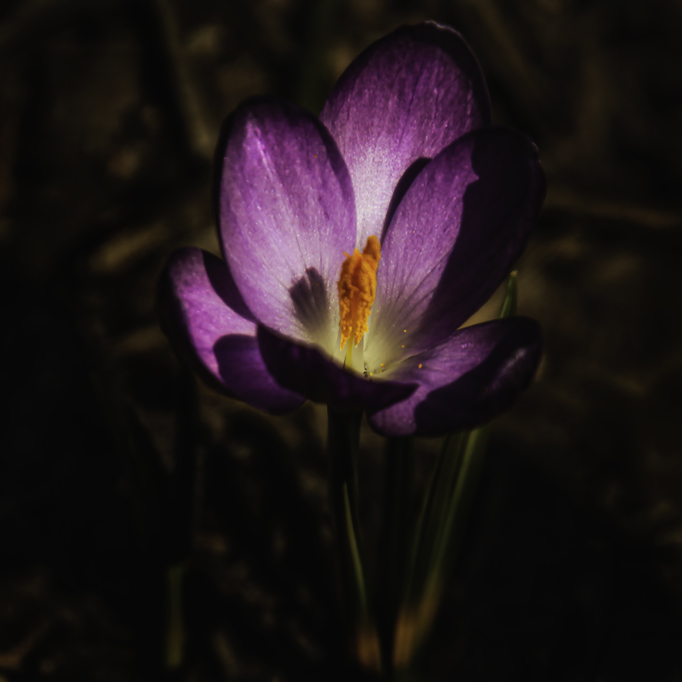
I liked this flower and decided to play with Sharon's suggestions. Initially I noticed some artifacts in the lower right where you had done some work. I took the image into Photoshop and used the healing brush there. I then did some heavy dodging and burning both with Vivenza and by brush. I also took a good deal of saturation out of the background. My goal was to take attention away from the bright stems or branches that competed with the flower. Just for fun, using NIK, I added a Glamor Glow as a special effect. |
Apr 8th |
 |
| 52 |
Apr 20 |
Comment |
Very nice Tom. I would never have know that the image was cropped given all the great detail. I like the way you composed it and think the real star of the show, the fish, is well emphasized thereby. My only critique would be that my first impression was that it was over sharpened. From what I can see, I would mask out a good bit of sharpening on the feathers and check for halo's sometimes caused by processing. For example, the lower beak may have a halo. |
Apr 8th |
| 52 |
Apr 20 |
Comment |
A man after my own heart. Great job. I think you handled the background perfectly and the exposure and focus look right on. I like seeing the feathers on the back of the eagle and having its head in full light. Well done John. |
Apr 8th |
| 52 |
Apr 20 |
Comment |
Such a beautiful tree surrounded by a carpet of flowers. It is lovely. I am distracted by the background I might try a very strong and purposeful vignette of sorts. It would not look natural, but may make a pleasing image. Also, the horizon looks slightly off to my eye. I agree that it has a lot of potential and is worth playing with. |
Apr 8th |
| 52 |
Apr 20 |
Comment |
I agree with Sharon's comments completely. It's outstanding. Very graphical I think to due to the very pure colors. I can't offer any suggestions either as I think it's perfect as is. |
Apr 8th |
| 52 |
Apr 20 |
Comment |
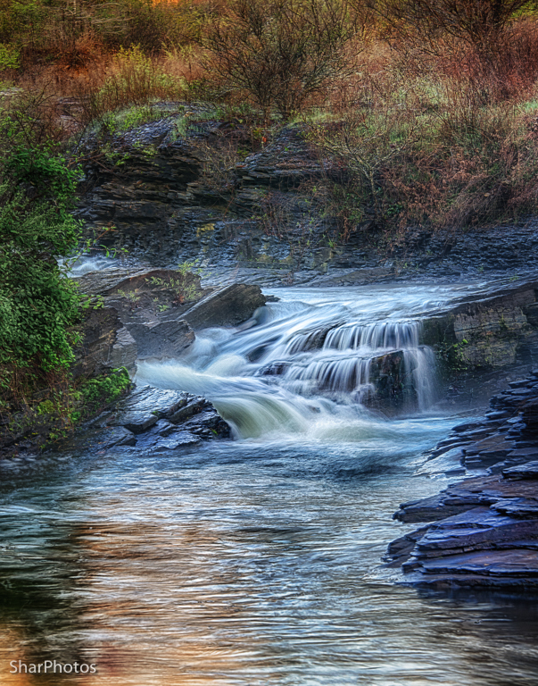
You are lucky! This is a lovely image and I think you cropped it perfectly. It's possible it's a monitor thing, since in a few other comments greens have looked too bright to me but not to others, but just in case: My eye is distracted by the bright green bush on the left. While I love the colors in the background, I think they compete with the wonderful complex waterfalls in the stream. I played with a copy with a lot of dodge and burning. I added clarity and saturation to the stream and desaturated the aforementioned bush. Looking at it, I can't say that I like mine better, it's just a different look.
Also, I used NIK all the time but have never seen or tried Reflector Effects. I'm looking forward to trying it out. Thanks. |
Apr 8th |
 |
7 comments - 1 reply for Group 52
|
8 comments - 1 reply Total
|


