|
| Group |
Round |
C/R |
Comment |
Date |
Image |
| 52 |
Sep 19 |
Reply |
Hi Judith. The stem is easier to see in your uncropped version. The very tip of the butterfly's tail intersects with it. It's far enough behind to be nicely out of focus so it really is a nitpik. The softness probably comes from my working on your small jpg. Have fun, Mike |
Sep 3rd |
| 52 |
Sep 19 |
Comment |
I like the point of view of the butterfly, which looks like a very healthy specimen. As a nitpick, I was a little bothered by the way the crop left in the stem of a flower which intersects with the end of the foremost wing, and the top looked a bit tight to my eye. I tried my hand on your original with a slightly different crop. I also decreased the luminance of the green and increased that of the reds and oranges and just played with some sliders in LR. All nitpicks as I like the image very much.
Looking |
Sep 3rd |
 |
| 52 |
Sep 19 |
Comment |
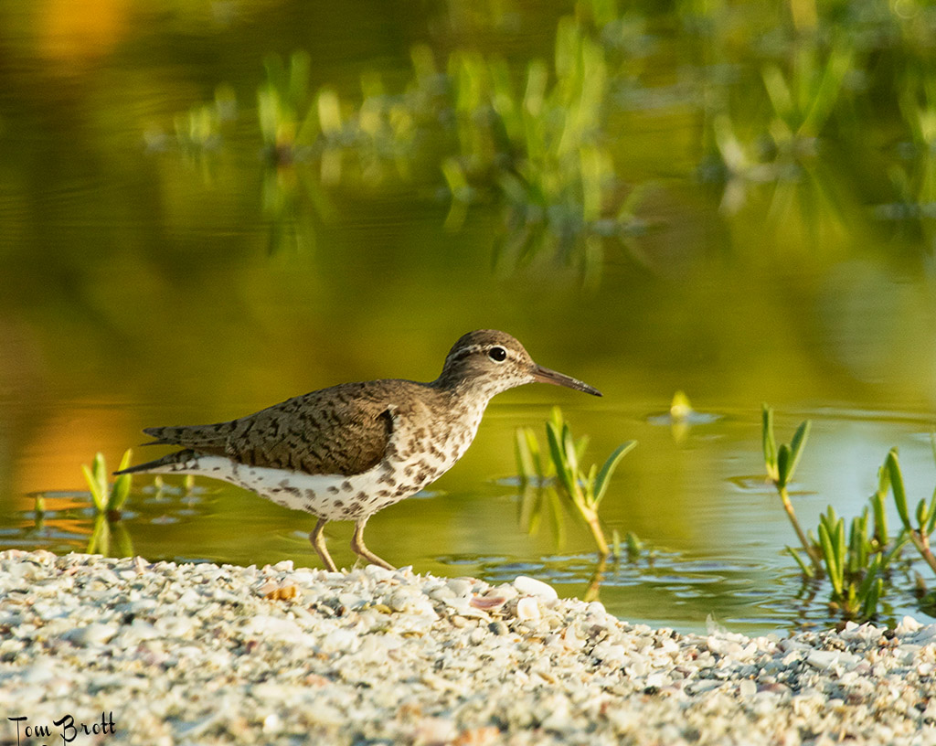
I love Little Estero and hope to get there more often next year. Very pretty shot Tom. I love the composition and the little hill the bird is walking down. I thought the horizon looked a bit off, very slight. Playing a bit, I adjusted it to what looked straight to me. I also dodged the dark section of the wing a bit and burned the highlights on the chest. Very little. Nice image. |
Sep 3rd |
 |
| 52 |
Sep 19 |
Comment |
This is my long sought after, not yet achieved, bucket shot. Congrats! You have a nice side of the fish, and the Osprey. Nice. I might try lightening up the shadows or adding a bit of contrast, careful of the white on the back of the bird's head, which looks a little bright to me. |
Sep 3rd |
| 52 |
Sep 19 |
Comment |
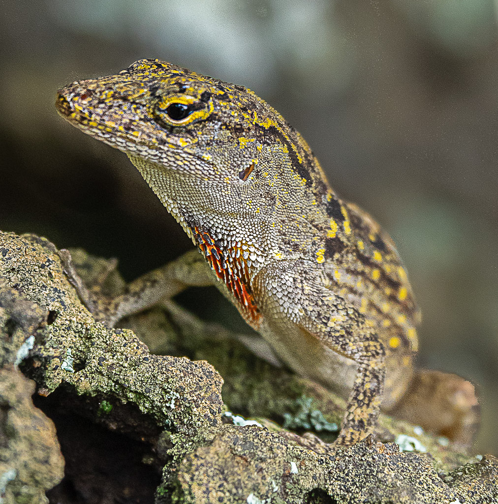
The head looks sharp to me but maybe that's a result of your sharpening. There is the edge of a leaf or something right along the upper edge, toward the center right I would clone or crop out. If the resolution has enough detail, a like a tighter crop, as I find the out of focus portions of the rock slightly distracting. Even as is, however, it looks fine to me. I like the color palate and pose of the subject. There are a few bright spots I would remove in the background. |
Sep 3rd |
 |
| 52 |
Sep 19 |
Comment |
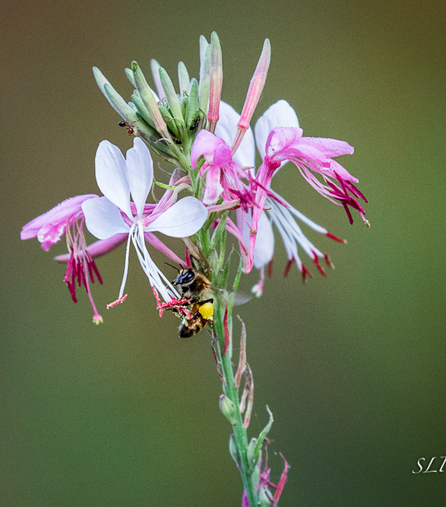
I like the strong simplicity of this image. I'm a fan of clean creamy backgrounds, like you have achieved here. I also like the crisp sharpness on the front of the flower and bee. Very nice. I'm not sure if it would be better, but sometimes I like to crop in at an angle, to create something more dynamic than a straight vertical. Not sure how that would look on a flower, which is generally vertical, but it might be worth playing with. A vignette, maybe even a strong pronounced one, depending upon what the Nature Division likes, might be interesting. I played a bit and added some contrast, tilted the image a bit, painted some structure on the bee and added a vignette. I think it adds some punch but loses the quiet quality of the original. Just an alternative approach. |
Sep 3rd |
 |
5 comments - 1 reply for Group 52
|
5 comments - 1 reply Total
|