|
| Group |
Round |
C/R |
Comment |
Date |
Image |
| 52 |
Nov 18 |
Reply |
Thanks Mark, and thanks for visiting. Nice suggestion. |
Nov 11th |
| 52 |
Nov 18 |
Comment |
I'm so glad you showed us the original. The color version, to me tells a totally different story. When I look at it in color, I see the fungus for what it is, and appreciate it's growth and wonderful colors. When I see the black and white version, besides the texture and shapes, I see a wonderful alien creature, bursting with life. Not sure if it's friendly or not. I like that effect and think the black and white works well. |
Nov 8th |
| 52 |
Nov 18 |
Comment |
I like this one too. Good catch by Lisa. I would probably just clone over it. I might also clone a bit the flowers that go out the top of the image, to make them look like they stop short of the edge. Possibly I'm more liberal in my editing philosophy and certainly don't think that is a flaw in the image, I just think it would make it stronger. This image has a graphic quality, with the flowers against the white sky, that I like a lot. And, the colors are fantastic. |
Nov 8th |
| 52 |
Nov 18 |
Comment |
I love cormorants and anhingas and find their antics (and calls) amusing. This guy really looks happy. The image makes me smile, which is just a wonderful effect for an image to have. Well done. My only suggestion would be to tone the blue down a touch, it looks too blue to me, and maybe reduce the highlights a touch. Nice job! |
Nov 8th |
| 52 |
Nov 18 |
Comment |
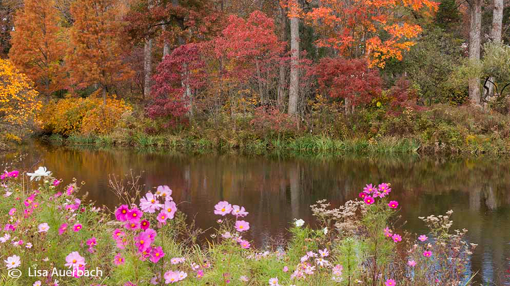
Very pretty but it looked a bit flat to my eye. I also thought a crop off the top would make the composition stronger. I wasn't sure if I liked the bare trees against the sky with so much nice color below. See what you think. I also added a touch of contrast and clarity. I would also, looking at it now, clone out the flowers on the very bottom right that are cut off. You could crop them out but then I think the edge would become too close to the tree trunk on that side. |
Nov 8th |
 |
| 52 |
Nov 18 |
Comment |
Beautiful image wonderfully composed. At least on the small size we are able to view, I don't see any noise that would bother me, and coming from film, noise sometimes is a plus, especially on something like rocks and sand. The color on the falling sand and rocks is wonderful. I agree with Tom's impression and like his adjustments. |
Nov 8th |
| 52 |
Nov 18 |
Comment |
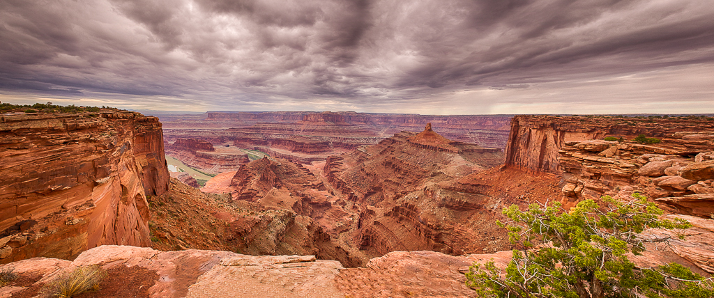
Wow, what majesty. This is certainly competition worthy. My eye is pulled right in and I want to linger over the scene. Great job. One though, my first impression was that you desaturated the clouds, which is a fine interpretation. However, since you didn't mention it I assume that is not the case. There is, however, a little blue in the sky on the left hand side, looking at the image. I might either remove or decrease that blue, or add a bit of blue to the rest of the sky, the latter being a slight preference. Just a touch, so it doesn't look black and white. Alternatively, and going the other direction, I might select the sky with a gradient, and make it warmer. I'm not sure if that would make this very strong image stronger or not but wanted to share the first thought that hit me when I saw it. I decided to give it a go and made a gradient, bringing the line from the top to the horizon and added both yellow and magenta. I immediately liked the effect. I then reduced the blue on the left mentioned at the outset. |
Nov 8th |
 |
| 52 |
Nov 18 |
Comment |
Here is the description that goes with this image: This was shot at Deerfield Pier, close to where I live. I go there often and have been trying for a good lightning shot for years. On this morning, I wasn't expecting lightning but, fortunately, had my lightning trigger with me just in case. I kept missing the lightning, either missing it while changing settings or pointing the wrong direction. Finally I got this one. It came out with the magenta cast you see, and I decided to leave it. Settings: .5/sec, f/8, ISO 100, 22mm on a Sony a7Riii and Sony 16-35 f/2.8. I can't recall the processing but am pretty sure I added some clarity and sharpening. Not sure what else. Possibly reduced the highlights a bit. |
Nov 4th |
| 52 |
Nov 18 |
Reply |
Thanks Stephen. I submitted two images at the same time and there must have been a mix-up. Thanks for the point out and comment. |
Nov 4th |
7 comments - 2 replies for Group 52
|
7 comments - 2 replies Total
|


