|
| Group |
Round |
C/R |
Comment |
Date |
Image |
| 40 |
Apr 18 |
Comment |
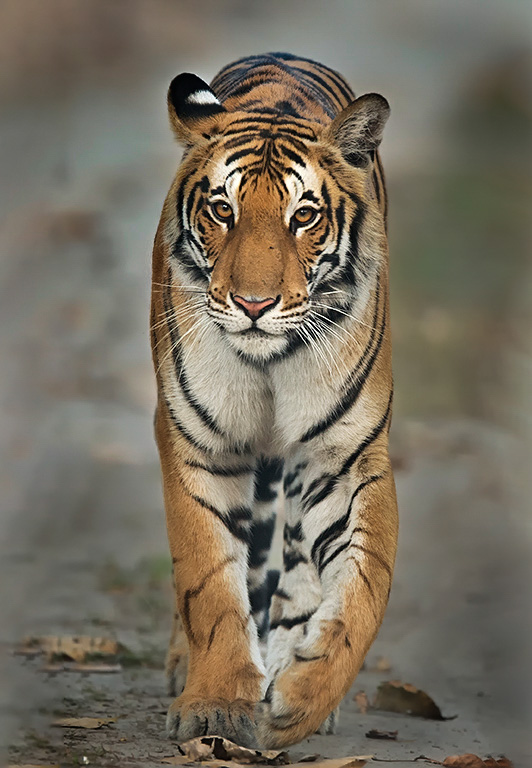
Hello Prakhar, my name is Mike Cohen, from group 52. I was asked to comment on your image. My good luck as I'm glad to have seen it. I try to offer constructive criticism, or maybe a different approach to compare with yours, just for the purpose of exploring possibilities. My first impression, besides wow, was that it looked a bit compressed on the sides. I don't think it is, I think it's just the framing of the tiger that gave my mind that impression. Only by way of suggestion, depending upon your feelings of image manipulation (for me, it's art so all goes), I might add a touch of canvas to the sides and a bit in the foreground as well. Just a bit.
Regarding sharpness, the star of the show is the tiger's eyes and face, which appear very sharp to me. I like that the rest of the body doesn't carry that sharpness. It draws my eye to where it counts.
Just to play a bit, I downloaded the image and added a touch of sharpness and highlights to the face and roughly darkened the area around the tiger. I added just a touch of space. I didn't spend a lot of time but just wanted to share a different approach for your consideration.
Congratulations on a wonderful image, to say nothing of the experience itself.
|
Apr 11th |
 |
1 comment - 0 replies for Group 40
|
| 52 |
Apr 18 |
Comment |
This image has great pop and pizzazz (which I just learned how to spell). The contrast of the color and shape of the blue petals with wonderful bokeh against the sharp stamin is wonderful. I might try to add some sharpness to the yellow at the top and clone out the very out of focus stem coming in from the left upper corner. It's so faint that it took my attention away from the show in the center. Beautiful image. |
Apr 13th |
| 52 |
Apr 18 |
Comment |
I absolutely love the rich colors and action in this image. The reflection is wonderful as is the concentric circles which demonstrate the action of the Reddish. It doesn't hurt that the Reddish is a beauty. The fact that you caught the eye just over the water is nice as well. I don't have any suggestions and like it just as it is. |
Apr 13th |
| 52 |
Apr 18 |
Comment |
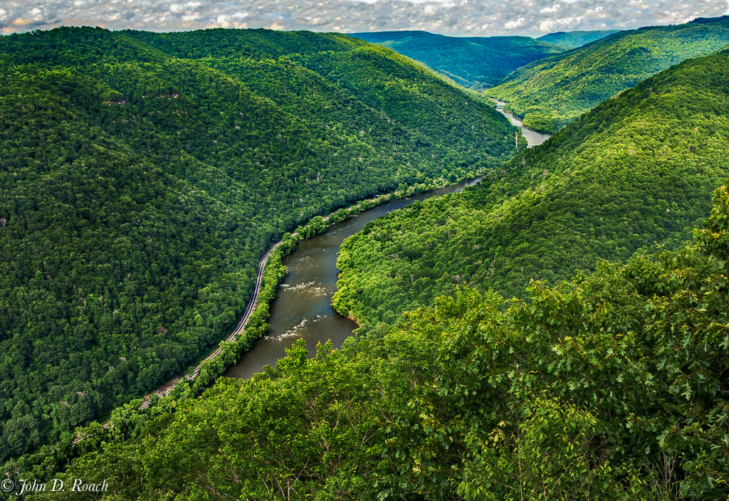
This image demonstrates the lush landscape of the area. I also like the way you composed the image with the placement of the river. I decided to play with it a bit and added just a touch more sky, and brushed in some darkness into the hills and river. |
Apr 13th |
 |
| 52 |
Apr 18 |
Comment |
It looks like you are standing right in the middle of the water. I love the texture and color of the water against the rocky sides. It contrasts nicely against the nice sky. I like the angle of the water going back into the frame to the two higher levels cascading down. The only suggestion I would make would be to reduce the shadows a bit on the sides of the rock adjacent to the water and add some clarity and maybe vibrance to bring even more attention to the water flow. |
Apr 13th |
| 52 |
Apr 18 |
Comment |
Nice image. I'm partial to out of focus backgrounds like you've shown here which allows your subject to standout strongly. I agree with Lisa's comments and would crop in on all sides, which I think would allow the reptile to stand out more. Selectively reducing the yellow int eh leaves would allow the iguana to stand out more, but would take some work as there is also a lot of yellow in the background. Maybe dodging or making a selection based on color or focus would allow you to separate the leaves from everything else and apply adjustments where you want them. That said, I think if it were mine I'd be happy just cropping it in a bit as I like the colors of the leaves and the iguana's colors are, I assume, somewhat for camouflage. |
Apr 13th |
| 52 |
Apr 18 |
Comment |
A very lovely image Sharon. After seeing this, I am definitely going there, so thanks. The standouts for me, besides the main subject, are its reflections in the foreground and the lovely contrast of warm and cool tones. I also like the bit of sand in the corner and your signature is, for the first time to my knowledge, not close to the edge :). The only suggestions I can offer would be to dodge a bit more at the base of the tree, or remove the dodging you mentioned and see which looks better. I can notice the trunk being much darker than the branches which looks a bit artificial to me. The only other think I might do is remove the bright streaky cloud. It competes to my eye with the tree and I think the image would be stronger without it. |
Apr 13th |
6 comments - 0 replies for Group 52
|
7 comments - 0 replies Total
|


